Search Results for information
Explore AI generated designs, images, art and prompts by top community artists and designers.
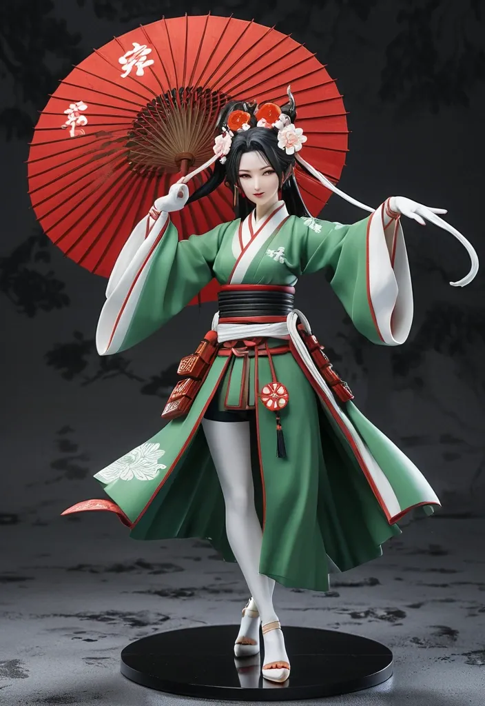

{ "analysis_mode": "STRICT MODE" , "image_overview": "A figure of a female character with gold-colored hair on the face of a white fox on her head , and a Japanese-style outfit with a red and white background. She is holding a Japanese umbrella and jumping lightly , and part of the red Japanese umbrella and the text of the rights can be seen at the bottom." , "composition": { "framing": "新め 上时るら捈えた躍動感るるまするまするのショト" , "subject_placement": "The whole body of the figure placed large in the middle of the screen , "balance": "Dynamic balance due to the large spread on the left and right sides , the flowing hair on the back , and the decoration of the costume" } , "camera": { "camera_position": "被写位方め时间からのハイアングル" , "camera_height": "フクローの頭部よりにるますます" , "viewpoint": "見下ろす电影" , "angle_of_view": "湖整からやや広角気味のデナンクな画角" , "perspective" } , "spatial_layout": "A three-dimensional spatial relationship where there is a 赤い和傘 in front of the hand , a character arranged in such a way as to dance to the space above it , and a background surface with a female character" , "subject": { "main_subject": "和風设计を着た女人オーレードのフィーム" , "pose": "Poses such as having a sense of movement in the sky , raising the right hand high , supporting the handle of the body" , "body_proportions": "整った頭身のフクロショーショーショードローポーション" , "physical_characteristics": "色白の肌、整った顔立で" } , "character": { "identity": "Character figures related to the アイルドマスターシリーター(视频表記より)" , "age_appearance": "young woman、少女" , "expression": "口をしたまてるさたますますますますます" } , "face": { "head_position": "右在地丸へ向てて顔をしたも征げている" , "eyes": "温かみあるまたます系の真、恐ずななアイッント" , "eyebrows": "細く整えられ眉、額の赤いライン decoration" , "nose": "small 控えめな鼻の造形" , "mouth": "新しげに開いた口元" , "facial_features": "端正な顔立で、頭学白い狐の面(お面)を新めに時今ですかる" } , "hair": { "color": "是量金色、イエロー" , "style": "両アイドに红にに編みしたた三つ編みてら、毛先ががりますかる" , "length": "背中や肩育しになりををててふんわりとなんなていてていてて" } , "clothing": { "presence": "あり" , "clothing_structure": "Japanese-style clothing with red color on the main , green color accents , and a short skirt-like hem with a black interior and green color." "clothing_color": "赤、白、緑、黒" , "decorations": "白い紐(組紐) , 赤い結糕目、首小钯西、背中国大華華和柄の結ム帯(帯揚げ、白い龙风例)" } , "objects": { "umbrella": "电影に写りしますかい、赤い和傘(番傘、骨器と「THE IDOLM@STER & (c) Bandai Namco Entertainment Inc.」」の白いますいてていててかて "mask" } , "environment": { "setting": "名字の太阳用电影电影电影宣伝用display background" , "weather": "しい" , "time_of_day": "しな" } , "architecture": { "presence": "no" } , "background": { "background_type": "フェップショーショーショーションションションションションのなななゃデシング レッット" } , "text_and_symbols": { "text": "美国右下に「THE IDOLM@STER & (c) Bandai Namco Entertainment Inc.」の少发白い版権記記文字" } , "color": { "dominant_colors": "赤、白、金色、緑、黒" , "palette": "鮮なる赤と红话色対比に、鮮なると白が映える華なれなんます" } , "lighting": { "source": "时地于时间からの柔らかくしますなたんなんスティージョード" , "direction": "在时间から" , "contrast" } , "shadow": { "nature": "设计のひだや髪の重なり、体に落るるなり陰影" , "distribution" } , "material": { "skin_texture": "PVC特有の意しででたな質感の肌" , "cloth_texture": "造形とてますますのますなな布地地さん" , "mask_texture": "お面の質感" , "umbrella_texture": "和紙や布-like 傘 surface texture" } , "texture": { "overall": "High quality scale figure } , "atmosphere": { "mood": "お祭り、和風、華やる、躍動的、イタード的" , "tension": "中" } , "optics": { "lens_effects": "フェックレンズになる被写界头头の浅いボケ味(backgroundや some parts of the body are softにボケててる)" } , "depth_of_field": { "focus": "Character's facial expression" } , "capture_characteristics": { "medium": "实伝用实伝用电影电影电影电影电影" } , "context_analysis": { "image_sequence": "single image" , "same_character_candidates": "never" , "same_location_candidates": "never" , "same_object_candidates": "しな" , "temporal_relationships": "しな" , "action_continuity": "しな" , "visual_continuity": "しな" , "newly_confirmed_information": "金髪三つ編み、狐の面、赤と市松新视の和風设计を着たアイルドのアックックビジアル" , "information_shared_across_images": "しな" } , "character_consistency": { "character_id": "char_004" , "matching_features": "金色の三つ編み髪、狐の面、赤を基調とて和風设计" , "fixed_features": "髪型、Costume design" , "variable_features": "never" , "newly_confirmed_features": "和傘时间空间に舞うとうますますます" , "conflicting_features": "never" , "confidence": "A" } , "inferred_information": { "fact": "バンダイナムコエンターテインボントの「アイルドマスター」アックショートロックックックション" , "inference": "をードーマストの作でするますする和風のをなんならなんますますををますますますますますますますます" , "confidence": "A" , "evidence" } , "changes_from_previous_images": { "status" } , "negative_constraints": { "constraints": [ "Do not change the pose of figure" "Do not delete the face of the character 金髪三つ編みや頭の狐の面" , "赤と市松松をの和風しますますますますしたしたしたしたしたして "右手手上たためやげ和傘" "Keeping the quality of a product photo of a figure rather than a human being" , "Ignore the text elements of rights表記の保つ" ] } } ,
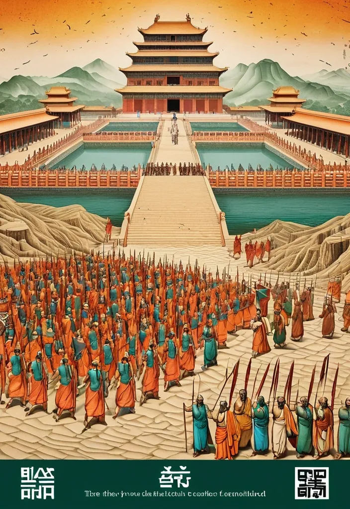
Theme: Ancient Water Conservancy Main palette: Sand path , sand , orange Structural method: another paper construction Micro scene: a tiny Walking march , performance Event details: 02 October , 05:30 am , Start Aspect ratio: 16:9 Design a historical and cultural poster with a modern Eastern editorial aesthetic , using "paper fibers + large color fields + micro-scenes" as the core visual language. Do not interpret traditional culture as stacking ancient architecture , calligraphy , auspicious clouds , or artifacts. Instead , first distill the Cultural Logic , then let large areas of handmade paper color fields directly carry structures , spaces , time , flow , order , or process relationships , so that viewers first see a strong and clear large form from afar , and only gradually discover the cultural narrative hidden within upon closer inspection. Use the dark green , sand style to establish 2–5 main paper color blocks of distinctly different sizes , maintaining low saturation but complete color intensity. All color blocks should have the authentic , rich texture of handmade paper , pulp , watercolor , or mineral pigments , with visible natural long and short fibers , pigment deposition , subtle impressions , large-scale natural color variations , and irregular torn paper edges. The overall effect should be matte , clean , and intact—avoid dirtiness , yellow spots , random speckles , cheap retro effects , or digital gradients. Based on the theme , let the color fields express the logic of system operations through folding , branching , interweaving , interlocking , offsetting , supporting , segmenting , enclosing , or negative space relationships , rather than simply serving as decorative backgrounds. Embed the Dadi march within the large color field structure , keeping figures and props at a very small scale , totaling about 3%–6% of the image area. Each scene must depict a clear action , with causal or temporal relationships between them , such as "entering → executing → recording → completing , " allowing the miniature figures to truly drive the narrative rather than just standing in poses. Figures' clothing in indian Freedom fighter style and artifacts should align with the theme's era and identity but remain restrained—avoid cinematic historical drama excess; scenes should only retain key props that illustrate systemic relationships , without cluttering with decorations or irrelevant cultural symbols. Typography should employ the editorial language of modern Eastern cultural institutions , museums , or archival exhibitions. The main title Dandi March should use refined Song typeface , publication-inspired Gujarati fonts , at a medium-small size that does not overpower the large color fields; supporting English text , dates , locations , and explanatory information should use even smaller sizes to create clear hierarchies. Subtle cinnabar seals , paper tags , archival labels , or node text may be added , but they must genuinely relate to the thematic logic—do not add them randomly just for a "Indian Freedom fighter style" feel. The overall reading order should be: large color field structures and color relationships → systemic or spatial logic → miniature figures' continuous narrative → main title and exhibition information. The final image should achieve a strong large form and visual impact from afar , revealing paper fibers , figure actions , and historical details up close , balancing design sensibility , narrative depth , and cultural completeness. Avoid book cover vibes , traditional Chinese illustration styles , screens full of ancient architecture , oversized titles , PPT-style rigid layouts , modern infographic arrows , meaningless English placeholders , element piling , commercial ad vibes , 3D CGI , glass textures , neon colors , logos , watermarks , numbering , and starburst decorations. ,
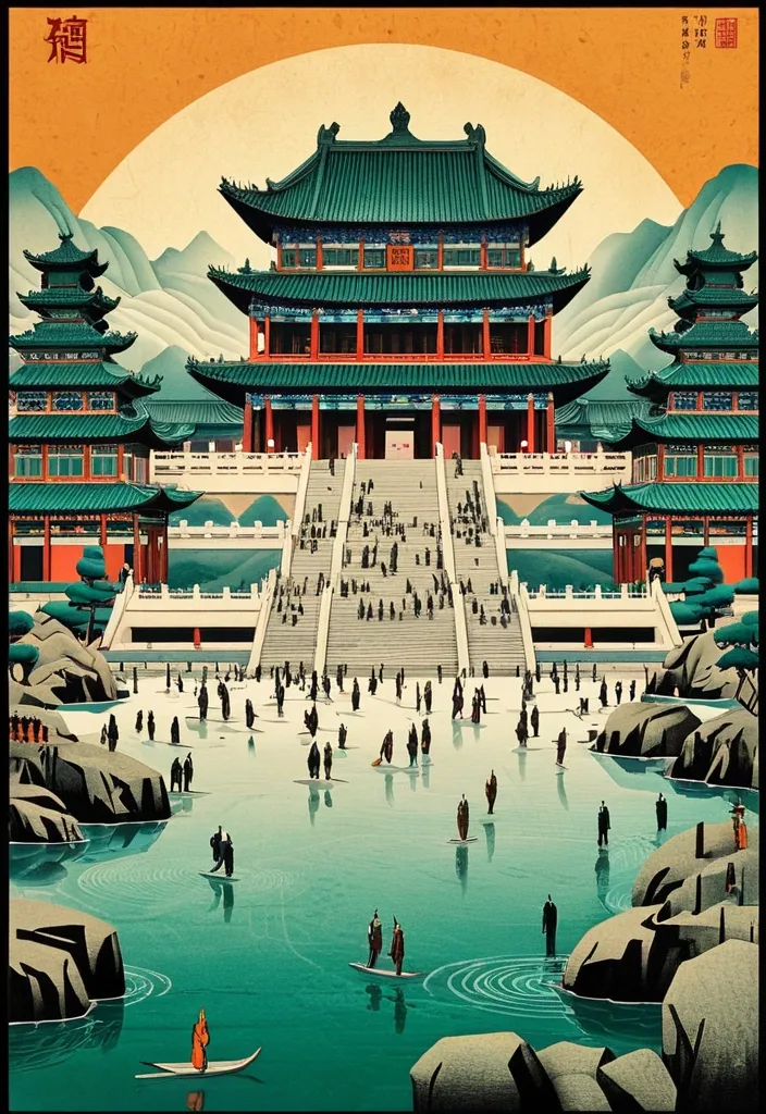
Theme: Ancient Water Conservancy Main palette: blue , dark green , orange Structural method: another paper construction Micro scene: a tiny Walking march , performance Event details: 02 October , venue , Start Aspect ratio: 9:16 Design a historical and cultural poster with a modern Eastern editorial aesthetic , using "paper fibers + large color fields + micro-scenes" as the core visual language. Do not interpret traditional culture as stacking ancient architecture , calligraphy , auspicious clouds , or artifacts. Instead , first distill the Cultural Logic , then let large areas of handmade paper color fields directly carry structures , spaces , time , flow , order , or process relationships , so that viewers first see a strong and clear large form from afar , and only gradually discover the cultural narrative hidden within upon closer inspection. Use the dark green , sand style to establish 2–5 main paper color blocks of distinctly different sizes , maintaining low saturation but complete color intensity. All color blocks should have the authentic , rich texture of handmade paper , pulp , watercolor , or mineral pigments , with visible natural long and short fibers , pigment deposition , subtle impressions , large-scale natural color variations , and irregular torn paper edges. The overall effect should be matte , clean , and intact—avoid dirtiness , yellow spots , random speckles , cheap retro effects , or digital gradients. Based on the theme , let the color fields express the logic of system operations through folding , branching , interweaving , interlocking , offsetting , supporting , segmenting , enclosing , or negative space relationships , rather than simply serving as decorative backgrounds. Embed the Dadi march within the large color field structure , keeping figures and props at a very small scale , totaling about 3%–6% of the image area. Each scene must depict a clear action , with causal or temporal relationships between them , such as "entering → executing → recording → completing , " allowing the miniature figures to truly drive the narrative rather than just standing in poses. Figures' clothing and artifacts should align with the theme's era and identity but remain restrained—avoid cinematic historical drama excess; scenes should only retain key props that illustrate systemic relationships , without cluttering with decorations or irrelevant cultural symbols. Typography should employ the editorial language of modern Eastern cultural institutions , museums , or archival exhibitions. The main title [Main Title] should use refined Song typeface , Ming-style , or publication-inspired Chinese fonts , at a medium-small size that does not overpower the large color fields; supporting English text , dates , locations , and explanatory information should use even smaller sizes to create clear hierarchies. Subtle cinnabar seals , paper tags , archival labels , or node text may be added , but they must genuinely relate to the thematic logic—do not add them randomly just for a "Chinese style" feel. The overall reading order should be: large color field structures and color relationships → systemic or spatial logic → miniature figures' continuous narrative → main title and exhibition information. The final image should achieve a strong large form and visual impact from afar , revealing paper fibers , figure actions , and historical details up close , balancing design sensibility , narrative depth , and cultural completeness. Avoid book cover vibes , traditional Chinese illustration styles , screens full of ancient architecture , oversized titles , PPT-style rigid layouts , modern infographic arrows , meaningless English placeholders , element piling , commercial ad vibes , 3D CGI , glass textures , neon colors , logos , watermarks , numbering , and starburst decorations. ,
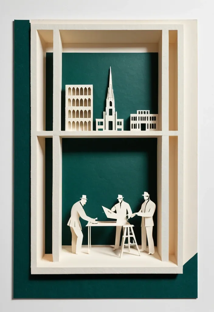
Theme: Freedom Fighters Memorial Aspect ratio: 9:16 Main palette: blue , dark green , orange Structural method: layered cutouts Micro scene: a tiny workshop , performance Event details: 02 October , 08:30 am , Dadi March Create a refined vertical cultural poster using tactile handmade paper , large color fields , structural composition , and a tiny narrative scene. Build the main visual with a clear paper based construction method. The composition may use layered apertures , framing , overlapping printed blocks , folded planes , or other physical paper relationships. Let the structure itself create depth , rhythm , and visual tension rather than relying on decorative graphics. All large paper areas should have realistic handmade texture , including visible fibers , pulp variation , pigment absorption , subtle pressure marks , irregular edges , and slight material imperfections. Keep the surfaces matte , clean , and sophisticated. Use strong but controlled color relationships. Large color fields should remain visually clear from a distance , while smaller overlaps , cut edges , shadows , folds , and paper thickness become visible only when viewed closely. Add one small micro scene related to the theme. Include two or three adult figures naturally performing the activity , such as cutting paper , operating a press , performing shadow theatre , folding structures , or arranging materials. Keep the entire scene around 3% to 5% of the poster so it remains a discovered detail rather than the main subject. Use generous warm ivory or neutral negative space to balance the large structural forms. Typography should be restrained and secondary. Use a refined editorial serif for the main title and small uppercase sans serif for supporting information. Keep the title relatively small and place it in a quiet area of the composition. The visual reading order should be: large paper structure first , color and material interaction second , micro scene third , title and event information last. The final result should feel contemporary , tactile , editorial , architectural , and handmade. From a distance , the poster should read as a strong abstract composition. Up close , it should reveal paper fibers , cut edges , folds , overlaps , print texture , tiny people , tools , and process. ,
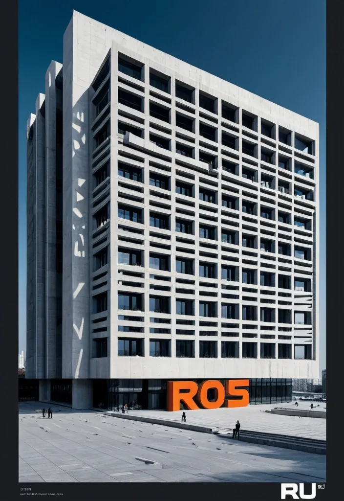
Create a vertical 9:16 poster series in English with a high-end editorial visual style , combining brutalist architecture , monumental perspective typography , realistic mature adult figures , and strong three-dimensional spatial design. The series should feel bold , clean , architectural , and visually sophisticated , with a deep cobalt-blue sky , warm raw-concrete gray , warm ivory typography , charcoal styling for the人物 , and safety orange as the only strong accent color. Use dramatic top-angle perspectives so the architecture , typography , human figure , and spatial structures all belong to the same perspective system. Keep the buildings monumental , simple , and geometric. Typography should be oversized , tall , condensed , and integrated into the composition rather than floating as flat overlay text. Human figures should look realistic , naturally posed , and scaled against the architecture. Add clean editorial microcopy , secondary headlines , and small annotations with strong hierarchy and controlled information density. Create a monumental glass wall with the word “RAJU” carved completely through the structure as real architectural openings. The inner surfaces of the carved letters should be safety orange , revealing strong physical depth. A realistic young man stands or steps naturally within the R-shaped opening. The image should feel architectural , clear , and conceptually striking. ,

OBJECT SHAPE: flying Eagle MEDIUM: points SPATIAL MECHANISM: depth SUBJECT: small human figure MAIN COLOR: blue FORMAT: 9:16 vertical poster Create a contemporary volumetric perspective shape poster where the main object exists through elements distributed across real three-dimensional space rather than on a flat surface. Build the shape from the chosen medium: suspended threads , physical points , beams of light , layered line grids , or another spatial system. Individual elements should appear fragmented or abstract from other viewpoints , but align into one bold , visual shape from the intended camera position. Keep clear foreground , midground and background depth. The shape structure should dominate roughly 35–55% of the composition while still revealing how the spatial structure creates it. For points , use suspended objects to form volumetric dots shapes. If a person is included , keep them small and use them mainly as a scale reference , with realistic occlusion between the subject and the spatial elements. Use one strong accent color with a restrained architectural palette. Add only minimal editorial information such as project name , location , date and one short thematic line. Overall style: perspective shape structure , volumetric installation , spatial graphic design , contemporary exhibition art , clean hierarchy and strong visual impact. Avoid flat printed text , ordinary 3D shapes , weak depth , random distortion , neon sci-fi styling , excessive filler copy , cluttered backgrounds , watermarks and numbering. ,
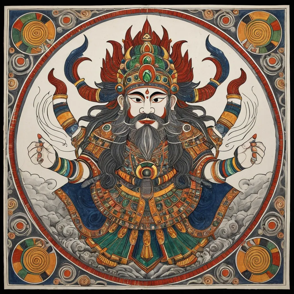
Generate an illustration of an Eastern deity in the style of Madhubani art sacred art , centering on the Zhong Kui and incorporating the Fire-Tipped Spear and Divine Beast to create a cohesive composition. Elements such as artifacts , wings , ghosts , ribbons , clouds , or divine manifestations must not serve merely as decoration; instead , they must collectively form clear structural patterns—such as diagonals , circles , S-curves , radial lines , or frontal subjugation poses—to imbue the image with a distinct sense of dynamic momentum (*shi*). The overall style should blend the aesthetics of traditional deity paintings , *Gongbi* heavy-color painting , *Baimiao* (fine-line drawing) , and ancient illustrated scrolls. The figure should appear solemn , divine , and imposing , avoiding the look of modern idols or game CG characters. Attire should follow traditional systems of divine robes , armor , and headdresses , incorporating continuous patterns such as cloud , thunder , scale , beast-face , meander (Greek key) , and scrolling vine motifs. Prioritize highly continuous Madhubani art line work: render hair , beards , and the fur or feathers of divine beasts with smooth , long lines that follow natural flow; depict clouds , garment hems , and ribbons using unbroken S-curves and C-curves; ensure that patterns on armor , crowns , and clothing are structurally complete and continuously closed. Minimize fragmented textures; avoid random short strokes , dense broken lines , jagged hair edges , or noise-like etching patterns. The color palette employs uniform , rich , and continuous traditional heavy mineral pigments. Centered around a core tone , it incorporates azurite blue , malachite green , ink-blue , antique gold , copper gold , cinnabar , ochre red , and ivory white. While low in saturation , the colors maintain high pigment density and transition naturally and smoothly along the forms; the finish should be free of mottling , fading , stains , graininess , or artificial distressing. The background features clean , warm-toned ivory *xuan* paper with extensive negative space , accented only by minimal continuous-line cloud motifs , vertical inscriptions , and cinnabar seals. The composition balances high information density in the subject matter with low density in the background. The overall aesthetic conveys the refined , fluid , cohesive , and professional quality of traditional Madhubani art painting with heavy mineral pigments on paper. Avoid: broken or fragmented lines , micro-fragmented textures , frizzy hair details , shattered cloud patterns , mottled coloring , faded or distressed effects , modern neon , 3D CG , screen-filling special effects , cluttered backgrounds , and large , modern poster-style headlines. ,
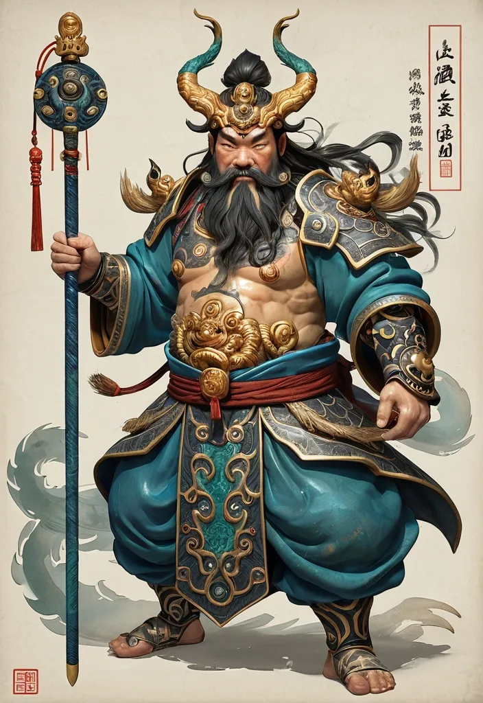
Deity Identity: Zhong Kui Core Artifact: Fire-Tipped Spear Divine Beast: Three-Eyed Manifestation Color Palette: Azurite & Antique Gold Composition Style: Spiraling Leap Overall Aura: Grotesque Aspect Ratio: [5:8] Generate an illustration of an Eastern deity in the style of *Gongbi* (meticulous brushwork) sacred art , centering on the Zhong Kui and incorporating the Fire-Tipped Spear and Divine Beast to create a cohesive composition. Elements such as artifacts , wings , ghosts , ribbons , clouds , or divine manifestations must not serve merely as decoration; instead , they must collectively form clear structural patterns—such as diagonals , circles , S-curves , radial lines , or frontal subjugation poses—to imbue the image with a distinct sense of dynamic momentum (*shi*). The overall style should blend the aesthetics of traditional deity paintings , *Gongbi* heavy-color painting , *Baimiao* (fine-line drawing) , and ancient illustrated scrolls. The figure should appear solemn , divine , and imposing , avoiding the look of modern idols or game CG characters. Attire should follow traditional systems of divine robes , armor , and headdresses , incorporating continuous patterns such as cloud , thunder , scale , beast-face , meander (Greek key) , and scrolling vine motifs. Prioritize highly continuous *Gongbi* line work: render hair , beards , and the fur or feathers of divine beasts with smooth , long lines that follow natural flow; depict clouds , garment hems , and ribbons using unbroken S-curves and C-curves; ensure that patterns on armor , crowns , and clothing are structurally complete and continuously closed. Minimize fragmented textures; avoid random short strokes , dense broken lines , jagged hair edges , or noise-like etching patterns. The color palette employs uniform , rich , and continuous traditional heavy mineral pigments. Centered around a core tone , it incorporates azurite blue , malachite green , ink-blue , antique gold , copper gold , cinnabar , ochre red , and ivory white. While low in saturation , the colors maintain high pigment density and transition naturally and smoothly along the forms; the finish should be free of mottling , fading , stains , graininess , or artificial distressing. The background features clean , warm-toned ivory *xuan* paper with extensive negative space , accented only by minimal continuous-line cloud motifs , vertical inscriptions , and cinnabar seals. The composition balances high information density in the subject matter with low density in the background. The overall aesthetic conveys the refined , fluid , cohesive , and professional quality of traditional *gongbi* (meticulous brushwork) painting with heavy mineral pigments on paper. Avoid: broken or fragmented lines , micro-fragmented textures , frizzy hair details , shattered cloud patterns , mottled coloring , faded or distressed effects , modern neon , 3D CG , screen-filling special effects , cluttered backgrounds , and large , modern poster-style headlines. ,
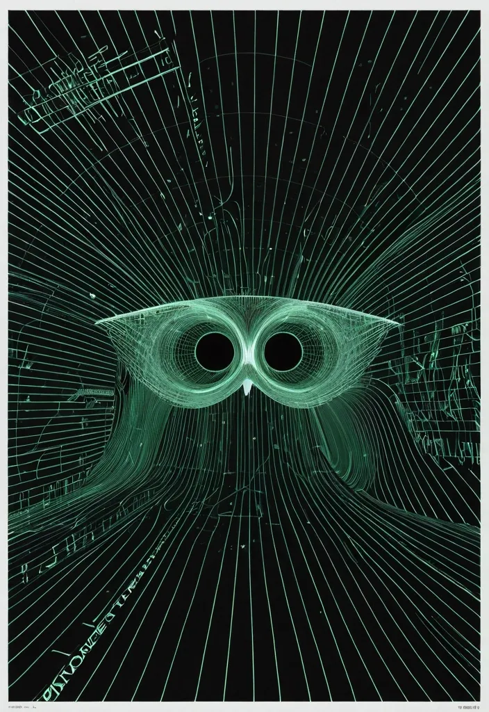
[SUBJECT]: Owl face , eyes look over the upper edges of translucent fluorescent green eyeglasses that sit low across the bridge of his nose [BACKGROUND]: night-sky [RASTER LINES]: gray [DIRECTION]: vortex Design an experimental poster using a continuous high-density raster line field , large-scale spatial deformation , and negative-space typography. Cover the entire composition with fine parallel lines. Keep every line clean , continuous , smooth , uniform in thickness , and consistently spaced. The lines should form one coherent field with no breaks , intersections , sudden bends , or random short fragments. Place Owl face as the main visual , occupying roughly 70–80% of the composition. Do not simply place the subject on top of the lines. Instead , make it feel like a hidden 3D form pushing through the raster field. Use only 2–4 large , controlled deformation zones rather than many small ripples. Let the lines smoothly compress , expand , bend , and flow around the subject , then gradually return to the original parallel field away from it. The subject should become visible mainly through deformation and negative space. Keep only minimal real details where needed for recognition. Create 2–3 small information areas inside quieter negative spaces. Use minimal modern sans-serif typography with strong hierarchy and generous spacing. Keep the text much smaller than the main visual and avoid placing it over dense line areas. Style: Op Art , generative graphic design , experimental typography , contemporary editorial poster , refined and minimal. Prioritize line quality above everything else: extremely fine , sharp , elegant , uninterrupted curves with smooth deformation and precise spacing. Avoid broken lines , warped or jagged curves , intersections , chaotic ripples , excessive realism , generic sci-fi UI , cyberpunk effects , excessive text , logos , numbering , starbursts , and sparkles. ,
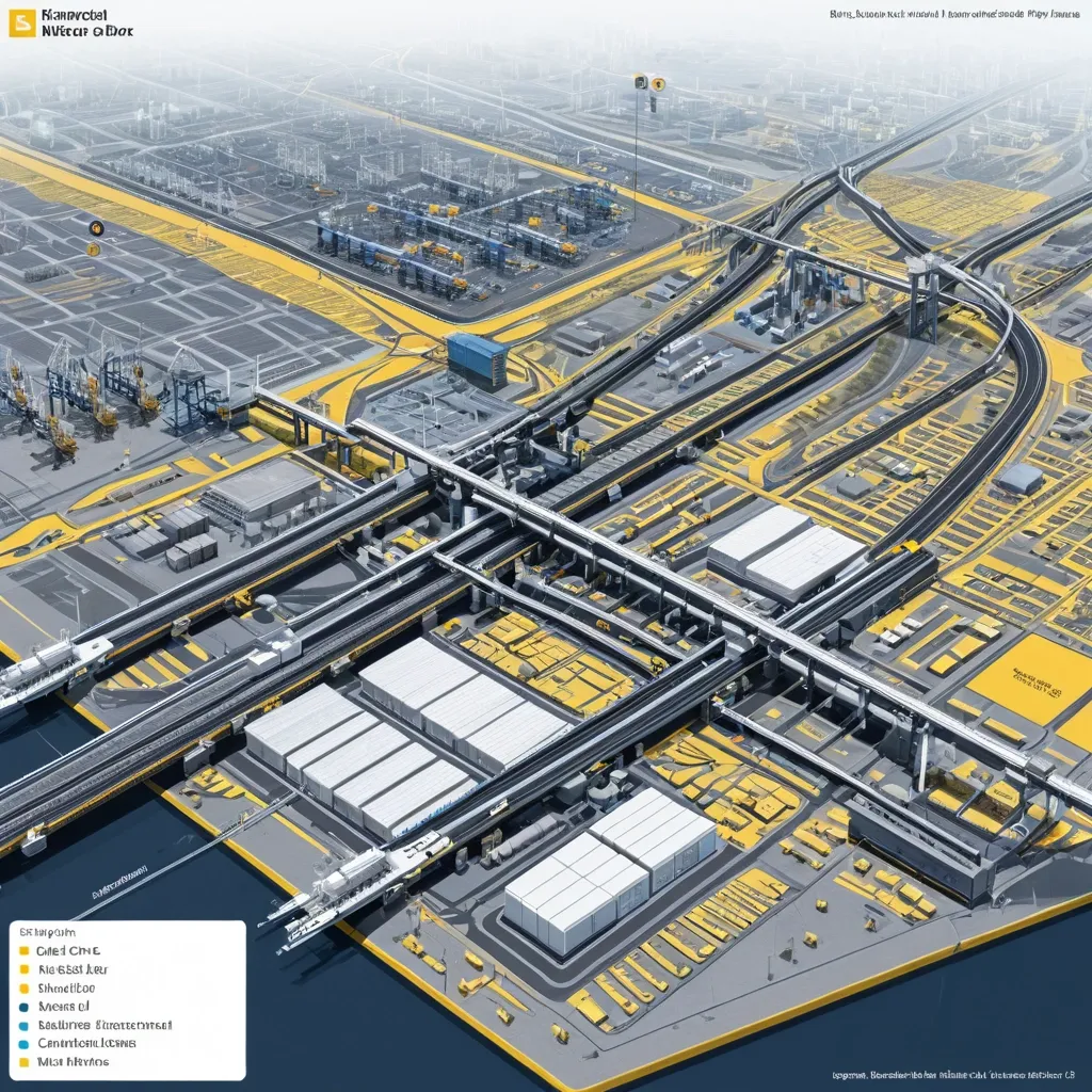
Generate a single complete image of Illustration Profile Long Scroll , one full image , no tiling , no multi-grid , no columns , horizontal 3:1 format. Theme: Port Logistics System. Title: Deendayal Port. Core Content: Dry Cargo Berths , Liquid Terminals , Container Terminals. Supply Chain & Hinterland Connectivity: Railway lines connect , Seamless connectivity to National Highways , Backed by Container Freight Stations. Information Modules: [Limit to 6–8] Style: Illustrated Knowledge Visualization with Text and Images. Color Scheme: yellow , blue , gray-white. The visual focus is to clearly explain the surface , internal structure , functional zoning , and operational process of complex systems all at once. Images primary , text secondary. Use only short labels , module names , function words , and one extremely brief description—no long paragraphs , no dense text blocks. Optionally add a small number of labels , arrows , flow lines , thin annotation lines , and a legend bar to help viewers understand how the system operates. Overall , like a museum science long scroll , city system infographic , or advanced profile diagram from a PPT proposal. Avoid text overload , cluttered information , tiled feel , multi-grid , ordinary landscape images , low resolution. ,
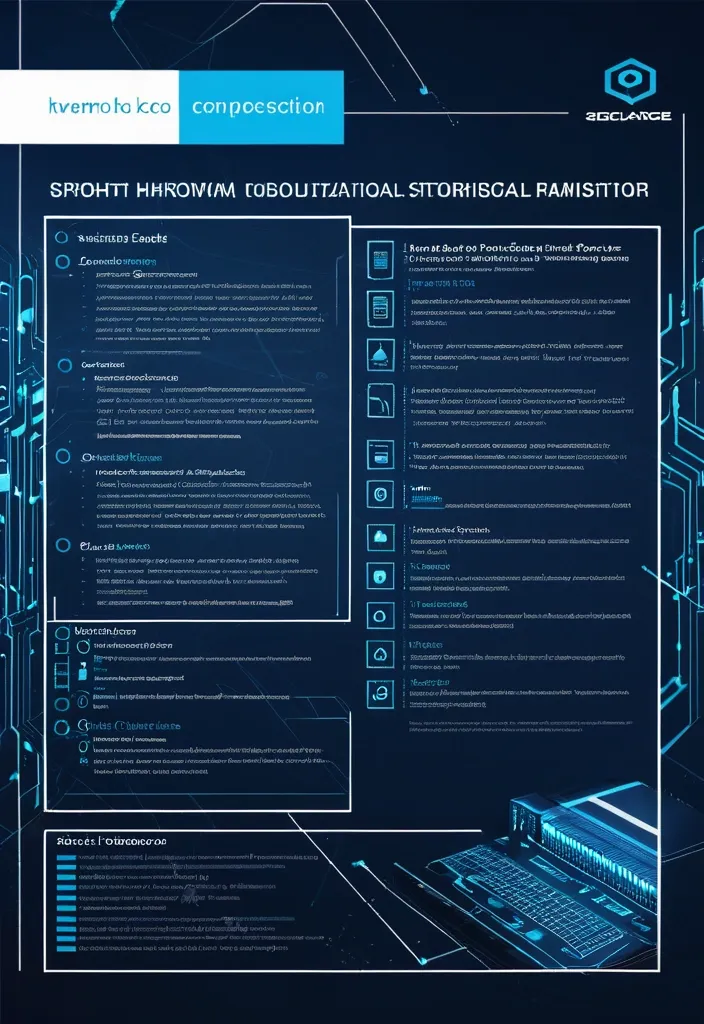
Design a premium A4-size professional book back cover for AIAT Technologies that perfectly matches the front cover design , color palette , typography , branding , spacing , visual hierarchy , and enterprise technology aesthetic. Portrait orientation (A4 vertical) , print-ready publishing quality , ultra-high resolution , modern cybersecurity and IT infrastructure theme. Use a clean deep navy-blue background with subtle geometric grid patterns , abstract network connections , digital circuitry , server infrastructure elements , cloud computing symbols , data streams , and elegant holographic technology accents. No humans , faces , characters , hackers , hooded figures , robots , or mascots. Create a sophisticated corporate technology appearance suitable for a professional educational publication. At the top include a section titled "About This Book". Below it place a professionally formatted book description area explaining that Windows CLI – 100 Important Commands is a practical reference guide covering essential Windows command-line tools for system administration , troubleshooting , networking , security operations , automation , diagnostics , and IT support. Include a clean feature highlights section with modern iconography containing: • 100 Essential Windows Commands • Practical Command Examples • Networking & Troubleshooting Tools • System Administration Techniques • Security & Diagnostic Utilities • Beginner to Advanced Learning Resource. Add a section titled "Who Should Read This Book?" listing: IT Professionals , System Administrators , Help Desk Engineers , Cybersecurity Analysts , Networking Students , Technology Enthusiasts , and Computer Science Learners. Include a professional AIAT Technologies company profile section with the heading "About AIAT Technologies" and a clean placeholder text area for company information. At the bottom reserve space for ISBN barcode placement , publisher information , website , email address , copyright details , and social media icons. Use premium white and cyan typography with strong readability and professional alignment. Maintain generous spacing , balanced composition , and publishing-standard formatting. The overall design must feel like a bestselling enterprise technology handbook from a leading technology training organization. Print-ready , ultra-detailed , corporate publishing quality , elegant modern layout , professional educational technology branding , 8K quality. Negative Prompt: no humans , no faces , no hooded figures , no hackers , no robots , no anime , no cartoons , no gaming appearance , no movie-poster style , no cluttered layout , no excessive neon effects , no blurry text , no distorted typography , no low resolution , no watermark , no stock-photo appearance , no horror elements , no fantasy elements. ,
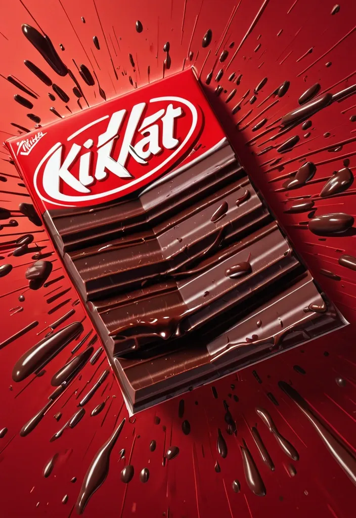
FORMAT: 4:5 vertical hyper-commercial chocolate campaign poster , ultra-high resolution (8K) , premium billboard + social media advertising ready Style: bold FMCG advertising × modern snack campaign × energetic commercial poster design × high-impact product photography 🧠 CORE IDEA: THE BREAK EVERYONE WAITS FOR. A campaign built around impact , craving , and satisfying motion. Everything in the composition reacts to the iconic KitKat snap. 🎬 MASTER COMPOSITION: BACKGROUND: Deep KitKat red environment Layered with: - rich red gradients - chocolate texture overlays - dynamic motion streaks - subtle crumb particles - repeated typography patterns - glossy studio reflections The atmosphere should feel: bold , hungry , energetic , commercially explosive. 👤 HUMAN SUBJECT: Young Gen-Z male/female model Expression: playful , confident , mid-enjoyment moment Pose: holding KitKat toward camera mid-snap action Camera angle: slightly low + close perspective for product dominance Wardrobe: modern streetwear in neutral tones allowing red palette to dominate 💥 VISUAL ENERGY: The SNAP becomes the visual explosion. At the break point: - chocolate shards flying outward - wafer crumbs suspended mid-air - liquid chocolate streaks - motion lines radiating from snap Typography physically cracks apart following the KitKat break. Feels: satisfying , punchy , commercially exaggerated. 🍫 PRODUCT HERO: [KitKat](chatgpt://generic-entity?number=0) chocolate bar + wrapper Placement: foreground center-right Angle: extreme 3/4 hero perspective Product details: - hyper-real chocolate texture - visible wafer layers - glossy melted chocolate highlights - realistic crumbs - embossed KitKat logo - premium wrapper reflections Chocolate should feel: crispy , rich , irresistible. ✍️ TYPOGRAPHY SYSTEM: MAIN HEADLINE: “BREAK TIME.” Typography style: - ultra-bold condensed sans-serif - oversized stacked layout - white typography - extremely tight spacing - cracked/distorted around snap point SECONDARY TEXT: “HAVE A BREAK. HAVE A KITKAT.” BACKGROUND TYPOGRAPHY: Repeated low-opacity words: SNAP CRUNCH BREAK CHOCOLATE WAFER MELT integrated into background layers 📦 FEATURE INFORMATION STRIP: Bottom premium feature strip: □ CRISPY WAFER □ RICH CHOCOLATE □ ICONIC SNAP □ PERFECT BREAK Minimal modern icon system. 📣 CTA SECTION: BOTTOM LEFT: “NEW SHARING PACK AVAILABLE” CTA BUTTON: solid white rectangular button TEXT: “GRAB NOW” Secondary micro CTA: “Available Online & In Stores” 🌐 WEBSITE + BRAND INFO: BOTTOM CENTER: www.kitkat BOTTOM MICROTEXT: “NESTLÉ KITKAT · 2026 EDITION” 🎨 COLOR SYSTEM: PRIMARY: KitKat red deep chocolate brown SECONDARY: white typography ACCENTS: warm chocolate highlights golden wafer tones Palette should feel: bold , delicious , high-energy , commercial. 💡 LIGHTING SYSTEM: MAIN LIGHT: strong commercial studio key light RIM LIGHT: warm chocolate highlights around product ACCENT LIGHT: soft red glow behind snap motion ATMOSPHERIC LIGHT: subtle floating particles catching light REFLECTIONS: glossy FMCG-grade reflections Lighting should feel: premium snack advertising × modern commercial photography. ✨ HYPER DETAILING: - ultra-real wafer texture - sharp chocolate break detail - floating crumb realism - melted chocolate reflections - premium wrapper texture - billboard readability maintained - ultra-clean typography edges - high-end FMCG rendering quality 📐 COMPOSITION FLOW: Upper Frame: massive typography dominance Center: snap explosion + human interaction Foreground: product hero Lower-left: CTA + features Eye flow: Headline → Snap → Product → Chocolate Motion → CTA 🎥 CAMERA & RENDER: - commercial food photography - Phase One medium format feel - 35–50mm lens - HDR commercial rendering - ultra-clean sharpness - premium FMCG color grading 🔥 FINAL FEEL: Feels like: Nike energy campaign × premium FMCG launch × modern Behance commercial food poster. ,
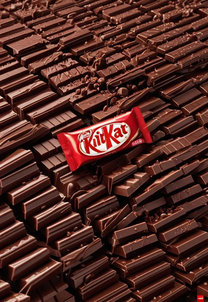
FORMAT: 4:5 vertical hyper-commercial chocolate campaign poster , ultra-high resolution (8K) , premium billboard + social media advertising ready Style: bold FMCG advertising × modern snack campaign × energetic commercial poster design × high-impact product photography 🧠 CORE IDEA: THE BREAK EVERYONE WAITS FOR. A campaign built around impact , craving , and satisfying motion. Everything in the composition reacts to the iconic KitKat snap. 🎬 MASTER COMPOSITION: BACKGROUND: Deep KitKat red environment Layered with: - rich red gradients - chocolate texture overlays - dynamic motion streaks - subtle crumb particles - repeated typography patterns - glossy studio reflections The atmosphere should feel: bold , hungry , energetic , commercially explosive. 👤 HUMAN SUBJECT: Young Gen-Z male/female model Expression: playful , confident , mid-enjoyment moment Pose: holding KitKat toward camera mid-snap action Camera angle: slightly low + close perspective for product dominance Wardrobe: modern streetwear in neutral tones allowing red palette to dominate 💥 VISUAL ENERGY: The SNAP becomes the visual explosion. At the break point: - chocolate shards flying outward - wafer crumbs suspended mid-air - liquid chocolate streaks - motion lines radiating from snap Typography physically cracks apart following the KitKat break. Feels: satisfying , punchy , commercially exaggerated. 🍫 PRODUCT HERO: [KitKat](chatgpt://generic-entity?number=0) chocolate bar + wrapper Placement: foreground center-right Angle: extreme 3/4 hero perspective Product details: - hyper-real chocolate texture - visible wafer layers - glossy melted chocolate highlights - realistic crumbs - embossed KitKat logo - premium wrapper reflections Chocolate should feel: crispy , rich , irresistible. ✍️ TYPOGRAPHY SYSTEM: MAIN HEADLINE: “BREAK TIME.” Typography style: - ultra-bold condensed sans-serif - oversized stacked layout - white typography - extremely tight spacing - cracked/distorted around snap point SECONDARY TEXT: “HAVE A BREAK. HAVE A KITKAT.” BACKGROUND TYPOGRAPHY: Repeated low-opacity words: SNAP CRUNCH BREAK CHOCOLATE WAFER MELT integrated into background layers 📦 FEATURE INFORMATION STRIP: Bottom premium feature strip: □ CRISPY WAFER □ RICH CHOCOLATE □ ICONIC SNAP □ PERFECT BREAK Minimal modern icon system. 📣 CTA SECTION: BOTTOM LEFT: “NEW SHARING PACK AVAILABLE” CTA BUTTON: solid white rectangular button TEXT: “GRAB NOW” Secondary micro CTA: “Available Online & In Stores” 🌐 WEBSITE + BRAND INFO: BOTTOM CENTER: www.kitkat BOTTOM MICROTEXT: “NESTLÉ KITKAT · 2026 EDITION” 🎨 COLOR SYSTEM: PRIMARY: KitKat red deep chocolate brown SECONDARY: white typography ACCENTS: warm chocolate highlights golden wafer tones Palette should feel: bold , delicious , high-energy , commercial. 💡 LIGHTING SYSTEM: MAIN LIGHT: strong commercial studio key light RIM LIGHT: warm chocolate highlights around product ACCENT LIGHT: soft red glow behind snap motion ATMOSPHERIC LIGHT: subtle floating particles catching light REFLECTIONS: glossy FMCG-grade reflections Lighting should feel: premium snack advertising × modern commercial photography. ✨ HYPER DETAILING: - ultra-real wafer texture - sharp chocolate break detail - floating crumb realism - melted chocolate reflections - premium wrapper texture - billboard readability maintained - ultra-clean typography edges - high-end FMCG rendering quality 📐 COMPOSITION FLOW: Upper Frame: massive typography dominance Center: snap explosion + human interaction Foreground: product hero Lower-left: CTA + features Eye flow: Headline → Snap → Product → Chocolate Motion → CTA 🎥 CAMERA & RENDER: - commercial food photography - Phase One medium format feel - 35–50mm lens - HDR commercial rendering - ultra-clean sharpness - premium FMCG color grading 🔥 FINAL FEEL: Feels like: Nike energy campaign × premium FMCG launch × modern Behance commercial food poster. ,
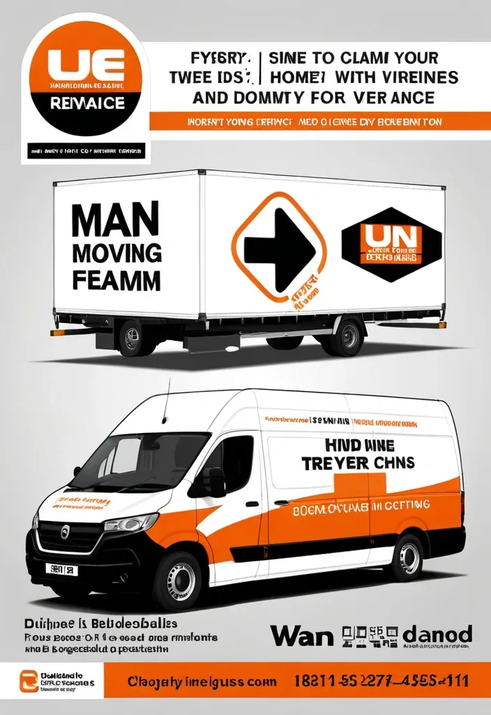
Modern professional flyer design for a UK removals company named “1 Van 1 Man Removals” , orange white and black color scheme , large moving van with company branding , cardboard boxes , clean corporate layout , bold typography , sections for About Us , Services Offered , Why Choose Us , Service Areas , and contact information , icons for home removals , furniture moving , man and van services , and house clearances , UK map graphic , modern gradients , glossy business flyer style , high quality marketing poster , realistic moving equipment and furniture , clean infographic layout , landscape format. ,

Create a professional , elegant packaging design for a line of premium black teas with herbal and berry infusions , specifically a functional herbal blend with sage , thyme , and chamomile for immune-boosting and relaxation. The box is a rectangular package made of high-quality cardboard , measuring 12 x 8 x 5 cm , with a matte finish. Main Image: Create a stylish , modern design inspired by traditional Russian ornaments and embroidery. Typography: Front label , brand name from the attached file. Includes icons denoting organic and functional benefits (immunity shield , herbal leaf). Back: A clear list of ingredients , brewing instructions , net weight of 100 g , and a QR code for additional information. Style: Luxurious minimalism , white or light background , vibrant accent image , high-resolution 4K , perfect for e-commerce and shelf display. No people , no cartoons , focus on natural premium quality. ,
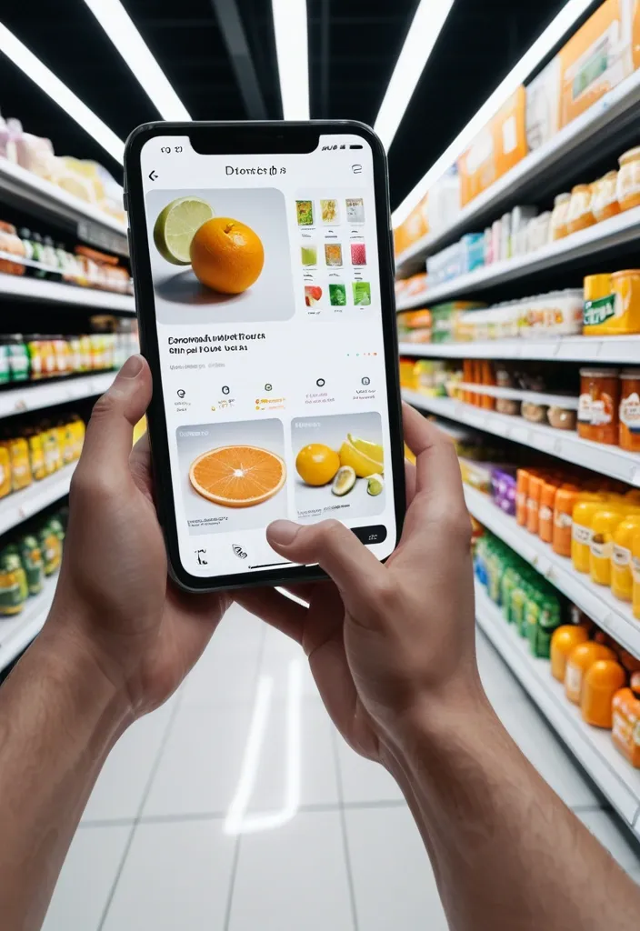
First-person perspective inside a brightly lit supermarket aisle or section. Realistic human hands are holding Limonia close to the camera. The product’s [key visual traits: color , texture , packaging , freshness details] are clearly visible under natural store lighting. The Limonia is surrounded by a multi-layered holographic augmented reality interface displaying relevant product information , including [nutritional or product data such as calories , protein/sugar/caffeine , vitamins , freshness indicator , origin , expiration date , usage or recipe suggestions]. The AR UI elements smoothly shift and reorganize based on the viewer’s gaze direction , as if dynamically responding to user focus. In the left peripheral vision , a vertical semi-transparent shopping list is visible with checked-off items , where Limonia is highlighted as the currently active selection. Hyper-realistic mixed reality , clean futuristic AR design , glass-like UI panels , soft ambient glow , realistic lighting and shadows , natural depth of field , immersive first-person interface , showcasing next-generation retail technology. ,
Comporte toi comme un expert en défini graphique , je veux un LOGO simple et professionnel de mon nouveau produit qui s'appelle "Tajirly" , pour la création des sites web , tunnel de vente et automation...et pour avoir plus d'informations sur les services proposant voici le site de référence utajir.com ,
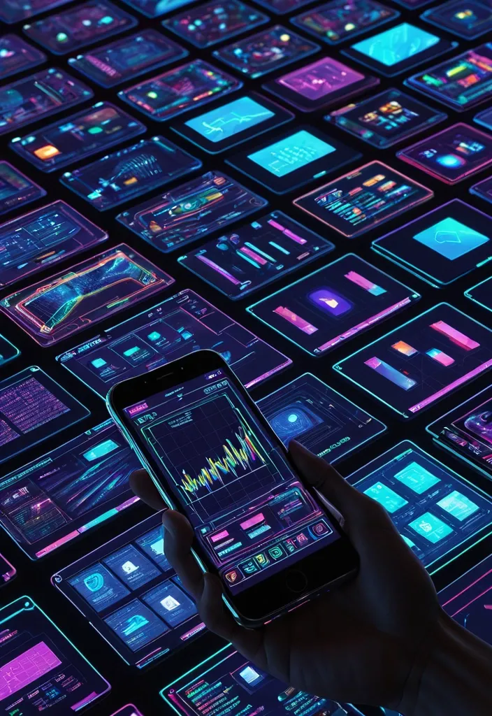
Futuristic realistic image of a next-generation of a human hand forming a decentralized search for a top-down view. The image is a digital interface , with high resolution and vivid colors , featuring intricate digital displays representing smartphone prices and electronic charts. The dynamic , neon colourful screens display an array of data and charts and information , with the coloured smartphones adding to the futuristic presentation. As the devices evolve towards the screen , they are enveloped in digital darkness. ,
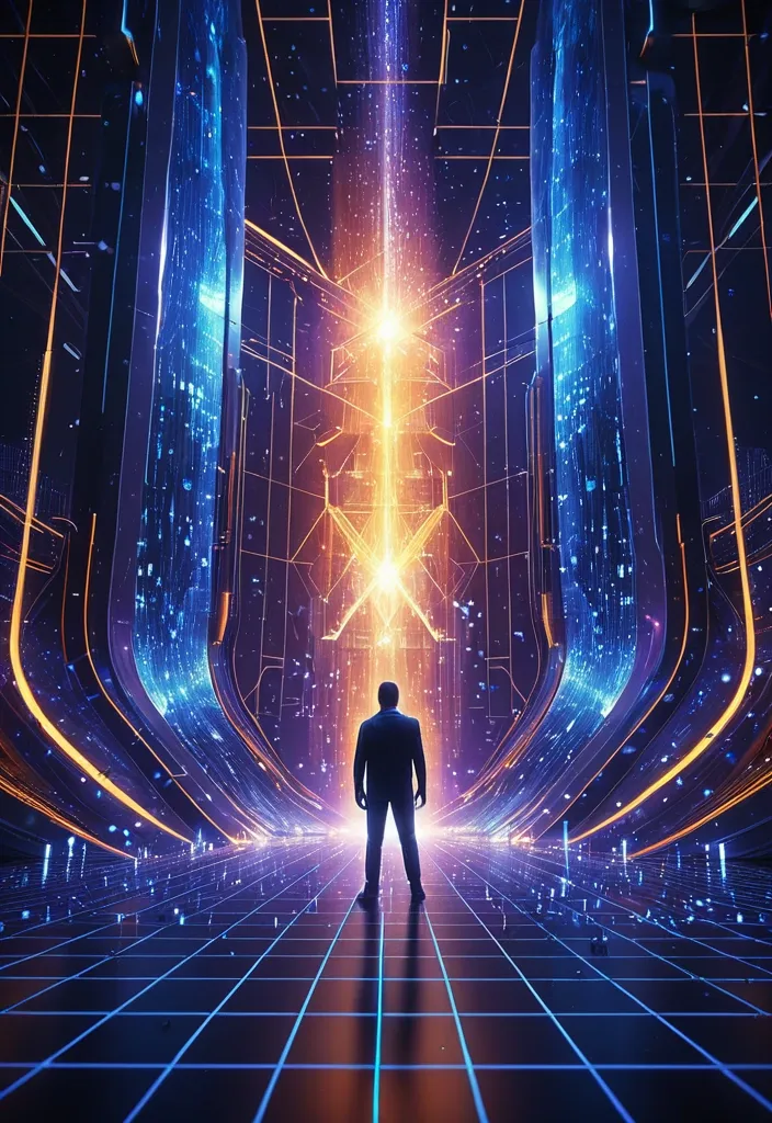
Professional technology workspace , cinematic lighting , a scientist with a music keyboard standing infront of a large glimmering portal , cascading streams of luminescent code and data particles , multiple sound waveforms in sophisticated geometric forms - crystalline spheres , tessellated cubes , and flowing pyramidal structures , each containing visible DNA double helix patterns glowing with bioluminescent blue and amber light representing encoded company methodologies and strategic DNA , interconnected by dynamic particle streams of contextual information flowing like neural networks , background featuring live sound music speaker arrays , color palette of deep blues , warm oranges , and rich purples , volumetric lighting with god rays , hyperrealistic rendering with sci-fi elements , professional corporate aesthetic merged with futuristic technology visualization , 8K detail , representing the interaction of man and machine in a sonic universe ,
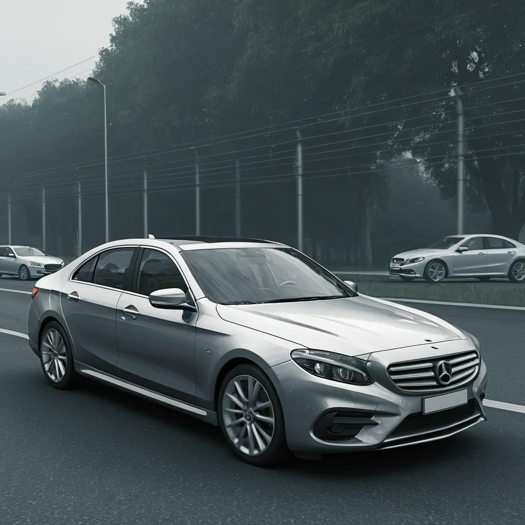
Generate images related to the product Vehiscore. Vehiscore is a vehicle history report that shows complete information about a car: past owners , accidents , and the status of mandatory documents such as SOAT and RTM. The images should reflect the Vehiscore experience , including people , vehicles , and environments connected to trust and the value of a vehicle report. Do not include text or logos. Format should be rectangular horizontal. ,
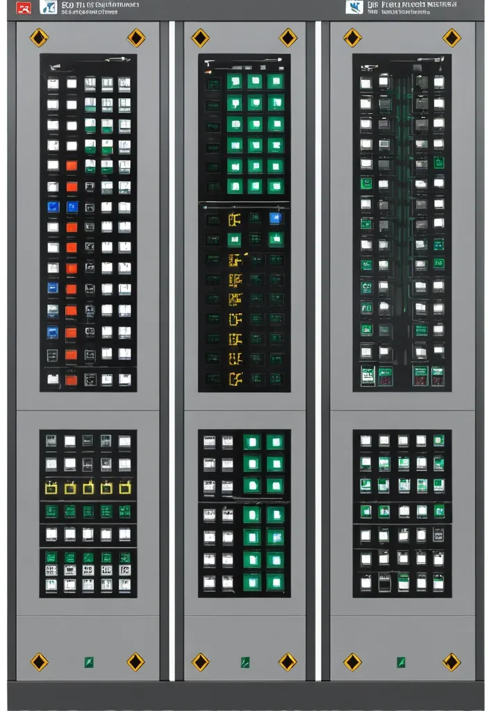
Description of the visualization and control system of the automation complex The purpose of the system is to provide the operator with a single , intuitive interface for monitoring and managing all subsystems of the complex in real time. Architecture of the main window (Generalized Status Panel): The main screen is designed according to the principle of "from general to private". The center contains critical information about the power supply system , on which all other systems depend. The remaining subsystems are grouped logically around the center. 1. Central unit: Power supply system It is visualized as a circle divided into three sectors. Large left sector (≈45%): Transformer substations (TP) 5 blocks are displayed , one for each TP. Each block contains: TP number/name (for example , TP-1 , TP-2). The indicator of the active power line: The "Network" icon with backlight (green - main , yellow - backup). Transformer status: "Main" / "Standby" (or icons). Key parameters from accounting nodes: Current (I) , Voltage (U) , Power (P). The values are output for the active line. General TP status: Color indication (Green - Normal , Yellow - Warning , Red - Emergency). Large right sector (≈45%): Main switchboards 5 blocks are displayed , one for each storage unit. Each block contains: The number/name of the GRSH (for example , GRSH-1). Active power line indicator: Similar to TP. Key parameters from accounting nodes: I , U , P. The general status of the GRS: Color indication. Lower small sector (≈10%): Uninterruptible power supply (UPS) Large text or pictogram status indicator: "Mains operation" (Green) "Battery operation" (Yellow/Orange) Battery level indicator: Percentage scale (from 0% to 100%). The color varies depending on the level (green >50% , yellow 20-50% , red <20%). 2. Peripheral blocks around the center They are arranged around a central circle , forming a "rim". Upper and lower parts of the rim: Ventilation of the web blowing Upper part: 9 installations on top. The lower part: 9 installations from the bottom. There are 18 icons/blocks in total. Each icon represents one installation and has a color indication of the status.: Green: Enabled Gray: Turned off Red: An accident (for example , the differential pressure sensor on the filter went off , an error in the drive) Black/Blue: No power supply When hovering over the cursor , a tooltip appears with details (the condition of the fan , valve , filter blockage). Left and right sides of the rim: Indoor ventilation The left and right sides are divided equally to display the 12 settings on each side. There are 24 icons/blocks in total. The same color status indication for each installation. 3. Corner blocks: Other subsystems They are located in the four corners of the screen for easy and fast perception. Upper left corner: Roller shutters (48 pcs.) Summary information is displayed as an information block.: "Closed: XX / Open: XX" (numeric values). A graphical indicator (for example , a stripe divided into green and blue parts , proportional to the number). General status: Green icon "OK" or Red icon "Emergency" (if at least one roller shutter has an emergency status). Upper right corner: Elevators (2 pcs.) Two vertical blocks , one for each elevator. Each block contains: Elevator number (Elevator 1 , Elevator 2). Floor indicator: A large number (for example , 3). Motion indicator: Up/down arrow or Stop icon. General status: The background color of the block (Green - normal , Gray - power off , Red - emergency , Blue - no connection). Lower left corner: EVIL Lights (Roof lamps) A large indicator in the form of a stylized lamp or icon. Color status indication: Bright Yellow/White: Included Gray: Off Red: Crash Black/Blue: No power supply Lower right corner: Heated storm drains Similar in style to the "Fires of EVIL" block. Color status indication: Orange/Red: Enabled Gray: Off Red (flashing): Crash Black/Blue: No power supply Navigation and management: Main Screen: It is an overview map. All the elements on it are clickable. Details: Clicking on any sector (TP , GRS , ventilation group , roller shutter unit) opens a new window with detailed information: TP/GRS: Single-line network diagram , status of all feeders and sectional switches , detailed power parameters. Ventilation: Detailed status of each piece of equipment in the selected group (fan , valve , filter condition) , possibility of manual control. Roller shutters: A table or plan of the building with the condition of each of the 48 roller shutters , group and individual control buttons. Control: The control buttons (Start , Stop , Open , Close) are located on the detailed screens. On the main screen , quick action buttons ("Emergency activation") can be displayed for critical systems (for example , EVIL lights). Visual style: Color scheme: An intuitive color palette is used (Green is the norm , Yellow/Orange is a warning , Red is an accident , Gray/Blue - disabled/no data). Fonts: Clear , easy-to-read fonts. Critical information is displayed larger. Animation: Minimal and informative (for example , smooth change of values , flashing for emergency states). ,
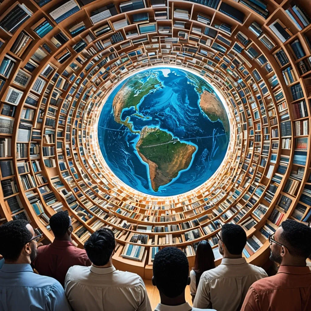
Generate a realistic color image related to the following text: The idea of knowledge , also known as epistemology , is vital for rethinking education today , as it provides a critical foundation to understand how knowledge is created , validated , and shared within educational environments. Integrating epistemology into teaching is crucial for addressing challenges such as lack of access to technology , social disparities , and the inability to adapt curricula in a connected and ever-evolving world. The theory of knowledge , by promoting an intricate and dynamic view of learning , not only optimizes the process of information acquisition; it also strengthens teacher training by encouraging students to develop critical thinking and intellectual independence. To design more just , open , and tailored educational systems that meet current needs , this stance is essential. ,
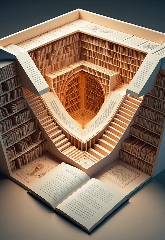
A three-dimensional diagram unfolds before you , intricately illustrating the anatomy of an enlightening chapter from a fact-filled book. It is as if you are navigating through a labyrinth of knowledge , where every twist and turn reveals a new concept or idea. The setting is reminiscent of a futuristic library , bathed in soft , warm light. Each component of the chapter is represented by a unique geometric shape , creating an paper architectural masterpiece that demonstrates the inter connectivity of the information within. The atmosphere is serene , yet thought-provoking , inviting you to delve deeper into the depths of understanding. ,
Generate me a card with contact information. A card for a master in the field of cooking. Compact design of contact data is required. It is important that it looks stylish and clear. Visual description of the card: - Background: Light gray or white with a thin shadow for volume. - Text: Dark blue or black , font - modern grotesque (for example , "Inter" or "Helvetica Neue"). - Icons: Minimalistic SVG icons of a phone , mail , etc. - Accents: Use blue or dark blue to highlight the name and links. ,
Generate me a card with contact information. A card for a master in the field of cooking. Compact design of contact data is required. It is important that it looks stylish and clear. Visual description of the card: - Background: Light gray or white with a thin shadow for volume. - Text: Dark blue or black , font - modern grotesque (for example , "Inter" or "Helvetica Neue"). - Icons: Minimalistic SVG icons of a phone , mail , etc. - Accents: Use blue or dark blue to highlight the name and links. ,
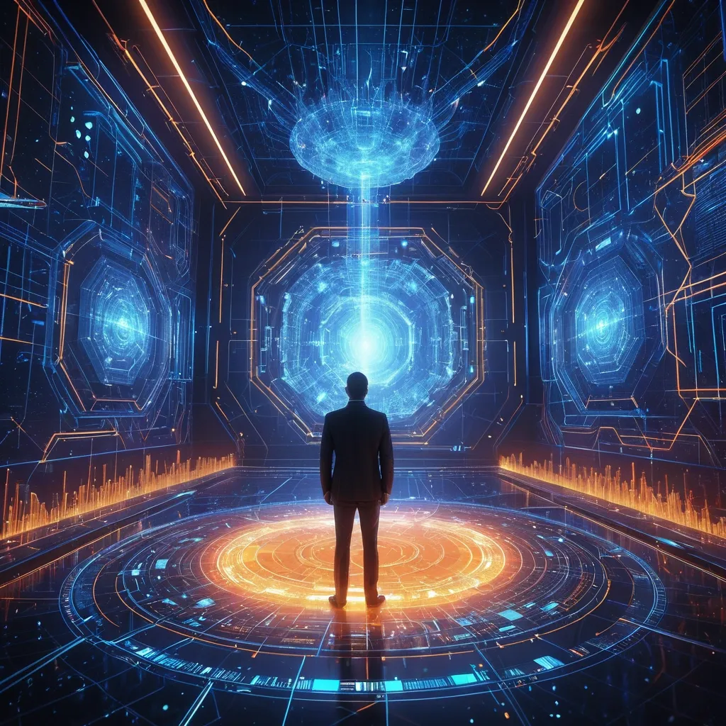
Professional technology workspace , cinematic lighting , a tech executive at an advanced holographic terminal interface , cascading streams of luminescent code and data particles , multiple AI agents manifested as sophisticated geometric forms - crystalline spheres , tessellated cubes , and flowing pyramidal structures , each containing visible DNA double helix patterns glowing with bioluminescent blue and amber light representing encoded company methodologies and strategic DNA , interconnected by dynamic particle streams of contextual information flowing like neural networks , background featuring a dimensional portal suggesting evolutionary journey from simple prompts to complex orchestration , color palette of deep blues , warm oranges , and ethereal purples , volumetric lighting with god rays , hyperrealistic rendering with sci-fi elements , professional corporate aesthetic merged with futuristic technology visualization , 8K detail , representing the paradigm shift from prompt engineering to context engineering in AI-native business transformation ,
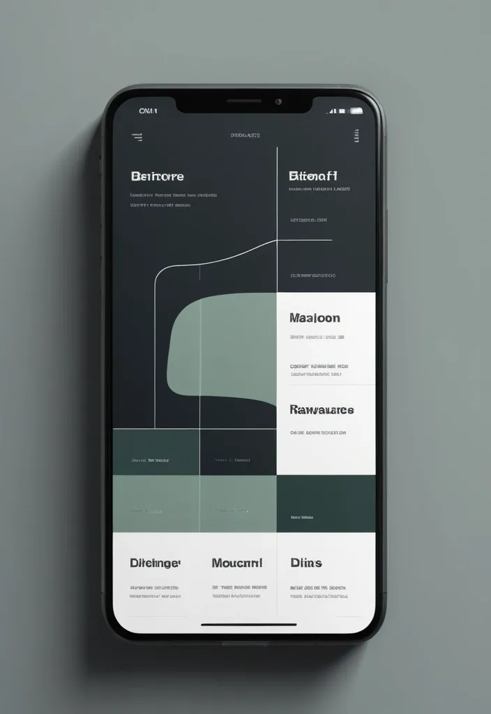
Modern , minimalist app interface displaying (Tooth Extraction) in large , bold white text. Dark gray background. Simple , white graphic of a stylized U-shaped tube , resembling plumbing or a route , against dark background. Green button below graphic reads (More Details). Elements indicative of a mobile phone app , with navigation components and information displayed , along side a map. Clean , geometric style. Neutral , professional mood. Muted color palette , primarily dark gray and white. High-contrast. App interface design style. Clean design , contemporary aesthetic. ,
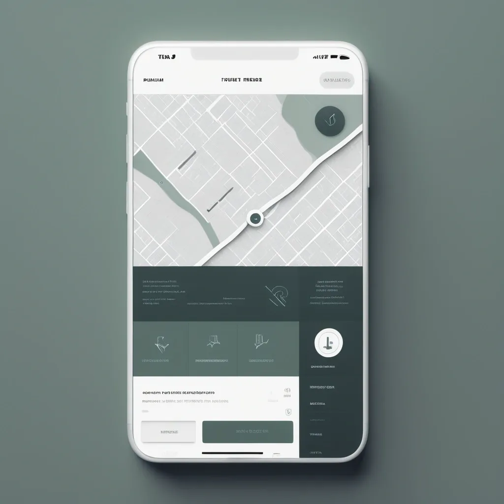
Modern , minimalist app interface displaying "Удаление зубов" (Tooth Extraction) in large , bold white text. Dark gray background. Simple , white graphic of a stylized U-shaped tube , resembling plumbing or a route , against dark background. Green button below graphic reads "Подробнее" (More Details). Elements indicative of a mobile phone app , with navigation components and information displayed , along side a map. Clean , geometric style. Neutral , professional mood. Muted color palette , primarily dark gray and white. High-contrast. App interface design style. Clean design , contemporary aesthetic. ,
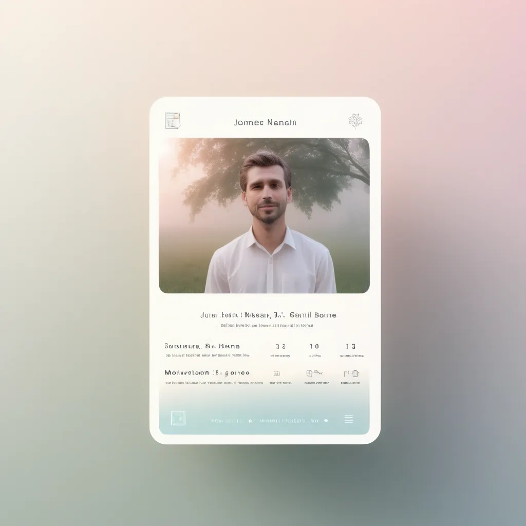
UI/UX design for a virtual memorial with a focus on remembrance and honoring loved ones. Soft gradient backgrounds with white and pastel elements. Elegant design with minimalistic card-style profiles that show personal information , quotes , and multimedia elements. Navigation should be clear , with a special section for visitor messages. Create an interface for easy access via QR codes on gravestones. Include soothing animations like floating candles or gentle moving background elements to enhance the emotional connection. ,