Search Results for numbering
Explore AI generated designs, images, art and prompts by top community artists and designers.
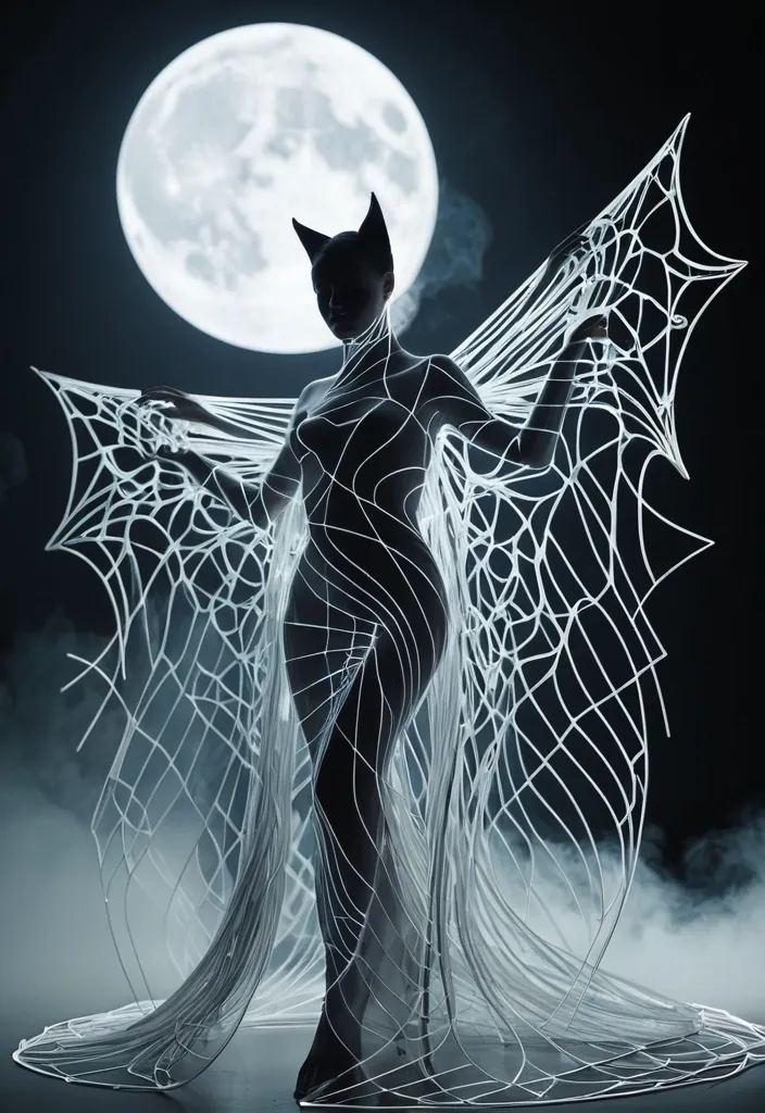

A dancer composed of a vortex dress of thousands razor‑sharp glass shards in hexagonal patterns that stretch against a glowing full moon. Follow natural anatomical curves , preserving expressive eyes , defined facial features , and graceful proportions. Use varying line density to create depth and sculptural volume. Favor beautiful side or full-length. PARAMETRIC GEOMETRY Let the hair and body contours seamlessly transform into massive flowing structures inspired by the selected theme. Use precise curve-stitching geometry: countless thin , individually straight lines with gradually shifting endpoints , forming sweeping curved surfaces , layered folds , and intricate spatial patterns. Keep the line flow clean , continuous , and structurally coherent. VISUAL STYLE Design an unexpected yet logical spatial relationship around the bats , allowing the giant object to interact realistically with the environment—for example , an object becoming an architectural entrance , fabric blending into mist , smoke gradually turning into bats , an animal silhouette obscuring the moon , or the subject piercing through text. The theme should be recognizable at first glance , with visual surprises revealed on second look. Avoid photographic skin , random tangled lines , broken contours , excessive mesh noise , blurry glow , plastic CGI , distorted anatomy , illegible text , decorative numbering , starbursts , and watermarks. ar 9:16. ,
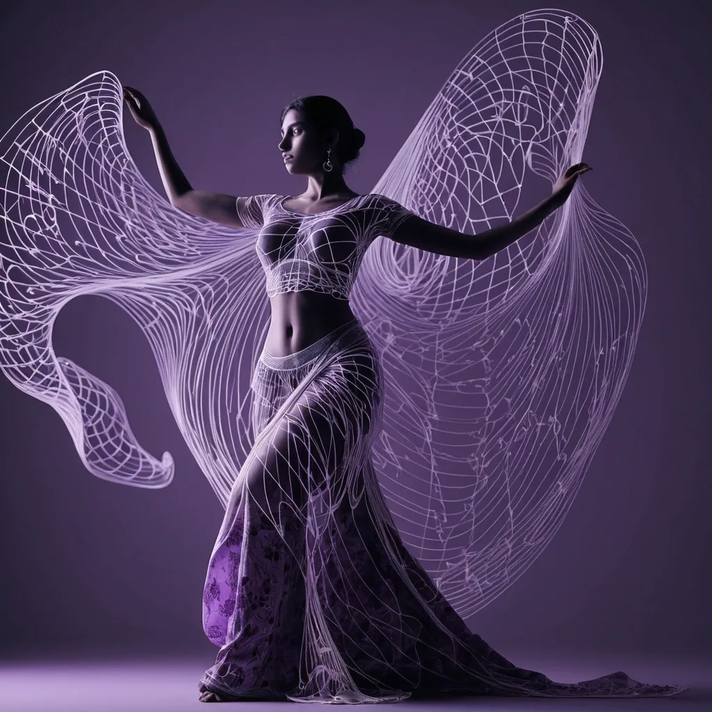
A Graceful gujarati women , Navratri grarba dancer , anatomically correct , full body , wearing Floral Printed Lime purple Chinon Silk Saree with Embroidery Work , jewelry elaboration of details , stage , beautiful lines , curves , soft lighting , lithe figure , delicate movements , intricate sequence , elegant backdrop , flowing curtains , lavender shades , gold shades , dance photography , by Lois Greenfield. Follow natural anatomical curves , preserving expressive eyes , defined facial features , and graceful proportions. Use varying line density to create depth and sculptural volume. Favor beautiful side or full-length. PARAMETRIC GEOMETRY Let the hair and body contours seamlessly transform into massive flowing structures inspired by the selected theme. Use precise curve-stitching geometry: countless thin , individually straight lines with gradually shifting endpoints , forming sweeping curved surfaces , layered folds , and intricate spatial patterns. Keep the line flow clean , continuous , and structurally coherent. VISUAL STYLE Design an unexpected yet logical spatial relationship around the ass , allowing the giant object to interact realistically with the environment—for example , an object becoming an architectural entrance , fabric blending into mist , smoke gradually turning into bats , an animal silhouette obscuring the moon , or the subject piercing through text. The theme should be recognizable at first glance , with visual surprises revealed on second look. Avoid photographic skin , random tangled lines , broken contours , excessive mesh noise , blurry glow , plastic CGI , distorted anatomy , illegible text , decorative numbering , starbursts , and watermarks. AR 1:1. ,
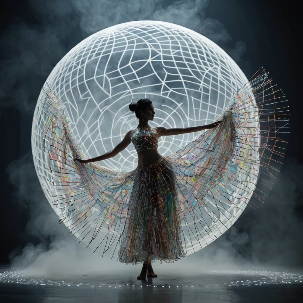
A dancer composed of a swirling Rayon Multicolor Gota Patti Lehenga Choli of thousands razor‑sharp glass shards in circuit patterns that stretch across the water , smooth , continuous contour lines. Follow natural anatomical curves , preserving expressive eyes , defined facial features , and graceful proportions. Use varying line density to create depth and sculptural volume. Favor beautiful side or full-length. PARAMETRIC GEOMETRY Let the hair and body contours seamlessly transform into massive flowing structures inspired by the selected theme. Use precise curve-stitching geometry: countless thin , individually straight lines with gradually shifting endpoints , forming sweeping curved surfaces , layered folds , and intricate spatial patterns. Keep the line flow clean , continuous , and structurally coherent. VISUAL STYLE Design an unexpected yet logical spatial relationship around the dancer , allowing the giant object to interact realistically with the environment—for example , an object becoming an architectural entrance , fabric blending into mist , smoke gradually turning into bats , an animal silhouette obscuring the moon , or the subject piercing through text. The theme should be recognizable at first glance , with visual surprises revealed on second look. Avoid photographic skin , random tangled lines , broken contours , excessive mesh noise , blurry glow , plastic CGI , distorted anatomy , illegible text , decorative numbering , starbursts , and watermarks. AR 1:1. ,
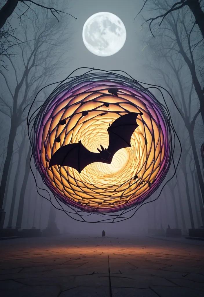
A 3D sphere made of swirling two hand's palm , orange , yellow and purple gradients. Dynamic motion , modern infographic style , smooth , continuous contour lines. Follow natural anatomical curves , preserving expressive eyes , defined facial features , and graceful proportions. Use varying line density to create depth and sculptural volume. Favor beautiful side or full-length. PARAMETRIC GEOMETRY Let the hair and body contours seamlessly transform into massive flowing structures inspired by the selected theme. Use precise curve-stitching geometry: countless thin , individually straight lines with gradually shifting endpoints , forming sweeping curved surfaces , layered folds , and intricate spatial patterns. Keep the line flow clean , continuous , and structurally coherent. VISUAL STYLE Design an unexpected yet logical spatial relationship around the bats , allowing the giant object to interact realistically with the environment—for example , an object becoming an architectural entrance , fabric blending into mist , smoke gradually turning into bats , an animal silhouette obscuring the moon , or the subject piercing through text. The theme should be recognizable at first glance , with visual surprises revealed on second look. Avoid photographic skin , random tangled lines , broken contours , excessive mesh noise , blurry glow , plastic CGI , distorted anatomy , illegible text , decorative numbering , starbursts , and watermarks. AR 9:16. ,
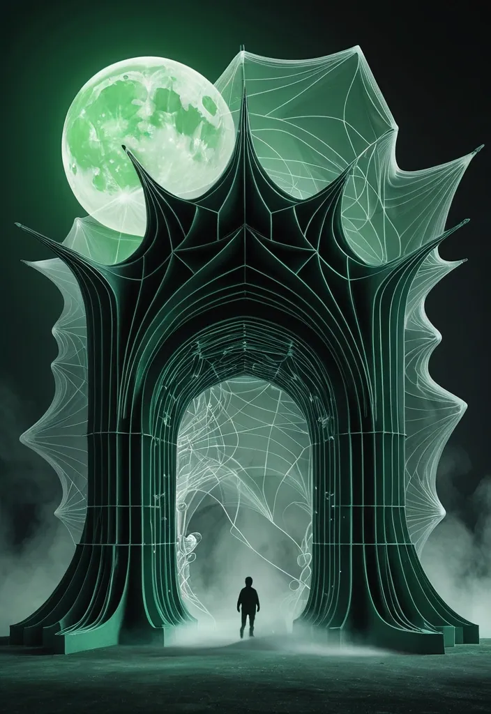
Midnight Potion: Green magical smoke transforming into bats , against a glowing full moon entirely from hundreds of ultra-fine , smooth , continuous contour lines. Follow natural anatomical curves , preserving expressive eyes , defined facial features , and graceful proportions. Use varying line density to create depth and sculptural volume. Favor beautiful side or full-length. PARAMETRIC GEOMETRY Let the hair and body contours seamlessly transform into massive flowing structures inspired by the selected theme. Use precise curve-stitching geometry: countless thin , individually straight lines with gradually shifting endpoints , forming sweeping curved surfaces , layered folds , and intricate spatial patterns. Keep the line flow clean , continuous , and structurally coherent. VISUAL STYLE Design an unexpected yet logical spatial relationship around the bats , allowing the giant object to interact realistically with the environment—for example , an object becoming an architectural entrance , fabric blending into mist , smoke gradually turning into bats , an animal silhouette obscuring the moon , or the subject piercing through text. The theme should be recognizable at first glance , with visual surprises revealed on second look. Avoid photographic skin , random tangled lines , broken contours , excessive mesh noise , blurry glow , plastic CGI , distorted anatomy , illegible text , decorative numbering , starbursts , and watermarks. ar 9:16. ,
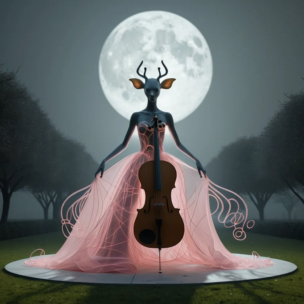
A spectral female with Giraffe head , playing a large polished brown cello , wearing a flowing pink swirling gown seated on yellow banana in the center of a vast garden , smooth , continuous contour lines. Follow natural anatomical curves , preserving expressive eyes , defined facial features , and graceful proportions. Use varying line density to create depth and sculptural volume. Favor beautiful side or full-length. PARAMETRIC GEOMETRY Let the hair and body contours seamlessly transform into massive flowing structures inspired by the selected theme. Use precise curve-stitching geometry: countless thin , individually straight lines with gradually shifting endpoints , forming sweeping curved surfaces , layered folds , and intricate spatial patterns. Keep the line flow clean , continuous , and structurally coherent. VISUAL STYLE Design an unexpected yet logical spatial relationship around the object , allowing the giant object to interact realistically with the environment—for example , an object becoming an architectural entrance , fabric blending into mist , smoke gradually turning into bats , an animal silhouette obscuring the moon , or the subject piercing through text. The theme should be recognizable at first glance , with visual surprises revealed on second look. Avoid photographic skin , random tangled lines , broken contours , excessive mesh noise , blurry glow , plastic CGI , distorted anatomy , illegible text , decorative numbering , starbursts , and watermarks. ar 9:16. ,
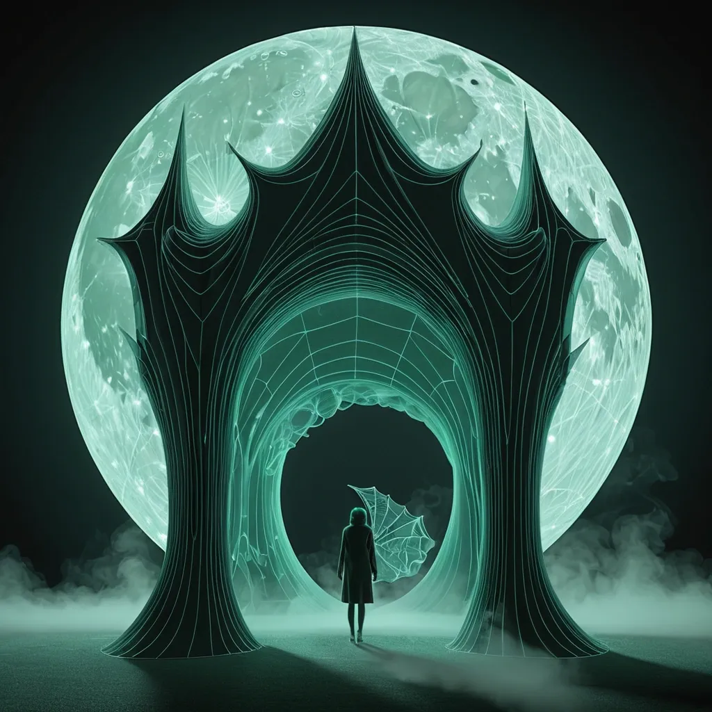
Midnight Potion: Green magical smoke transforming into bats , against a glowing full moon entirely from hundreds of ultra-fine , smooth , continuous contour lines. Follow natural anatomical curves , preserving expressive eyes , defined facial features , and graceful proportions. Use varying line density to create depth and sculptural volume. Favor beautiful side or full-length. PARAMETRIC GEOMETRY Let the hair and body contours seamlessly transform into massive flowing structures inspired by the selected theme. Use precise curve-stitching geometry: countless thin , individually straight lines with gradually shifting endpoints , forming sweeping curved surfaces , layered folds , and intricate spatial patterns. Keep the line flow clean , continuous , and structurally coherent. VISUAL STYLE Design an unexpected yet logical spatial relationship around the object , allowing the giant object to interact realistically with the environment—for example , an object becoming an architectural entrance , fabric blending into mist , smoke gradually turning into bats , an animal silhouette obscuring the moon , or the subject piercing through text. The theme should be recognizable at first glance , with visual surprises revealed on second look. Avoid photographic skin , random tangled lines , broken contours , excessive mesh noise , blurry glow , plastic CGI , distorted anatomy , illegible text , decorative numbering , starbursts , and watermarks. ar 9:16. ,
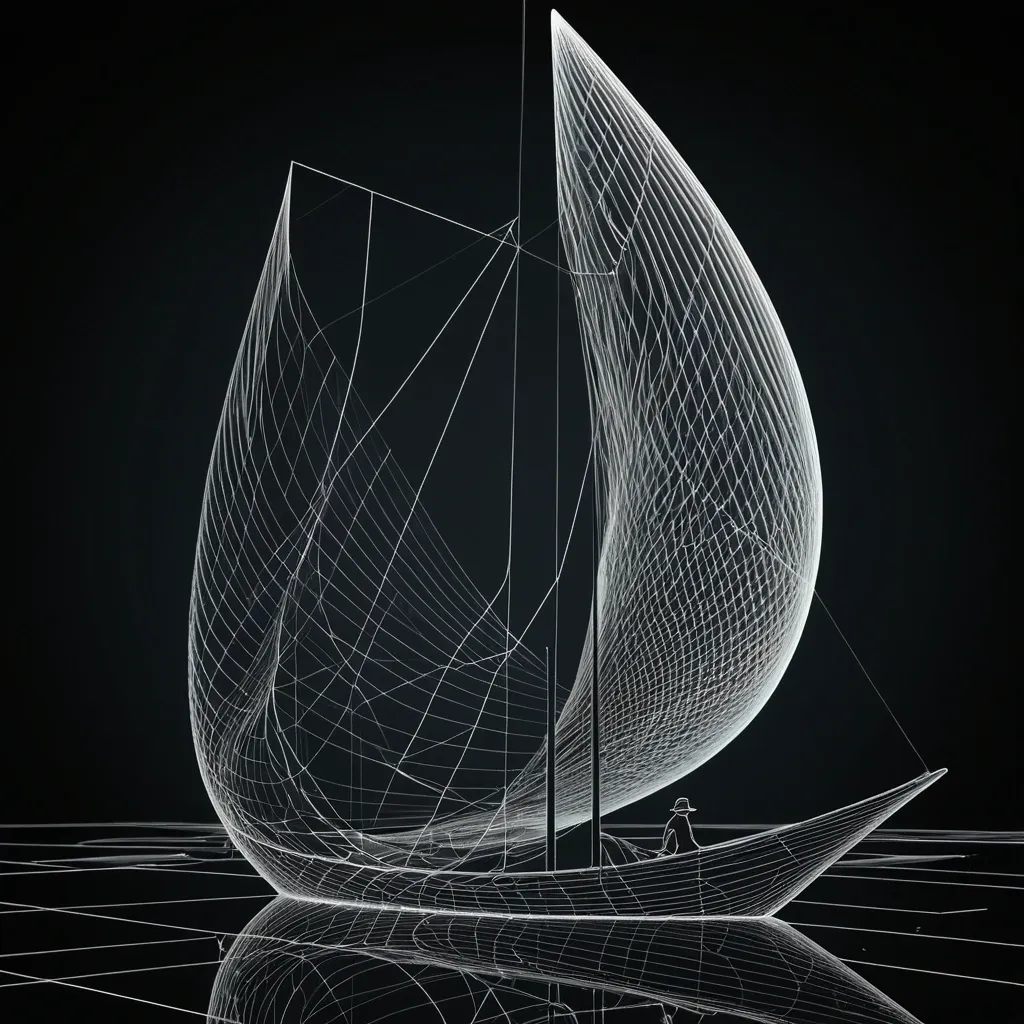
A lone figure in a conical hat stands on a long narrow skiff , holding a pole , tethered by rope to a larger dark sailing junk with a tall sail. Still water mirrors both boats entirely from hundreds of ultra-fine , smooth , continuous contour lines. Follow natural anatomical curves , preserving expressive eyes , defined facial features , and graceful proportions. Use varying line density to create depth and sculptural volume. Favor beautiful side or full-length. PARAMETRIC GEOMETRY Let the hair and body contours seamlessly transform into massive flowing structures inspired by the selected theme. Use precise curve-stitching geometry: countless thin , individually straight lines with gradually shifting endpoints , forming sweeping curved surfaces , layered folds , and intricate spatial patterns. Keep the line flow clean , continuous , and structurally coherent. VISUAL STYLE Pure near-black background , high-contrast colored filaments , and subtle ivory highlights. The portrait and geometric structures must feel like one unified artwork. Crisp vector-like precision , elegant mathematical complexity , and gallery-quality graphic design. Avoid photographic skin , random tangled lines , broken contours , excessive mesh noise , blurry glow , plastic CGI , distorted anatomy , illegible text , decorative numbering , starbursts , and watermarks. ar 16:9. ,
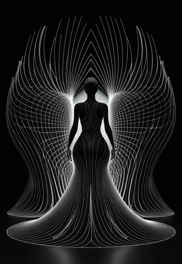
A horned dark-winged figure in a sweeping black gown stands facing away , staff in hand , against a glowing full moon entirely from hundreds of ultra-fine , smooth , continuous contour lines. Follow natural anatomical curves , preserving expressive eyes , defined facial features , and graceful proportions. Use varying line density to create depth and sculptural volume. Favor beautiful side or full-length. PARAMETRIC GEOMETRY Let the hair and body contours seamlessly transform into massive flowing structures inspired by the selected theme. Use precise curve-stitching geometry: countless thin , individually straight lines with gradually shifting endpoints , forming sweeping curved surfaces , layered folds , and intricate spatial patterns. Keep the line flow clean , continuous , and structurally coherent. VISUAL STYLE Pure near-black background , high-contrast colored filaments , and subtle ivory highlights. The portrait and geometric structures must feel like one unified artwork. Crisp vector-like precision , elegant mathematical complexity , and gallery-quality graphic design. Avoid photographic skin , random tangled lines , broken contours , excessive mesh noise , blurry glow , plastic CGI , distorted anatomy , illegible text , decorative numbering , starbursts , and watermarks. ar 9:16. ,
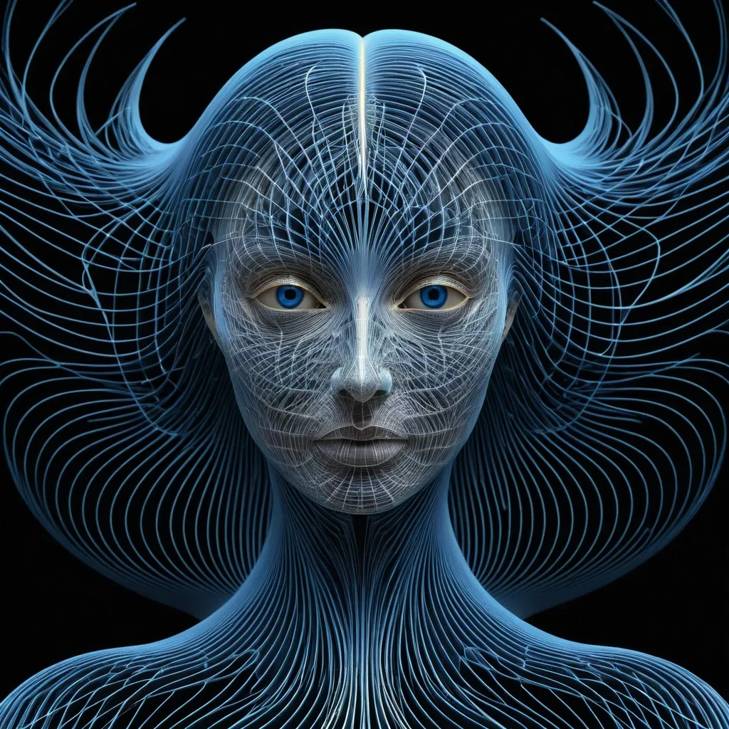
A pale feminine with sharp blue eyes emerges from darkness at the center of enormous sweeping wings made of flowing blue and gold fractal light and shoulders entirely from hundreds of ultra-fine , smooth , continuous contour lines. Follow natural anatomical curves , preserving expressive eyes , defined facial features , and graceful proportions. Use varying line density to create depth and sculptural volume. Favor beautiful side or full-length. PARAMETRIC GEOMETRY Let the hair and body contours seamlessly transform into massive flowing structures inspired by the selected theme. Use precise curve-stitching geometry: countless thin , individually straight lines with gradually shifting endpoints , forming sweeping curved surfaces , layered folds , and intricate spatial patterns. Keep the line flow clean , continuous , and structurally coherent. VISUAL STYLE Pure near-black background , high-contrast colored filaments , and subtle ivory highlights. The portrait and geometric structures must feel like one unified artwork. Crisp vector-like precision , elegant mathematical complexity , and gallery-quality graphic design. Avoid photographic skin , random tangled lines , broken contours , excessive mesh noise , blurry glow , plastic CGI , distorted anatomy , illegible text , decorative numbering , starbursts , and watermarks. ar 9:16. ,
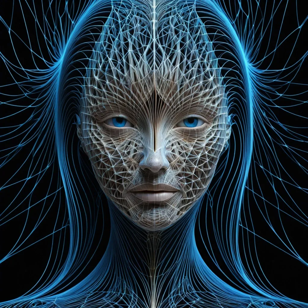
A pale feminine face with sharp blue eyes emerges from darkness at the center of enormous sweeping wings made of flowing blue and gold fractal light and shoulders entirely from hundreds of ultra-fine , smooth , continuous contour lines. Follow natural anatomical curves , preserving expressive eyes , defined facial features , and graceful proportions. Use varying line density to create depth and sculptural volume. Favor beautiful side or 3/4 profiles. PARAMETRIC GEOMETRY Let the hair and body contours seamlessly transform into massive flowing structures inspired by the selected theme. Use precise curve-stitching geometry: countless thin , individually straight lines with gradually shifting endpoints , forming sweeping curved surfaces , layered folds , and intricate spatial patterns. Keep the line flow clean , continuous , and structurally coherent. VISUAL STYLE Pure near-black background , high-contrast colored filaments , and subtle ivory highlights. The portrait and geometric structures must feel like one unified artwork. Crisp vector-like precision , elegant mathematical complexity , and gallery-quality graphic design. Avoid photographic skin , random tangled lines , broken contours , excessive mesh noise , blurry glow , plastic CGI , distorted anatomy , illegible text , decorative numbering , starbursts , and watermarks. ,
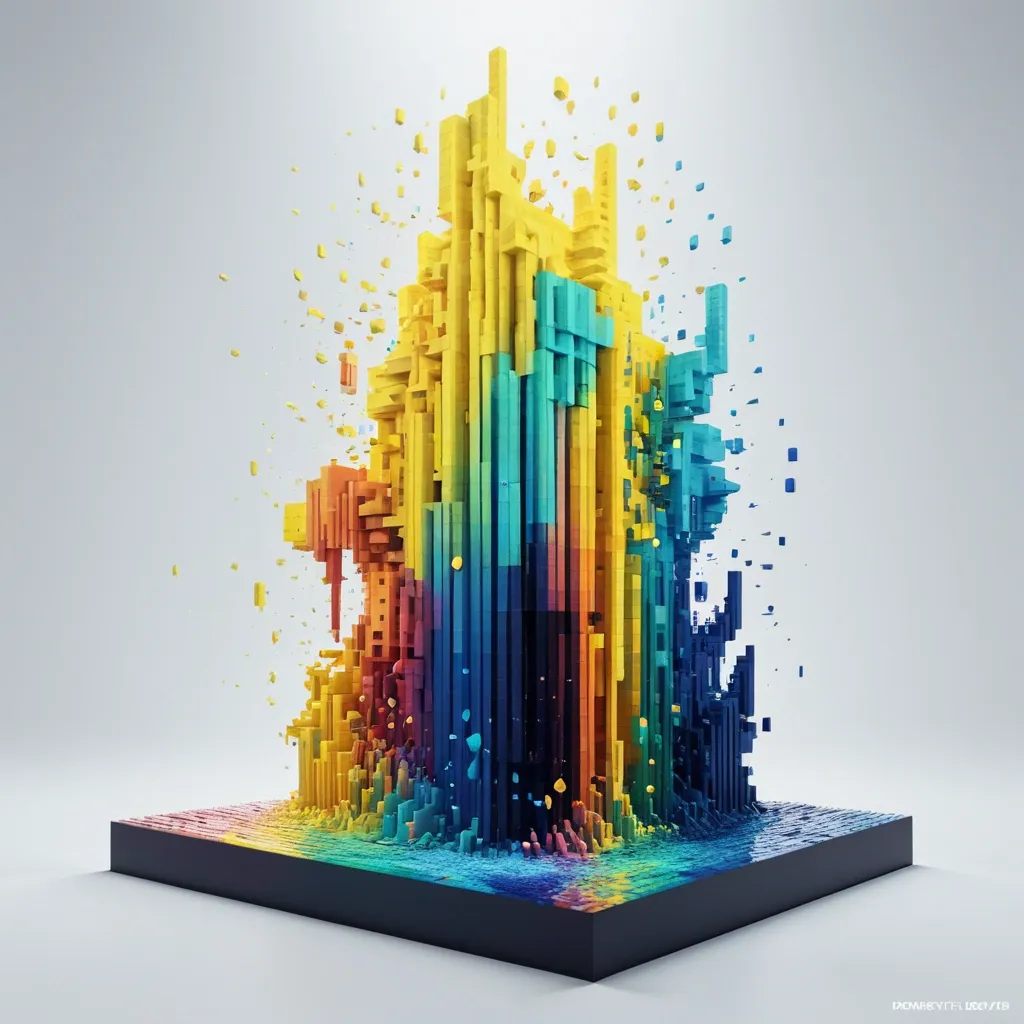
Palette: light yellow + waves blue + radial Motion: spiral bloom Create a 9:16 experimental 3D voxel poster featuring a dancer , in flowing artifacts , rotating liquid paints drops beneath the figure in a whimsical watercolor composition. Let the blocks follow the natural growth direction of the petals instead of becoming random pixels. Build a strong spatial motion based on the selected direction , with denser and shorter blocks near the visual core and longer blocks extending toward the camera to create dramatic Z-axis depth , perspective , and a sense of motion. Use a controlled color system built around the chosen palette. Keep the main subject vivid and coherent , while deep shadows and dark gaps between the drops create strong negative space and dimensional contrast. Add only a small amount of accent color when needed. The final image should feel like a premium contemporary art poster: bold silhouette , strong thumbnail impact , rich spatial depth , refined lighting , and a clear balance between dense 3D geometry and minimal typography. Avoid Minecraft aesthetics , flat pixel art , random cubes , identical extrusion lengths , rainbow colors , excessive text , heavy neon , thick 3D lettering , meaningless placeholder copy , logos , numbering , watermarks , and cheap CGI materials. ,
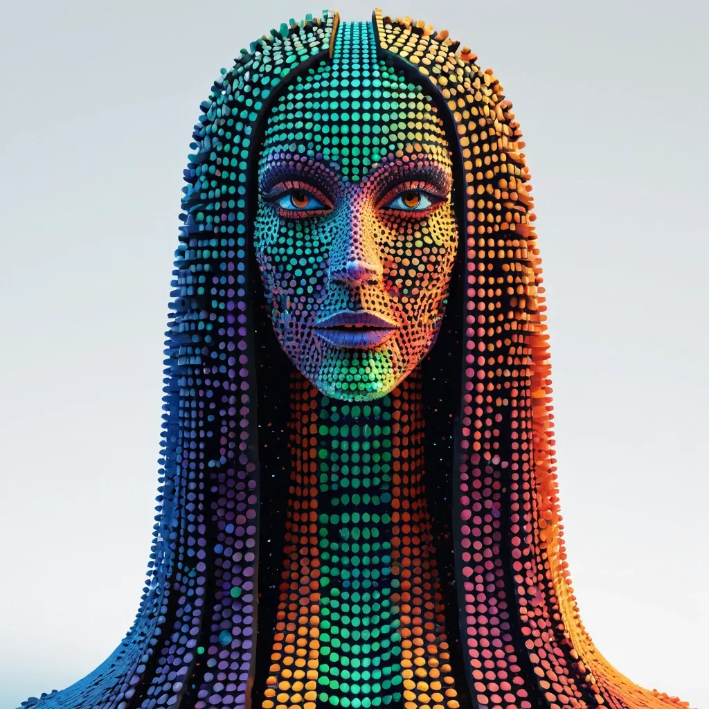
Create a experimental 3D image featuring a female , wears a towering headdress of frog's eyes , Her long , wavy brown hair flows beneath the dress. in flowing and rotating dots beneath the figure , but reconstruct its drops and structure from thousands of elongated dots and scales with varied lengths , depths , and scales. Let the dots follow the natural growth direction of the dots instead of becoming random drops. Build a strong spatial motion based on the selected direction in canopy shape , with denser and shorter dots near the visual core and longer waves extending toward the camera to create dramatic Z-axis depth , perspective , and a sense of motion. Use a controlled color system built around the chosen palette. Keep the main subject vivid and coherent , while deep shadows and dark gaps between the drops create strong negative space and dimensional contrast. Add only a small amount of accent color when needed. The final image should feel like a premium contemporary art poster: bold silhouette , strong thumbnail impact , rich spatial depth , refined lighting , and a clear balance between dense 3D geometry and minimal typography. Avoid Minecraft aesthetics , flat pixel art , random cubes , identical extrusion lengths , rainbow colors , excessive text , heavy neon , thick 3D lettering , meaningless placeholder copy , logos , numbering , watermarks , and cheap CGI materials. ,
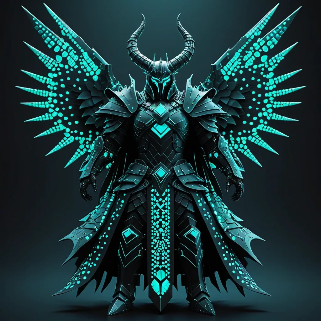
Palette: fish scales + black Motion: winged spread Background: Black Create a experimental 3D poster featuring a dark armored figure with large horns , surrounded by glowing teal energy. the character is positioned in the center , wearing ornate dark plate armor with a tattered cloak. intense teal light radiates from the armor joints and helmet , but reconstruct its drops and structure from thousands of elongated dots and scales with varied lengths , depths , and scales. Let the dots follow the natural growth direction of the dots instead of becoming random drops. Build a strong spatial motion based on the selected direction in canopy shape , with denser and shorter dots near the visual core and longer waves extending toward the camera to create dramatic Z-axis depth , perspective , and a sense of motion. Use a controlled color system built around the chosen palette. Keep the main subject vivid and coherent , while deep shadows and dark gaps between the drops create strong negative space and dimensional contrast. Add only a small amount of accent color when needed. The final image should feel like a premium contemporary art poster: bold silhouette , strong thumbnail impact , rich spatial depth , refined lighting , and a clear balance between dense 3D geometry and minimal typography. Avoid Minecraft aesthetics , flat pixel art , random cubes , identical extrusion lengths , rainbow colors , excessive text , heavy neon , thick 3D lettering , meaningless placeholder copy , logos , numbering , watermarks , and cheap CGI materials. ,
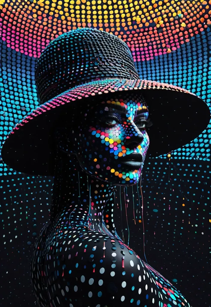
Title: TEDPOL Palette: fish scales + black Motion: spiral bloom Background: Black Create a experimental 3D poster featuring a female , wears a brimmed hat of frog's eyes , in flowing and rotating dots beneath the figure , but reconstruct its drops and structure from thousands of elongated drop dots and fish scales with varied lengths , depths , and scales. Let the dots follow the natural growth direction of the dots instead of becoming random drops. Build a strong spatial motion based on the selected direction in canopy shape , with denser and shorter dots near the visual core and longer waves extending toward the camera to create dramatic Z-axis depth , perspective , and a sense of motion. Use a controlled color system built around the chosen palette. Keep the main subject vivid and coherent , while deep shadows and dark gaps between the drops create strong negative space and dimensional contrast. Add only a small amount of accent color when needed. The final image should feel like a premium contemporary art poster: bold silhouette , strong thumbnail impact , rich spatial depth , refined lighting , and a clear balance between dense 3D geometry and minimal typography. Avoid Minecraft aesthetics , flat pixel art , random cubes , identical extrusion lengths , rainbow colors , excessive text , heavy neon , thick 3D lettering , meaningless placeholder copy , logos , numbering , watermarks , and cheap CGI materials. ,
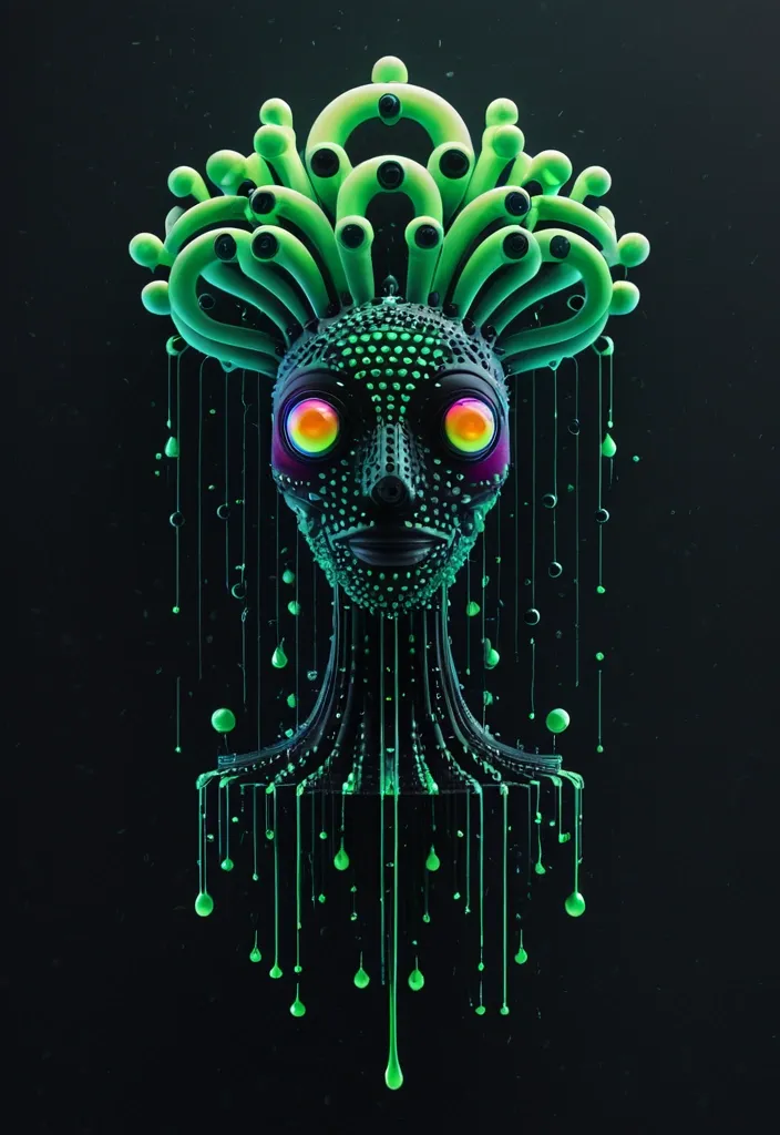
Title: TEDPOL Palette: water drop + green gradient Motion: spiral bloom Background: Black Create a 1:1 experimental 3D portrait poster featuring a alien , wears a towering headdress of frog's eyes , in swirls wax , and dark mechanical spirals , in flowing and rotating dots beneath the figure , but reconstruct its drops and structure from thousands of elongated drop dots and water drops with varied lengths , depths , and scales. Let the dots follow the natural growth direction of the dots instead of becoming random drops. Build a strong spatial motion based on the selected direction in heart shape , with denser and shorter dots near the visual core and longer waves extending toward the camera to create dramatic -Z-axis depth , perspective , and a sense of motion. Use a controlled color system built around the chosen palette. Keep the main subject vivid and coherent , while deep shadows and dark gaps between the drops create strong negative space and dimensional contrast. Add only a small amount of accent color when needed. The final image should feel like a premium contemporary art poster: bold silhouette , strong thumbnail impact , rich spatial depth , refined lighting , and a clear balance between dense 3D geometry and minimal typography. Avoid Minecraft aesthetics , flat pixel art , random cubes , identical extrusion lengths , rainbow colors , excessive text , heavy neon , thick 3D lettering , meaningless placeholder copy , logos , numbering , watermarks , and cheap CGI materials. ,
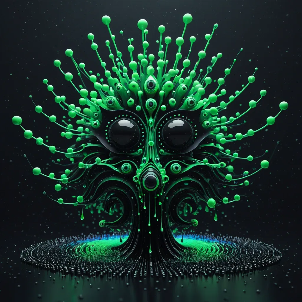
Title: TEDPOL Palette: water drop + green gradient Motion: spiral bloom Background: Black Create a experimental 3D portrait poster featuring a alien , wears a towering headdress of frog's eyes , in swirls wax , and dark mechanical spirals , in flowing and rotating dots beneath the figure , but reconstruct its drops and structure from thousands of elongated drop dots and water drops with varied lengths , depths , and scales. Let the dots follow the natural growth direction of the dots instead of becoming random drops. Build a strong spatial motion based on the selected direction in heart shape , with denser and shorter dots near the visual core and longer waves extending toward the camera to create dramatic -Z-axis depth , perspective , and a sense of motion. Use a controlled color system built around the chosen palette. Keep the main subject vivid and coherent , while deep shadows and dark gaps between the drops create strong negative space and dimensional contrast. Add only a small amount of accent color when needed. The final image should feel like a premium contemporary art poster: bold silhouette , strong thumbnail impact , rich spatial depth , refined lighting , and a clear balance between dense 3D geometry and minimal typography. Avoid Minecraft aesthetics , flat pixel art , random cubes , identical extrusion lengths , rainbow colors , excessive text , heavy neon , thick 3D lettering , meaningless placeholder copy , logos , numbering , watermarks , and cheap CGI materials. ,
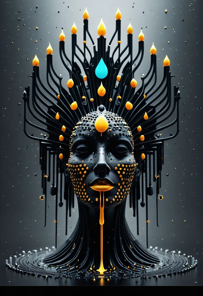
Title: TEDPOL Palette: water drop + gray Motion: winged spread Background: Black Create a experimental 3D portrait poster featuring a witch , wears a towering headdress of gold and Candles , in swirls wax , and dark mechanical spirals , in flowing and rotating dots beneath the figure , but reconstruct its drops and structure from thousands of elongated drop dots and water drops with varied lengths , depths , and scales. Let the dots follow the natural growth direction of the dots instead of becoming random drops. Build a strong spatial motion based on the selected direction in skull shape , with denser and shorter dots near the visual core and longer waves extending toward the camera to create dramatic -Z-axis depth , perspective , and a sense of motion. Use a controlled color system built around the chosen palette. Keep the main subject vivid and coherent , while deep shadows and dark gaps between the drops create strong negative space and dimensional contrast. Add only a small amount of accent color when needed. The final image should feel like a premium contemporary art poster: bold silhouette , strong thumbnail impact , rich spatial depth , refined lighting , and a clear balance between dense 3D geometry and minimal typography. Avoid Minecraft aesthetics , flat pixel art , random cubes , identical extrusion lengths , rainbow colors , excessive text , heavy neon , thick 3D lettering , meaningless placeholder copy , logos , numbering , watermarks , and cheap CGI materials. ,
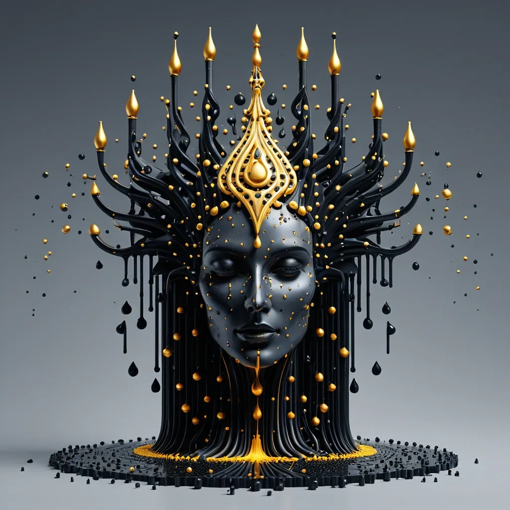
Palette: water drop + gray Motion: winged spread Background: Black Create a experimental 3D portrait poster featuring a witch , wears a towering headdress of gold and Candles , wax swirls , and dark mechanical spirals , in flowing and rotating dots beneath the figure , but reconstruct its drops and structure from thousands of elongated drop dots and water drops with varied lengths , depths , and scales. Let the dots follow the natural growth direction of the dots instead of becoming random drops. Build a strong spatial motion based on the selected direction in skull shape , with denser and shorter dots near the visual core and longer waves extending toward the camera to create dramatic -Z-axis depth , perspective , and a sense of motion. Use a controlled color system built around the chosen palette. Keep the main subject vivid and coherent , while deep shadows and dark gaps between the drops create strong negative space and dimensional contrast. Add only a small amount of accent color when needed. The final image should feel like a premium contemporary art poster: bold silhouette , strong thumbnail impact , rich spatial depth , refined lighting , and a clear balance between dense 3D geometry and minimal typography. Avoid Minecraft aesthetics , flat pixel art , random cubes , identical extrusion lengths , rainbow colors , excessive text , heavy neon , thick 3D lettering , meaningless placeholder copy , logos , numbering , watermarks , and cheap CGI materials. ,
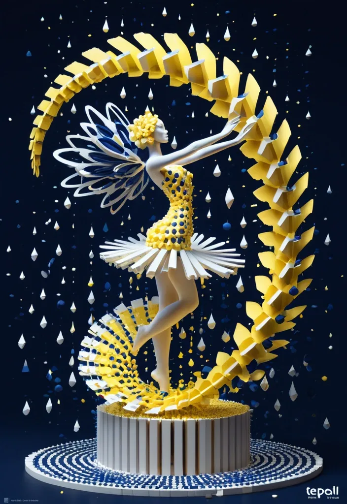
Subject: Wings dancer Title: Tedpol Palette: light yellow + dark blue + white Motion: spiral bloom Create a experimental 3D voxel poster featuring a female , in flowing artifacts , rotating drops beneath the figure , but reconstruct its petals and structure from thousands of elongated rectangular prisms and cuboid blocks with varied lengths , depths , and scales. Let the dots follow the natural growth direction of the petals instead of becoming random dots. Build a strong spatial motion based on the selected direction , with denser and shorter dots near the visual core and longer waves extending toward the camera to create dramatic Z-axis depth , perspective , and a sense of motion. Use a controlled color system built around the chosen palette. Keep the main subject vivid and coherent , while deep shadows and dark gaps between the drops create strong negative space and dimensional contrast. Add only a small amount of accent color when needed. Add minimal editorial typography with a large main title , a short secondary phrase , and one small meaningful tagline. Give the main title a subtle frosted-glass or translucent material with restrained highlights and slight environmental reflections; keep the other text clean , luminous , and highly readable. The final image should feel like a premium contemporary art poster: bold silhouette , strong thumbnail impact , rich spatial depth , refined lighting , and a clear balance between dense 3D geometry and minimal typography. Avoid Minecraft aesthetics , flat pixel art , random cubes , identical extrusion lengths , rainbow colors , excessive text , heavy neon , thick 3D lettering , meaningless placeholder copy , logos , numbering , watermarks , and cheap CGI materials. ,
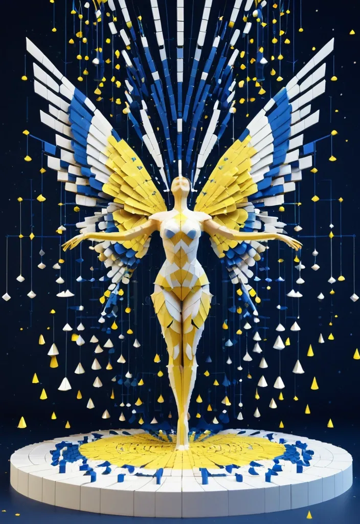
Subject: Wings dancer Title: Tedpol Palette: light yellow + dark blue + white Motion: winged spread Create a experimental 3D voxel poster featuring a female , in flowing artifacts , rotating drops beneath the figure , but reconstruct its petals and structure from thousands of elongated rectangular prisms and cuboid blocks with varied lengths , depths , and scales. Let the dots follow the natural growth direction of the petals instead of becoming random dots. Build a strong spatial motion based on the selected direction , with denser and shorter dots near the visual core and longer waves extending toward the camera to create dramatic Z-axis depth , perspective , and a sense of motion. Use a controlled color system built around the chosen palette. Keep the main subject vivid and coherent , while deep shadows and dark gaps between the drops create strong negative space and dimensional contrast. Add only a small amount of accent color when needed. Add minimal editorial typography with a large main title , a short secondary phrase , and one small meaningful tagline. Give the main title a subtle frosted-glass or translucent material with restrained highlights and slight environmental reflections; keep the other text clean , luminous , and highly readable. The final image should feel like a premium contemporary art poster: bold silhouette , strong thumbnail impact , rich spatial depth , refined lighting , and a clear balance between dense 3D geometry and minimal typography. Avoid Minecraft aesthetics , flat pixel art , random cubes , identical extrusion lengths , rainbow colors , excessive text , heavy neon , thick 3D lettering , meaningless placeholder copy , logos , numbering , watermarks , and cheap CGI materials. ,
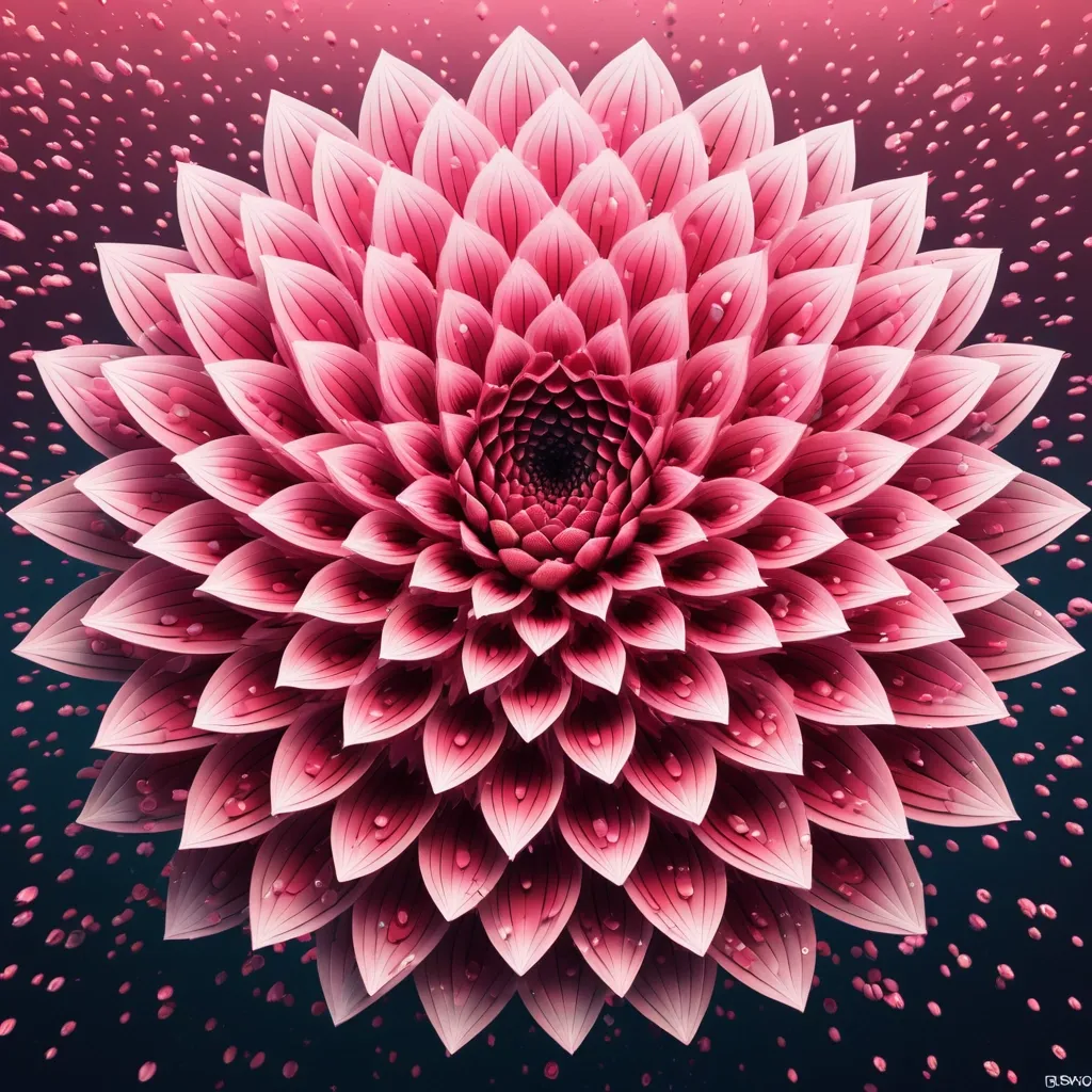
Subject: L O T U S Palette: pink gradient + water waves + bloom Motion: spiral bloom Create a 9:16 experimental 3D voxel poster featuring one oversized botanical subject filling most of the frame. Keep the flower clearly recognizable , but reconstruct its petals and structure from thousands of elongated dots with varied lengths , depths , and scales. Let the strips follow the natural growth direction of the petals instead of becoming random pixels. Build a strong spatial motion based on the selected direction , with denser and shorter blocks near the visual core and longer blocks extending toward the camera to create dramatic Z-axis depth , perspective , and a sense of motion. Use a controlled color system built around the chosen palette. Keep the main subject vivid and coherent , while deep shadows and dark gaps between the blocks create strong negative space and dimensional contrast. Add only a small amount of accent color when needed. Add minimal editorial typography with a large main title , a short secondary phrase , and one small meaningful tagline. Give the main title a subtle frosted-glass or translucent material with restrained highlights and slight environmental reflections; keep the other text clean , luminous , and highly readable. The final image should feel like a premium contemporary art poster: bold silhouette , strong thumbnail impact , rich spatial depth , refined lighting , and a clear balance between dense 3D geometry and minimal typography. Avoid Minecraft aesthetics , flat pixel art , random cubes , identical extrusion lengths , rainbow colors , excessive text , heavy neon , thick 3D lettering , meaningless placeholder copy , logos , numbering , watermarks , and cheap CGI materials. ,
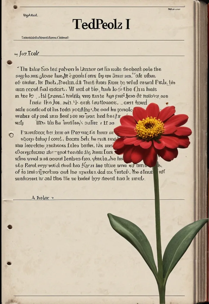
Subject: Flower Title: Tedpoll Secondary text: short Chinese Tagline: short meaningful Palette: light yellow + dark orange + vortex Motion: vortex spread Create a 9:16 experimental 3D voxel poster featuring one oversized botanical subject filling most of the frame. Keep the flower clearly recognizable , but reconstruct its petals and structure from thousands of elongated rectangular prisms and cuboid blocks with varied lengths , depths , and scales. Let the blocks follow the natural growth direction of the petals instead of becoming random pixels. Build a strong spatial motion based on the selected direction , with denser and shorter blocks near the visual core and longer blocks extending toward the camera to create dramatic Z-axis depth , perspective , and a sense of motion. Use a controlled color system built around the chosen palette. Keep the main subject vivid and coherent , while deep shadows and dark gaps between the blocks create strong negative space and dimensional contrast. Add only a small amount of accent color when needed. Add minimal editorial typography with a large main title , a short secondary phrase , and one small meaningful tagline. Give the main title a subtle frosted-glass or translucent material with restrained highlights and slight environmental reflections; keep the other text clean , luminous , and highly readable. The final image should feel like a premium contemporary art poster: bold silhouette , strong thumbnail impact , rich spatial depth , refined lighting , and a clear balance between dense 3D geometry and minimal typography. Avoid Minecraft aesthetics , flat pixel art , random cubes , identical extrusion lengths , rainbow colors , excessive text , heavy neon , thick 3D lettering , meaningless placeholder copy , logos , numbering , watermarks , and cheap CGI materials. ,
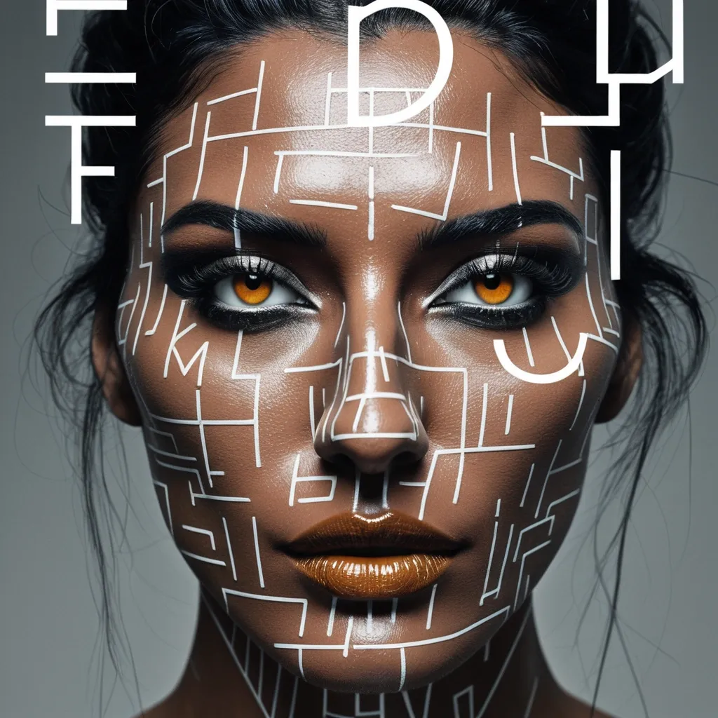
Create a sophisticated editorial portrait poster built around selective focus. Use a realistic photographic portrait with natural skin texture , pores , subtle imperfections , believable hair , and authentic facial structure. Avoid plastic skin , CGI smoothness , heavy beauty retouching , or generic commercial-model styling. Aspect Ratio: 9:16. Keep most of the portrait softly blurred , slightly motion-softened , desaturated , or reduced in detail. Only the selected horizontal sharp slice should return to sharp detail , natural skin tone , and clear texture. The sharp and blurred areas must remain perfectly aligned as the same person and the same photographic moment , with no duplicated eyes , second face , or pasted-photo effect. Choose one focus structure: a horizontal sharp band across the eyes , a small floating window isolating part of the face , a narrow offset focus frame through motion blur , or a larger offset frame that deliberately shifts attention away from the facial center. Use a restrained neutral palette of charcoal , gray , warm beige , off-white , and natural skin tones. Use rust orange as the only strong accent for the focus lines , main title , and a few key details. Keep the visual rule: Neutral Field + One Accent Color. Use mature magazine-style typography: a high-contrast editorial serif for MOTION , a condensed bold sans serif for RAJU , and a small neutral sans serif for secondary information. Include harp through motion as meaningful copy connected to the subject and concept , not random filler text. Keep the composition asymmetric with generous negative space. Let the portrait , typography , and focus geometry interact naturally. Add subtle film grain , light scan texture , and restrained print texture so the whole poster feels like one finished editorial piece. The final result should feel like a polished independent fashion , photography , music , or culture magazine poster , with blur and sharpness deliberately controlling where the viewer looks. Avoid cyberpunk HUDs , excessive UI graphics , neon gradients , gibberish text , logos , watermarks , numbering , sparkle symbols , harsh Gaussian blur , melted facial features , duplicated features , plastic skin , and over-retouching. ,
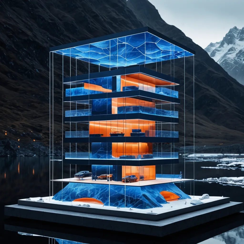
Eternal Ring: Diamond ring becomes a building leading to mountains and waters , then scale it up to an architectural level , and naturally transform the Product Core Structure into the Space Transformation Method , making the product itself truly become a part of architecture , landscape , or space , rather than a simply suspended oversized object. In the River , incorporate extremely small Miniature Figures to emphasize scale , and through roads , reflections , mist , glass , architecture , terrain , or figure interactions , create authentic spatial relationships between the product and the environment. Incorporate a second layer of visual discovery , such as a world hidden inside the product , the product structure transforming into architecture , materials creating spatial refraction , reflections completing forms , figures passing through the product , or product components extending into real space. Overall , use the dark blue as the dominant environmental color palette , with the Orange concentrated on the product or key visual structures , maintaining the texture of a premium brand Campaign , magazine Editorial , outdoor KV , and commercial proposal. Avoid ordinary product shelf shots , e-commerce ads , mere gigantification , cyberpunk aesthetics , complex UI , fake parameters , fake logos , garbled text , numbering , and cheap CG lighting effects. Aspect Ratio 16: 8 ,
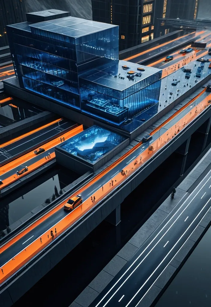
Time Entering the Realm: Giant watch dial becomes a plaza , second hand extending into a bridge , and market-ready product design , then scale it up to an architectural level , and naturally transform the Product Core Structure into the Space Transformation Method , making the product itself truly become a part of architecture , landscape , or space , rather than a simply suspended oversized object. In the Highway , incorporate extremely small Miniature Figures to emphasize scale , and through roads , reflections , mist , glass , architecture , terrain , or figure interactions , create authentic spatial relationships between the product and the environment. Incorporate a second layer of visual discovery , such as a world hidden inside the product , the product structure transforming into architecture , materials creating spatial refraction , reflections completing forms , figures passing through the product , or product components extending into real space. Overall , use the dark blue as the dominant environmental color palette , with the Orange concentrated on the product or key visual structures , maintaining the texture of a premium brand Campaign , magazine Editorial , outdoor KV , and commercial proposal. Avoid ordinary product shelf shots , e-commerce ads , mere gigantification , cyberpunk aesthetics , complex UI , fake parameters , fake logos , garbled text , numbering , and cheap CG lighting effects. Aspect Ratio 16:8 ,
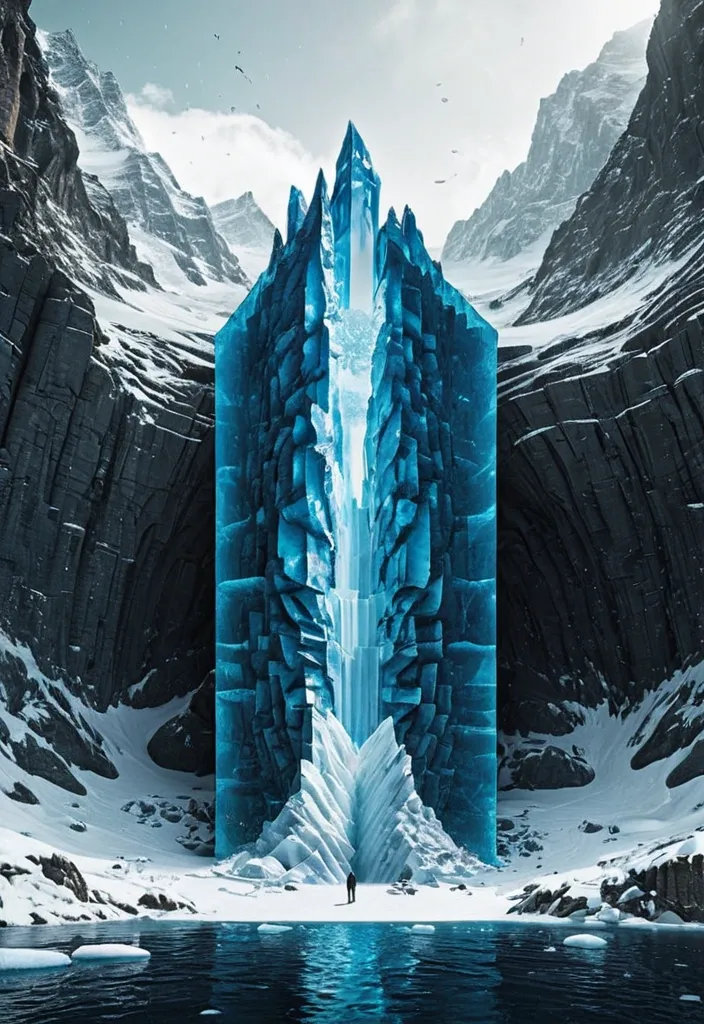
Theme: Ice Surface world: Ice-fort appears above the surface Hidden world: Cave gate is revealed underneath Key natural structure: Ice mass Main palette: Deep blue Title: Navro Subtitle: lishotta Create a premium 9:16 editorial poster from the WORLD SLICE series. Show a realistic natural landscape as if a section of the world has been physically cut open , revealing a much larger hidden structure beneath the visible surface. Keep the surface relatively simple and easy to read , while the hidden section becomes the main visual surprise. Use strong scale contrast , clear geological or ecological layers , realistic materials , believable depth , atmospheric perspective and cinematic natural light. The cutaway should not look like a glass box or aquarium. Treat it as a real piece of land , ocean , forest or ice physically sliced from the planet. Let parts of nature break beyond the geometric cutaway boundary: roots , rock formations , ice , water or terrain may extend outside the original shape to create stronger visual impact. Keep the central object around 55–70% of the poster width and preserve generous negative space. Avoid making the 3D cutaway too large. Integrate typography into the composition instead of adding many tiny labels. Use one bold main title , one short supporting line and only a few minimal editorial details. Allow natural elements to overlap , pass behind or partially cover the typography. Use a refined mix of modern serif and condensed sans-serif typography. The poster should feel like premium nature editorial design , contemporary art direction and photorealistic environmental visualization. Prioritize: strong thumbnail readability , one clear visual surprise , large recognizable forms , realistic natural textures , clean hierarchy , high-end editorial composition , and a strong contrast between the visible world and the hidden world. No logo , no watermark , no numbering , no excessive micro text , no HUD interface , no four-point sparkle symbols , no cheap CGI , no glass-container look. Make the final image feel like a complete finished poster , not a template. ,
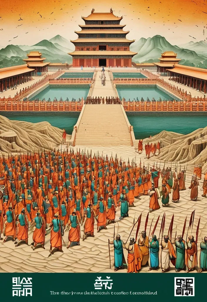
Theme: Ancient Water Conservancy Main palette: Sand path , sand , orange Structural method: another paper construction Micro scene: a tiny Walking march , performance Event details: 02 October , 05:30 am , Start Aspect ratio: 16:9 Design a historical and cultural poster with a modern Eastern editorial aesthetic , using "paper fibers + large color fields + micro-scenes" as the core visual language. Do not interpret traditional culture as stacking ancient architecture , calligraphy , auspicious clouds , or artifacts. Instead , first distill the Cultural Logic , then let large areas of handmade paper color fields directly carry structures , spaces , time , flow , order , or process relationships , so that viewers first see a strong and clear large form from afar , and only gradually discover the cultural narrative hidden within upon closer inspection. Use the dark green , sand style to establish 2–5 main paper color blocks of distinctly different sizes , maintaining low saturation but complete color intensity. All color blocks should have the authentic , rich texture of handmade paper , pulp , watercolor , or mineral pigments , with visible natural long and short fibers , pigment deposition , subtle impressions , large-scale natural color variations , and irregular torn paper edges. The overall effect should be matte , clean , and intact—avoid dirtiness , yellow spots , random speckles , cheap retro effects , or digital gradients. Based on the theme , let the color fields express the logic of system operations through folding , branching , interweaving , interlocking , offsetting , supporting , segmenting , enclosing , or negative space relationships , rather than simply serving as decorative backgrounds. Embed the Dadi march within the large color field structure , keeping figures and props at a very small scale , totaling about 3%–6% of the image area. Each scene must depict a clear action , with causal or temporal relationships between them , such as "entering → executing → recording → completing , " allowing the miniature figures to truly drive the narrative rather than just standing in poses. Figures' clothing in indian Freedom fighter style and artifacts should align with the theme's era and identity but remain restrained—avoid cinematic historical drama excess; scenes should only retain key props that illustrate systemic relationships , without cluttering with decorations or irrelevant cultural symbols. Typography should employ the editorial language of modern Eastern cultural institutions , museums , or archival exhibitions. The main title Dandi March should use refined Song typeface , publication-inspired Gujarati fonts , at a medium-small size that does not overpower the large color fields; supporting English text , dates , locations , and explanatory information should use even smaller sizes to create clear hierarchies. Subtle cinnabar seals , paper tags , archival labels , or node text may be added , but they must genuinely relate to the thematic logic—do not add them randomly just for a "Indian Freedom fighter style" feel. The overall reading order should be: large color field structures and color relationships → systemic or spatial logic → miniature figures' continuous narrative → main title and exhibition information. The final image should achieve a strong large form and visual impact from afar , revealing paper fibers , figure actions , and historical details up close , balancing design sensibility , narrative depth , and cultural completeness. Avoid book cover vibes , traditional Chinese illustration styles , screens full of ancient architecture , oversized titles , PPT-style rigid layouts , modern infographic arrows , meaningless English placeholders , element piling , commercial ad vibes , 3D CGI , glass textures , neon colors , logos , watermarks , numbering , and starburst decorations. ,
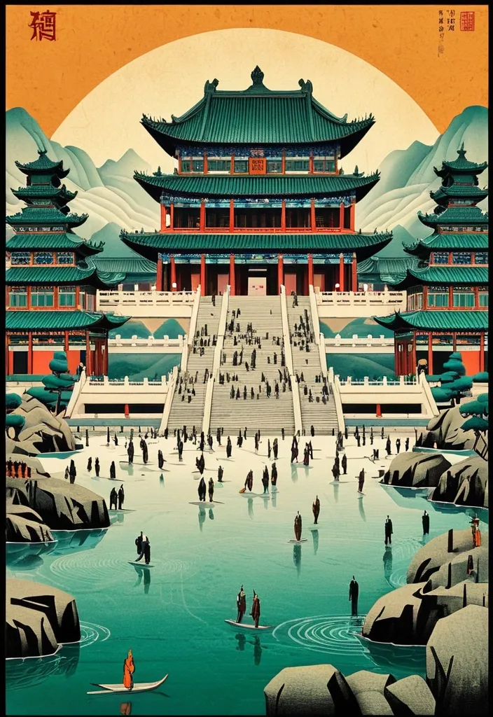
Theme: Ancient Water Conservancy Main palette: blue , dark green , orange Structural method: another paper construction Micro scene: a tiny Walking march , performance Event details: 02 October , venue , Start Aspect ratio: 9:16 Design a historical and cultural poster with a modern Eastern editorial aesthetic , using "paper fibers + large color fields + micro-scenes" as the core visual language. Do not interpret traditional culture as stacking ancient architecture , calligraphy , auspicious clouds , or artifacts. Instead , first distill the Cultural Logic , then let large areas of handmade paper color fields directly carry structures , spaces , time , flow , order , or process relationships , so that viewers first see a strong and clear large form from afar , and only gradually discover the cultural narrative hidden within upon closer inspection. Use the dark green , sand style to establish 2–5 main paper color blocks of distinctly different sizes , maintaining low saturation but complete color intensity. All color blocks should have the authentic , rich texture of handmade paper , pulp , watercolor , or mineral pigments , with visible natural long and short fibers , pigment deposition , subtle impressions , large-scale natural color variations , and irregular torn paper edges. The overall effect should be matte , clean , and intact—avoid dirtiness , yellow spots , random speckles , cheap retro effects , or digital gradients. Based on the theme , let the color fields express the logic of system operations through folding , branching , interweaving , interlocking , offsetting , supporting , segmenting , enclosing , or negative space relationships , rather than simply serving as decorative backgrounds. Embed the Dadi march within the large color field structure , keeping figures and props at a very small scale , totaling about 3%–6% of the image area. Each scene must depict a clear action , with causal or temporal relationships between them , such as "entering → executing → recording → completing , " allowing the miniature figures to truly drive the narrative rather than just standing in poses. Figures' clothing and artifacts should align with the theme's era and identity but remain restrained—avoid cinematic historical drama excess; scenes should only retain key props that illustrate systemic relationships , without cluttering with decorations or irrelevant cultural symbols. Typography should employ the editorial language of modern Eastern cultural institutions , museums , or archival exhibitions. The main title [Main Title] should use refined Song typeface , Ming-style , or publication-inspired Chinese fonts , at a medium-small size that does not overpower the large color fields; supporting English text , dates , locations , and explanatory information should use even smaller sizes to create clear hierarchies. Subtle cinnabar seals , paper tags , archival labels , or node text may be added , but they must genuinely relate to the thematic logic—do not add them randomly just for a "Chinese style" feel. The overall reading order should be: large color field structures and color relationships → systemic or spatial logic → miniature figures' continuous narrative → main title and exhibition information. The final image should achieve a strong large form and visual impact from afar , revealing paper fibers , figure actions , and historical details up close , balancing design sensibility , narrative depth , and cultural completeness. Avoid book cover vibes , traditional Chinese illustration styles , screens full of ancient architecture , oversized titles , PPT-style rigid layouts , modern infographic arrows , meaningless English placeholders , element piling , commercial ad vibes , 3D CGI , glass textures , neon colors , logos , watermarks , numbering , and starburst decorations. ,

TITLE: Warrior MEDIUM: drop SPATIAL MECHANISM: optical reveal SUBJECT: Ninja Warrior in magnificent Tang dynasty MAIN COLOR: water drop FORMAT: 9:20 vertical poster Create a contemporary volumetric perspective typography poster where the main word exists through elements distributed across real three-dimensional space rather than on a flat surface. Build the word from the chosen medium: layered Water drops. Individual elements should appear fragmented or abstract from other viewpoints , but align into one bold , readable word from the intended camera position. Keep Tang dynasty temple , with background depth. The typography should dominate roughly 30–55% of the composition while still revealing how the spatial structure creates it. For drops , build each letter from lines at different depths. If a person is included , keep them small and use them mainly as a scale reference , he is in action pose on the ground , both hands firmly gripping the large sword , the enormous sharp sword edge extending from the bottom-center foreground toward his face , muzzle pointed straight into the lens , intense direct eye contact , dramatic foreground sword blur. Overall style: perspective typography , volumetric installation , spatial graphic design , contemporary exhibition art , clean hierarchy and strong visual impact. Avoid flat printed text , ordinary 3D letters , weak depth , random distortion , neon sci-fi styling , excessive filler copy , cluttered backgrounds , watermarks and numbering. ,