Search Results for condensed
Explore AI generated designs, images, art and prompts by top community artists and designers.
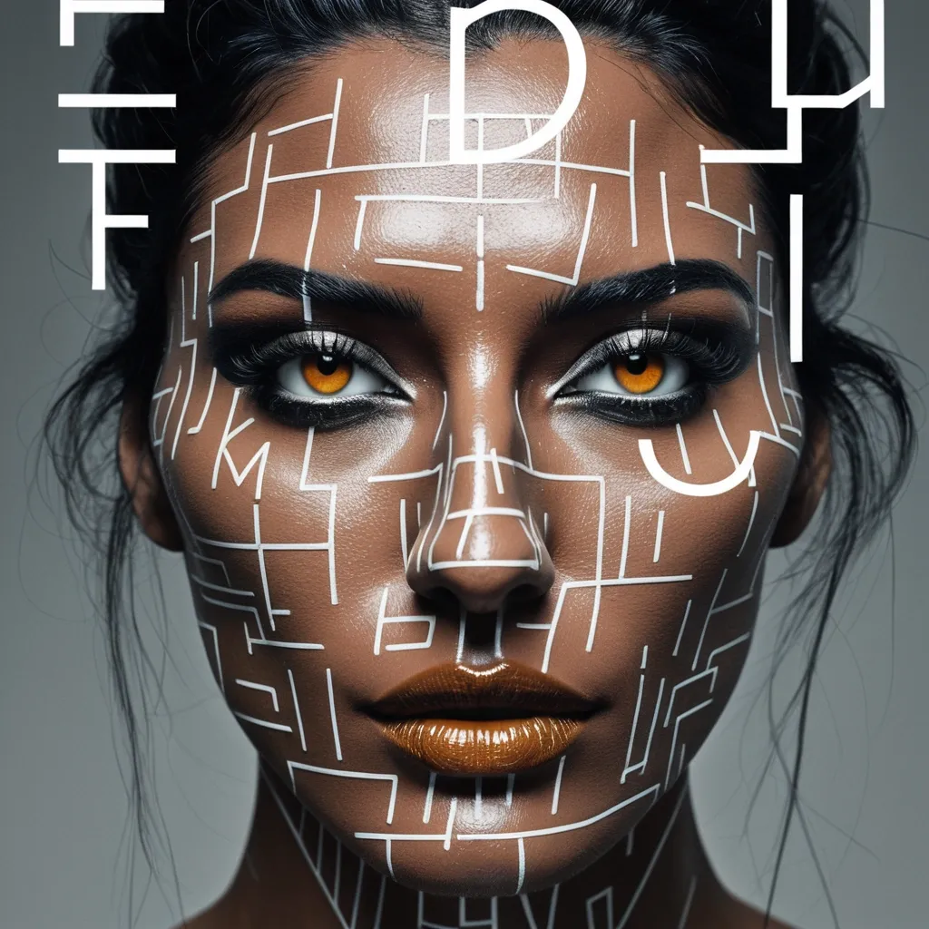

Create a sophisticated editorial portrait poster built around selective focus. Use a realistic photographic portrait with natural skin texture , pores , subtle imperfections , believable hair , and authentic facial structure. Avoid plastic skin , CGI smoothness , heavy beauty retouching , or generic commercial-model styling. Aspect Ratio: 9:16. Keep most of the portrait softly blurred , slightly motion-softened , desaturated , or reduced in detail. Only the selected horizontal sharp slice should return to sharp detail , natural skin tone , and clear texture. The sharp and blurred areas must remain perfectly aligned as the same person and the same photographic moment , with no duplicated eyes , second face , or pasted-photo effect. Choose one focus structure: a horizontal sharp band across the eyes , a small floating window isolating part of the face , a narrow offset focus frame through motion blur , or a larger offset frame that deliberately shifts attention away from the facial center. Use a restrained neutral palette of charcoal , gray , warm beige , off-white , and natural skin tones. Use rust orange as the only strong accent for the focus lines , main title , and a few key details. Keep the visual rule: Neutral Field + One Accent Color. Use mature magazine-style typography: a high-contrast editorial serif for MOTION , a condensed bold sans serif for RAJU , and a small neutral sans serif for secondary information. Include harp through motion as meaningful copy connected to the subject and concept , not random filler text. Keep the composition asymmetric with generous negative space. Let the portrait , typography , and focus geometry interact naturally. Add subtle film grain , light scan texture , and restrained print texture so the whole poster feels like one finished editorial piece. The final result should feel like a polished independent fashion , photography , music , or culture magazine poster , with blur and sharpness deliberately controlling where the viewer looks. Avoid cyberpunk HUDs , excessive UI graphics , neon gradients , gibberish text , logos , watermarks , numbering , sparkle symbols , harsh Gaussian blur , melted facial features , duplicated features , plastic skin , and over-retouching. ,
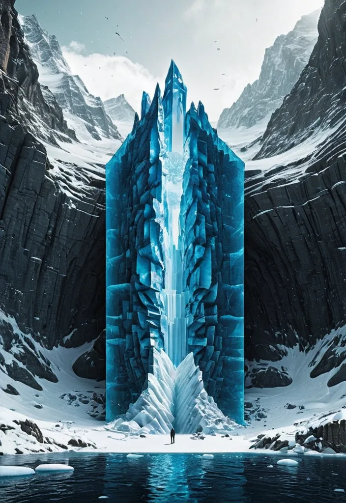
Theme: Ice Surface world: Ice-fort appears above the surface Hidden world: Cave gate is revealed underneath Key natural structure: Ice mass Main palette: Deep blue Title: Navro Subtitle: lishotta Create a premium 9:16 editorial poster from the WORLD SLICE series. Show a realistic natural landscape as if a section of the world has been physically cut open , revealing a much larger hidden structure beneath the visible surface. Keep the surface relatively simple and easy to read , while the hidden section becomes the main visual surprise. Use strong scale contrast , clear geological or ecological layers , realistic materials , believable depth , atmospheric perspective and cinematic natural light. The cutaway should not look like a glass box or aquarium. Treat it as a real piece of land , ocean , forest or ice physically sliced from the planet. Let parts of nature break beyond the geometric cutaway boundary: roots , rock formations , ice , water or terrain may extend outside the original shape to create stronger visual impact. Keep the central object around 55–70% of the poster width and preserve generous negative space. Avoid making the 3D cutaway too large. Integrate typography into the composition instead of adding many tiny labels. Use one bold main title , one short supporting line and only a few minimal editorial details. Allow natural elements to overlap , pass behind or partially cover the typography. Use a refined mix of modern serif and condensed sans-serif typography. The poster should feel like premium nature editorial design , contemporary art direction and photorealistic environmental visualization. Prioritize: strong thumbnail readability , one clear visual surprise , large recognizable forms , realistic natural textures , clean hierarchy , high-end editorial composition , and a strong contrast between the visible world and the hidden world. No logo , no watermark , no numbering , no excessive micro text , no HUD interface , no four-point sparkle symbols , no cheap CGI , no glass-container look. Make the final image feel like a complete finished poster , not a template. ,
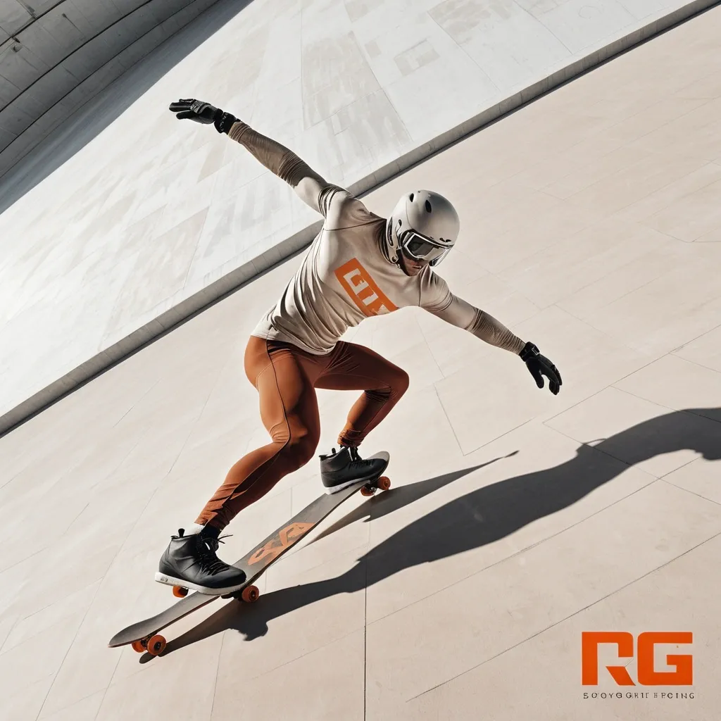
Create a finished sports-editorial campaign poster , 9:16 , full bleed. Lifelike action photography , monumental condensed typography , warm stone palette. One clear athletic moment becomes a sculptural focal point: a real body mid-action , directional hard light , deep sculpted shadow , believable skin , fabric and equipment texture. One headline in massive , heavy , ultra-narrow all-caps sans-serif , bone white. The type is a structural shape in the scene , not a caption: split , stacked or broken by the action. The athlete and headline physically interact: passing through , slicing between or overlapping the letters. Every character stays readable. Palette: warm taupe , stone , greige , bone white , charcoal shadow , with small rust-orange accents only. Strong scale contrast between body and type , with open color fields for breathing room. Headline: TAKE FLIGHT · board as underline · concrete skate bowl Skater at the peak of a high aerial above the bowl , cream windbreaker and dark trousers; the bowl's curved lip echoes the baseline. Type interaction: the board slices between TAKE and FLIGHT like a moving underline. No other text , no logos or brand marks , no watermark , no pseudo-lettering , no neon , no plastic skin , no fake distressed print , no effects that hide the action. ,
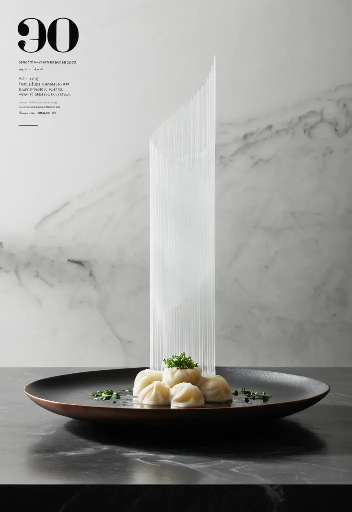
Vertical 4:5 editorial food poster featuring a single plate of handmade steamed Sev Usal arranged on a dark hammered ceramic dish over a charcoal stone countertop. The composition is centered and highly architectural. A tall column of hot vapor rises directly above the Sev Usal and becomes the dominant graphic element. Instead of soft , fluffy steam , shape the vapor into layered translucent sheets , geometric folds , vertical planes , and overlapping glass-like structures , creating the feeling of an architectural monument built from heat. Only the chef’s hands and forearms are visible. One arm enters naturally from the upper left in a clean ivory chef sleeve , delicately dropping Fresh coriander leaves onto the Sev Usal. suggesting the dish has just been served. No face or full human figure. The background is a flattened matte charcoal kitchen wall with minimal detail. Include only one functional object in the distance: a warm brushed-copper saucepan , softly out of focus. Use a restrained palette of charcoal black , warm ivory , stone gray , muted copper , soft bamboo brown , and fresh herbal green. Dramatic directional restaurant lighting creates sculptural highlights on the dumplings , realistic moisture , gentle shadows , and visible heat. Place an enormous translucent numeral “01” behind the rising vapor , partially obscured by the steam architecture and integrated into the composition rather than floating over it. At the bottom , set the word “SEV USAL” in tall , narrow condensed editorial typography with generous letter spacing. Add very small secondary type around the edges for a refined culinary-magazine feel. Minimal , premium , tactile , quiet luxury , food photography blended with Swiss editorial design and architectural poster composition. Heat , precision , ritual , stillness. No clutter , no cartoon styling , no excessive props. ,
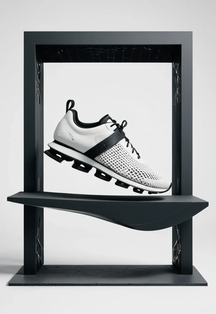
Create a premium future-sport editorial footwear concept board , 9:16 , full bleed. Modular panel atelier layout , sculptural unbranded footwear , human movement. A disciplined high-contrast editorial board composed of 2 to 4 crisp modular image panels with clean gutters and generous negative space. Obsidian , warm bone , and brushed titanium palette with a single restrained glacial-cyan accent line or marker. Hero footwear features an original unbranded sculptural architecture: pearl-bone knit upper , open heel cage , floating brushed-titanium arch bridge , and a continuous smoked-ceramic rocker with three long carved channels. Smooth integrated forefoot , no separate round pods , no red sole. Panels combine: one dynamic human athletic gesture or quiet moment in natural scale , one hero shoe profile catching metallic highlights , and one tactile macro detailing the open arch bridge and rocker grooves. floating leap · obsidian-to-bone cyclorama Athlete suspended in a vertical leap in profile with folded leg. Opposite panels isolate a floating smoked-ceramic shoe macro and the open titanium arch void. Layout: tall motion panel left , stacked footwear macros right. Title: WEIGHTLESS. Render one clean editorial title in refined condensed grotesk. Keep typography grid-aligned with minimal micro-labels. No Nike , no Reebok , no swoosh , no logos , no fake brand marks , no cluttered HUD , no duplicate limbs. ,
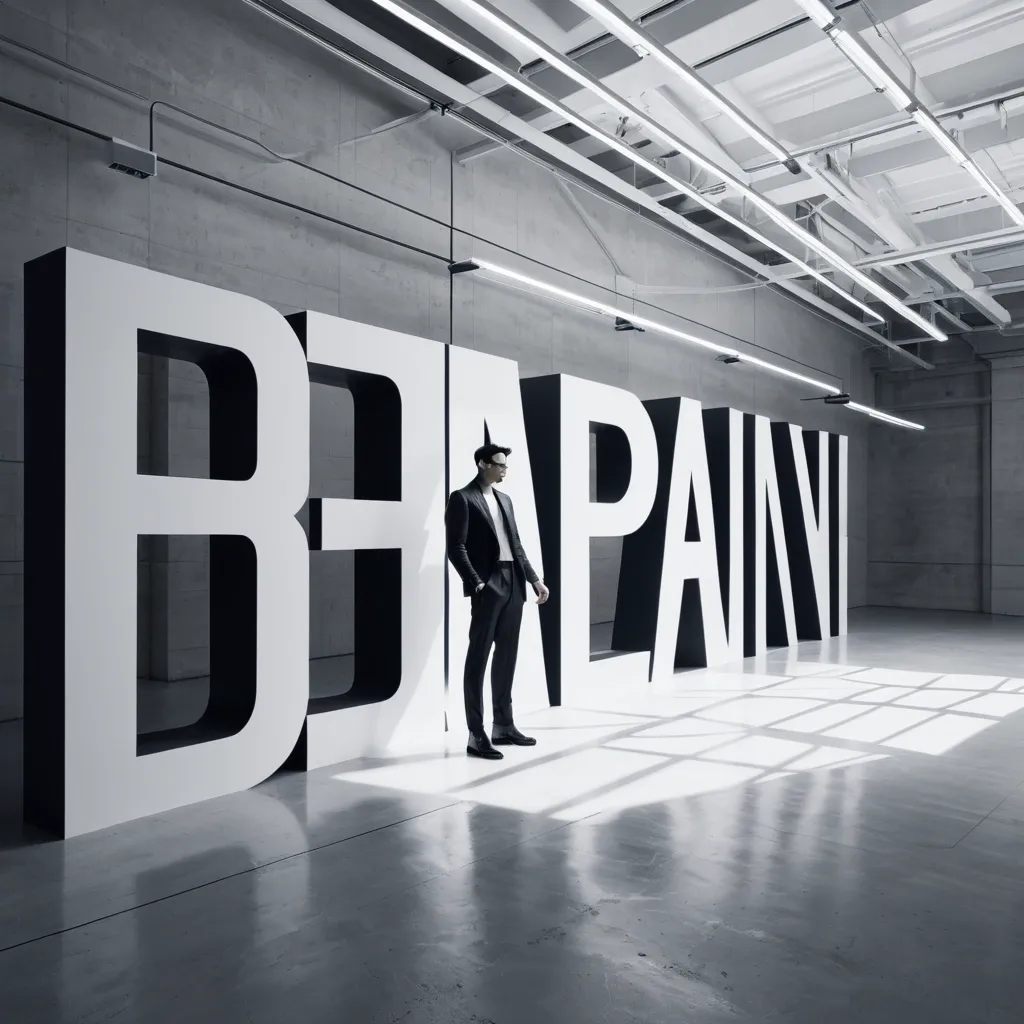
MAIN WORD: RAJU SUBJECT: adult East Asian man POSE: twisting SPATIAL METHOD: layered perspective BACKGROUND: concrete gray ACCENT COLOR: magenta ACCENT LABEL: TURN ASPECT RATIO: 9:16 Create a high-end fashion editorial poster where the subject stands inside a space built from typography. Use one adult fashion subject with realistic skin and hair , a clean elongated silhouette , monochrome tailored clothing , dimensional studio lighting , and a restrained but sculptural pose. Build the composition with oversized ultra-condensed sans-serif typography across multiple spatial planes. Combine solid letters , thin outline letters , cropped forms , and strong perspective distortion. Typography should appear on different surfaces or in different directions , creating real depth around the subject. Use [SPATIAL METHOD] as the main idea: • Folded surfaces: typography bends across walls , corners , or floor planes. • Layered perspective: multiple type planes at different depths. • Type and shadow: large letters and the subject both cast strong shadows. • Rotating type planes: large letter panels turn at different angles around the subject. Use a clear directional studio light so the subject has volume and the space includes readable shadows. Let the shadows interact with the typography and the floor to enhance depth. Keep the background minimal and architectural. Add only a few pieces of meaningful microcopy and one small high-saturation orange label containing "Mastram". Maintain a strong hierarchy: one main word , one subject , one secondary outline-type layer , one small color label , and a clear sense of spatial perspective. The final image should feel like bold editorial art direction: graphic , photographic , spatial , and stop-scroll worthy. ,
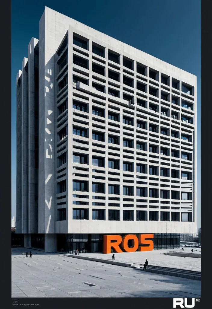
Create a vertical 9:16 poster series in English with a high-end editorial visual style , combining brutalist architecture , monumental perspective typography , realistic mature adult figures , and strong three-dimensional spatial design. The series should feel bold , clean , architectural , and visually sophisticated , with a deep cobalt-blue sky , warm raw-concrete gray , warm ivory typography , charcoal styling for the人物 , and safety orange as the only strong accent color. Use dramatic top-angle perspectives so the architecture , typography , human figure , and spatial structures all belong to the same perspective system. Keep the buildings monumental , simple , and geometric. Typography should be oversized , tall , condensed , and integrated into the composition rather than floating as flat overlay text. Human figures should look realistic , naturally posed , and scaled against the architecture. Add clean editorial microcopy , secondary headlines , and small annotations with strong hierarchy and controlled information density. Create a monumental glass wall with the word “RAJU” carved completely through the structure as real architectural openings. The inner surfaces of the carved letters should be safety orange , revealing strong physical depth. A realistic young man stands or steps naturally within the R-shaped opening. The image should feel architectural , clear , and conceptually striking. ,
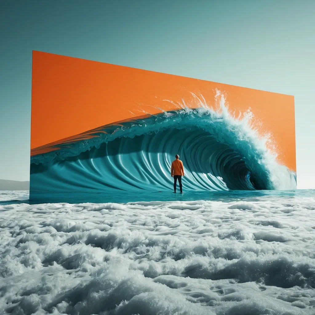
Create a spectacular stop-scrolling surreal editorial advertising poster in a vertical 4:5 composition. CORE CONCEPT Take an untouchable element of reality—OCEAN LANDSCAPE—and make it physically behave like LIQUID . Show one monumental physical action: STRETCH IT. Behind the manipulated reality , reveal surfing man. The contrast must instantly communicate Welcome. The concept should be understandable within one second without relying on text. SCALE & REALISM Make the intervention enormous , affecting a major portion of the environment so reality itself feels tangible. Give the material convincing thickness , folds , tension , torn edges , wrinkles , reflections , shadows , deformation , or wetness appropriate to its physical properties. COLOR Use strong controlled contrast: Visible world: blue Hidden world: green Accent: orange Limit the palette to 3–4 dominant colors. TYPOGRAPHY Headline: "LISHOTTA" — maximum 2–5 words. Use one premium editorial typeface: ULTRA-CONDENSED GROTESK. Integrate the typography into the physical action. Letters may tear , fold , bend , disappear behind the opening , change color , or follow the distorted surface. Keep the headline instantly readable at thumbnail size. VISUAL STANDARD World-class conceptual advertising , surreal photography , monumental scale , hyperreal material behavior , cinematic lighting , bold negative space , controlled color blocking , tactile print texture , subtle analog film grain , and one unforgettable visual idea. The final image should trigger an immediate “HOW IS THAT POSSIBLE?” reaction while remaining elegant , sophisticated , and suitable for a global fashion , culture , or creative campaign. ,
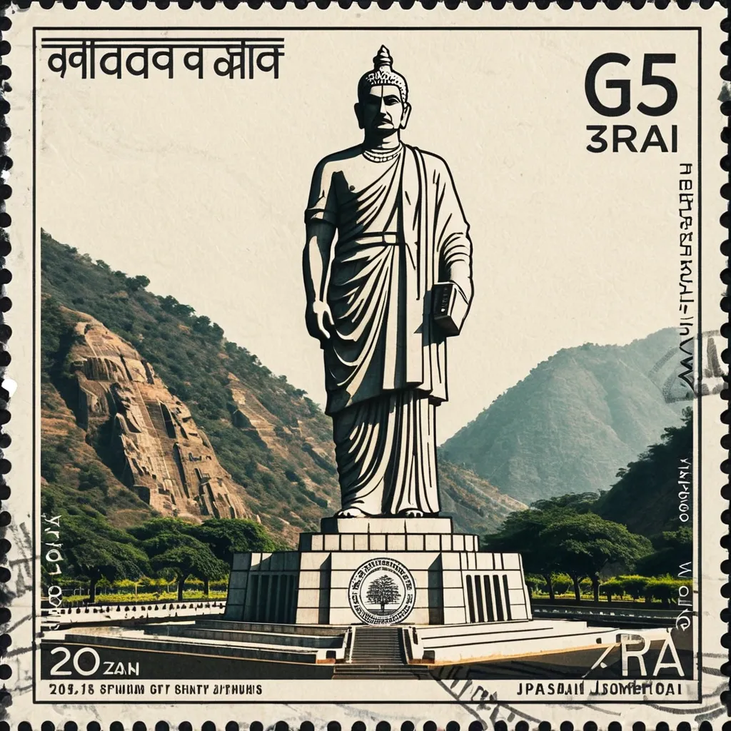
Create a realistic photographic scene of Statue Of Unity , accurately depicting its recognizable architecture , landscape , people , vegetation , terrain , perspective , lighting , shadows , and natural atmosphere. The scene must remain photographic and realistic , with only subtle archival grading and fine film grain. Make it resemble an authentic vintage travel postage stamp with: Subtle perforated edges Aged printed texture Mild ink absorption Slight print wear and tonal variation Natural analog character POSTAGE TYPOGRAPHY Integrate small vintage postal typography directly into the stamp: Statue Of Unity Small Narmada valley , near Kevadia in the state of Gujarat , India POSTAGE denomination or numerical value October 2013–October 2018 Optional small serial/issue number Use restrained serif , engraved , condensed , or archival lettering with subtle fading and imperfect ink. Keep typography away from important visual details. Avoid modern branding , fake government logos , and decorative slogans. RIGHT — RUBBER STAMP Create a small 2–4 color hand-carved rubber-stamp impression representing the most recognizable features of Statue Of Unity. Simplify the scene into strong visual shapes such as architecture , mountain contours , roads , shorelines , settlements , vegetation , or distinctive silhouettes. Remove unnecessary crowds , vehicles , repetitive buildings , and fine details. Place the stamp in the lower-middle of the right panel , occupying about 30–38% of the panel height , with generous whitespace. Use muted colors inspired by the destination. Add authentic handmade imperfections: uneven carving , broken edges , dry ink , paper show-through , granular texture , uneven pressure , ghosting , and subtle 1–2 mm color misregistration. It should look like a genuine hand-stamped mark on aged paper , never a clean vector logo. FIELD-NOTE TEXT Add small typewriter-style text near the stamp: Statue Of Unity No. 2018 182 metres · Narmada valley · Ekta Nagar 2018 October Keep the text small , understated , and secondary. STYLE Quiet , archival , tactile , regional , understated , and collectible — like a genuine travel document combining a vintage photographic postage stamp with an architect's field-note rubber stamp. ,
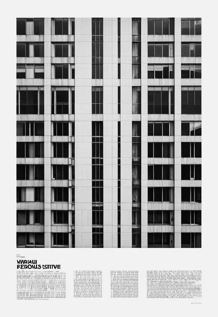
Transform the uploaded image into a premium brutalist editorial magazine poster. The entire poster should first be converted into high-contrast black-and-white. Apply: a monochrome newspaper print aesthetic a gritty editorial grain a matte paper texture a photocopy texture a magazine print imperfections a rough print noise a halftone grain a subtle paper fibers a archive print quality a high ISO film grain The black-and-white treatment should dominate approximately 75-85% of the composition. COLOR REVEAL SYSTEM Create multiple rectangular crop windows across the layout. Inside these crop windows preserve the original image colors. Only these selected fragments should remain in color. The rest of the poster remains black-and-white. Use: a vertical crop strips a horizontal crop strips a offset rectangles a overlapping image fragments a editorial cutout windows Color windows should reveal important details such as: eyes , hands , clothing details , objects , accessories , key focal points. TYPOGRAPHY Massive oversized condensed sans-serif typography. Typography should be large enough to be cropped by the canvas edges. Magazine-cover style hierarchy. Brutalist editorial design. Swiss-inspired layout. Add: a huge headline a section labels a issue numbers a micro typography a coordinates a technical annotations a small captions a editorial metadata LAYOUT Structured grid system. Intentional asymmetry. Layered rectangles. Editorial composition. Luxury magazine design. Poster design. Creative agency portfolio aesthetic. TEXTURE Heavy print grain. Visible paper texture. Magazine stock texture. Photocopied poster feel. Slight ink spread. Physical print imperfections. Scanned publication appearance. Most imp - 85% black-and-white editorial print , 15% selective color reveal windows. MOOD High-end editorial. Fashion campaign. Art-direction showcase. Creative magazine cover. Brutalist design poster. IMPORTANT The monochrome treatment must dominate the poster. The color fragments should feel like windows cut into a black-and-white print. Do not create a fully colored poster. Do not create random collage effects. The result should resemble a premium editorial publication where selective color slices reveal the original photograph beneath a gritty black-and-white printed surface ,
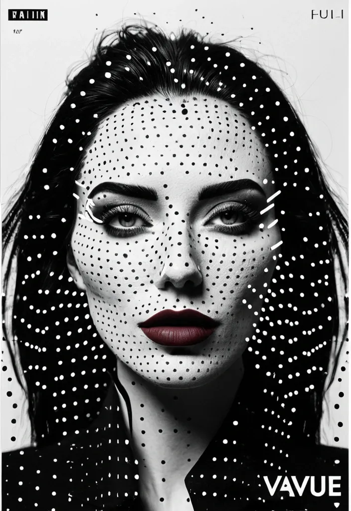
Create a 9:16 experimental character poster using a close or waist-up portrait with expressive body language. Keep most of the portrait in high-contrast black and white , then add a clear halftone screen-print effect. Use finer dots on the face and denser dots in the hair , clothing and shadows , so it feels like a printed zine rather than simple photo grain. Add one color scan window through an important part of the portrait. It can run vertically across the eye , face and hand , horizontally through the eyes and gesture , or extend from the face down into the collar and body. Inside this window , return to clean high-resolution photography with realistic cool-neutral skin , blue-grey shadows and natural lip tones. Keep it crisp and free of halftone texture so the contrast between “printed portrait” and “real detail” feels obvious. Use oversized condensed typography as part of the composition rather than placing a title in empty space. Let the letters crop off the canvas , overlap the body , pass behind the subject or cut across the scan window. Keep the palette restrained: black , white and cool grey as the base , then one cool blue and one muted red / burgundy as accents. Only add a few small identity-style labels such as “IDENTITY TRACE” , “SUBJECT ACTIVE” , “GESTURE READ” or “FEATURE ACTIVE”. A few thin lines , circles and open corner marks are enough. The final image should feel like a mix of youth-culture poster , printed zine , character dossier and experimental magazine editorial. Avoid warm yellow grading , multiple random scan windows , floating facial features , heavy glitch effects , dense UI graphics , long paragraphs , numbering , Vol./Issue labels , sparkle symbols , logos or watermarks. ,
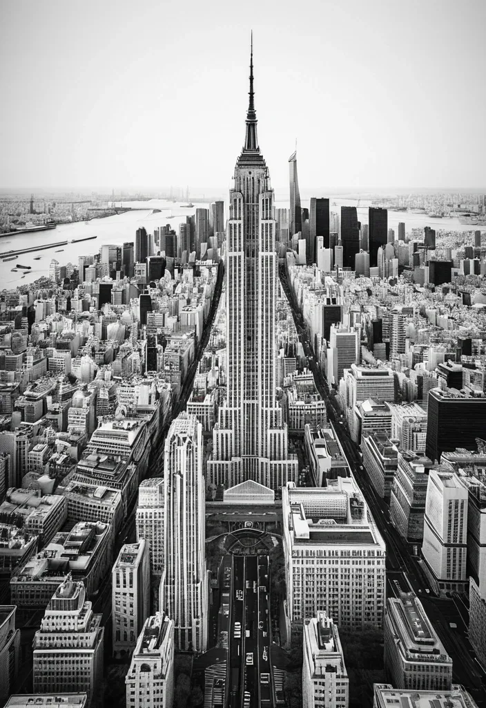
CITY: [TOKYO / NEW YORK / PARIS / DUBAI / YOUR CITY] MAIN LANDMARK: [most iconic landmark] OTHER LANDMARKS: [4–5 recognizable landmarks] TYPE COLOR: [accent color] FOREGROUND DETAIL: [cherry blossoms / taxi / leaves / palm leaves] COUNTRY: [country name] Create a 9:16 vertical city poster using iconic landmarks from the same city. Treat each landmark as an independent architectural collage element rather than a realistic street scene. Place the landmarks around the edges of the frame using an extreme worm’s-eye perspective , with their forms rising and converging toward the center of the sky. Use the MAIN LANDMARK as the central vertical anchor. Keep it the most complete and recognizable structure in the composition. Arrange the other landmarks from the upper-left , upper-right , lower-left and lower-right edges. Make them large near the frame edges and gradually narrower toward the center , creating a strong radial , upward-moving composition. Do not follow real geographic positions. The goal is to reconstruct the visual identity of the city through its landmarks. Behind the architecture , place the city name in huge ultra-tall condensed sans-serif typography. The letters should occupy around 45–60% of the image , partially hidden behind the landmarks while remaining clearly readable. Keep the city-name typography clean , solid and sharp. No distressed texture , cracks or worn lettering. Use a limited three-color system: warm off-white paper background , charcoal / grayscale architecture , one strong accent color for the city name. Render the landmarks with realistic architectural photography , then add subtle vintage editorial print texture , fine grain , halftone and paper texture. Add a small blurred foreground detail connected to the city , occupying only around 5–10% of the lower edge , to create depth and local atmosphere. Core visual formula: iconic landmarks + extreme low-angle perspective + radial convergence + giant city typography + limited colors + subtle foreground depth. ,
# Финальный промт для агента (Antigravity + Stitch MCP) ## Сайт-визитка: продажа и установка весов для погрузчиков Скопируй весь блок ниже целиком в чат задач агента как первое сообщение проекта. --- ## ПРОМТ ДЛЯ АГЕНТА (копировать с этой строки) Ты — фронтенд-разработчик и веб-дизайнер. Твоя задача: построить одностраничный сайт-визитку (лендинг) компании , которая продаёт и устанавливает весовое оборудование на вилочные погрузчики (весоизмерительные вилы , крановые весы , встраиваемые системы взвешивания , индикаторы , поверка/калибровка). Работай пошагово , по фазам ниже. После каждой фазы показывай результат (код + краткое описание) и жди подтверждения , прежде чем переходить к следующей фазе. Не используй lorem ipsum — весь текст должен быть по теме; если данные неизвестны , помечай их `[ЗАПОЛНИТЬ: ...]` явным образом прямо в коде и в комментарии. ### 0. Вводные данные проекта - Название компании: `[ЗАПОЛНИТЬ]` (если не указано — использовать нейтральное «ВесПром» как рабочее название и пометить как временное) - Номер WhatsApp: `[ЗАПОЛНИТЬ: +7XXXXXXXXXX]` - Регион работы: `[ЗАПОЛНИТЬ: город/страна]` - Ассортимент (минимум для карточек каталога , если не дано — использовать этот дефолтный список): 1. Весоизмерительные вилы (грузоподъёмность 1–5 т , точность ±0.5%) 2. Крановые/подвесные весы для интеграции с погрузчиком 3. Встраиваемые весовые системы (монтаж в раму погрузчика) 4. Индикаторы веса и дисплеи (проводные/беспроводные) 5. Поверка и калибровка весового оборудования 6. Сервисное обслуживание и ремонт - Логотип/фото/сертификаты: отсутствуют → генерировать текстовые/иконочные плейсхолдеры , фото заменять описательными alt-текстами и SVG-иллюстрациями/иконками вместо реальных фотографий. - Сайт: **одна страница** , без отдельных подстраниц. - Тип сборки: чистый HTML/CSS/JS , без бэкенда. Все заявки идут через кнопки WhatsApp (`wa.me`) , формы обратной связи не делать. ### 1. Дизайн-система — строгий индустриальный стиль (тёмный , техничный) Зафиксировать как CSS-переменные в начале `styles.css`: ```css :root { /* Фон и поверхности */ --bg-primary: #0E1116; --bg-surface: #171B21; --bg-surface-2: #1F252D; --border-color: #2A313B; /* Акцент — индустриальный оранжевый (сигнальный цвет техники) */ --accent: #FF7A1A; --accent-hover: #FF9142; --accent-muted: rgba(255 , 122 , 26 , 0.12); /* Текст */ --text-primary: #F5F6F7; --text-secondary: #9AA3AD; --text-on-accent: #0E1116; /* Статусы/бейджи */ --success: #3DDC84; /* Радиусы — небольшие , без "мягкого" UI */ --radius-sm: 4px; --radius-md: 8px; /* Шкала отступов */ --space-1: 4px; --space-2: 8px; --space-3: 12px; --space-4: 16px; --space-5: 24px; --space-6: 32px; --space-7: 48px; --space-8: 64px; --space-9: 96px; } ``` - Шрифт: `Inter` (или `Manrope`) через Google Fonts. Заголовки — 700 , текст — 400/500. - Масштаб типографики: H1 — 48px / mobile 32px; H2 — 32px / mobile 24px; H3 — 22px; body — 16px; small — 14px. Line-height заголовков 1.1–1.2 , текста — 1.5. - Иконки: line-style (обводка , без заливки) , тема — вес/точность/погрузчик/сертификат. Использовать инлайн SVG. - Кнопки: primary — заливка `--accent` , текст `--text-on-accent` , radius `--radius-sm` , без теней , чёткая обводка при hover. Secondary — прозрачная с обводкой `--border-color`. - Общее ощущение: контраст , чёткие линии-разделители секций (border-top 1px `--border-color`) , минимум скруглений , минимум декоративных теней. Сгенерировать через Stitch MCP референс hero-блока по промпту: > "Industrial B2B landing page hero , dark navy/graphite background #0E1116 , orange accent #FF7A1A , bold condensed sans-serif headline , forklift with weighing attachment illustration , minimal rounded corners , trust badges row" Выбрать один вариант , зафиксировать композицию (расположение заголовка/кнопки/иллюстрации) как референс для вёрстки. ### 2. Структура страницы (порядок секций и содержимое) 1. **Header** (sticky , `--bg-surface` с нижней обводкой) - Слева: логотип-плейсхолдер (текст названия компании , шрифт 700). - Справа: пункты меню-якоря (Услуги , Каталог , Как работаем , Кейсы , Контакты) — скрыть в бургер на мобильных. - Кнопка WhatsApp (primary) — крайняя справа. 2. **Hero** - H1: «Весы для погрузчиков под ключ: подбор , монтаж , поверка» - Подзаголовок: 1–2 предложения про скорость и точность монтажа , гарантию. - Кнопка WhatsApp (крупная , primary) — текст «Написать в WhatsApp» + иконка. - Строка доверия под кнопкой: 3 коротких пункта в столбик/строку («Гарантия N лет» , «Выезд по региону `[ЗАПОЛНИТЬ]`» , «Поверка включена»). - Иллюстрация/SVG погрузчика с весами справа (или фон-паттерн , если иллюстрации нет). 3. **Услуги** (4 карточки в сетке , `--bg-surface` фон карточки , border `--border-color`) - Продажа весового оборудования - Монтаж на погрузчик - Поверка и калибровка - Сервис и ремонт - На каждой карточке: иконка , заголовок , 1–2 строки описания. 4. **Каталог** (сетка карточек товаров , 4–6 позиций из списка в п.0) - На карточке: иконка/плейсхолдер-изображение , название , 2–3 ключевые характеристики (грузоподъёмность , точность , IP-класс) , кнопка WhatsApp с текстом `«Интересует {название товара}»` (urlencoded). 5. **Как мы работаем** (степпер/таймлайн , 5 шагов) - Заявка в WhatsApp → Консультация и подбор → Выезд/монтаж → Поверка → Гарантийная поддержка. - Каждый шаг: номер , короткий заголовок , 1 строка описания. 6. **Преимущества** (4–6 пунктов , иконка + короткий текст) - Например: «Гарантия на монтаж» , «Сертифицированное оборудование» , «Опыт работы `[ЗАПОЛНИТЬ]` лет» , «Выезд по региону» , «Поверка включена в стоимость» , «Сервис 24/7» — оставить как варианты , отметить реальные цифры как `[ЗАПОЛНИТЬ]`. 7. **Кейсы** (сетка/карусель из 3 карточек) - Плейсхолдер-описание объекта (склад/производство/логистика) , тип установленного оборудования , результат в 1 фразе. 8. **Сертификаты и документы** (ряд бейджей) - Плейсхолдер-иконки «Сертификат соответствия» , «Свидетельство о поверке» — с пометкой `[ЗАПОЛНИТЬ: реальные документы]`. 9. **Отзывы** (2–3 карточки) - Плейсхолдер-тексты , помечены как черновые. 10. **Финальный CTA-блок** - Крупный заголовок-призыв , крупная кнопка WhatsApp по центру. - Контакты: телефон , email (плейсхолдеры) , адрес/регион. - Карта — встроенный статичный блок-плейсхолдер (реальный embed добавить , когда будет адрес). 11. **Footer** - Название компании , копирайт , повтор кнопки WhatsApp (маленькая) , ссылки на мессенджеры при наличии. **Плавающая кнопка WhatsApp** — fixed , правый нижний угол , видна на всех секциях при скролле , иконка WhatsApp в зелёном кружке (`#25D366`) , лёгкая пульсация (анимация раз в 3–4 сек , без резких эффектов). ### 3. WhatsApp-интеграция (техническая часть) - Формат ссылки: `https://wa.me/<номер_без_плюса_и_пробелов>?text=<urlencoded_текст>` - Номер и дефолтный текст вынести в константы в начале `main.js`: ```js const WHATSAPP_NUMBER = "ЗАПОЛНИТЬ"; // международный формат без + const WHATSAPP_DEFAULT_TEXT = "Здравствуйте! Интересуют весы для погрузчика , хочу проконсультироваться"; ``` - Все ссылки — `target="_blank" rel="noopener noreferrer"`. - Для карточек каталога текст сообщения формируется динамически: `Здравствуйте! Интересует ${имя_товара} , хочу проконсультироваться`. ### 4. Технические требования - Адаптив mobile-first , брейкпоинты: 375 / 768 / 1024 / 1440. - Изображения — webp , `loading="lazy"` (кроме hero-изображения). - Контраст текста — проверить на соответствие WCAG AA (особенно `--text-secondary` на `--bg-primary`). - Кросс-браузерность: Chrome , Safari , Firefox. - Favicon , `sitemap.xml` , `robots.txt`. ### 5. SEO и метаданные - `<title>`: «Весы для погрузчиков — продажа , монтаж , поверка [Регион]» - `meta description`: 1–2 предложения с УТП и регионом. - OG-теги (og:title , og:description , og:image — hero-изображение). - H1 — один на странице (см. Hero). - Alt-тексты у всех изображений/иконок. - Микроразметка `schema.org`: `LocalBusiness` (общие данные компании) + `Product` для каждой карточки каталога. ### 6. Порядок выполнения (для модели Flash 3.6 Medium — дробить по шагам) Выполнять и показывать результат по одному пункту за раз , не объединяя несколько секций в один ответ: 1. Скелет HTML + подключение CSS-переменных из раздела 1. 2. Header + мобильное меню + плавающая кнопка WhatsApp. 3. Hero-секция. 4. Секция «Услуги». 5. Секция «Каталог». 6. Секция «Как мы работаем». 7. Секция «Преимущества». 8. Секция «Кейсы». 9. Секция «Сертификаты». 10. Секция «Отзывы». 11. Финальный CTA-блок + Footer. 12. SEO-метатеги , favicon , sitemap.xml , robots.txt. 13. Финальная проверка: адаптив на 4 брейкпоинтах , контраст , все wa.me-ссылки , lazy-loading изображений. ### 7. Чек-лист приёмки (сверить перед сдачей) - [ ] Все `[ЗАПОЛНИТЬ]`-плейсхолдеры собраны в единый список в комментарии наверху `index.html` для удобной правки. - [ ] Все кнопки/ссылки ведут на корректный `wa.me` с правильным текстом. - [ ] Плавающая кнопка WhatsApp не перекрывает контент на мобильных (проверить над footer). - [ ] Ни одной формы обратной связи в коде нет. - [ ] Адаптив проверен на 375/768/1024/1440. - [ ] Цветовая схема соответствует разделу 1 (никаких случайных цветов вне палитры). - [ ] Lorem ipsum отсутствует — весь текст по теме. ## КОНЕЦ ПРОМТА (копировать до этой строки) ,
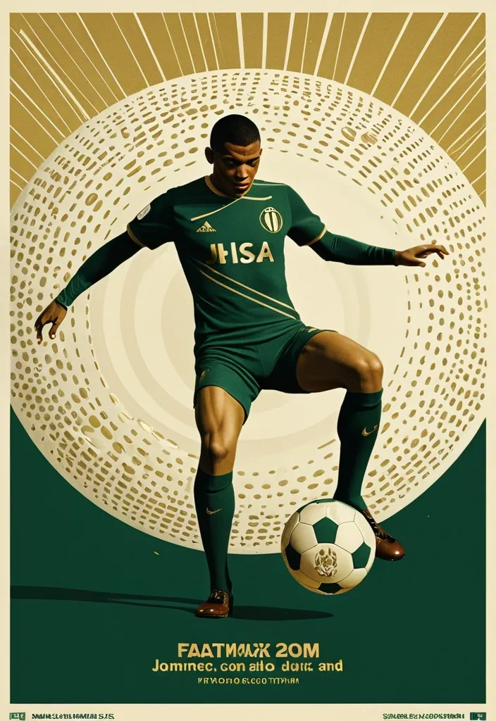
A professional vertical 3:4 poster for FIFA World Cup 2026. STYLE: vintage sport editorial meets modern Swiss typography — 1960s-70s sports magazine grit fused with bold contemporary graphic design. PALETTE: warm gold #D4AF37 + deep forest green #1B3A2D + cream off-white #F5F0E8. Entire image is monochromatic within this palette — NO bright colors anywhere. LAYOUT — Top: massive bold title "FIFA" on first line , "WORLD CUP" on second line , in extremely bold sans-serif , square heavy letterforms , filled with dense halftone dot texture like old newspaper print , cream off-white color , spanning full width. The letters have a slight rough edge like screen-printed ink. Center: A dynamic silhouette of Kylian Mbappé mid-kick —athletic explosive running posture. a powerful action pose: one leg extended forward striking the football , body leaning into the shot , in a vast star-filled cosmic night , just struck by his foot a thin flashlight shadow emerge into enormous half-football's ring , light imperial Starwars style giant half-football(3D rendering:0.1) drifting across the void , dissolving into Phantom. The figure is rendered as a high-contrast duotone graphic in warm gold against deep green , with subtle film grain and light vintage halftone texture. Behind him , a faint circular sunburst graphic radiates outward in gold lines , evoking classic 1970s sports posters. At his feet , the official 2026 World Cup ball "Trionda" — rendered in the SAME duotone gold-and-cream palette as the rest of the image , no bright red/green/blue. The ball's distinctive wave pattern and panel construction are visible through tonal contrast and embossed texture in gold and cream tones , like a vintage screen print. The ball is mid-flight , just struck by his foot. Bottom: slogan "Say It. Make Your Cup." in the SAME extremely bold sans-serif font as the title — square , heavy , condensed letterforms with the same halftone dot texture fill , cream off-white color , matching the "FIFA WORLD CUP" title typography exactly. A thin gold rule line separates it slightly. Below the slogan , "2026" in the same bold sans-serif style , smaller but matching. DESIGN: bold negative space , strong diagonal tension from Mbappé's striking pose , clear visual hierarchy. The vintage feel is subtle — light film grain , slight warm color shift , delicate halftone pattern on all text. The ENTIRE image stays strictly within the gold-green-cream palette — Trionda ball must NOT appear in bright colors , only duotone gold/cream with tonal embossed detail. ANCHOR: reminiscent of 1970s World Cup matchday programmes crossed with modern minimalist editorial design. AVOID: generic Inter/Helvetica typography , generic purple gradients , SaaS landing page style , stock photo aesthetic , rounded card stacks , watermarks , misspelled text , low contrast text , multi-step compositing seams , bright colors anywhere in the image , a colorful football , thin or lightweight fonts at the bottom , mismatched typography between title and slogan. Clean , high-resolution image quality: smooth continuous tonal gradients , uniform and well-controlled texture throughout , surfaces and materials intact and naturally rendered. The main subject is crisp and clearly separated from a softly layered background with clear depth. Free of digital noise and over-sharpening artifacts. No watermark , no garbled text. ,
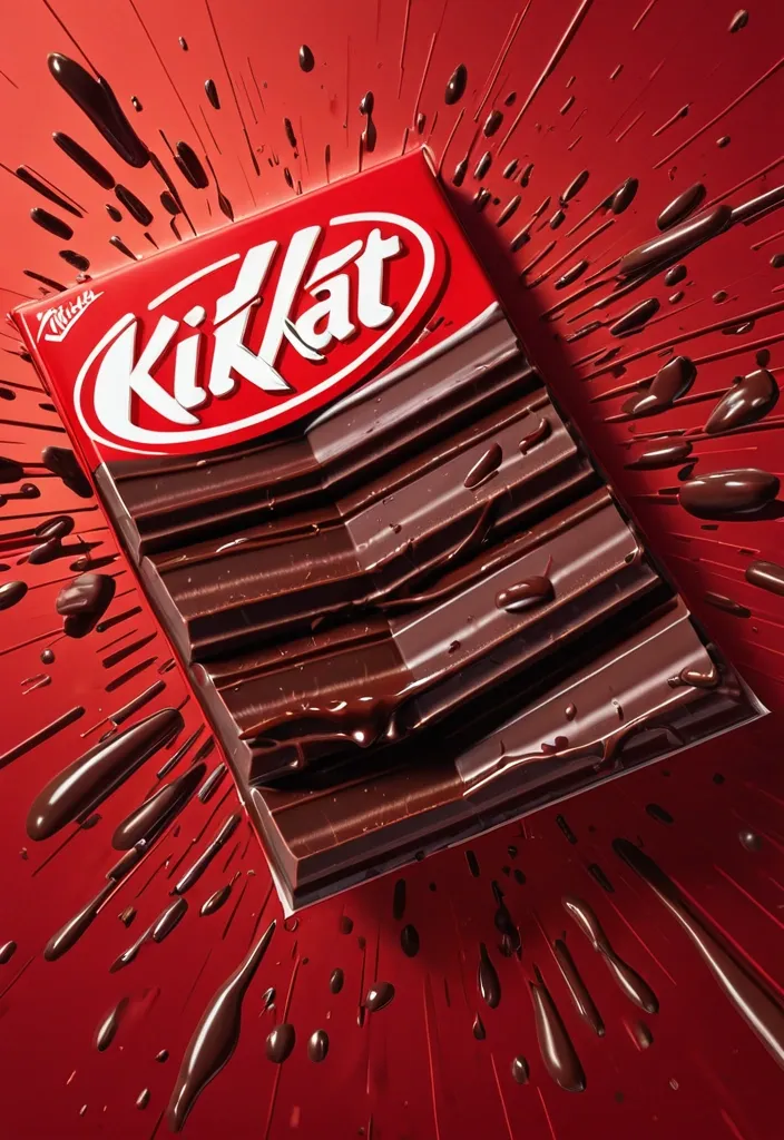
FORMAT: 4:5 vertical hyper-commercial chocolate campaign poster , ultra-high resolution (8K) , premium billboard + social media advertising ready Style: bold FMCG advertising × modern snack campaign × energetic commercial poster design × high-impact product photography 🧠 CORE IDEA: THE BREAK EVERYONE WAITS FOR. A campaign built around impact , craving , and satisfying motion. Everything in the composition reacts to the iconic KitKat snap. 🎬 MASTER COMPOSITION: BACKGROUND: Deep KitKat red environment Layered with: - rich red gradients - chocolate texture overlays - dynamic motion streaks - subtle crumb particles - repeated typography patterns - glossy studio reflections The atmosphere should feel: bold , hungry , energetic , commercially explosive. 👤 HUMAN SUBJECT: Young Gen-Z male/female model Expression: playful , confident , mid-enjoyment moment Pose: holding KitKat toward camera mid-snap action Camera angle: slightly low + close perspective for product dominance Wardrobe: modern streetwear in neutral tones allowing red palette to dominate 💥 VISUAL ENERGY: The SNAP becomes the visual explosion. At the break point: - chocolate shards flying outward - wafer crumbs suspended mid-air - liquid chocolate streaks - motion lines radiating from snap Typography physically cracks apart following the KitKat break. Feels: satisfying , punchy , commercially exaggerated. 🍫 PRODUCT HERO: [KitKat](chatgpt://generic-entity?number=0) chocolate bar + wrapper Placement: foreground center-right Angle: extreme 3/4 hero perspective Product details: - hyper-real chocolate texture - visible wafer layers - glossy melted chocolate highlights - realistic crumbs - embossed KitKat logo - premium wrapper reflections Chocolate should feel: crispy , rich , irresistible. ✍️ TYPOGRAPHY SYSTEM: MAIN HEADLINE: “BREAK TIME.” Typography style: - ultra-bold condensed sans-serif - oversized stacked layout - white typography - extremely tight spacing - cracked/distorted around snap point SECONDARY TEXT: “HAVE A BREAK. HAVE A KITKAT.” BACKGROUND TYPOGRAPHY: Repeated low-opacity words: SNAP CRUNCH BREAK CHOCOLATE WAFER MELT integrated into background layers 📦 FEATURE INFORMATION STRIP: Bottom premium feature strip: □ CRISPY WAFER □ RICH CHOCOLATE □ ICONIC SNAP □ PERFECT BREAK Minimal modern icon system. 📣 CTA SECTION: BOTTOM LEFT: “NEW SHARING PACK AVAILABLE” CTA BUTTON: solid white rectangular button TEXT: “GRAB NOW” Secondary micro CTA: “Available Online & In Stores” 🌐 WEBSITE + BRAND INFO: BOTTOM CENTER: www.kitkat BOTTOM MICROTEXT: “NESTLÉ KITKAT · 2026 EDITION” 🎨 COLOR SYSTEM: PRIMARY: KitKat red deep chocolate brown SECONDARY: white typography ACCENTS: warm chocolate highlights golden wafer tones Palette should feel: bold , delicious , high-energy , commercial. 💡 LIGHTING SYSTEM: MAIN LIGHT: strong commercial studio key light RIM LIGHT: warm chocolate highlights around product ACCENT LIGHT: soft red glow behind snap motion ATMOSPHERIC LIGHT: subtle floating particles catching light REFLECTIONS: glossy FMCG-grade reflections Lighting should feel: premium snack advertising × modern commercial photography. ✨ HYPER DETAILING: - ultra-real wafer texture - sharp chocolate break detail - floating crumb realism - melted chocolate reflections - premium wrapper texture - billboard readability maintained - ultra-clean typography edges - high-end FMCG rendering quality 📐 COMPOSITION FLOW: Upper Frame: massive typography dominance Center: snap explosion + human interaction Foreground: product hero Lower-left: CTA + features Eye flow: Headline → Snap → Product → Chocolate Motion → CTA 🎥 CAMERA & RENDER: - commercial food photography - Phase One medium format feel - 35–50mm lens - HDR commercial rendering - ultra-clean sharpness - premium FMCG color grading 🔥 FINAL FEEL: Feels like: Nike energy campaign × premium FMCG launch × modern Behance commercial food poster. ,
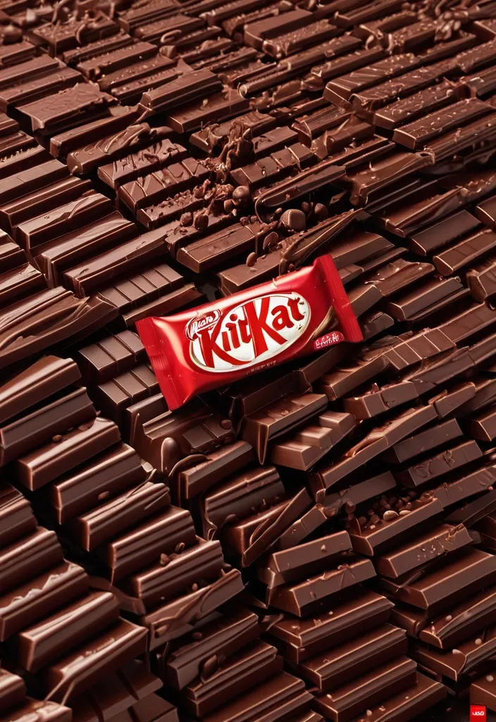
FORMAT: 4:5 vertical hyper-commercial chocolate campaign poster , ultra-high resolution (8K) , premium billboard + social media advertising ready Style: bold FMCG advertising × modern snack campaign × energetic commercial poster design × high-impact product photography 🧠 CORE IDEA: THE BREAK EVERYONE WAITS FOR. A campaign built around impact , craving , and satisfying motion. Everything in the composition reacts to the iconic KitKat snap. 🎬 MASTER COMPOSITION: BACKGROUND: Deep KitKat red environment Layered with: - rich red gradients - chocolate texture overlays - dynamic motion streaks - subtle crumb particles - repeated typography patterns - glossy studio reflections The atmosphere should feel: bold , hungry , energetic , commercially explosive. 👤 HUMAN SUBJECT: Young Gen-Z male/female model Expression: playful , confident , mid-enjoyment moment Pose: holding KitKat toward camera mid-snap action Camera angle: slightly low + close perspective for product dominance Wardrobe: modern streetwear in neutral tones allowing red palette to dominate 💥 VISUAL ENERGY: The SNAP becomes the visual explosion. At the break point: - chocolate shards flying outward - wafer crumbs suspended mid-air - liquid chocolate streaks - motion lines radiating from snap Typography physically cracks apart following the KitKat break. Feels: satisfying , punchy , commercially exaggerated. 🍫 PRODUCT HERO: [KitKat](chatgpt://generic-entity?number=0) chocolate bar + wrapper Placement: foreground center-right Angle: extreme 3/4 hero perspective Product details: - hyper-real chocolate texture - visible wafer layers - glossy melted chocolate highlights - realistic crumbs - embossed KitKat logo - premium wrapper reflections Chocolate should feel: crispy , rich , irresistible. ✍️ TYPOGRAPHY SYSTEM: MAIN HEADLINE: “BREAK TIME.” Typography style: - ultra-bold condensed sans-serif - oversized stacked layout - white typography - extremely tight spacing - cracked/distorted around snap point SECONDARY TEXT: “HAVE A BREAK. HAVE A KITKAT.” BACKGROUND TYPOGRAPHY: Repeated low-opacity words: SNAP CRUNCH BREAK CHOCOLATE WAFER MELT integrated into background layers 📦 FEATURE INFORMATION STRIP: Bottom premium feature strip: □ CRISPY WAFER □ RICH CHOCOLATE □ ICONIC SNAP □ PERFECT BREAK Minimal modern icon system. 📣 CTA SECTION: BOTTOM LEFT: “NEW SHARING PACK AVAILABLE” CTA BUTTON: solid white rectangular button TEXT: “GRAB NOW” Secondary micro CTA: “Available Online & In Stores” 🌐 WEBSITE + BRAND INFO: BOTTOM CENTER: www.kitkat BOTTOM MICROTEXT: “NESTLÉ KITKAT · 2026 EDITION” 🎨 COLOR SYSTEM: PRIMARY: KitKat red deep chocolate brown SECONDARY: white typography ACCENTS: warm chocolate highlights golden wafer tones Palette should feel: bold , delicious , high-energy , commercial. 💡 LIGHTING SYSTEM: MAIN LIGHT: strong commercial studio key light RIM LIGHT: warm chocolate highlights around product ACCENT LIGHT: soft red glow behind snap motion ATMOSPHERIC LIGHT: subtle floating particles catching light REFLECTIONS: glossy FMCG-grade reflections Lighting should feel: premium snack advertising × modern commercial photography. ✨ HYPER DETAILING: - ultra-real wafer texture - sharp chocolate break detail - floating crumb realism - melted chocolate reflections - premium wrapper texture - billboard readability maintained - ultra-clean typography edges - high-end FMCG rendering quality 📐 COMPOSITION FLOW: Upper Frame: massive typography dominance Center: snap explosion + human interaction Foreground: product hero Lower-left: CTA + features Eye flow: Headline → Snap → Product → Chocolate Motion → CTA 🎥 CAMERA & RENDER: - commercial food photography - Phase One medium format feel - 35–50mm lens - HDR commercial rendering - ultra-clean sharpness - premium FMCG color grading 🔥 FINAL FEEL: Feels like: Nike energy campaign × premium FMCG launch × modern Behance commercial food poster. ,
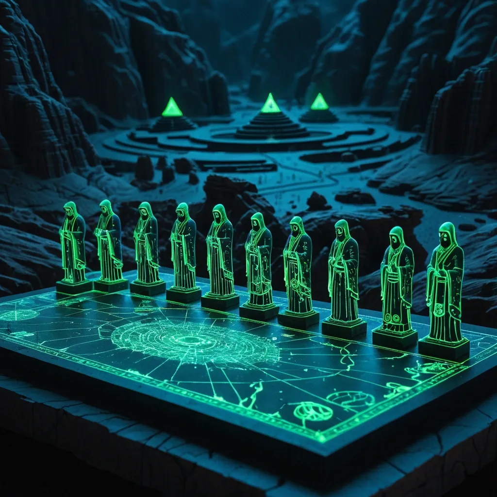
A group of enigmatic , hooded figures , covered with ancient tattoos , their blurry face are fluorescent black no facial features , etched in ether ink and forgotten runes , gather around a detailed fluorescent green-dotted 3d miniature diorama of Narmada valley lying on a surface , with the Statue of Unity is the world's tallest statue , located at bank of Narmada river as focal point , condensed into a tiny tabletop world with technical schematics in red , It should have icon of tall statue icon somewhere in map , labels and data overlays vortex around him. Behind them stretches a vast , deep night desert with bioluminescent caves. The image is captured as a hyper-detailed cinematic film still , with sharp focus on the guardian and a soft bokeh effect on the background , Rendered in Octane , rich detailing --ar 16:9 --raw --stylize 200 ,

blurry , flat , no bevel , wrong spelling , extra words , background scene , shield , icon , format 512×128. Text "ShieldSmithGuild" only , uppercase letters , bold condensed sans-serif font , sharp angular edges. Polished reflective gold material , strong 3D bevel effect , gem-like highlights , warm orange-brown shadows in recessed areas. Lighting from top-left , metallic sheen. Transparent or dark background. Premium game logo typography , no other elements. ,
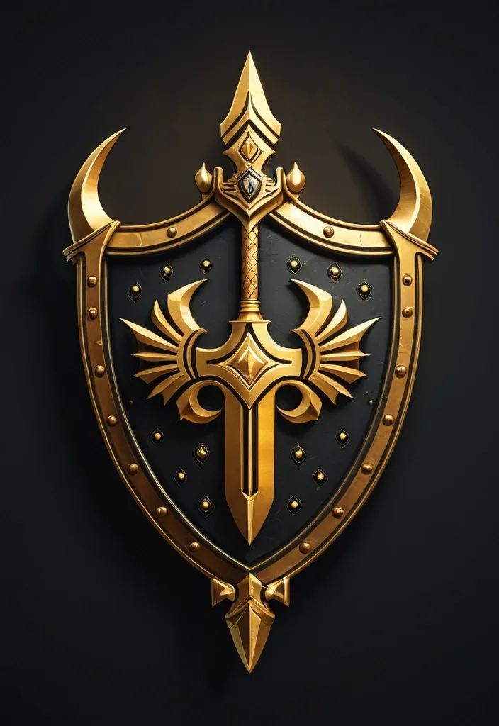
blurry , flat , cartoon , anime , bright background , format 512×512 Heraldic shield logo , wide at top tapering to point at bottom , curved sides. Multi-layered ornate frame: outer dark black metallic band , inner thick bronze-gold band with small round rivet studs along entire border. Golden pointed crests at top , bottom and upper-middle points of shield. Central large golden 3D emblem: stylized sword or trident , central pointed shaft with two upward-curving wing-like blades each side , polished reflective gold. Text "ShieldSmithGuild" in uppercase bold condensed sans-serif , sharp angular letters , 3D beveled reflective gold , gem-like highlight and warm orange-brown shadows , centered below the emblem inside shield. Dark charcoal black background , textured like carved stone or hammered metal plates , rough ancient feel. Four corners: subtle partial golden ornate corner pieces. Lighting from top-left , strong highlights on gold , deep shadows. Premium game logo , fantasy , no photo ,

A highly cinematic and visually stunning neo-noir revenge thriller movie poster with the tagline ‘Revenge is Bloody Beautiful.’ The central figure stands alone in a rain-soaked alleyway , illuminated by flickering neon lights. This protagonist—either a striking woman in a blood-splattered red dress with a cold , determined gaze or a sharply dressed man in a tailored black suit gripping a bloodied knife—exudes an aura of vengeance and power. Their expression is fierce yet composed , eyes locked onto an unseen target , as if ready to deliver final justice. The background showcases a dark and gritty cityscape , partially shrouded in mist. The towering buildings are lit with neon signs in deep crimson , electric blue , and eerie purples , reflecting off the wet pavement. The rain pours heavily , streaking down like liquid glass , with drops bouncing off the character’s shoulders. Rising steam from sewer grates swirls in the air , adding a sense of motion and depth. To the side , a luxury car sits abandoned , its windshield riddled with bullet holes , headlights still faintly glowing. Shadows lurk in the distance—perhaps an unknown assassin watching from the rooftop , or the blurred silhouette of an enemy escaping into the night. A distant police siren casts an ominous glow , hinting at the chaos left in the protagonist’s wake. The typography is bold and artistic , with the movie title styled in a sharp , edgy font that resembles blood streaks or knife slashes. The tagline ‘Revenge is Bloody Beautiful’ glows in deep red , designed to look like a neon sign flickering in the rain. The color palette is rich with contrasts—dark shadows , moody blues , and splashes of blood-red intensifying the dramatic tone. At the bottom , the poster features classic movie billing text in a small , condensed font , listing the director , main actors , production companies , and credits. This text blends seamlessly into the design , ensuring the artwork remains the focal point while maintaining authenticity to real movie posters. The overall mood is intense , mysterious , and stylish , evoking elements of classic noir , modern cyberpunk , and high-stakes revenge cinema. The poster should feel like a piece of art , drawing viewers into a world where justice is personal , and vengeance is executed with elegance and precision ,
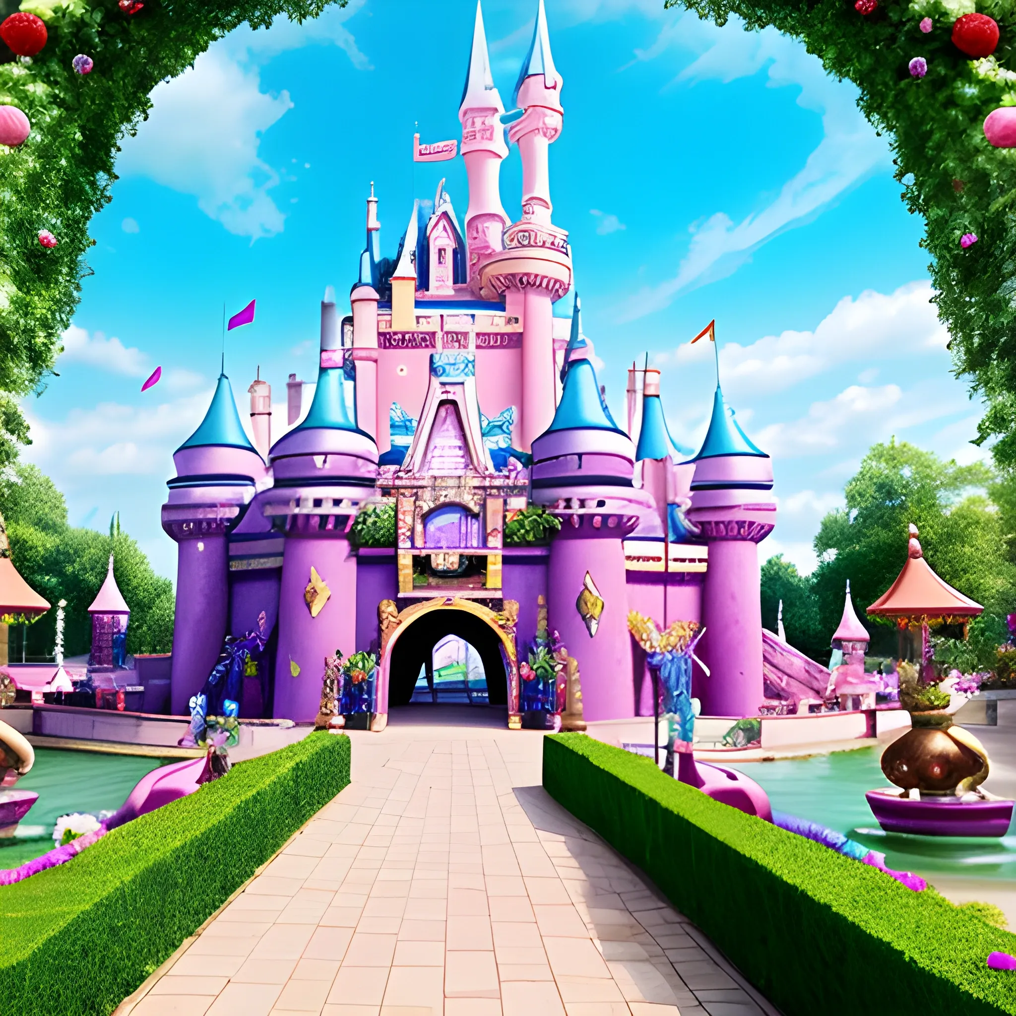
Welcome to this castle of joy and vitality! As you step through the castle gates , a sense of exhilarating delight washes over you. The castle's exterior is adorned with fairytale colors and a lively atmosphere , as if leaping straight out of a storybook. Reaching skyward , the castle is constructed of colorful stones , as if condensed from sweet dreams. These stones shimmer with golden , pink , and sky-blue hues , creating an ambiance that feels like stepping into a dreamland. Colorful lanterns adorn the porch , and various-shaped pennants flutter in the breeze , accompanied by cheerful music , creating a festive and lively atmosphere. A grand archway leads visitors into the castle's interior , a wonderland full of surprises and delights. Inside , the castle is beautifully decorated , with breathtaking landscapes and facilities. Greeting you is a magnificent fountain , with dancing water jets emitting a fresh fragrance. Colorful flowers and lush greenery surround the amusement park , providing a leisurely and pleasant walking area for visitors. Strolling along the cobblestone path , you'll discover a variety of amusement rides , including joyful carousels , thrilling roller coasters , and exciting water parks , immersing visitors in endless fun. Suitable for all ages , everyone can find their own happiness in this castle of joy! In this castle filled with laughter and dreams , let's create wonderful memories and spend a joyful time together! ,