Search Results for "random visual clutter"
Explore AI generated designs, images, art and prompts by top community artists and designers.
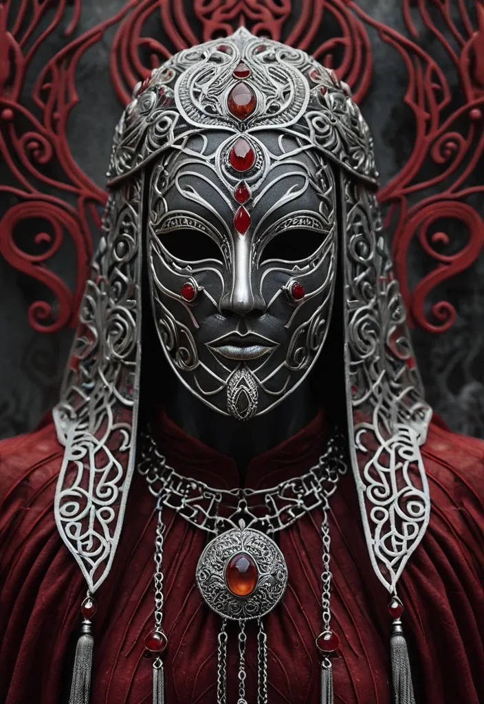

{ "project": { "type": "music_blend_art" , "song": "SONG TITLE" , "artist": "ARTIST NAME" , "core_emotion": "MYSTERY / SOLEMNITY / ANCIENT POWER" , "visual_interpretation": "A faceless , ceremonial figure whose identity is entirely hidden behind ornate silver , standing still like a living relic" , "aspect_ratio": "9:16" , "intended_use": "Instagram Story" , "resolution": "4K , ultra-high detail" } , "source_images": [ { "role": "primary_subject" , "description": "A figure draped in a deep crimson hooded veil with embroidered , worn edges , face fully covered by an ornate silver filigree mask-headpiece with engraved patterns , two amber-gold eye-like gems , and rows of dangling silver chains and tassel pendants" , "importance": "dominant" } , { "role": "secondary_subject" , "description": "A heavy silver collar and chest ornament at the base of the frame , over dark layered garments with fine red and gold embroidery" , "importance": "supporting" } , { "role": "symbolic_element" , "description": "A blurred geometric wall in faded red , cream and grey zigzag patterns behind the figure" , "importance": "subtle" } ] , "art_direction": { "style": [ "hyper-realistic cinematic portrait" , "dark historical fantasy" , "ultra-detailed textile and metalwork photography" , "surreal visual storytelling" ] , "composition": "Centered , symmetrical , slightly low camera angle , so the figure looks monumental" , "blending_method": [ "photographic depth separation" , "soft atmospheric haze at the edges" , "selective sharpness on metalwork" ] , "visual_hierarchy": "One dominant focal point , the silver mask , supported by the draped crimson fabric" , "edges": "Crisp on the silver and embroidery , softly falling off into the background" , "texture": "Visible fabric weave , frayed embroidery , tarnished and polished silver , tiny scratches , realistic fabric folds" , "color_palette": "Deep crimson and oxblood red , cool tarnished silver , faint amber gold , muted terracotta and grey in the background" , "lighting": "Dramatic low-key cinematic lighting , strong specular highlights on the silver , soft shadowed folds in the cloth" , "depth": "Sharp foreground subject , shallow depth of field , softly blurred patterned wall behind" } , "emotional_storytelling": { "central_idea": "Identity hidden , power and history worn as armor" , "literal_elements": "Silver filigree face mask , dangling chain tassels , crimson veil , silver collar , patterned wall" , "abstract_elements": "Faint breath-like haze around the mask , tiny glints of light drifting from the chains , the amber gems reading as watching eyes" , "energy": "Slow , deliberate , ceremonial rhythm with a quiet , ominous weight" , "ambiguity": "Allow multiple interpretations without losing the central theme" } , "integration_rules": { "unify_all_images": true , "preserve_recognizable_subjects": true , "avoid_visible_white_borders": true , "avoid_separate_sticker_like_cutouts": true , "avoid_rigid_panel_layouts": true , "avoid_unrelated_decorative_elements": true , "avoid_generic_ai_wallpaper_aesthetic": true } , "finish": { "appearance": "A cohesive , photorealistic cinematic still with film-like depth" , "detail_level": "Extreme micro-detail on the silverwork , embroidery and fabric fibers , 85mm portrait look , shallow depth of field" , "imperfection": "Natural wear , slight fabric wrinkles and metal tarnish" , "text": "none" , "watermark": "none" , "quality": "4K , high-resolution , sharp , carefully composed" } , "negative_prompt": [ "visible white borders" , "disconnected image fragments" , "sticker collage" , "cartoon or illustration look" , "painterly brush strokes" , "plastic skin" , "visible face or eyes through the mask" , "generic stock imagery" , "random visual clutter" , "unmotivated neon effects" , "unreadable accidental text" , "excessive sharpening" , "blurry details" , "oversaturated colors" , "warped or merged chains" ] } ,
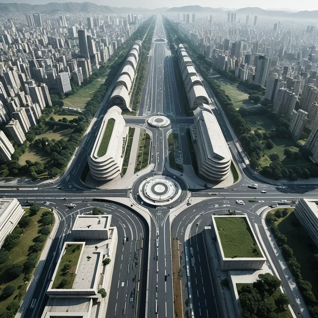
Create a surreal architectural photography piece based on a photo of any uploaded city , building , street , square , or landmark. Core Visual: Reconstruct the original scene into a "Vertical Folding World" with strong visual illusions. The bottom of the image maintains a near-normal road or ground perspective , gradually rising toward the top of the frame , ultimately transitioning seamlessly into a nearly 90° vertical aerial view , as if the entire city surface has been folded upward. Scene Recognition: Automatically analyze mountains , roads , forest , landscapes , landmarks , and spatial axes in the original image , preserving the most recognizable shapes , architectural language , and environmental features of the main subject. Adaptively design the folding method based on the original scene's structure , without forcibly adding large landmarks that didn't originally exist. Spatial Composition: Employ a hybrid perspective combining extreme high vantage points , ultra-wide-angle architectural photography , and orthographic top-down views. Emphasize central symmetry , road leading lines , geometric order , and spatial depth. Roads , steps , or squares at the bottom of the image naturally extend upward , forming a continuous , fluid , and striking spatial bending effect. Visual Details: Statue of Unity(a world's tallest statue (182 meters) located in Ekta Nagar (Kevadia) , Gujarat , India) , road corridor , trees , vehicles , pedestrians , and paving textures all maintain realistic proportions and rich details. Distant vegetation forms intricate geometric patterns , while building clusters present a visual density akin to a real miniature city. Photographic Texture: Hyper-realistic architectural photography , authentic drone-shot imagery , cinematic natural lighting , high-definition architectural textures , clear spatial layering , meticulous environmental shadows , realistic materials and lighting , 8K visual details. Composition: a clear visual center; buildings and landscapes organized along the central axis of the frame; strong depth in the foreground; precise top-down landscape in the distance; overall evoking a shocking , rational , and surreal architectural aesthetic. Top Landmark Text Design: Automatically identify the city , region , or famous landmark in the uploaded image , extracting its location's English name as the sole main title , such as Statue of Unity. In the top approximately 05% area of the image , add an oversized English title using bold , clean sans-serif font (Large Clean Sans Serif) , drawing from modern Japanese graphic design and high-end travel magazine typography aesthetics. The title spans horizontally , occupying as much width as possible , with tight letter spacing , in pure white or a color with strong contrast to the environment. Main Subject Occlusion Text: Position the text in front of the city background and behind the main landmark. Use authentic architectural outlines as a foreground mask , allowing the landmark to naturally obscure parts of the text , creating precise foreground-background layering and spatial depth. Preserve the integrity of architectural structures , ensuring the text does not cover key identifying features of the landmark. The overall design is clean , bold , and visually impactful. No additional subtitles , logos , decorative text , borders , or watermarks. Maintain the random composition. Negative Constraints: No fisheye circular distortion , no spherical planet effects , no floating buildings , no arbitrary duplication of buildings , no damage to subject recognizability , no cartoon style , no plastic CG texture , no cluttered collages , no obvious image seams , no text watermarks. ,
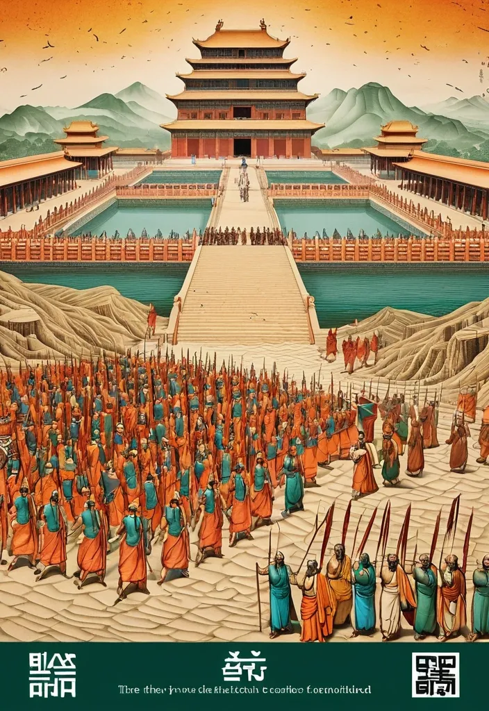
Theme: Ancient Water Conservancy Main palette: Sand path , sand , orange Structural method: another paper construction Micro scene: a tiny Walking march , performance Event details: 02 October , 05:30 am , Start Aspect ratio: 16:9 Design a historical and cultural poster with a modern Eastern editorial aesthetic , using "paper fibers + large color fields + micro-scenes" as the core visual language. Do not interpret traditional culture as stacking ancient architecture , calligraphy , auspicious clouds , or artifacts. Instead , first distill the Cultural Logic , then let large areas of handmade paper color fields directly carry structures , spaces , time , flow , order , or process relationships , so that viewers first see a strong and clear large form from afar , and only gradually discover the cultural narrative hidden within upon closer inspection. Use the dark green , sand style to establish 2–5 main paper color blocks of distinctly different sizes , maintaining low saturation but complete color intensity. All color blocks should have the authentic , rich texture of handmade paper , pulp , watercolor , or mineral pigments , with visible natural long and short fibers , pigment deposition , subtle impressions , large-scale natural color variations , and irregular torn paper edges. The overall effect should be matte , clean , and intact—avoid dirtiness , yellow spots , random speckles , cheap retro effects , or digital gradients. Based on the theme , let the color fields express the logic of system operations through folding , branching , interweaving , interlocking , offsetting , supporting , segmenting , enclosing , or negative space relationships , rather than simply serving as decorative backgrounds. Embed the Dadi march within the large color field structure , keeping figures and props at a very small scale , totaling about 3%–6% of the image area. Each scene must depict a clear action , with causal or temporal relationships between them , such as "entering → executing → recording → completing , " allowing the miniature figures to truly drive the narrative rather than just standing in poses. Figures' clothing in indian Freedom fighter style and artifacts should align with the theme's era and identity but remain restrained—avoid cinematic historical drama excess; scenes should only retain key props that illustrate systemic relationships , without cluttering with decorations or irrelevant cultural symbols. Typography should employ the editorial language of modern Eastern cultural institutions , museums , or archival exhibitions. The main title Dandi March should use refined Song typeface , publication-inspired Gujarati fonts , at a medium-small size that does not overpower the large color fields; supporting English text , dates , locations , and explanatory information should use even smaller sizes to create clear hierarchies. Subtle cinnabar seals , paper tags , archival labels , or node text may be added , but they must genuinely relate to the thematic logic—do not add them randomly just for a "Indian Freedom fighter style" feel. The overall reading order should be: large color field structures and color relationships → systemic or spatial logic → miniature figures' continuous narrative → main title and exhibition information. The final image should achieve a strong large form and visual impact from afar , revealing paper fibers , figure actions , and historical details up close , balancing design sensibility , narrative depth , and cultural completeness. Avoid book cover vibes , traditional Chinese illustration styles , screens full of ancient architecture , oversized titles , PPT-style rigid layouts , modern infographic arrows , meaningless English placeholders , element piling , commercial ad vibes , 3D CGI , glass textures , neon colors , logos , watermarks , numbering , and starburst decorations. ,
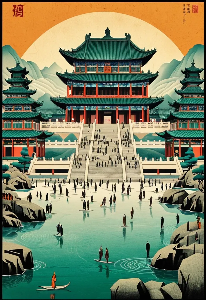
Theme: Ancient Water Conservancy Main palette: blue , dark green , orange Structural method: another paper construction Micro scene: a tiny Walking march , performance Event details: 02 October , venue , Start Aspect ratio: 9:16 Design a historical and cultural poster with a modern Eastern editorial aesthetic , using "paper fibers + large color fields + micro-scenes" as the core visual language. Do not interpret traditional culture as stacking ancient architecture , calligraphy , auspicious clouds , or artifacts. Instead , first distill the Cultural Logic , then let large areas of handmade paper color fields directly carry structures , spaces , time , flow , order , or process relationships , so that viewers first see a strong and clear large form from afar , and only gradually discover the cultural narrative hidden within upon closer inspection. Use the dark green , sand style to establish 2–5 main paper color blocks of distinctly different sizes , maintaining low saturation but complete color intensity. All color blocks should have the authentic , rich texture of handmade paper , pulp , watercolor , or mineral pigments , with visible natural long and short fibers , pigment deposition , subtle impressions , large-scale natural color variations , and irregular torn paper edges. The overall effect should be matte , clean , and intact—avoid dirtiness , yellow spots , random speckles , cheap retro effects , or digital gradients. Based on the theme , let the color fields express the logic of system operations through folding , branching , interweaving , interlocking , offsetting , supporting , segmenting , enclosing , or negative space relationships , rather than simply serving as decorative backgrounds. Embed the Dadi march within the large color field structure , keeping figures and props at a very small scale , totaling about 3%–6% of the image area. Each scene must depict a clear action , with causal or temporal relationships between them , such as "entering → executing → recording → completing , " allowing the miniature figures to truly drive the narrative rather than just standing in poses. Figures' clothing and artifacts should align with the theme's era and identity but remain restrained—avoid cinematic historical drama excess; scenes should only retain key props that illustrate systemic relationships , without cluttering with decorations or irrelevant cultural symbols. Typography should employ the editorial language of modern Eastern cultural institutions , museums , or archival exhibitions. The main title [Main Title] should use refined Song typeface , Ming-style , or publication-inspired Chinese fonts , at a medium-small size that does not overpower the large color fields; supporting English text , dates , locations , and explanatory information should use even smaller sizes to create clear hierarchies. Subtle cinnabar seals , paper tags , archival labels , or node text may be added , but they must genuinely relate to the thematic logic—do not add them randomly just for a "Chinese style" feel. The overall reading order should be: large color field structures and color relationships → systemic or spatial logic → miniature figures' continuous narrative → main title and exhibition information. The final image should achieve a strong large form and visual impact from afar , revealing paper fibers , figure actions , and historical details up close , balancing design sensibility , narrative depth , and cultural completeness. Avoid book cover vibes , traditional Chinese illustration styles , screens full of ancient architecture , oversized titles , PPT-style rigid layouts , modern infographic arrows , meaningless English placeholders , element piling , commercial ad vibes , 3D CGI , glass textures , neon colors , logos , watermarks , numbering , and starburst decorations. ,

TITLE: Warrior MEDIUM: drop SPATIAL MECHANISM: optical reveal SUBJECT: Ninja Warrior in magnificent Tang dynasty MAIN COLOR: water drop FORMAT: 9:20 vertical poster Create a contemporary volumetric perspective typography poster where the main word exists through elements distributed across real three-dimensional space rather than on a flat surface. Build the word from the chosen medium: layered Water drops. Individual elements should appear fragmented or abstract from other viewpoints , but align into one bold , readable word from the intended camera position. Keep Tang dynasty temple , with background depth. The typography should dominate roughly 30–55% of the composition while still revealing how the spatial structure creates it. For drops , build each letter from lines at different depths. If a person is included , keep them small and use them mainly as a scale reference , he is in action pose on the ground , both hands firmly gripping the large sword , the enormous sharp sword edge extending from the bottom-center foreground toward his face , muzzle pointed straight into the lens , intense direct eye contact , dramatic foreground sword blur. Overall style: perspective typography , volumetric installation , spatial graphic design , contemporary exhibition art , clean hierarchy and strong visual impact. Avoid flat printed text , ordinary 3D letters , weak depth , random distortion , neon sci-fi styling , excessive filler copy , cluttered backgrounds , watermarks and numbering. ,

TITLE: DROPS MEDIUM: drop SPATIAL MECHANISM: optical reveal SUBJECT: young beautiful East Asian woman in magnificent Tang dynasty MAIN COLOR: water drop FORMAT: 9:16 vertical poster Create a contemporary volumetric perspective typography poster where the main word exists through elements distributed across real three-dimensional space rather than on a flat surface. Build the word from the chosen medium: suspended threads , layered Water drops. Individual elements should appear fragmented or abstract from other viewpoints , but align into one bold , readable word from the intended camera position. Keep space foreground , with background depth. The typography should dominate roughly 35–55% of the composition while still revealing how the spatial structure creates it. For drops , build each letter from lines at different depths. If a person is included , keep them small and use them mainly as a scale reference , with low-angle forced-perspective composition: she is seated on the ground , both hands firmly gripping the gun , the enormous gun barrel extending from the bottom-center foreground toward her face , muzzle pointed straight into the lens , intense direct eye contact , dramatic foreground barrel blur. If a person is included , keep them small and use them mainly as a scale reference , with realistic occlusion between the subject and the spatial elements. Overall style: perspective typography , volumetric installation , spatial graphic design , contemporary exhibition art , clean hierarchy and strong visual impact. Avoid flat printed text , ordinary 3D letters , weak depth , random distortion , neon sci-fi styling , excessive filler copy , cluttered backgrounds , watermarks and numbering. ,

OBJECT SHAPE: Statue of lord Ganesha MEDIUM: points SPATIAL MECHANISM: depth SUBJECT: small mature man MAIN COLOR: Orange to yellow FORMAT: 1:1 vertical poster Create a contemporary volumetric perspective shape poster where the main object exists through elements distributed across real three-dimensional space rather than on a flat surface. Build the shape from the chosen medium: physical points. Individual elements should appear fragmented or abstract from other viewpoints , but align into one bold , visual shape from the intended camera position. Keep clear foreground , otherworldly city street with background depth. The shape structure should dominate roughly 35–55% of the composition while still revealing how the spatial structure creates it. For points , use suspended objects to form volumetric dots shapes. Overall style: perspective shape structure , volumetric installation , spatial graphic design , contemporary exhibition art , clean hierarchy and strong visual impact. Avoid flat printed text , ordinary 3D shapes , weak depth , random distortion , neon sci-fi styling , excessive filler copy , cluttered backgrounds , watermarks and numbering. ,

OBJECT SHAPE: flying Eagle MEDIUM: points SPATIAL MECHANISM: depth SUBJECT: small human figure MAIN COLOR: blue FORMAT: 9:16 vertical poster Create a contemporary volumetric perspective shape poster where the main object exists through elements distributed across real three-dimensional space rather than on a flat surface. Build the shape from the chosen medium: suspended threads , physical points , beams of light , layered line grids , or another spatial system. Individual elements should appear fragmented or abstract from other viewpoints , but align into one bold , visual shape from the intended camera position. Keep clear foreground , midground and background depth. The shape structure should dominate roughly 35–55% of the composition while still revealing how the spatial structure creates it. For points , use suspended objects to form volumetric dots shapes. If a person is included , keep them small and use them mainly as a scale reference , with realistic occlusion between the subject and the spatial elements. Use one strong accent color with a restrained architectural palette. Add only minimal editorial information such as project name , location , date and one short thematic line. Overall style: perspective shape structure , volumetric installation , spatial graphic design , contemporary exhibition art , clean hierarchy and strong visual impact. Avoid flat printed text , ordinary 3D shapes , weak depth , random distortion , neon sci-fi styling , excessive filler copy , cluttered backgrounds , watermarks and numbering. ,
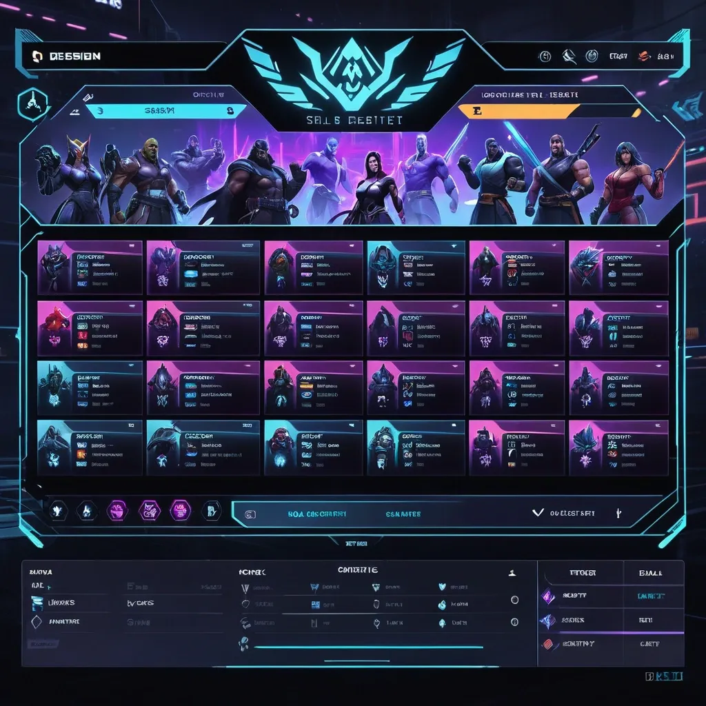
Create a premium , highly believable Character Select Screen for an imaginary game called NIGHT CIRCUIT. The goal is to make the interface feel like a real playable roster screen from a major game: visually addictive , commercially polished , instantly readable , and full of personality. It should feel like a screen players would pause on , screenshot , and obsess over before choosing their main. Game details: - Game title: NIGHT CIRCUIT - Genre: competitive fighting game - Core concept: a neon-noir 2D fighter where underground icons , assassins , idols , and synthetic rebels battle for control of a city-sized entertainment grid - Roster type: small elite cast - Main fantasy: choosing a stylish , dangerous fighter with a very specific attitude and mastering them completely - Audience: fighting-game fans , anime-game lovers , esports audiences , design-conscious gamers - Tone: stylish , competitive , electric , cinematic - Cultural vibe: anime fighter , arcade prestige , cyber-street fashion , esports polish - Reality level: believable AAA Screen structure: Build the interface like a real character selection menu. Include sections such as: - game logo or mode title - character grid or lineup - highlighted selected character - full character portrait or hero pose - character name - class / role / faction - stats or attributes - signature ability or move - optional difficulty rating - optional lock / unlock state - optional alternate skins or color variants - optional player cursor or selection frame For the roster , include: - 12 believable character slots - distinct silhouettes and identities - a coherent roster ecosystem - varied classes , archetypes , or playstyles - names that feel genre-appropriate and memorable Include: - a strong selected-character focus - premium UI hierarchy - readable roster logic - believable stat or role indicators - polished iconography - clear class/faction differentiation - strong "pick your main" energy - instantly shareable game-interface appeal Visual direction: - Make the screen feel like a real game menu players would see before a match or campaign start - Emphasize identity , hype , choice , and roster fantasy - Balance clean UX structure with strong character-worldbuilding - Make it suitable for social sharing , fake game concepts , fan-worldbuilding , gaming mockups , or launch materials - The result should look like a genuine roster screen from a popular game Art direction: - Style: premium anime-fighter character select UI with esports-ready polish - Color palette: black , electric violet , cyan , crimson , silver-grey - Typography feel: sharp arcade-sci-fi type with clean stat labels - Material feel: console match-lobby screen and tournament-ready roster interface - Lighting or image mood: neon glow , competitive energy , polished dark-mode interface - Background: abstract digital arena with city-grid light trails Composition: - Show the screen as one cohesive character-select interface - Make the selected character , roster , and key stats instantly readable - Use real game-menu hierarchy and interaction logic - Make the cast feel iconic , varied , and mechanically real - Make the final output feel like a premium fake game UI with viral potential Output quality: - ultra-detailed - visually structured - commercially believable - culturally fluent - polished gaming UI design - strong hierarchy and spacing - premium character-roster composition - instantly shareable visual concept Optional content blocks: - player 1 marker - random select slot - difficulty stars - alternate skin selector - faction icon - season character lock Avoid: - generic character poses - weak roster variety - fake-looking stat systems - cluttered interface - random icons without gameplay logic - amateur game-menu aesthetics - inconsistent character style across the roster - too much text fighting the UI ,