Search Results for instantly readable
Explore AI generated designs, images, art and prompts by top community artists and designers.
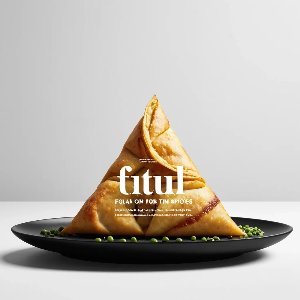

Brand: Aimosa Food: Samosa (popular fried or baked pastry with a savory filling , usually made with spiced potatoes , onions , and peas) Headline: Test of Street. Physical Interaction: FOLD. Accent Color: dark yellow Product Name: Samosa Price: 8$ Aspect Ratio: 9:16 Create a premium editorial food poster where real food physically interacts with and reshapes oversized typography , using a female open mouth background , bold white Heavy Grotesk typography , photorealistic food materials , generous negative space , and a broken editorial grid inspired by contemporary Indian food branding and high-end magazine design. The food and typography must exist inside the same physical world , the food should not simply overlap , decorate , or sit beside the letters , instead the selected physical action must visibly alter the typography through believable material behavior , geometry , heat , pressure , bending , abrasion , or surface transformation. A continuous food surface fold into a Triangle while the typography printed on that same surface bends , compresses , stretches , foreshortens , and wraps with it; Use only one main physical mechanism per poster , keep the cause and effect visually clear , untouched areas of the typography should remain hard , clean , geometric , and readable , all deformation should happen only where the food , tool , heat , or physical force actually makes contact. Use a broken editorial grid with strong scale contrast , asymmetric placement , edge information , small meaningful annotations , and large areas of negative space , add details such as Potatoes , Green peas , Fresh coriander leaves , Green chilies , 24hrs , and always available in hot , but avoid traditional menu rows , long horizontal divider lines , rigid bottom information bars , boxed prices , and template-like layouts. Use bold Grotesk Sans Serif for the main headline , high-contrast Editorial Serif or Italic Serif for product names , quotes , and prices , keep the palette minimal with a cream background , black typography , natural food colors , and one accent color. The final poster should feel clever , physical , premium , contemporary , and instantly readable at thumbnail size , the first glance should reveal the food and headline , the second glance should reveal the physical mechanism that has transformed the typography. ,
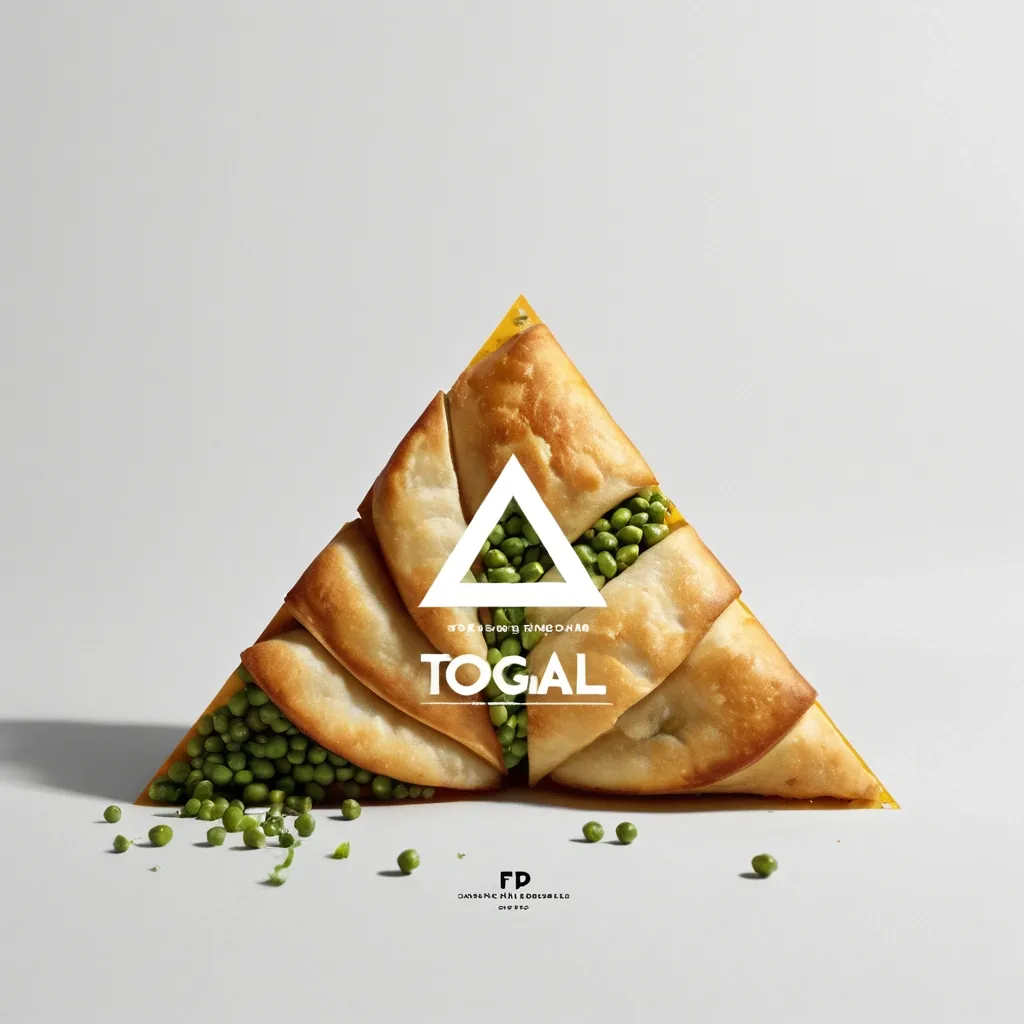
Brand: Aimosa Food: Samosa (popular fried or baked pastry with a savory filling , usually made with spiced potatoes , onions , and peas) Headline: Test of Street. Physical Interaction: FOLD. Accent Color: dark yellow Product Name: Samosa Price: 8$ Aspect Ratio: 9:16 Create a premium editorial food poster where real food physically interacts with and reshapes oversized typography , using a warm Night street background , bold white Heavy Grotesk typography , photorealistic food materials , generous negative space , and a broken editorial grid inspired by contemporary Indian food branding and high-end magazine design. The food and typography must exist inside the same physical world , the food should not simply overlap , decorate , or sit beside the letters , instead the selected physical action must visibly alter the typography through believable material behavior , geometry , heat , pressure , bending , abrasion , or surface transformation. A continuous food surface fold into a Triangle while the typography printed on that same surface bends , compresses , stretches , foreshortens , and wraps with it; Use only one main physical mechanism per poster , keep the cause and effect visually clear , untouched areas of the typography should remain hard , clean , geometric , and readable , all deformation should happen only where the food , tool , heat , or physical force actually makes contact. Use a broken editorial grid with strong scale contrast , asymmetric placement , edge information , small meaningful annotations , and large areas of negative space , add details such as Potatoes , Green peas , Fresh coriander leaves , Green chilies , 24hrs , and always available in hot , but avoid traditional menu rows , long horizontal divider lines , rigid bottom information bars , boxed prices , and template-like layouts. Use bold Grotesk Sans Serif for the main headline , high-contrast Editorial Serif or Italic Serif for product names , quotes , and prices , keep the palette minimal with a cream background , black typography , natural food colors , and one accent color. The final poster should feel clever , physical , premium , contemporary , and instantly readable at thumbnail size , the first glance should reveal the food and headline , the second glance should reveal the physical mechanism that has transformed the typography. ,
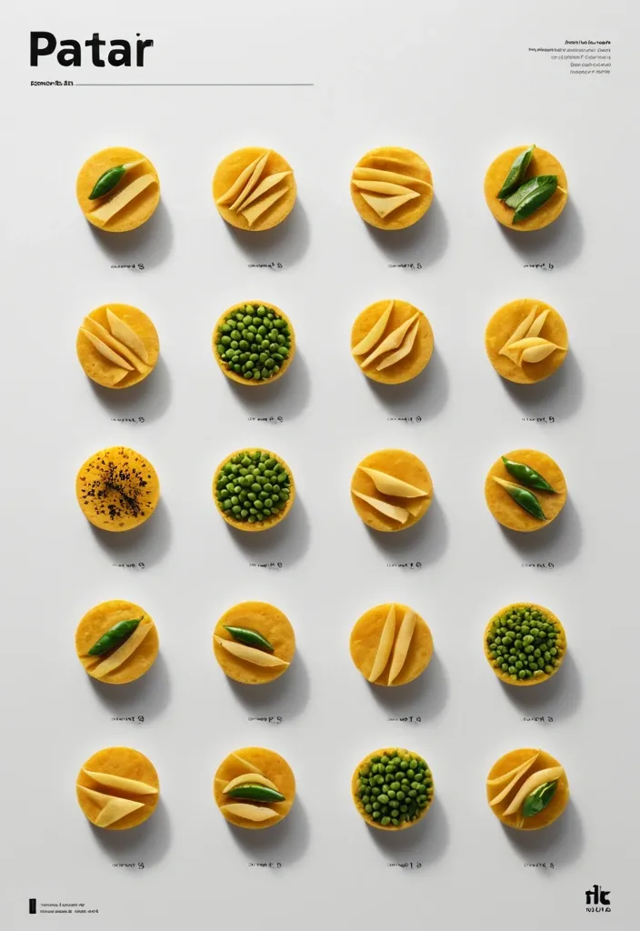
Brand: Duotone Food: Samosa (popular fried or baked pastry with a savory filling , usually made with spiced potatoes , onions , and peas) Headline: Saving of Pocket Physical Interaction: FOLD Accent Color: dark yellow Product Name: બારાસ Price: 8$ Aspect Ratio: 9:16 Create a premium editorial food poster where real food physically interacts with and reshapes oversized typography , using a warm Night street background , bold white Heavy Grotesk typography , photorealistic food materials , generous negative space , and a broken editorial grid inspired by contemporary Indian food branding and high-end magazine design. The food and typography must exist inside the same physical world , the food should not simply overlap , decorate , or sit beside the letters , instead the selected physical action must visibly alter the typography through believable material behavior , geometry , heat , pressure , bending , abrasion , or surface transformation. typography printed directly onto a thin food surface follows the same crease , perspective compression , rotation , and occlusion as the food is physically folded; Use only one main physical mechanism per poster , keep the cause and effect visually clear , untouched areas of the typography should remain hard , clean , geometric , and readable , all deformation should happen only where the food , tool , heat , or physical force actually makes contact. Use a broken editorial grid with strong scale contrast , asymmetric placement , edge information , small meaningful annotations , and large areas of negative space , add details such as Potatoes , Green peas , Fresh coriander leaves , Green chilies , 24hrs , Xyz Lane , and always available in hot , but avoid traditional menu rows , long horizontal divider lines , rigid bottom information bars , boxed prices , and template-like layouts. Use bold Grotesk Sans Serif for the main headline , high-contrast Editorial Serif or Italic Serif for product names , quotes , and prices , keep the palette minimal with a cream background , black typography , natural food colors , and one accent color. The final poster should feel clever , physical , premium , contemporary , and instantly readable at thumbnail size , the first glance should reveal the food and headline , the second glance should reveal the physical mechanism that has transformed the typography. ,
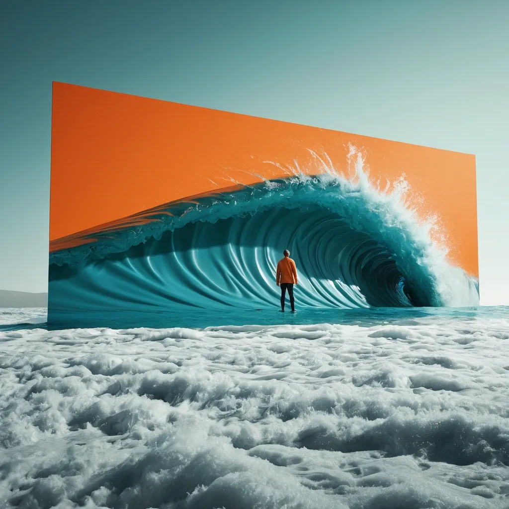
Create a spectacular stop-scrolling surreal editorial advertising poster in a vertical 4:5 composition. CORE CONCEPT Take an untouchable element of reality—OCEAN LANDSCAPE—and make it physically behave like LIQUID . Show one monumental physical action: STRETCH IT. Behind the manipulated reality , reveal surfing man. The contrast must instantly communicate Welcome. The concept should be understandable within one second without relying on text. SCALE & REALISM Make the intervention enormous , affecting a major portion of the environment so reality itself feels tangible. Give the material convincing thickness , folds , tension , torn edges , wrinkles , reflections , shadows , deformation , or wetness appropriate to its physical properties. COLOR Use strong controlled contrast: Visible world: blue Hidden world: green Accent: orange Limit the palette to 3–4 dominant colors. TYPOGRAPHY Headline: "LISHOTTA" — maximum 2–5 words. Use one premium editorial typeface: ULTRA-CONDENSED GROTESK. Integrate the typography into the physical action. Letters may tear , fold , bend , disappear behind the opening , change color , or follow the distorted surface. Keep the headline instantly readable at thumbnail size. VISUAL STANDARD World-class conceptual advertising , surreal photography , monumental scale , hyperreal material behavior , cinematic lighting , bold negative space , controlled color blocking , tactile print texture , subtle analog film grain , and one unforgettable visual idea. The final image should trigger an immediate “HOW IS THAT POSSIBLE?” reaction while remaining elegant , sophisticated , and suitable for a global fashion , culture , or creative campaign. ,
Ultra-realistic high end commercial food photography , vertical 3:4 composition. Three adorable cute dragon-shaped samosa arranged diagonally on a premium light pastel-green ceramic plate , placed on a beautifully textured rustic wooden table. Each samosa is handcrafted from fresh , glossy emerald green bamboo leaves , tightly wrapped and naturally tied with fine beige twine. The central portion of each dumpling is sculpted from soft , pearlescent white sticky rice into a charming baby dragon face , with adorable round black eyes , a tiny golden-yellow nose , a sweet smiling mouth , two small curved horns , tiny pointed ears , and delicate dragon whiskers. Small edible pink accents on the cheeks and tiny golden details add extra cuteness. The dragon faces should look cute , friendly , playful , and instantly recognizable , inspired by traditional East Asian dragon aesthetics but with a soft baby-like appearance. Each dragon has slightly different facial expressions and charming personality. The sticky rice looks freshly steamed , soft , glossy , moist , plump , and slightly translucent , with individually visible rice grains and realistic natural texture. The bamboo leaves feature detailed veins , subtle wrinkles , fresh moisture , and realistic glossy highlights. Create a strong visual hierarchy: the front dragon samosa is the hero subject , slightly larger and in razor-sharp focus , while the two behind it gradually fade into creamy cinematic bokeh. Arrange all three with slight overlap and natural depth , creating a visually dynamic diagonal composition. Add a few loose bamboo leaves , tiny sticky-rice grains , and subtle leaf fragments around the plate for authentic handcrafted detail. Warm rustic wooden background softly blurred into an elegant golden-green bokeh. Lighting: soft warm natural window light from the upper left , subtle golden rim lighting , delicate highlights on the sticky rice and bamboo leaves , gentle realistic shadows , appetizing warm glow. Camera: professional full-frame camera , 85mm macro lens , f/2.8 , ISO 100 , 1/200s , shallow depth of field , razor-sharp focus on the front dragon face , realistic optical bokeh , natural perspective. Visual style: premium commercial food advertising , adorable East Asian-inspired aesthetic , photorealistic , ultra-detailed , cinematic realism , vibrant but natural colors , mouth-watering presentation , sophisticated styling , 8K texture detail. Composition: vertical 3:4 , hero dragon positioned slightly below the upper third , three dumplings forming a strong diagonal flow , foreground depth , balanced negative space , highly eye-catching and instantly readable. Negative prompt: scary dragon , aggressive expression , realistic animal head , sharp teeth , monstrous features , deformed face , extra horns , extra eyes , malformed ears , distorted rice , plastic texture , fake bamboo leaves , excessive props , messy composition , cartoon illustration , CGI appearance , low detail , blurry subject , text , logo , watermark. ,
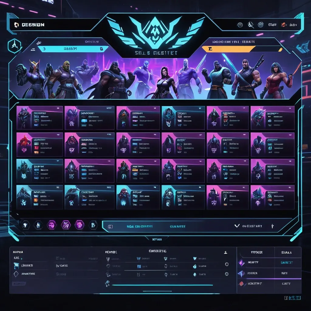
Create a premium , highly believable Character Select Screen for an imaginary game called NIGHT CIRCUIT. The goal is to make the interface feel like a real playable roster screen from a major game: visually addictive , commercially polished , instantly readable , and full of personality. It should feel like a screen players would pause on , screenshot , and obsess over before choosing their main. Game details: - Game title: NIGHT CIRCUIT - Genre: competitive fighting game - Core concept: a neon-noir 2D fighter where underground icons , assassins , idols , and synthetic rebels battle for control of a city-sized entertainment grid - Roster type: small elite cast - Main fantasy: choosing a stylish , dangerous fighter with a very specific attitude and mastering them completely - Audience: fighting-game fans , anime-game lovers , esports audiences , design-conscious gamers - Tone: stylish , competitive , electric , cinematic - Cultural vibe: anime fighter , arcade prestige , cyber-street fashion , esports polish - Reality level: believable AAA Screen structure: Build the interface like a real character selection menu. Include sections such as: - game logo or mode title - character grid or lineup - highlighted selected character - full character portrait or hero pose - character name - class / role / faction - stats or attributes - signature ability or move - optional difficulty rating - optional lock / unlock state - optional alternate skins or color variants - optional player cursor or selection frame For the roster , include: - 12 believable character slots - distinct silhouettes and identities - a coherent roster ecosystem - varied classes , archetypes , or playstyles - names that feel genre-appropriate and memorable Include: - a strong selected-character focus - premium UI hierarchy - readable roster logic - believable stat or role indicators - polished iconography - clear class/faction differentiation - strong "pick your main" energy - instantly shareable game-interface appeal Visual direction: - Make the screen feel like a real game menu players would see before a match or campaign start - Emphasize identity , hype , choice , and roster fantasy - Balance clean UX structure with strong character-worldbuilding - Make it suitable for social sharing , fake game concepts , fan-worldbuilding , gaming mockups , or launch materials - The result should look like a genuine roster screen from a popular game Art direction: - Style: premium anime-fighter character select UI with esports-ready polish - Color palette: black , electric violet , cyan , crimson , silver-grey - Typography feel: sharp arcade-sci-fi type with clean stat labels - Material feel: console match-lobby screen and tournament-ready roster interface - Lighting or image mood: neon glow , competitive energy , polished dark-mode interface - Background: abstract digital arena with city-grid light trails Composition: - Show the screen as one cohesive character-select interface - Make the selected character , roster , and key stats instantly readable - Use real game-menu hierarchy and interaction logic - Make the cast feel iconic , varied , and mechanically real - Make the final output feel like a premium fake game UI with viral potential Output quality: - ultra-detailed - visually structured - commercially believable - culturally fluent - polished gaming UI design - strong hierarchy and spacing - premium character-roster composition - instantly shareable visual concept Optional content blocks: - player 1 marker - random select slot - difficulty stars - alternate skin selector - faction icon - season character lock Avoid: - generic character poses - weak roster variety - fake-looking stat systems - cluttered interface - random icons without gameplay logic - amateur game-menu aesthetics - inconsistent character style across the roster - too much text fighting the UI ,