Search Results for Create a premium
Explore AI generated designs, images, art and prompts by top community artists and designers.
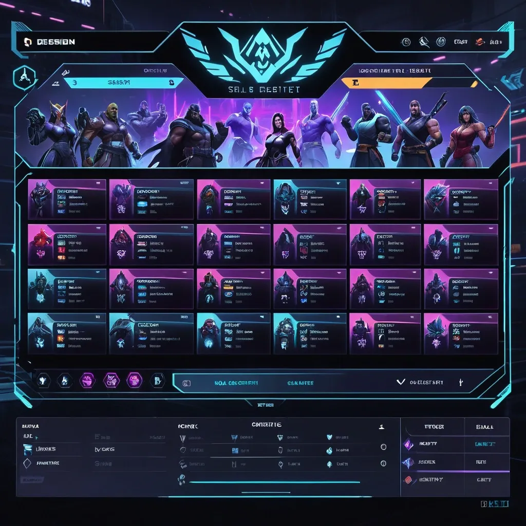

Create a premium , highly believable Character Select Screen for an imaginary game called NIGHT CIRCUIT. The goal is to make the interface feel like a real playable roster screen from a major game: visually addictive , commercially polished , instantly readable , and full of personality. It should feel like a screen players would pause on , screenshot , and obsess over before choosing their main. Game details: - Game title: NIGHT CIRCUIT - Genre: competitive fighting game - Core concept: a neon-noir 2D fighter where underground icons , assassins , idols , and synthetic rebels battle for control of a city-sized entertainment grid - Roster type: small elite cast - Main fantasy: choosing a stylish , dangerous fighter with a very specific attitude and mastering them completely - Audience: fighting-game fans , anime-game lovers , esports audiences , design-conscious gamers - Tone: stylish , competitive , electric , cinematic - Cultural vibe: anime fighter , arcade prestige , cyber-street fashion , esports polish - Reality level: believable AAA Screen structure: Build the interface like a real character selection menu. Include sections such as: - game logo or mode title - character grid or lineup - highlighted selected character - full character portrait or hero pose - character name - class / role / faction - stats or attributes - signature ability or move - optional difficulty rating - optional lock / unlock state - optional alternate skins or color variants - optional player cursor or selection frame For the roster , include: - 12 believable character slots - distinct silhouettes and identities - a coherent roster ecosystem - varied classes , archetypes , or playstyles - names that feel genre-appropriate and memorable Include: - a strong selected-character focus - premium UI hierarchy - readable roster logic - believable stat or role indicators - polished iconography - clear class/faction differentiation - strong "pick your main" energy - instantly shareable game-interface appeal Visual direction: - Make the screen feel like a real game menu players would see before a match or campaign start - Emphasize identity , hype , choice , and roster fantasy - Balance clean UX structure with strong character-worldbuilding - Make it suitable for social sharing , fake game concepts , fan-worldbuilding , gaming mockups , or launch materials - The result should look like a genuine roster screen from a popular game Art direction: - Style: premium anime-fighter character select UI with esports-ready polish - Color palette: black , electric violet , cyan , crimson , silver-grey - Typography feel: sharp arcade-sci-fi type with clean stat labels - Material feel: console match-lobby screen and tournament-ready roster interface - Lighting or image mood: neon glow , competitive energy , polished dark-mode interface - Background: abstract digital arena with city-grid light trails Composition: - Show the screen as one cohesive character-select interface - Make the selected character , roster , and key stats instantly readable - Use real game-menu hierarchy and interaction logic - Make the cast feel iconic , varied , and mechanically real - Make the final output feel like a premium fake game UI with viral potential Output quality: - ultra-detailed - visually structured - commercially believable - culturally fluent - polished gaming UI design - strong hierarchy and spacing - premium character-roster composition - instantly shareable visual concept Optional content blocks: - player 1 marker - random select slot - difficulty stars - alternate skin selector - faction icon - season character lock Avoid: - generic character poses - weak roster variety - fake-looking stat systems - cluttered interface - random icons without gameplay logic - amateur game-menu aesthetics - inconsistent character style across the roster - too much text fighting the UI ,
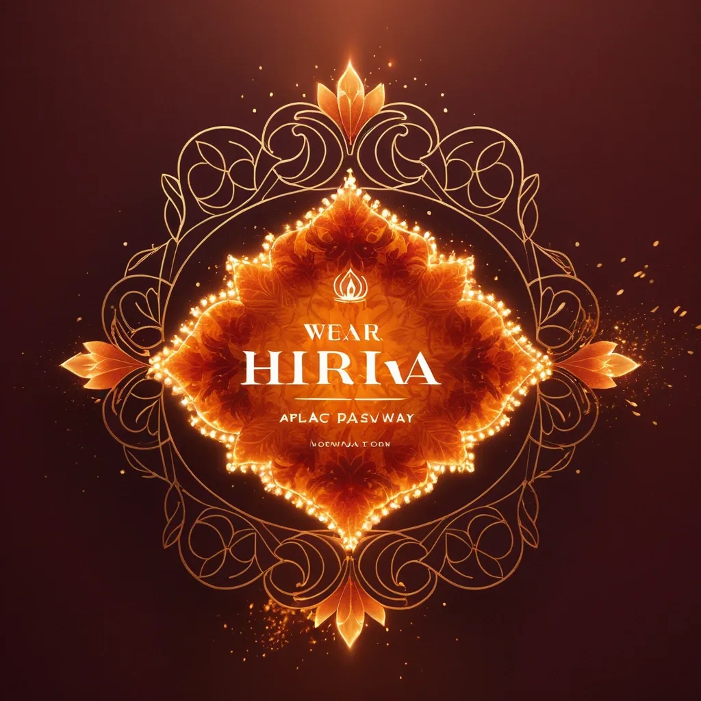
Create a premium festive Instagram post in 4:5 portrait ratio (1080x1350) for occasion of Holika Dahan. MAIN VISUAL CONCEPT – Elegant Holika Dahan bonfire glowing in the center – Warm golden-orange flames (controlled , aesthetic , not chaotic) – Subtle flower petals floating in air – Soft festive spark particles BRAND PRESENCE – Place Laam Herbals logo at bottom center – Small elegant product silhouettes (very subtle , optional) – Brand name in premium gold font BACKGROUND – Deep warm sunset gradient (orange blending into soft maroon) – Subtle temple or traditional pattern texture (very faint) – No clutter TEXT (ROYAL GOLD / WARM CREAM) MAIN GREETING (Large & Elegant): ✨ “Happy Holika Dahan” ✨ SUBTEXT: “May this sacred fire burn away negativity and illuminate your life with purity and prosperity.” – Luxury serif typography – Center aligned – Balanced spacing – Soft glowing text effect LIGHTING – Warm golden glow from fire reflecting on text – Cinematic festive lighting MOOD Sacred • Warm • Festive • Elegant • Premium Brand Greeting Quality: Ultra-HD Style: Luxury festive brand campaign Aspect Ratio: 4:5 portrait ,
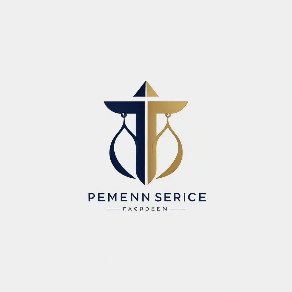
Create a premium minimalist logo for a law firm named “Femida Service”. Concept: – Symbol: elegant scales of justice , stylized or abstract , representing balance , law , and fairness. – Combine the symbol with clean , professional typography. – The logo should convey authority , trust , and modern professionalism. Design Style: – Minimalist and geometric. – Flat vector look — no gradients , shadows , or 3D effects. – Balanced composition with precise symmetry and generous white space. Colors: – Primary: Deep Navy Blue (#0D1B2A) – Accent: Judicial Gold (#C9A646) – Background: White or transparent Typography: – Use uppercase letters: FEMIDA SERVICE – Choose a serif or clean sans-serif font (e.g. , Playfair Display , Lora , Inter , or Helvetica Neue). Mood keywords: – Elegant , corporate , timeless , confident , law , justice , balance , premium , clarity. Goal: A logo suitable for a legal firm website , business cards , official documents , and presentations — clean , memorable , and professional. ,
Create a premium minimalist logo for a law firm named “Femida Service”. Concept: – Symbol: elegant scales of justice , stylized or abstract , representing balance , law , and fairness. – Combine the symbol with clean , professional typography. – The logo should convey authority , trust , and modern professionalism. Design Style: – Minimalist and geometric. – Flat vector look — no gradients , shadows , or 3D effects. – Balanced composition with precise symmetry and generous white space. Colors: – Primary: Deep Navy Blue (#0D1B2A) – Accent: Judicial Gold (#C9A646) – Background: White or transparent Typography: – Use uppercase letters: FEMIDA SERVICE – Choose a serif or clean sans-serif font (e.g. , Playfair Display , Lora , Inter , or Helvetica Neue). Mood keywords: – Elegant , corporate , timeless , confident , law , justice , balance , premium , clarity. Goal: A logo suitable for a legal firm website , business cards , official documents , and presentations — clean , memorable , and professional. ,
Create a premium service card for a design studio for retouching high-end photos. The card should be designed in a modern , minimalistic style , with elegant fonts , soft shadows and a luxurious color palette (black , gold , white and beige). Include icons or small visual elements representing each service. The design should be clear , professional and suitable for a premium branding agency. High resolution , ready to work on the Internet and print.” ,