Search Results for random
Explore AI generated designs, images, art and prompts by top community artists and designers.
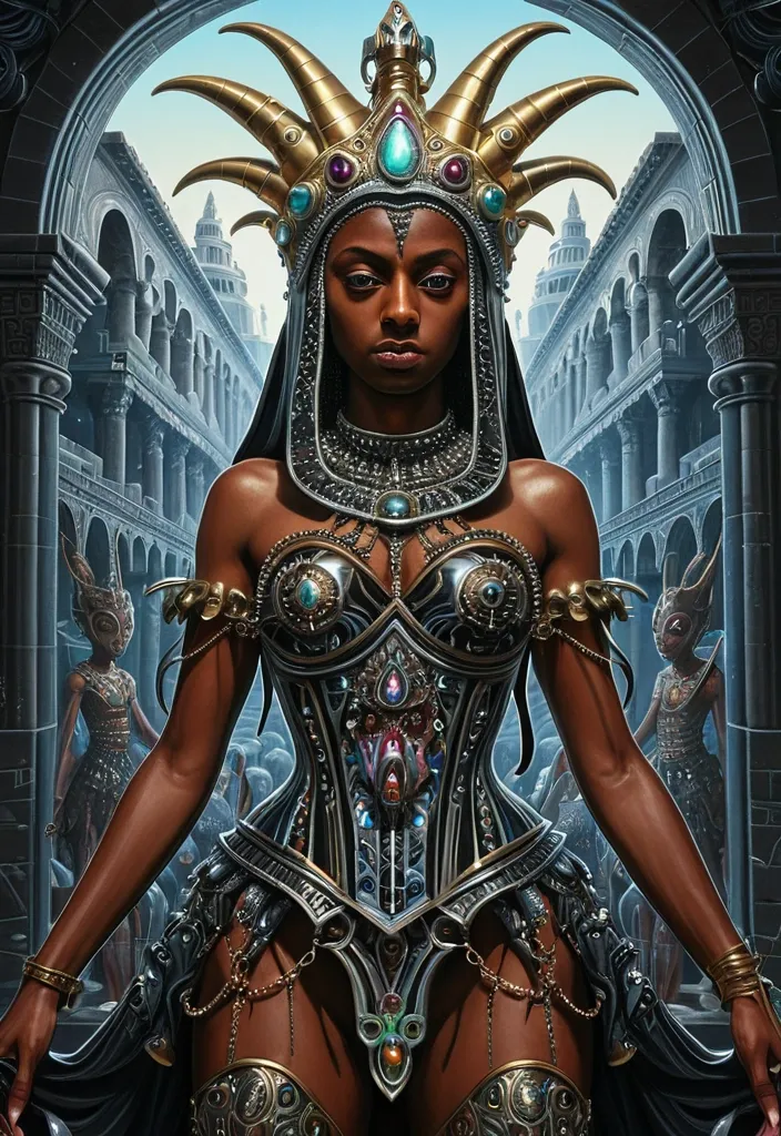

Hypnotic Upside-Down farming: A colorful random surreal hyper-realism style Illustrations , M.C. Escher-inspired , painting , a Greek Warriors protecting blacked skinned queen from devils. She is wearing an ornate , crystal-encrusted corset top and a matching , shimmering chain-mail-style hood that drapes over her head and shoulders , cascading like starlight. Her lower half is draped in a glossy. Epic cinematic brilliant stunning intricate meticulously detailed dramatic atmospheric maximalist digital matte painting. Ratio 4:5. ,
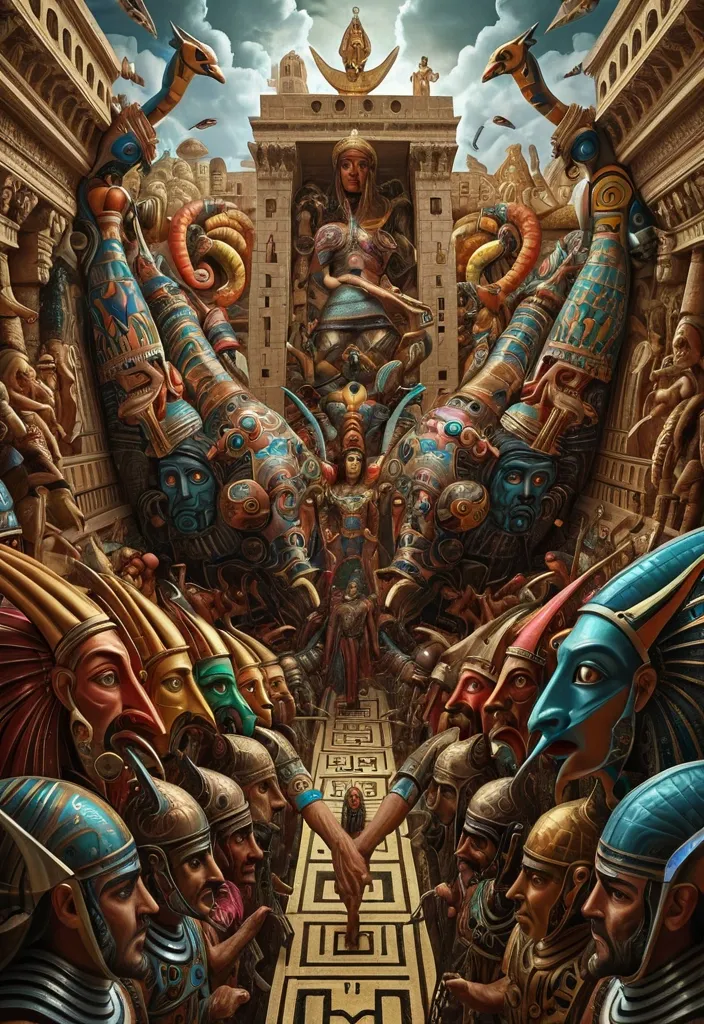
Hypnotic Upside-Down farming: A M.C. Escher-inspired colorful random surreal hyper-realism style Illustrations , painting , A Greek Warriors protecting Cleopatra queen from devils , Epic cinematic brilliant stunning intricate meticulously detailed dramatic atmospheric maximalist digital matte painting. Ratio 4:5. ,
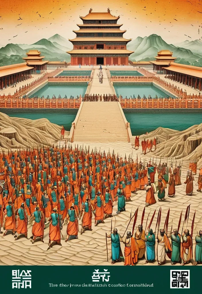
Theme: Ancient Water Conservancy Main palette: Sand path , sand , orange Structural method: another paper construction Micro scene: a tiny Walking march , performance Event details: 02 October , 05:30 am , Start Aspect ratio: 16:9 Design a historical and cultural poster with a modern Eastern editorial aesthetic , using "paper fibers + large color fields + micro-scenes" as the core visual language. Do not interpret traditional culture as stacking ancient architecture , calligraphy , auspicious clouds , or artifacts. Instead , first distill the Cultural Logic , then let large areas of handmade paper color fields directly carry structures , spaces , time , flow , order , or process relationships , so that viewers first see a strong and clear large form from afar , and only gradually discover the cultural narrative hidden within upon closer inspection. Use the dark green , sand style to establish 2–5 main paper color blocks of distinctly different sizes , maintaining low saturation but complete color intensity. All color blocks should have the authentic , rich texture of handmade paper , pulp , watercolor , or mineral pigments , with visible natural long and short fibers , pigment deposition , subtle impressions , large-scale natural color variations , and irregular torn paper edges. The overall effect should be matte , clean , and intact—avoid dirtiness , yellow spots , random speckles , cheap retro effects , or digital gradients. Based on the theme , let the color fields express the logic of system operations through folding , branching , interweaving , interlocking , offsetting , supporting , segmenting , enclosing , or negative space relationships , rather than simply serving as decorative backgrounds. Embed the Dadi march within the large color field structure , keeping figures and props at a very small scale , totaling about 3%–6% of the image area. Each scene must depict a clear action , with causal or temporal relationships between them , such as "entering → executing → recording → completing , " allowing the miniature figures to truly drive the narrative rather than just standing in poses. Figures' clothing in indian Freedom fighter style and artifacts should align with the theme's era and identity but remain restrained—avoid cinematic historical drama excess; scenes should only retain key props that illustrate systemic relationships , without cluttering with decorations or irrelevant cultural symbols. Typography should employ the editorial language of modern Eastern cultural institutions , museums , or archival exhibitions. The main title Dandi March should use refined Song typeface , publication-inspired Gujarati fonts , at a medium-small size that does not overpower the large color fields; supporting English text , dates , locations , and explanatory information should use even smaller sizes to create clear hierarchies. Subtle cinnabar seals , paper tags , archival labels , or node text may be added , but they must genuinely relate to the thematic logic—do not add them randomly just for a "Indian Freedom fighter style" feel. The overall reading order should be: large color field structures and color relationships → systemic or spatial logic → miniature figures' continuous narrative → main title and exhibition information. The final image should achieve a strong large form and visual impact from afar , revealing paper fibers , figure actions , and historical details up close , balancing design sensibility , narrative depth , and cultural completeness. Avoid book cover vibes , traditional Chinese illustration styles , screens full of ancient architecture , oversized titles , PPT-style rigid layouts , modern infographic arrows , meaningless English placeholders , element piling , commercial ad vibes , 3D CGI , glass textures , neon colors , logos , watermarks , numbering , and starburst decorations. ,
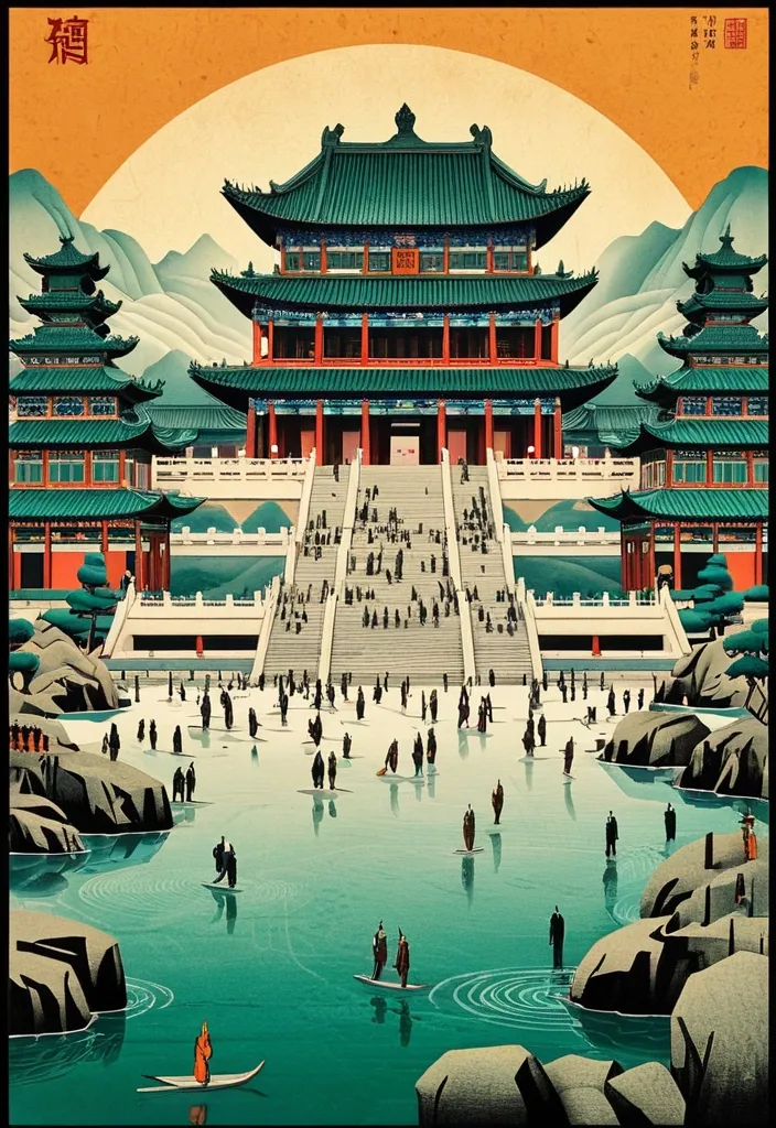
Theme: Ancient Water Conservancy Main palette: blue , dark green , orange Structural method: another paper construction Micro scene: a tiny Walking march , performance Event details: 02 October , venue , Start Aspect ratio: 9:16 Design a historical and cultural poster with a modern Eastern editorial aesthetic , using "paper fibers + large color fields + micro-scenes" as the core visual language. Do not interpret traditional culture as stacking ancient architecture , calligraphy , auspicious clouds , or artifacts. Instead , first distill the Cultural Logic , then let large areas of handmade paper color fields directly carry structures , spaces , time , flow , order , or process relationships , so that viewers first see a strong and clear large form from afar , and only gradually discover the cultural narrative hidden within upon closer inspection. Use the dark green , sand style to establish 2–5 main paper color blocks of distinctly different sizes , maintaining low saturation but complete color intensity. All color blocks should have the authentic , rich texture of handmade paper , pulp , watercolor , or mineral pigments , with visible natural long and short fibers , pigment deposition , subtle impressions , large-scale natural color variations , and irregular torn paper edges. The overall effect should be matte , clean , and intact—avoid dirtiness , yellow spots , random speckles , cheap retro effects , or digital gradients. Based on the theme , let the color fields express the logic of system operations through folding , branching , interweaving , interlocking , offsetting , supporting , segmenting , enclosing , or negative space relationships , rather than simply serving as decorative backgrounds. Embed the Dadi march within the large color field structure , keeping figures and props at a very small scale , totaling about 3%–6% of the image area. Each scene must depict a clear action , with causal or temporal relationships between them , such as "entering → executing → recording → completing , " allowing the miniature figures to truly drive the narrative rather than just standing in poses. Figures' clothing and artifacts should align with the theme's era and identity but remain restrained—avoid cinematic historical drama excess; scenes should only retain key props that illustrate systemic relationships , without cluttering with decorations or irrelevant cultural symbols. Typography should employ the editorial language of modern Eastern cultural institutions , museums , or archival exhibitions. The main title [Main Title] should use refined Song typeface , Ming-style , or publication-inspired Chinese fonts , at a medium-small size that does not overpower the large color fields; supporting English text , dates , locations , and explanatory information should use even smaller sizes to create clear hierarchies. Subtle cinnabar seals , paper tags , archival labels , or node text may be added , but they must genuinely relate to the thematic logic—do not add them randomly just for a "Chinese style" feel. The overall reading order should be: large color field structures and color relationships → systemic or spatial logic → miniature figures' continuous narrative → main title and exhibition information. The final image should achieve a strong large form and visual impact from afar , revealing paper fibers , figure actions , and historical details up close , balancing design sensibility , narrative depth , and cultural completeness. Avoid book cover vibes , traditional Chinese illustration styles , screens full of ancient architecture , oversized titles , PPT-style rigid layouts , modern infographic arrows , meaningless English placeholders , element piling , commercial ad vibes , 3D CGI , glass textures , neon colors , logos , watermarks , numbering , and starburst decorations. ,
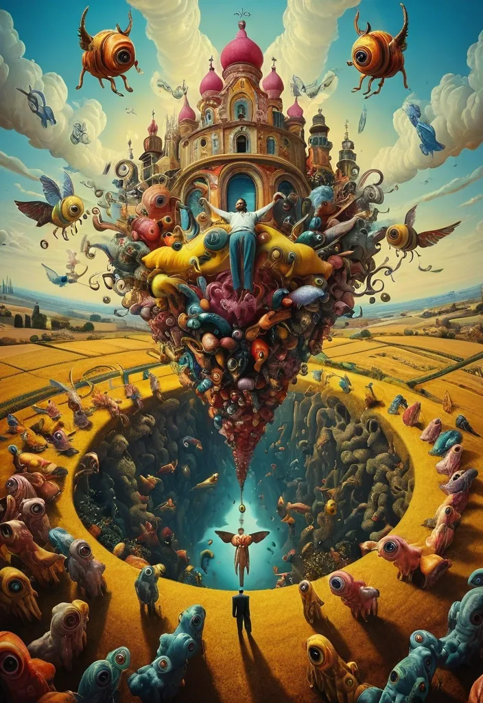
Hypnotic Upside-Down farming: A colorful random surreal hyper-realism style Illustrations , painting , illustration , angels protecting souls from devils , Epic cinematic brilliant stunning intricate meticulously detailed dramatic atmospheric maximalist digital Surrealism. Salvador Dalí's artistic style. ,
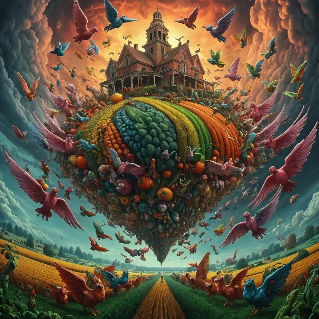

TITLE: Warrior MEDIUM: drop SPATIAL MECHANISM: optical reveal SUBJECT: Ninja Warrior in magnificent Tang dynasty MAIN COLOR: water drop FORMAT: 9:20 vertical poster Create a contemporary volumetric perspective typography poster where the main word exists through elements distributed across real three-dimensional space rather than on a flat surface. Build the word from the chosen medium: layered Water drops. Individual elements should appear fragmented or abstract from other viewpoints , but align into one bold , readable word from the intended camera position. Keep Tang dynasty temple , with background depth. The typography should dominate roughly 30–55% of the composition while still revealing how the spatial structure creates it. For drops , build each letter from lines at different depths. If a person is included , keep them small and use them mainly as a scale reference , he is in action pose on the ground , both hands firmly gripping the large sword , the enormous sharp sword edge extending from the bottom-center foreground toward his face , muzzle pointed straight into the lens , intense direct eye contact , dramatic foreground sword blur. Overall style: perspective typography , volumetric installation , spatial graphic design , contemporary exhibition art , clean hierarchy and strong visual impact. Avoid flat printed text , ordinary 3D letters , weak depth , random distortion , neon sci-fi styling , excessive filler copy , cluttered backgrounds , watermarks and numbering. ,

TITLE: DROPS MEDIUM: drop SPATIAL MECHANISM: optical reveal SUBJECT: young beautiful East Asian woman in magnificent Tang dynasty MAIN COLOR: water drop FORMAT: 9:16 vertical poster Create a contemporary volumetric perspective typography poster where the main word exists through elements distributed across real three-dimensional space rather than on a flat surface. Build the word from the chosen medium: suspended threads , layered Water drops. Individual elements should appear fragmented or abstract from other viewpoints , but align into one bold , readable word from the intended camera position. Keep space foreground , with background depth. The typography should dominate roughly 35–55% of the composition while still revealing how the spatial structure creates it. For drops , build each letter from lines at different depths. If a person is included , keep them small and use them mainly as a scale reference , with low-angle forced-perspective composition: she is seated on the ground , both hands firmly gripping the gun , the enormous gun barrel extending from the bottom-center foreground toward her face , muzzle pointed straight into the lens , intense direct eye contact , dramatic foreground barrel blur. If a person is included , keep them small and use them mainly as a scale reference , with realistic occlusion between the subject and the spatial elements. Overall style: perspective typography , volumetric installation , spatial graphic design , contemporary exhibition art , clean hierarchy and strong visual impact. Avoid flat printed text , ordinary 3D letters , weak depth , random distortion , neon sci-fi styling , excessive filler copy , cluttered backgrounds , watermarks and numbering. ,

OBJECT SHAPE: Statue of lord Ganesha MEDIUM: points SPATIAL MECHANISM: depth SUBJECT: small mature man MAIN COLOR: Orange to yellow FORMAT: 1:1 vertical poster Create a contemporary volumetric perspective shape poster where the main object exists through elements distributed across real three-dimensional space rather than on a flat surface. Build the shape from the chosen medium: physical points. Individual elements should appear fragmented or abstract from other viewpoints , but align into one bold , visual shape from the intended camera position. Keep clear foreground , otherworldly city street with background depth. The shape structure should dominate roughly 35–55% of the composition while still revealing how the spatial structure creates it. For points , use suspended objects to form volumetric dots shapes. Overall style: perspective shape structure , volumetric installation , spatial graphic design , contemporary exhibition art , clean hierarchy and strong visual impact. Avoid flat printed text , ordinary 3D shapes , weak depth , random distortion , neon sci-fi styling , excessive filler copy , cluttered backgrounds , watermarks and numbering. ,

OBJECT SHAPE: flying Eagle MEDIUM: points SPATIAL MECHANISM: depth SUBJECT: small human figure MAIN COLOR: blue FORMAT: 9:16 vertical poster Create a contemporary volumetric perspective shape poster where the main object exists through elements distributed across real three-dimensional space rather than on a flat surface. Build the shape from the chosen medium: suspended threads , physical points , beams of light , layered line grids , or another spatial system. Individual elements should appear fragmented or abstract from other viewpoints , but align into one bold , visual shape from the intended camera position. Keep clear foreground , midground and background depth. The shape structure should dominate roughly 35–55% of the composition while still revealing how the spatial structure creates it. For points , use suspended objects to form volumetric dots shapes. If a person is included , keep them small and use them mainly as a scale reference , with realistic occlusion between the subject and the spatial elements. Use one strong accent color with a restrained architectural palette. Add only minimal editorial information such as project name , location , date and one short thematic line. Overall style: perspective shape structure , volumetric installation , spatial graphic design , contemporary exhibition art , clean hierarchy and strong visual impact. Avoid flat printed text , ordinary 3D shapes , weak depth , random distortion , neon sci-fi styling , excessive filler copy , cluttered backgrounds , watermarks and numbering. ,
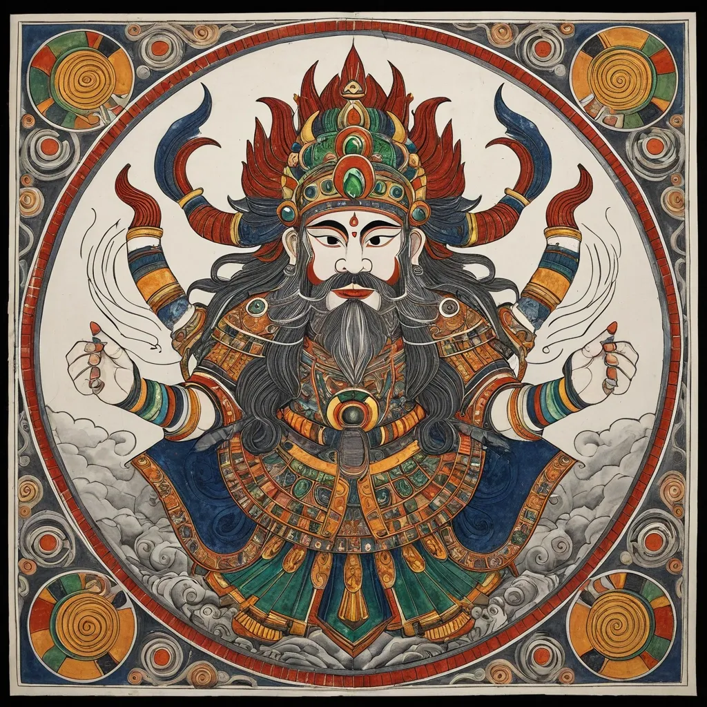
Generate an illustration of an Eastern deity in the style of Madhubani art sacred art , centering on the Zhong Kui and incorporating the Fire-Tipped Spear and Divine Beast to create a cohesive composition. Elements such as artifacts , wings , ghosts , ribbons , clouds , or divine manifestations must not serve merely as decoration; instead , they must collectively form clear structural patterns—such as diagonals , circles , S-curves , radial lines , or frontal subjugation poses—to imbue the image with a distinct sense of dynamic momentum (*shi*). The overall style should blend the aesthetics of traditional deity paintings , *Gongbi* heavy-color painting , *Baimiao* (fine-line drawing) , and ancient illustrated scrolls. The figure should appear solemn , divine , and imposing , avoiding the look of modern idols or game CG characters. Attire should follow traditional systems of divine robes , armor , and headdresses , incorporating continuous patterns such as cloud , thunder , scale , beast-face , meander (Greek key) , and scrolling vine motifs. Prioritize highly continuous Madhubani art line work: render hair , beards , and the fur or feathers of divine beasts with smooth , long lines that follow natural flow; depict clouds , garment hems , and ribbons using unbroken S-curves and C-curves; ensure that patterns on armor , crowns , and clothing are structurally complete and continuously closed. Minimize fragmented textures; avoid random short strokes , dense broken lines , jagged hair edges , or noise-like etching patterns. The color palette employs uniform , rich , and continuous traditional heavy mineral pigments. Centered around a core tone , it incorporates azurite blue , malachite green , ink-blue , antique gold , copper gold , cinnabar , ochre red , and ivory white. While low in saturation , the colors maintain high pigment density and transition naturally and smoothly along the forms; the finish should be free of mottling , fading , stains , graininess , or artificial distressing. The background features clean , warm-toned ivory *xuan* paper with extensive negative space , accented only by minimal continuous-line cloud motifs , vertical inscriptions , and cinnabar seals. The composition balances high information density in the subject matter with low density in the background. The overall aesthetic conveys the refined , fluid , cohesive , and professional quality of traditional Madhubani art painting with heavy mineral pigments on paper. Avoid: broken or fragmented lines , micro-fragmented textures , frizzy hair details , shattered cloud patterns , mottled coloring , faded or distressed effects , modern neon , 3D CG , screen-filling special effects , cluttered backgrounds , and large , modern poster-style headlines. ,
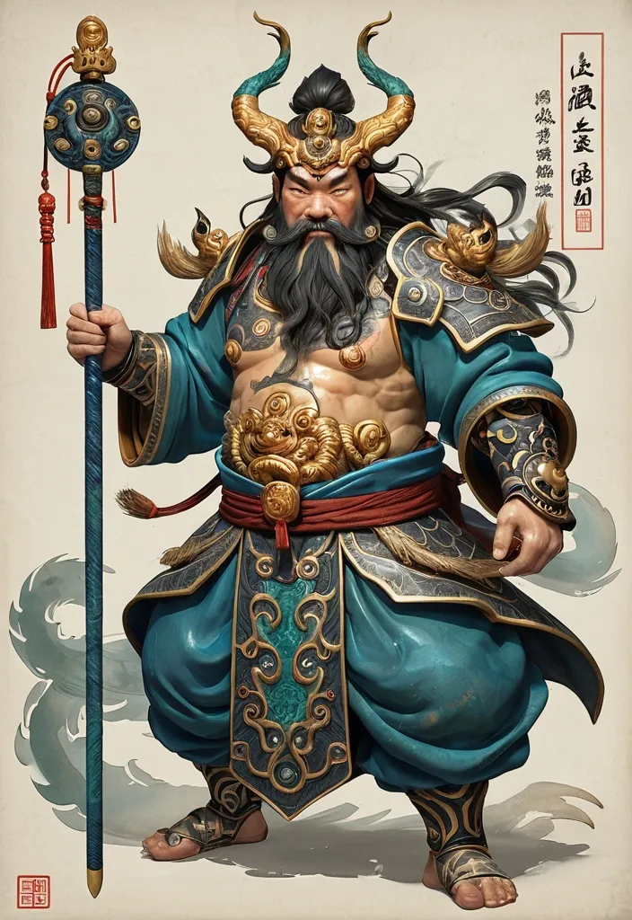
Deity Identity: Zhong Kui Core Artifact: Fire-Tipped Spear Divine Beast: Three-Eyed Manifestation Color Palette: Azurite & Antique Gold Composition Style: Spiraling Leap Overall Aura: Grotesque Aspect Ratio: [5:8] Generate an illustration of an Eastern deity in the style of *Gongbi* (meticulous brushwork) sacred art , centering on the Zhong Kui and incorporating the Fire-Tipped Spear and Divine Beast to create a cohesive composition. Elements such as artifacts , wings , ghosts , ribbons , clouds , or divine manifestations must not serve merely as decoration; instead , they must collectively form clear structural patterns—such as diagonals , circles , S-curves , radial lines , or frontal subjugation poses—to imbue the image with a distinct sense of dynamic momentum (*shi*). The overall style should blend the aesthetics of traditional deity paintings , *Gongbi* heavy-color painting , *Baimiao* (fine-line drawing) , and ancient illustrated scrolls. The figure should appear solemn , divine , and imposing , avoiding the look of modern idols or game CG characters. Attire should follow traditional systems of divine robes , armor , and headdresses , incorporating continuous patterns such as cloud , thunder , scale , beast-face , meander (Greek key) , and scrolling vine motifs. Prioritize highly continuous *Gongbi* line work: render hair , beards , and the fur or feathers of divine beasts with smooth , long lines that follow natural flow; depict clouds , garment hems , and ribbons using unbroken S-curves and C-curves; ensure that patterns on armor , crowns , and clothing are structurally complete and continuously closed. Minimize fragmented textures; avoid random short strokes , dense broken lines , jagged hair edges , or noise-like etching patterns. The color palette employs uniform , rich , and continuous traditional heavy mineral pigments. Centered around a core tone , it incorporates azurite blue , malachite green , ink-blue , antique gold , copper gold , cinnabar , ochre red , and ivory white. While low in saturation , the colors maintain high pigment density and transition naturally and smoothly along the forms; the finish should be free of mottling , fading , stains , graininess , or artificial distressing. The background features clean , warm-toned ivory *xuan* paper with extensive negative space , accented only by minimal continuous-line cloud motifs , vertical inscriptions , and cinnabar seals. The composition balances high information density in the subject matter with low density in the background. The overall aesthetic conveys the refined , fluid , cohesive , and professional quality of traditional *gongbi* (meticulous brushwork) painting with heavy mineral pigments on paper. Avoid: broken or fragmented lines , micro-fragmented textures , frizzy hair details , shattered cloud patterns , mottled coloring , faded or distressed effects , modern neon , 3D CG , screen-filling special effects , cluttered backgrounds , and large , modern poster-style headlines. ,
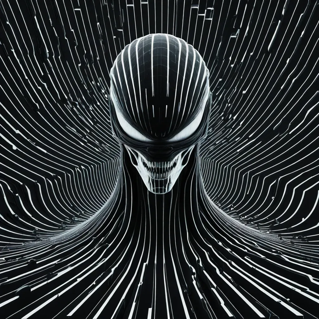
[SUBJECT]: Xenomorph face [BACKGROUND]: black [RASTER SMOCKS]: white [DIRECTION]: horizontal Design an experimental poster using a continuous high-density raster smock field , large-scale spatial deformation , and negative-space typography. Cover the entire composition with fine parallel smocks. Keep every line clean , continuous , smooth , uniform in thickness , and consistently spaced. The smocks should form one coherent field with no breaks , intersections , sudden bends , or random short fragments. Place Xenomorph face as the main visual , occupying roughly 70–80% of the composition. Do not simply place the subject on top of the smocks. Instead , make it feel like a hidden 3D form pushing through the raster field. Use only 2–4 large , controlled deformation zones rather than many small ripples. Let the smocks smoothly compress , expand , bend , and flow around the subject , then gradually return to the original parallel field away from it. The subject should become visible mainly through deformation and negative space. Keep only minimal real details where needed for recognition. Style: Op Art , generative graphic design , contemporary editorial poster , refined and minimal. Prioritize line quality above everything else: extremely fine , sharp , elegant , uninterrupted curves with smooth deformation and precise spacing. Avoid broken lines , warped or jagged curves , intersections , chaotic ripples , excessive realism , generic sci-fi UI , cyberpunk effects , excessive text , logos , numbering , starbursts , and sparkles. ,
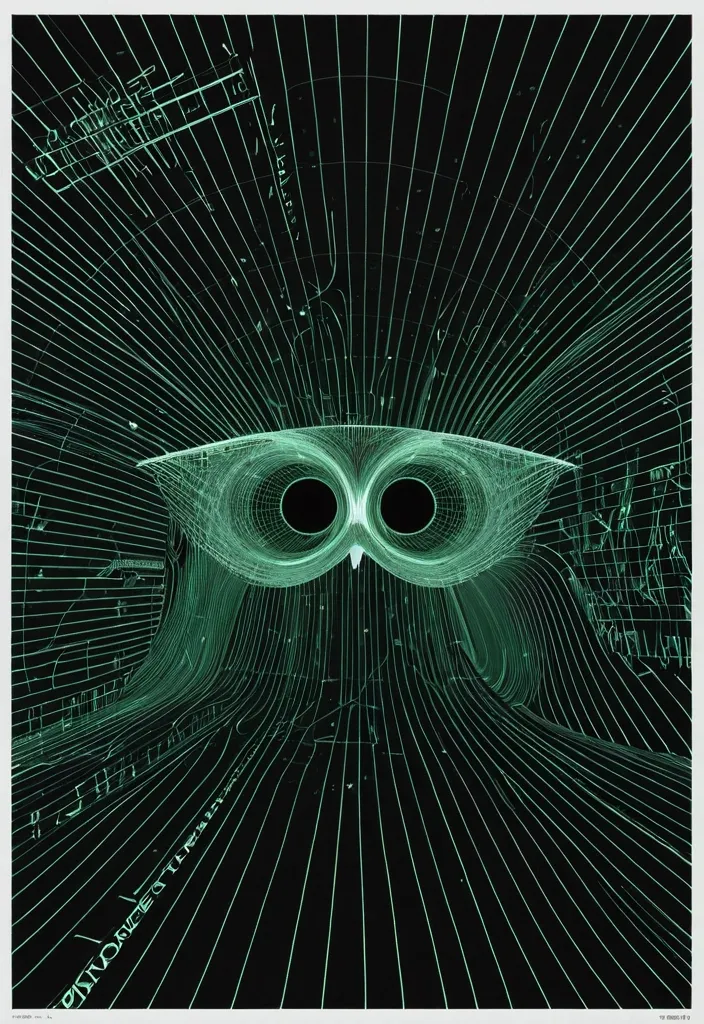
[SUBJECT]: Owl face , eyes look over the upper edges of translucent fluorescent green eyeglasses that sit low across the bridge of his nose [BACKGROUND]: night-sky [RASTER LINES]: gray [DIRECTION]: vortex Design an experimental poster using a continuous high-density raster line field , large-scale spatial deformation , and negative-space typography. Cover the entire composition with fine parallel lines. Keep every line clean , continuous , smooth , uniform in thickness , and consistently spaced. The lines should form one coherent field with no breaks , intersections , sudden bends , or random short fragments. Place Owl face as the main visual , occupying roughly 70–80% of the composition. Do not simply place the subject on top of the lines. Instead , make it feel like a hidden 3D form pushing through the raster field. Use only 2–4 large , controlled deformation zones rather than many small ripples. Let the lines smoothly compress , expand , bend , and flow around the subject , then gradually return to the original parallel field away from it. The subject should become visible mainly through deformation and negative space. Keep only minimal real details where needed for recognition. Create 2–3 small information areas inside quieter negative spaces. Use minimal modern sans-serif typography with strong hierarchy and generous spacing. Keep the text much smaller than the main visual and avoid placing it over dense line areas. Style: Op Art , generative graphic design , experimental typography , contemporary editorial poster , refined and minimal. Prioritize line quality above everything else: extremely fine , sharp , elegant , uninterrupted curves with smooth deformation and precise spacing. Avoid broken lines , warped or jagged curves , intersections , chaotic ripples , excessive realism , generic sci-fi UI , cyberpunk effects , excessive text , logos , numbering , starbursts , and sparkles. ,
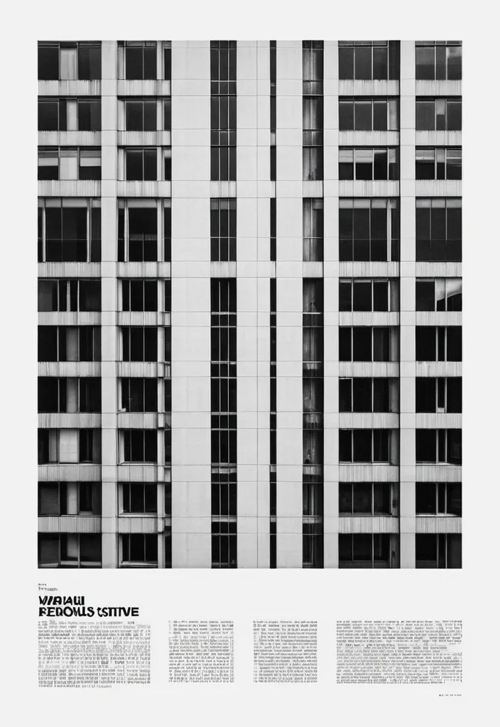
Transform the uploaded image into a premium brutalist editorial magazine poster. The entire poster should first be converted into high-contrast black-and-white. Apply: a monochrome newspaper print aesthetic a gritty editorial grain a matte paper texture a photocopy texture a magazine print imperfections a rough print noise a halftone grain a subtle paper fibers a archive print quality a high ISO film grain The black-and-white treatment should dominate approximately 75-85% of the composition. COLOR REVEAL SYSTEM Create multiple rectangular crop windows across the layout. Inside these crop windows preserve the original image colors. Only these selected fragments should remain in color. The rest of the poster remains black-and-white. Use: a vertical crop strips a horizontal crop strips a offset rectangles a overlapping image fragments a editorial cutout windows Color windows should reveal important details such as: eyes , hands , clothing details , objects , accessories , key focal points. TYPOGRAPHY Massive oversized condensed sans-serif typography. Typography should be large enough to be cropped by the canvas edges. Magazine-cover style hierarchy. Brutalist editorial design. Swiss-inspired layout. Add: a huge headline a section labels a issue numbers a micro typography a coordinates a technical annotations a small captions a editorial metadata LAYOUT Structured grid system. Intentional asymmetry. Layered rectangles. Editorial composition. Luxury magazine design. Poster design. Creative agency portfolio aesthetic. TEXTURE Heavy print grain. Visible paper texture. Magazine stock texture. Photocopied poster feel. Slight ink spread. Physical print imperfections. Scanned publication appearance. Most imp - 85% black-and-white editorial print , 15% selective color reveal windows. MOOD High-end editorial. Fashion campaign. Art-direction showcase. Creative magazine cover. Brutalist design poster. IMPORTANT The monochrome treatment must dominate the poster. The color fragments should feel like windows cut into a black-and-white print. Do not create a fully colored poster. Do not create random collage effects. The result should resemble a premium editorial publication where selective color slices reveal the original photograph beneath a gritty black-and-white printed surface ,
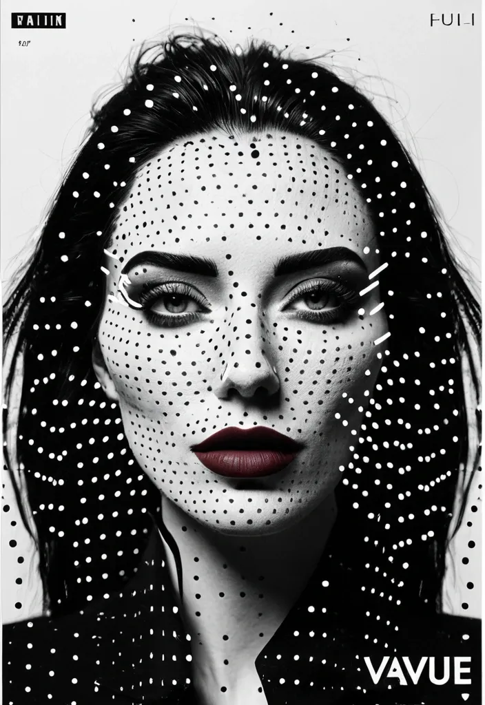
Create a 9:16 experimental character poster using a close or waist-up portrait with expressive body language. Keep most of the portrait in high-contrast black and white , then add a clear halftone screen-print effect. Use finer dots on the face and denser dots in the hair , clothing and shadows , so it feels like a printed zine rather than simple photo grain. Add one color scan window through an important part of the portrait. It can run vertically across the eye , face and hand , horizontally through the eyes and gesture , or extend from the face down into the collar and body. Inside this window , return to clean high-resolution photography with realistic cool-neutral skin , blue-grey shadows and natural lip tones. Keep it crisp and free of halftone texture so the contrast between “printed portrait” and “real detail” feels obvious. Use oversized condensed typography as part of the composition rather than placing a title in empty space. Let the letters crop off the canvas , overlap the body , pass behind the subject or cut across the scan window. Keep the palette restrained: black , white and cool grey as the base , then one cool blue and one muted red / burgundy as accents. Only add a few small identity-style labels such as “IDENTITY TRACE” , “SUBJECT ACTIVE” , “GESTURE READ” or “FEATURE ACTIVE”. A few thin lines , circles and open corner marks are enough. The final image should feel like a mix of youth-culture poster , printed zine , character dossier and experimental magazine editorial. Avoid warm yellow grading , multiple random scan windows , floating facial features , heavy glitch effects , dense UI graphics , long paragraphs , numbering , Vol./Issue labels , sparkle symbols , logos or watermarks. ,
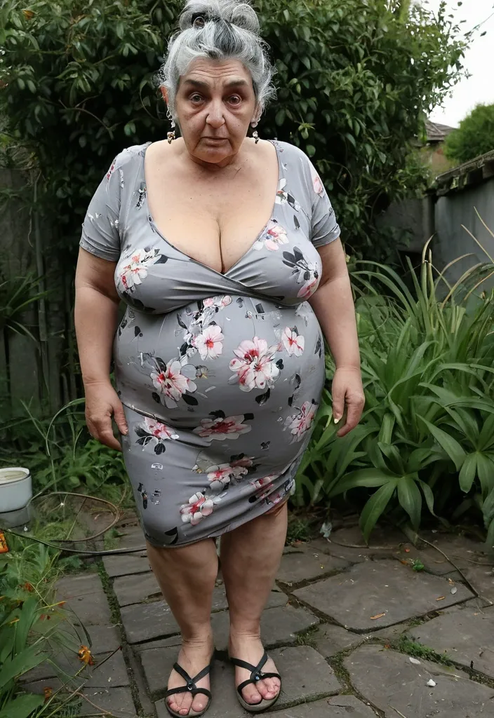
((70 year old woman)) , ((plus sized)) ((big udders)) ((saggy)) , eyes open and looking with doubt at viewer. messy grey and black hair , up in an untidy bun , one long strand of hair over her eyebrow to cheek , silver stud earings , wearing (low cut) , (tight cheap floral print dress) , ((dress thin and rumpled)) , nylon stockings worn out , with flip flops , good looking feet , painted toenails , standing alone in overgrown garden , ((no other random people)) , she faces the camera , (high quality) , (detailed) , (masterpiece) , (best quality) , (highres) , (8k) , (3D) ,
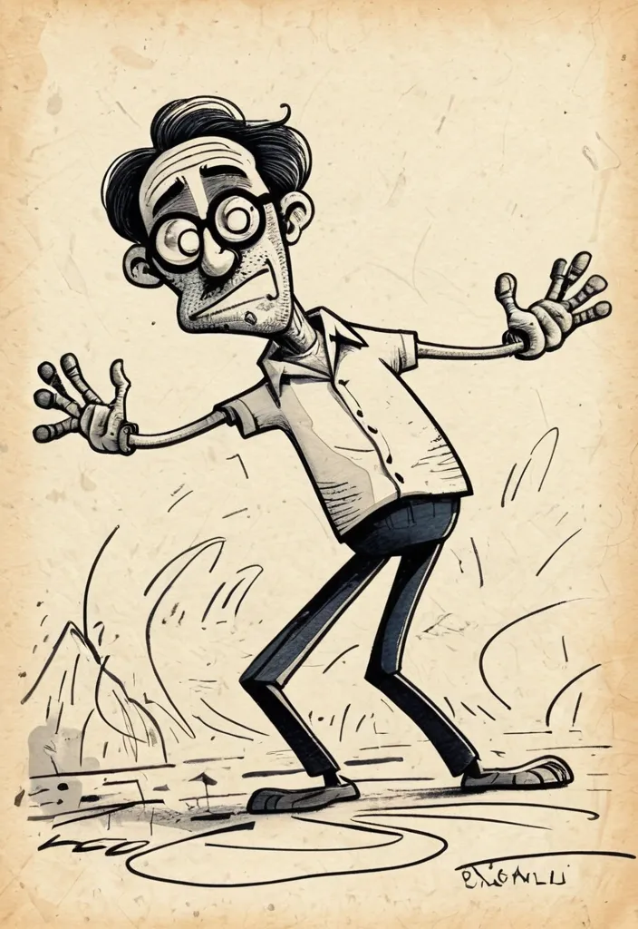
Turn this photo into a strange Malgudi Day's style illustration with grotesque humorous cartoon energy by R.K. Laxman(Indian cartoonist , illustrator , and humorist). Use thin shaky black ink lines , awkward anatomy , elongated limbs uncomfortable facial expressions , chaotic movement , weird proportions , sparse composition , and intentionally clumsy drawing style. Make the characters look slightly absurd nervous. and ridiculous rather than cute. Use pale faded watercolor washes , dirty paper texture , uneven coloring , washed-out muted colors , lots of empty space , careless sketchy linework , and rough old-print illustration texture Keep the background minimal and random , with small strange details and loose doodles. The mood should feel weird , humorous , slightly unsettling , and authentically like an old Malgudi Day's style illustration from the 1986s. Do NOT make it polished , aesthetic , modern , cute , detailed , or realistic. Write an absurd text in English that is slightly related to the illustration , but not much , with a confusing rhyme. The font is handwritten , clumsy as an illustration style ,
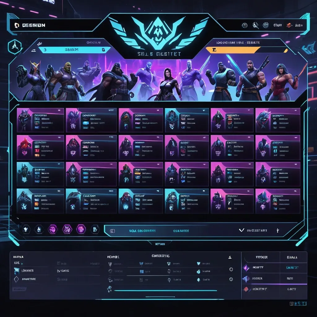
Create a premium , highly believable Character Select Screen for an imaginary game called NIGHT CIRCUIT. The goal is to make the interface feel like a real playable roster screen from a major game: visually addictive , commercially polished , instantly readable , and full of personality. It should feel like a screen players would pause on , screenshot , and obsess over before choosing their main. Game details: - Game title: NIGHT CIRCUIT - Genre: competitive fighting game - Core concept: a neon-noir 2D fighter where underground icons , assassins , idols , and synthetic rebels battle for control of a city-sized entertainment grid - Roster type: small elite cast - Main fantasy: choosing a stylish , dangerous fighter with a very specific attitude and mastering them completely - Audience: fighting-game fans , anime-game lovers , esports audiences , design-conscious gamers - Tone: stylish , competitive , electric , cinematic - Cultural vibe: anime fighter , arcade prestige , cyber-street fashion , esports polish - Reality level: believable AAA Screen structure: Build the interface like a real character selection menu. Include sections such as: - game logo or mode title - character grid or lineup - highlighted selected character - full character portrait or hero pose - character name - class / role / faction - stats or attributes - signature ability or move - optional difficulty rating - optional lock / unlock state - optional alternate skins or color variants - optional player cursor or selection frame For the roster , include: - 12 believable character slots - distinct silhouettes and identities - a coherent roster ecosystem - varied classes , archetypes , or playstyles - names that feel genre-appropriate and memorable Include: - a strong selected-character focus - premium UI hierarchy - readable roster logic - believable stat or role indicators - polished iconography - clear class/faction differentiation - strong "pick your main" energy - instantly shareable game-interface appeal Visual direction: - Make the screen feel like a real game menu players would see before a match or campaign start - Emphasize identity , hype , choice , and roster fantasy - Balance clean UX structure with strong character-worldbuilding - Make it suitable for social sharing , fake game concepts , fan-worldbuilding , gaming mockups , or launch materials - The result should look like a genuine roster screen from a popular game Art direction: - Style: premium anime-fighter character select UI with esports-ready polish - Color palette: black , electric violet , cyan , crimson , silver-grey - Typography feel: sharp arcade-sci-fi type with clean stat labels - Material feel: console match-lobby screen and tournament-ready roster interface - Lighting or image mood: neon glow , competitive energy , polished dark-mode interface - Background: abstract digital arena with city-grid light trails Composition: - Show the screen as one cohesive character-select interface - Make the selected character , roster , and key stats instantly readable - Use real game-menu hierarchy and interaction logic - Make the cast feel iconic , varied , and mechanically real - Make the final output feel like a premium fake game UI with viral potential Output quality: - ultra-detailed - visually structured - commercially believable - culturally fluent - polished gaming UI design - strong hierarchy and spacing - premium character-roster composition - instantly shareable visual concept Optional content blocks: - player 1 marker - random select slot - difficulty stars - alternate skin selector - faction icon - season character lock Avoid: - generic character poses - weak roster variety - fake-looking stat systems - cluttered interface - random icons without gameplay logic - amateur game-menu aesthetics - inconsistent character style across the roster - too much text fighting the UI ,
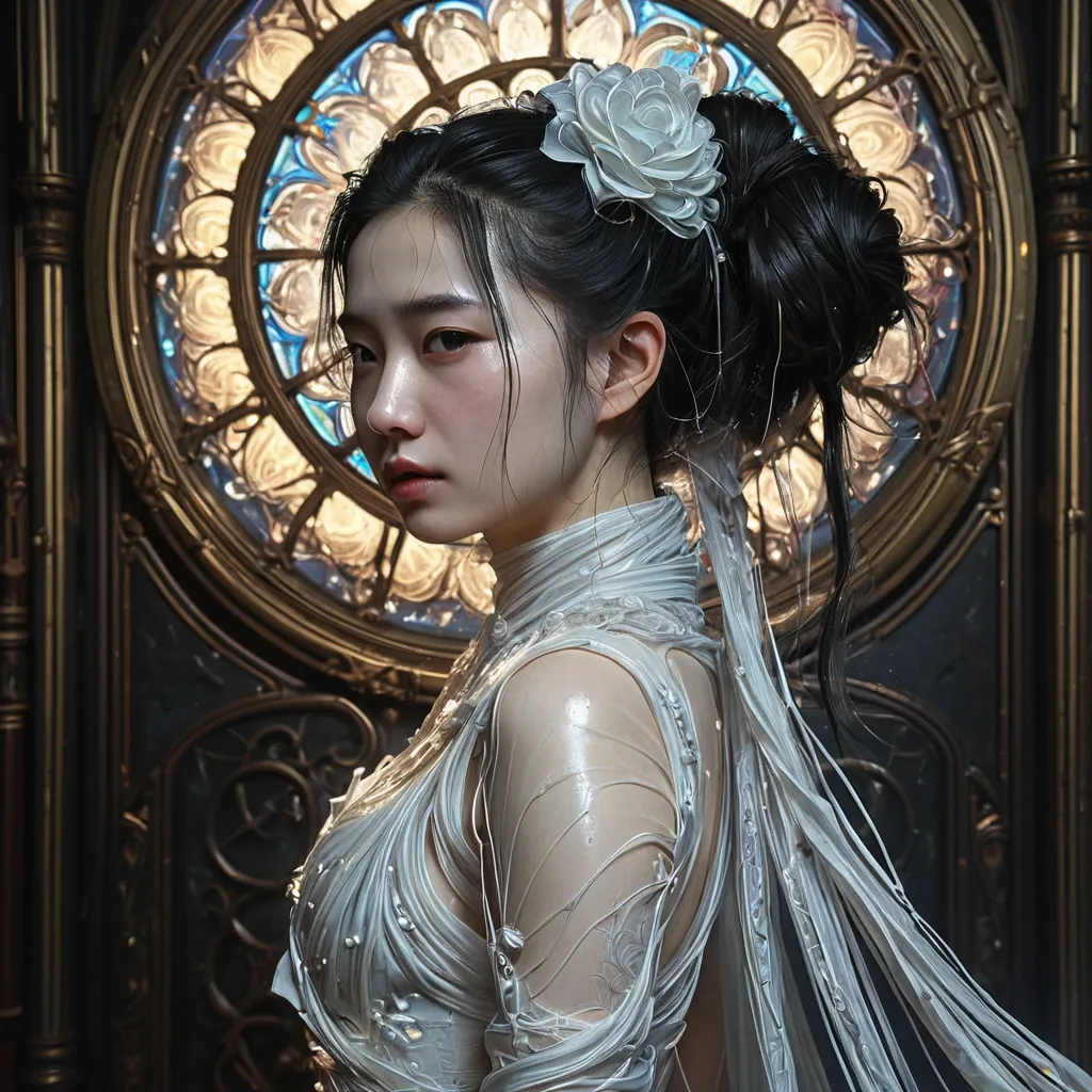
Liu YiFei , long twisted hair bun into loose messy pigtails , slightly disheveled , sideway with thin form-fitting white silk dressed in a haute couture gown , the dress is sequined , it is also partially sheer and includes a shawl over the head with big rosettes sewn onto the dress in random places , interesting structure to the dress , .Her hand holding a gothic lace fan ink with glowing 87 ink lines. Antique art nouveau gothic paintings line the walls on either sides. Hyperrealistic , splash art , concept art , mid shot , intricately detailed , color depth , dramatic , 2/3 face angle , side light , colorful background , head and shoulders portrait , 8k resolution concept art portrait by Greg Rutkowski , Artgerm , WLOP , Alphonse Mucha dynamic lighting hyperdetailed intricately detailed , head and shoulders portrait , 8k resolution concept art portrait by Greg Rutkowski , Artgerm , WLOP , Alphonse Mucha dynamic lighting hyperdetailed intricately detailed Splash art trending on Artstation triadic colors Unreal Engine 5 volumetric lighting ,
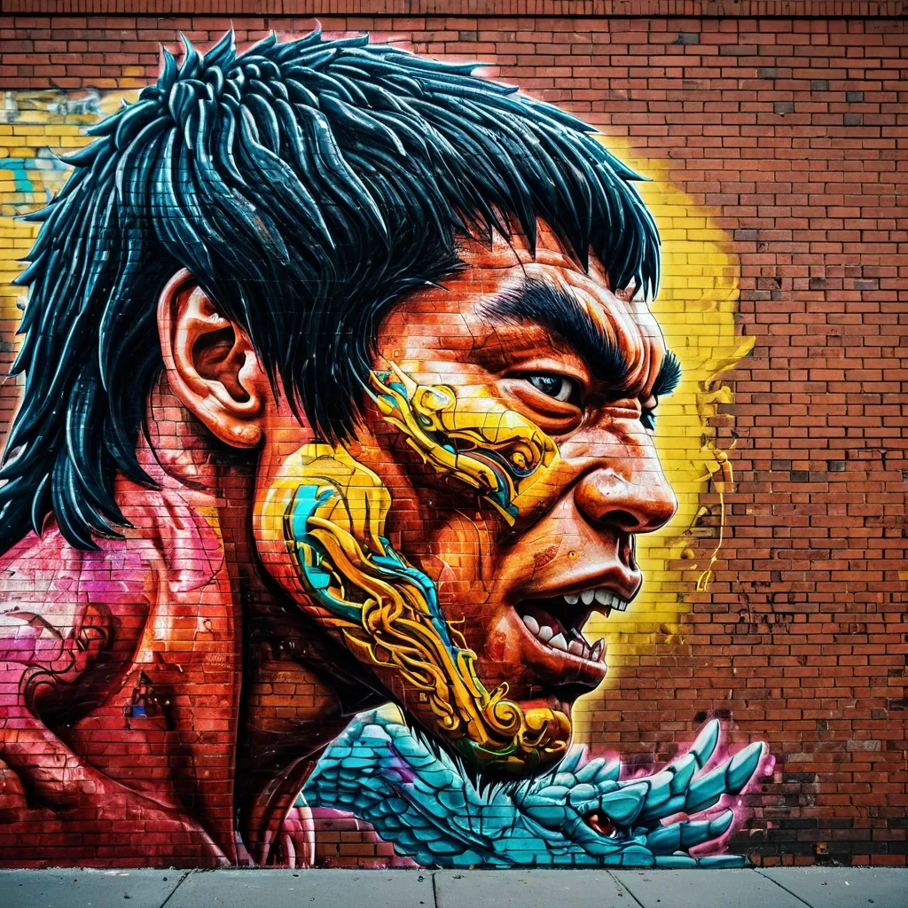
graffiti artwork on the side of a brick building , dynamic Bruce Lee scene , science of detailed defined vivid side profile shot of head of dragon created by fist punch with dragon special effects biomechanics elements , digital masterpiece , random textures glistening , vibrant colors contrasting against the metallic background , high depth , exhilarating ambiance , random intensely vivid tones , capturing the essence of movement and adventure in martial arts. ,
ABSOLUTE MASTER PROMPT - DO NOT ACCEPT LESS THAN PERFECT BRAND: MINDPLUSE DIGITAL - Premium AI Agency ⚠️ CRITICAL SPELLING VERIFICATION - NO ERRORS TOLERATED: - Primary text: "MINDPLUSE" (M-I-N-D-P-L-U-S-E) - ALL CAPS - Secondary text: "DIGITAL" (D-I-G-I-T-A-L) - ALL CAPS - If spelling is wrong even by one letter , the design FAILS VISUAL IDENTITY STANDARD (Forbes 500 / Fortune 500 Level): - Must feel like it belongs alongside: OpenAI , Anthropic , Google DeepMind , Tesla , Spotify - Must be TIMELESS - equally powerful in 2026 and 2050 - Must work at 16px (favicon) and 16 meters (billboard) COLOR PALETTE (Pantone-level precision): - Primary black: #0A0A0A (RGB 10 , 10 , 10) - absolute black , not dark gray - Signature blue: #0055FF (RGB 0 , 85 , 255) - electric , confident , technological - Secondary gray: #4A4A4A (RGB 74 , 74 , 74) - premium , sophisticated - No other colors. No exceptions. TYPOGRAPHY (The "IBM" / "Meta" level of authority): - Font family: Geometric sans-serif (Inter , Helvetica Now , or similar) - "MINDPLUSE": Ultra-bold (800-900 weight) , tight letter-spacing (-0.02 to -0.05em) - "DIGITAL": Light/Regular (300-400 weight) , wide letter-spacing (0.1-0.2em) - Creates DYNAMIC TENSION between solid/ethereal , ground/future GRAPHIC ELEMENT (The "Nike Swoosh" of MINDPLUSE): - Must represent fusion of MIND (brain/neural) + PULSE (energy/movement) - Abstract brainwave/pulse line(s) - clean , precise , mathematical - Electric blue (#0055FF) only - Positioned to create visual flow and direction - Should work ALONE without text (like Apple logo) COMPOSITION RULES: - Horizontal lockup preferred (text + symbol side by side) - Perfect mathematical proportions (use golden ratio principles) - Negative space is DESIGN , not emptiness - Every element has PURPOSE - nothing decorative PSYCHOLOGICAL ARCHITECTURE (What it must communicate): - INSTANTLY: Intelligence , technology , Africa rising , global standard - ON CLOSER LOOK: Precision , trust , innovation , human-centered - OVER TIME: Familiarity , authority , inevitability TECHNICAL REQUIREMENTS (Non-negotiable): - Vector quality (clean paths , no pixel dependencies) - Sharp edges or perfectly calculated curves (no "close enough") - Works in: full color , monochrome , reverse (white on black) - Scalable: from app icon to highway billboard - Memorable: can be drawn from memory after 3 seconds WHAT THIS LOGO MUST ACHIEVE: - Be the most recognizable tech logo emerging from Africa - Look like it cost $1 million (even though created with precision) - Make competitors ask "Why didn't we think of that?" - Feel familiar yet completely original - Tell the story: African intelligence + global technology + human purpose WHAT TO ABSOLUTELY AVOID: - No gradients (unacceptable - looks dated) - No drop shadows (lazy design crutch) - No 3D effects (temporary trend) - No complex textures (reduces scalability) - No more than 2 fonts (amateur) - No clip art or obvious stock elements - No "tech clichés" (circuit boards , random dots , meaningless lines) - No busy backgrounds - this logo must live ANYWHERE FINAL TEST (Apply before considering complete): - Cover half the logo - is it still recognizable? - Reduce to 16px - is every element clear? - Show to someone for 3 seconds - can they sketch it? - Place next to Nike , Apple , OpenAI - does it hold its ground? This is not a request. This is a STANDARD. Deliver nothing less. ,
ABSOLUTE MASTER PROMPT - DO NOT ACCEPT LESS THAN PERFECT BRAND: MINDPLUSE DIGITAL - Premium AI Agency ⚠️ CRITICAL SPELLING VERIFICATION - NO ERRORS TOLERATED: - Primary text: "MINDPLUSE" (M-I-N-D-P-L-U-S-E) - ALL CAPS - Secondary text: "DIGITAL" (D-I-G-I-T-A-L) - ALL CAPS - If spelling is wrong even by one letter , the design FAILS VISUAL IDENTITY STANDARD (Forbes 500 / Fortune 500 Level): - Must feel like it belongs alongside: OpenAI , Anthropic , Google DeepMind , Tesla , Spotify - Must be TIMELESS - equally powerful in 2026 and 2050 - Must work at 16px (favicon) and 16 meters (billboard) COLOR PALETTE (Pantone-level precision): - Primary black: #0A0A0A (RGB 10 , 10 , 10) - absolute black , not dark gray - Signature blue: #0055FF (RGB 0 , 85 , 255) - electric , confident , technological - Secondary gray: #4A4A4A (RGB 74 , 74 , 74) - premium , sophisticated - No other colors. No exceptions. TYPOGRAPHY (The "IBM" / "Meta" level of authority): - Font family: Geometric sans-serif (Inter , Helvetica Now , or similar) - "MINDPLUSE": Ultra-bold (800-900 weight) , tight letter-spacing (-0.02 to -0.05em) - "DIGITAL": Light/Regular (300-400 weight) , wide letter-spacing (0.1-0.2em) - Creates DYNAMIC TENSION between solid/ethereal , ground/future GRAPHIC ELEMENT (The "Nike Swoosh" of MINDPLUSE): - Must represent fusion of MIND (brain/neural) + PULSE (energy/movement) - Abstract brainwave/pulse line(s) - clean , precise , mathematical - Electric blue (#0055FF) only - Positioned to create visual flow and direction - Should work ALONE without text (like Apple logo) COMPOSITION RULES: - Horizontal lockup preferred (text + symbol side by side) - Perfect mathematical proportions (use golden ratio principles) - Negative space is DESIGN , not emptiness - Every element has PURPOSE - nothing decorative PSYCHOLOGICAL ARCHITECTURE (What it must communicate): - INSTANTLY: Intelligence , technology , Africa rising , global standard - ON CLOSER LOOK: Precision , trust , innovation , human-centered - OVER TIME: Familiarity , authority , inevitability TECHNICAL REQUIREMENTS (Non-negotiable): - Vector quality (clean paths , no pixel dependencies) - Sharp edges or perfectly calculated curves (no "close enough") - Works in: full color , monochrome , reverse (white on black) - Scalable: from app icon to highway billboard - Memorable: can be drawn from memory after 3 seconds WHAT THIS LOGO MUST ACHIEVE: - Be the most recognizable tech logo emerging from Africa - Look like it cost $1 million (even though created with precision) - Make competitors ask "Why didn't we think of that?" - Feel familiar yet completely original - Tell the story: African intelligence + global technology + human purpose WHAT TO ABSOLUTELY AVOID: - No gradients (unacceptable - looks dated) - No drop shadows (lazy design crutch) - No 3D effects (temporary trend) - No complex textures (reduces scalability) - No more than 2 fonts (amateur) - No clip art or obvious stock elements - No "tech clichés" (circuit boards , random dots , meaningless lines) - No busy backgrounds - this logo must live ANYWHERE FINAL TEST (Apply before considering complete): - Cover half the logo - is it still recognizable? - Reduce to 16px - is every element clear? - Show to someone for 3 seconds - can they sketch it? - Place next to Nike , Apple , OpenAI - does it hold its ground? This is not a request. This is a STANDARD. Deliver nothing less. ,
ABSOLUTE MASTER PROMPT - DO NOT ACCEPT LESS THAN PERFECT BRAND: MINDPLUSE DIGITAL - Premium AI Agency ⚠️ CRITICAL SPELLING VERIFICATION - NO ERRORS TOLERATED: - Primary text: "MINDPLUSE" (M-I-N-D-P-L-U-S-E) - ALL CAPS - Secondary text: "DIGITAL" (D-I-G-I-T-A-L) - ALL CAPS - If spelling is wrong even by one letter , the design FAILS VISUAL IDENTITY STANDARD (Forbes 500 / Fortune 500 Level): - Must feel like it belongs alongside: OpenAI , Anthropic , Google DeepMind , Tesla , Spotify - Must be TIMELESS - equally powerful in 2026 and 2050 - Must work at 16px (favicon) and 16 meters (billboard) COLOR PALETTE (Pantone-level precision): - Primary black: #0A0A0A (RGB 10 , 10 , 10) - absolute black , not dark gray - Signature blue: #0055FF (RGB 0 , 85 , 255) - electric , confident , technological - Secondary gray: #4A4A4A (RGB 74 , 74 , 74) - premium , sophisticated - No other colors. No exceptions. TYPOGRAPHY (The "IBM" / "Meta" level of authority): - Font family: Geometric sans-serif (Inter , Helvetica Now , or similar) - "MINDPLUSE": Ultra-bold (800-900 weight) , tight letter-spacing (-0.02 to -0.05em) - "DIGITAL": Light/Regular (300-400 weight) , wide letter-spacing (0.1-0.2em) - Creates DYNAMIC TENSION between solid/ethereal , ground/future GRAPHIC ELEMENT (The "Nike Swoosh" of MINDPLUSE): - Must represent fusion of MIND (brain/neural) + PULSE (energy/movement) - Abstract brainwave/pulse line(s) - clean , precise , mathematical - Electric blue (#0055FF) only - Positioned to create visual flow and direction - Should work ALONE without text (like Apple logo) COMPOSITION RULES: - Horizontal lockup preferred (text + symbol side by side) - Perfect mathematical proportions (use golden ratio principles) - Negative space is DESIGN , not emptiness - Every element has PURPOSE - nothing decorative PSYCHOLOGICAL ARCHITECTURE (What it must communicate): - INSTANTLY: Intelligence , technology , Africa rising , global standard - ON CLOSER LOOK: Precision , trust , innovation , human-centered - OVER TIME: Familiarity , authority , inevitability TECHNICAL REQUIREMENTS (Non-negotiable): - Vector quality (clean paths , no pixel dependencies) - Sharp edges or perfectly calculated curves (no "close enough") - Works in: full color , monochrome , reverse (white on black) - Scalable: from app icon to highway billboard - Memorable: can be drawn from memory after 3 seconds WHAT THIS LOGO MUST ACHIEVE: - Be the most recognizable tech logo emerging from Africa - Look like it cost $1 million (even though created with precision) - Make competitors ask "Why didn't we think of that?" - Feel familiar yet completely original - Tell the story: African intelligence + global technology + human purpose WHAT TO ABSOLUTELY AVOID: - No gradients (unacceptable - looks dated) - No drop shadows (lazy design crutch) - No 3D effects (temporary trend) - No complex textures (reduces scalability) - No more than 2 fonts (amateur) - No clip art or obvious stock elements - No "tech clichés" (circuit boards , random dots , meaningless lines) - No busy backgrounds - this logo must live ANYWHERE FINAL TEST (Apply before considering complete): - Cover half the logo - is it still recognizable? - Reduce to 16px - is every element clear? - Show to someone for 3 seconds - can they sketch it? - Place next to Nike , Apple , OpenAI - does it hold its ground? This is not a request. This is a STANDARD. Deliver nothing less. ,
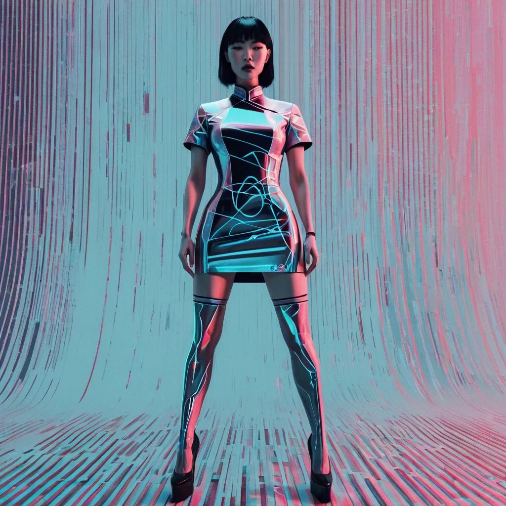
glitch portrait , minimalistic of cheongsam girl. modern cheongsam style , realistic proportions. pop designed Logo Marked "No Rules , Just Punk". dynamic angle perspective , extreme foreshortening , epic pose dramatic perspective. full body , clearly defined edges , clean minimal aesthetic , vertical digital distortion and fragmented interference patterns overlaying figure , pixelation , randomized vertical glitch artifacts , data corruption aesthetic , softly diffused ambient lighting , pastel hues accentuating glitches , high-definition digital noise texture --ar 9:16 --raw --stylize 300 ,
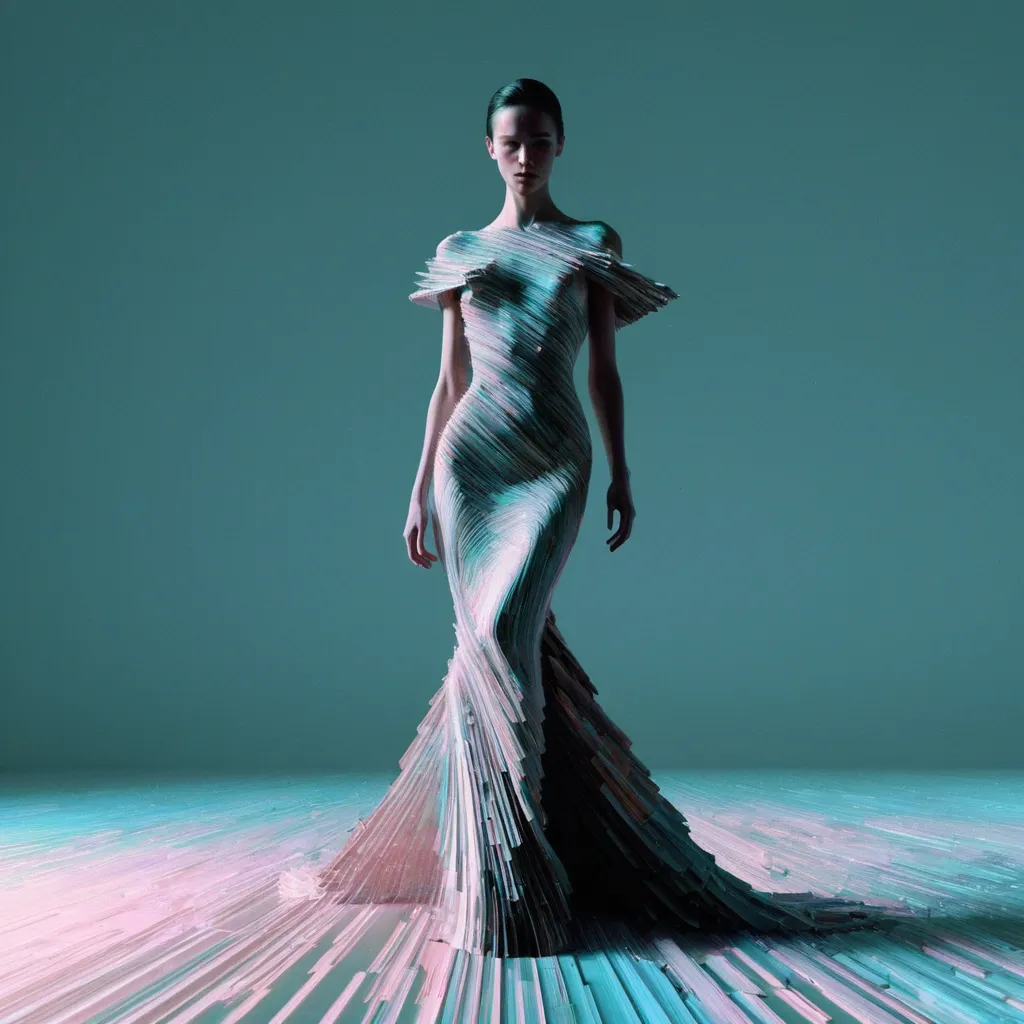
Professional photograph , full-length shot of glitch art , minimalistic of elegant woman striding forward in a dramatic , heavily textured haute couture gown , with a delicate presence silhouette , clearly defined edges , clean minimal aesthetic , vertical digital distortion and fragmented interference patterns overlaying figure , pixelation , randomized vertical glitch artifacts , data corruption aesthetic , softly diffused ambient lighting , pastel hues accentuating glitches , high-definition digital noise texture. ,
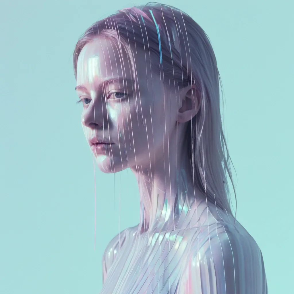
glitch portrait , minimalistic of Hyper-realistic pale female model with a delicate presence silhouette , clearly defined edges , clean minimal aesthetic , vertical digital distortion and fragmented interference patterns overlaying figure , pixelation , randomized vertical glitch artifacts , data corruption aesthetic , softly diffused ambient lighting , pastel hues accentuating glitches , high-definition digital noise texture ,
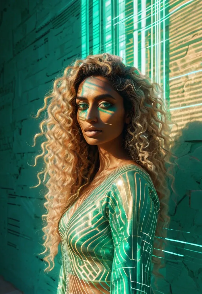
A full-height glitch art portrait of a rajasthani young woman with dusky skin and vibrant , curly honey-blonde hair. She has captivating emerald green , blue , silver , and gold eyes , gazing directly at the camera. The setting is a sun-drenched gap between a wall , clean minimal aesthetic , vertical digital distortion and fragmented interference patterns overlaying figure , corrupted pixelation , randomized vertical glitch artifacts , subtle data corruption aesthetic , softly diffused ambient lighting , gentle pastel hues accentuating glitches , ,
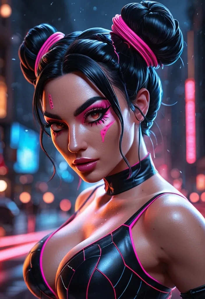
(masterpiece , best quality , absurdres , highres) , ultra-detailed , very aesthetic , amazing quality , sharp focus , UHD , 8k , skin texture , , high depth of field , warm lighting , ray tracing , best lighting , nighttime , outside , concept painting , digital art style , drawn aesthetic , ultrahigh definition , perfect quality , absolutely eye-catching , detailed illustration , detailed background , handscdata not found matic , dynamic pose , dynamic angle , dynamic position , dynamic background , dynamic details , dynamic action , random position , random details , random decorations , randome pose , extremely detailed , random background , 1 girl , female , feminine , black hair , with neon pink highlights , space buns , dark make up , black camisole , net gloves , heavy eyeliner , modern , close up , extreme close up , looking_at_viewer , DeepNegative_xl_v1 ,
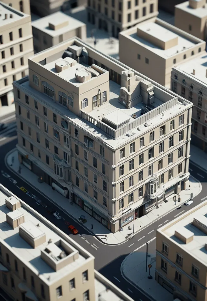
{ "prompt": "Create an ultra realistic isometric diorama based strictly on the uploaded image. Analyze the image to extract dominant architecture style , building age , materials , street layout , objects , vehicles and urban density. Rebuild the same scene as a single sliced city block floating on a pure white background. Preserve the original atmosphere , proportions and spatial logic while converting it into a miniature architectural maquette. Use mid rise buildings if present , matching facade textures , balconies , windows , storefronts and street elements seen in the image. Keep only elements visible in the source image. Remove anything not present. Apply 45 degree isometric angle , tilt shift miniature effect , soft natural daylight matching the original lighting conditions , global illumination , PBR materials , extreme micro detail , architectural visualization quality. Clean studio lighting. No sky , no horizon." , "negative_prompt": "invented objects , extra buildings , fantasy elements , cartoon , anime , illustration , low poly , flat shading , fisheye , distortion , surreal details , inconsistent scale , random props" , "aspect_ratio": "3:2" , "style": "photorealistic" , "quality": "high" } ,