AI Image Prompts for App Icon
Explore AI generated designs, images, art and prompts by top community artists and designers.

ABSOLUTE MASTER PROMPT - DO NOT ACCEPT LESS THAN PERFECT BRAND: MINDPLUSE DIGITAL - Premium AI Agency ⚠️ CRITICAL SPELLING VERIFICATION - NO ERRORS TOLERATED: - Primary text: "MINDPLUSE" (M-I-N-D-P-L-U-S-E) - ALL CAPS - Secondary text: "DIGITAL" (D-I-G-I-T-A-L) - ALL CAPS - If spelling is wrong even by one letter , the design FAILS VISUAL IDENTITY STANDARD (Forbes 500 / Fortune 500 Level): - Must feel like it belongs alongside: OpenAI , Anthropic , Google DeepMind , Tesla , Spotify - Must be TIMELESS - equally powerful in 2026 and 2050 - Must work at 16px (favicon) and 16 meters (billboard) COLOR PALETTE (Pantone-level precision): - Primary black: #0A0A0A (RGB 10 , 10 , 10) - absolute black , not dark gray - Signature blue: #0055FF (RGB 0 , 85 , 255) - electric , confident , technological - Secondary gray: #4A4A4A (RGB 74 , 74 , 74) - premium , sophisticated - No other colors. No exceptions. TYPOGRAPHY (The "IBM" / "Meta" level of authority): - Font family: Geometric sans-serif (Inter , Helvetica Now , or similar) - "MINDPLUSE": Ultra-bold (800-900 weight) , tight letter-spacing (-0.02 to -0.05em) - "DIGITAL": Light/Regular (300-400 weight) , wide letter-spacing (0.1-0.2em) - Creates DYNAMIC TENSION between solid/ethereal , ground/future GRAPHIC ELEMENT (The "Nike Swoosh" of MINDPLUSE): - Must represent fusion of MIND (brain/neural) + PULSE (energy/movement) - Abstract brainwave/pulse line(s) - clean , precise , mathematical - Electric blue (#0055FF) only - Positioned to create visual flow and direction - Should work ALONE without text (like Apple logo) COMPOSITION RULES: - Horizontal lockup preferred (text + symbol side by side) - Perfect mathematical proportions (use golden ratio principles) - Negative space is DESIGN , not emptiness - Every element has PURPOSE - nothing decorative PSYCHOLOGICAL ARCHITECTURE (What it must communicate): - INSTANTLY: Intelligence , technology , Africa rising , global standard - ON CLOSER LOOK: Precision , trust , innovation , human-centered - OVER TIME: Familiarity , authority , inevitability TECHNICAL REQUIREMENTS (Non-negotiable): - Vector quality (clean paths , no pixel dependencies) - Sharp edges or perfectly calculated curves (no "close enough") - Works in: full color , monochrome , reverse (white on black) - Scalable: from app icon to highway billboard - Memorable: can be drawn from memory after 3 seconds WHAT THIS LOGO MUST ACHIEVE: - Be the most recognizable tech logo emerging from Africa - Look like it cost $1 million (even though created with precision) - Make competitors ask "Why didn't we think of that?" - Feel familiar yet completely original - Tell the story: African intelligence + global technology + human purpose WHAT TO ABSOLUTELY AVOID: - No gradients (unacceptable - looks dated) - No drop shadows (lazy design crutch) - No 3D effects (temporary trend) - No complex textures (reduces scalability) - No more than 2 fonts (amateur) - No clip art or obvious stock elements - No "tech clichés" (circuit boards , random dots , meaningless lines) - No busy backgrounds - this logo must live ANYWHERE FINAL TEST (Apply before considering complete): - Cover half the logo - is it still recognizable? - Reduce to 16px - is every element clear? - Show to someone for 3 seconds - can they sketch it? - Place next to Nike , Apple , OpenAI - does it hold its ground? This is not a request. This is a STANDARD. Deliver nothing less. ,
ABSOLUTE MASTER PROMPT - DO NOT ACCEPT LESS THAN PERFECT BRAND: MINDPLUSE DIGITAL - Premium AI Agency ⚠️ CRITICAL SPELLING VERIFICATION - NO ERRORS TOLERATED: - Primary text: "MINDPLUSE" (M-I-N-D-P-L-U-S-E) - ALL CAPS - Secondary text: "DIGITAL" (D-I-G-I-T-A-L) - ALL CAPS - If spelling is wrong even by one letter , the design FAILS VISUAL IDENTITY STANDARD (Forbes 500 / Fortune 500 Level): - Must feel like it belongs alongside: OpenAI , Anthropic , Google DeepMind , Tesla , Spotify - Must be TIMELESS - equally powerful in 2026 and 2050 - Must work at 16px (favicon) and 16 meters (billboard) COLOR PALETTE (Pantone-level precision): - Primary black: #0A0A0A (RGB 10 , 10 , 10) - absolute black , not dark gray - Signature blue: #0055FF (RGB 0 , 85 , 255) - electric , confident , technological - Secondary gray: #4A4A4A (RGB 74 , 74 , 74) - premium , sophisticated - No other colors. No exceptions. TYPOGRAPHY (The "IBM" / "Meta" level of authority): - Font family: Geometric sans-serif (Inter , Helvetica Now , or similar) - "MINDPLUSE": Ultra-bold (800-900 weight) , tight letter-spacing (-0.02 to -0.05em) - "DIGITAL": Light/Regular (300-400 weight) , wide letter-spacing (0.1-0.2em) - Creates DYNAMIC TENSION between solid/ethereal , ground/future GRAPHIC ELEMENT (The "Nike Swoosh" of MINDPLUSE): - Must represent fusion of MIND (brain/neural) + PULSE (energy/movement) - Abstract brainwave/pulse line(s) - clean , precise , mathematical - Electric blue (#0055FF) only - Positioned to create visual flow and direction - Should work ALONE without text (like Apple logo) COMPOSITION RULES: - Horizontal lockup preferred (text + symbol side by side) - Perfect mathematical proportions (use golden ratio principles) - Negative space is DESIGN , not emptiness - Every element has PURPOSE - nothing decorative PSYCHOLOGICAL ARCHITECTURE (What it must communicate): - INSTANTLY: Intelligence , technology , Africa rising , global standard - ON CLOSER LOOK: Precision , trust , innovation , human-centered - OVER TIME: Familiarity , authority , inevitability TECHNICAL REQUIREMENTS (Non-negotiable): - Vector quality (clean paths , no pixel dependencies) - Sharp edges or perfectly calculated curves (no "close enough") - Works in: full color , monochrome , reverse (white on black) - Scalable: from app icon to highway billboard - Memorable: can be drawn from memory after 3 seconds WHAT THIS LOGO MUST ACHIEVE: - Be the most recognizable tech logo emerging from Africa - Look like it cost $1 million (even though created with precision) - Make competitors ask "Why didn't we think of that?" - Feel familiar yet completely original - Tell the story: African intelligence + global technology + human purpose WHAT TO ABSOLUTELY AVOID: - No gradients (unacceptable - looks dated) - No drop shadows (lazy design crutch) - No 3D effects (temporary trend) - No complex textures (reduces scalability) - No more than 2 fonts (amateur) - No clip art or obvious stock elements - No "tech clichés" (circuit boards , random dots , meaningless lines) - No busy backgrounds - this logo must live ANYWHERE FINAL TEST (Apply before considering complete): - Cover half the logo - is it still recognizable? - Reduce to 16px - is every element clear? - Show to someone for 3 seconds - can they sketch it? - Place next to Nike , Apple , OpenAI - does it hold its ground? This is not a request. This is a STANDARD. Deliver nothing less. ,
ABSOLUTE MASTER PROMPT - DO NOT ACCEPT LESS THAN PERFECT BRAND: MINDPLUSE DIGITAL - Premium AI Agency ⚠️ CRITICAL SPELLING VERIFICATION - NO ERRORS TOLERATED: - Primary text: "MINDPLUSE" (M-I-N-D-P-L-U-S-E) - ALL CAPS - Secondary text: "DIGITAL" (D-I-G-I-T-A-L) - ALL CAPS - If spelling is wrong even by one letter , the design FAILS VISUAL IDENTITY STANDARD (Forbes 500 / Fortune 500 Level): - Must feel like it belongs alongside: OpenAI , Anthropic , Google DeepMind , Tesla , Spotify - Must be TIMELESS - equally powerful in 2026 and 2050 - Must work at 16px (favicon) and 16 meters (billboard) COLOR PALETTE (Pantone-level precision): - Primary black: #0A0A0A (RGB 10 , 10 , 10) - absolute black , not dark gray - Signature blue: #0055FF (RGB 0 , 85 , 255) - electric , confident , technological - Secondary gray: #4A4A4A (RGB 74 , 74 , 74) - premium , sophisticated - No other colors. No exceptions. TYPOGRAPHY (The "IBM" / "Meta" level of authority): - Font family: Geometric sans-serif (Inter , Helvetica Now , or similar) - "MINDPLUSE": Ultra-bold (800-900 weight) , tight letter-spacing (-0.02 to -0.05em) - "DIGITAL": Light/Regular (300-400 weight) , wide letter-spacing (0.1-0.2em) - Creates DYNAMIC TENSION between solid/ethereal , ground/future GRAPHIC ELEMENT (The "Nike Swoosh" of MINDPLUSE): - Must represent fusion of MIND (brain/neural) + PULSE (energy/movement) - Abstract brainwave/pulse line(s) - clean , precise , mathematical - Electric blue (#0055FF) only - Positioned to create visual flow and direction - Should work ALONE without text (like Apple logo) COMPOSITION RULES: - Horizontal lockup preferred (text + symbol side by side) - Perfect mathematical proportions (use golden ratio principles) - Negative space is DESIGN , not emptiness - Every element has PURPOSE - nothing decorative PSYCHOLOGICAL ARCHITECTURE (What it must communicate): - INSTANTLY: Intelligence , technology , Africa rising , global standard - ON CLOSER LOOK: Precision , trust , innovation , human-centered - OVER TIME: Familiarity , authority , inevitability TECHNICAL REQUIREMENTS (Non-negotiable): - Vector quality (clean paths , no pixel dependencies) - Sharp edges or perfectly calculated curves (no "close enough") - Works in: full color , monochrome , reverse (white on black) - Scalable: from app icon to highway billboard - Memorable: can be drawn from memory after 3 seconds WHAT THIS LOGO MUST ACHIEVE: - Be the most recognizable tech logo emerging from Africa - Look like it cost $1 million (even though created with precision) - Make competitors ask "Why didn't we think of that?" - Feel familiar yet completely original - Tell the story: African intelligence + global technology + human purpose WHAT TO ABSOLUTELY AVOID: - No gradients (unacceptable - looks dated) - No drop shadows (lazy design crutch) - No 3D effects (temporary trend) - No complex textures (reduces scalability) - No more than 2 fonts (amateur) - No clip art or obvious stock elements - No "tech clichés" (circuit boards , random dots , meaningless lines) - No busy backgrounds - this logo must live ANYWHERE FINAL TEST (Apply before considering complete): - Cover half the logo - is it still recognizable? - Reduce to 16px - is every element clear? - Show to someone for 3 seconds - can they sketch it? - Place next to Nike , Apple , OpenAI - does it hold its ground? This is not a request. This is a STANDARD. Deliver nothing less. ,
1. Название проекта: Разработка айдентики для бренда корейской еды навынос «MinaRi». 2. Бренд: MinaRi 3. Дескриптор: Корейская еда навынос 4. Слоган: (На усмотрение дизайнера , опционально). I. Концепция бренда Суть: Современный , динамичный и аутентичный бренд , предлагающий свежую и вкусную корейскую еду в формате to-go. Ценность: Удобство , скорость , аутентичный вкус , погружение в корейскую кулинарную культуру. Целевая аудитория: Молодые люди 18-35 лет (фанаты к-поп , любители азиатской культуры) , студенты , жители окрестностей , следящие за трендами. Ключевое сообщение: «MinaRi» — это твой ежедневный доступ к настоящей Корее. Вкусно , быстро и доступно II. Задача Разработать логотип , который: Передает корейскую эстетику , но выглядит современно и минималистично. Выглядит аппетитно и вызывает желание попробовать. Отлично считывается в маленьком размере (иконка в приложении , профиль в соцсетях) и в большом (вывеска , упаковка). Работает в связке с дескриптором «Корейская еда навынос». Обязательные элементы к представлению Основной логотип: Горизонтальный и вертикальный варианты. Знак (Symbol): Отдельный графический элемент , который может жить без надписи (иконка для favicon , app icon , стикеры). Блок логотипа: Четкое и стилистически единое сочетание знака и названия. Работа с дескриптором: Варианты интеграции фразы «Корейская еда навынос» в композицию логотипа или его постоянное сопровождение. Цветовые палитры: ,
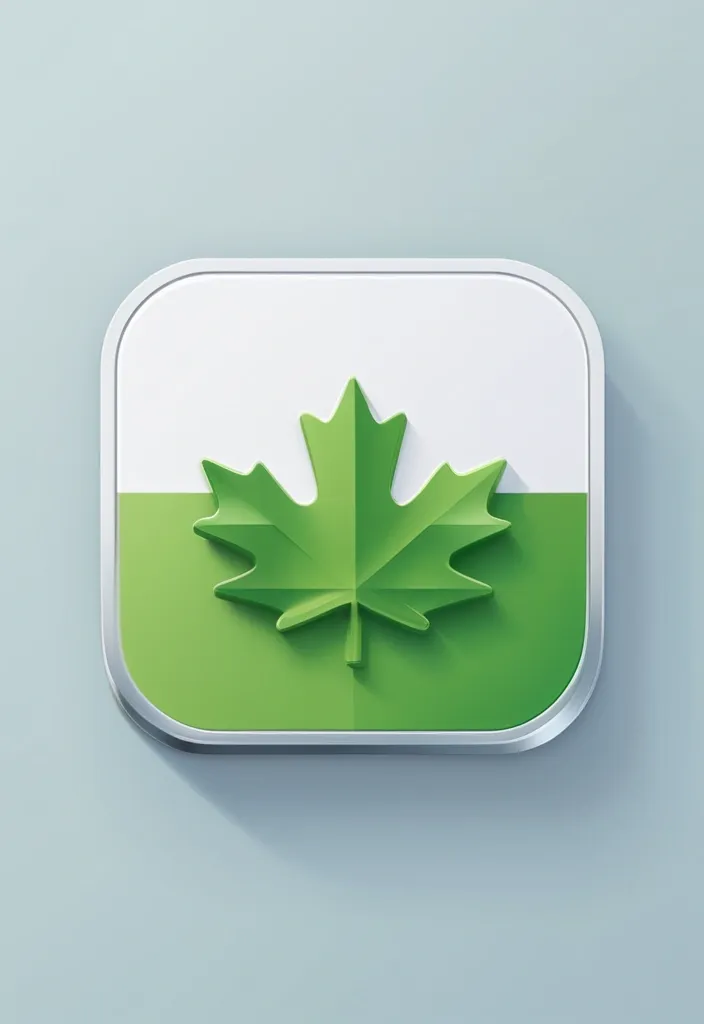
Design a clean , modern iOS-style mobile app icon for a Canadian corporate tax software called ‘SimpleTax’. Use a rounded square shape with flat colors and a minimalistic layout. Feature a maple leaf as the central element to reflect Canadian identity , and include green accents (such as a stripe , badge , or border) to suggest finance. Add a small version tag like ‘2024.1’ in a subtle but readable position. Avoid any glassy , glossy , or 3D effects — the style should be flat , balanced , professional , and App Store-ready. ,

The app icon depicts a cute and simplified cartoon dolphin. The dolphin has a smooth and sleek body , with a graceful curved shape to portray its swimming motion. Its eyes are big , round , and expressive , giving it a warm and inviting look. The dolphin's mouth is curved upward in a friendly smile , signifying the app's positive and engaging nature. It has a small fin on its back and two flippers on each side , adding to the playful and energetic appearance. To symbolize the app's focus on nearby connections , the dolphin is shown with a subtle radar-like circle emitting from its head , indicating its ability to detect and connect with other users in the vicinity. The color scheme is bright and vibrant , with shades of blue for the dolphin's body to represent the ocean and its natural habitat. The radar circle could be a slightly lighter shade of blue or a different color like green or turquoise , making it stand out while complementing the overall design. The entire icon is set against a transparent or lightly colored background , ensuring that the dolphin is the central focus and can be easily recognized even in smaller sizes. This cartoon dolphin app icon conveys a sense of friendliness , communication , and connection while maintaining a simple and approachable style that can effectively represent the NearHub app. ,


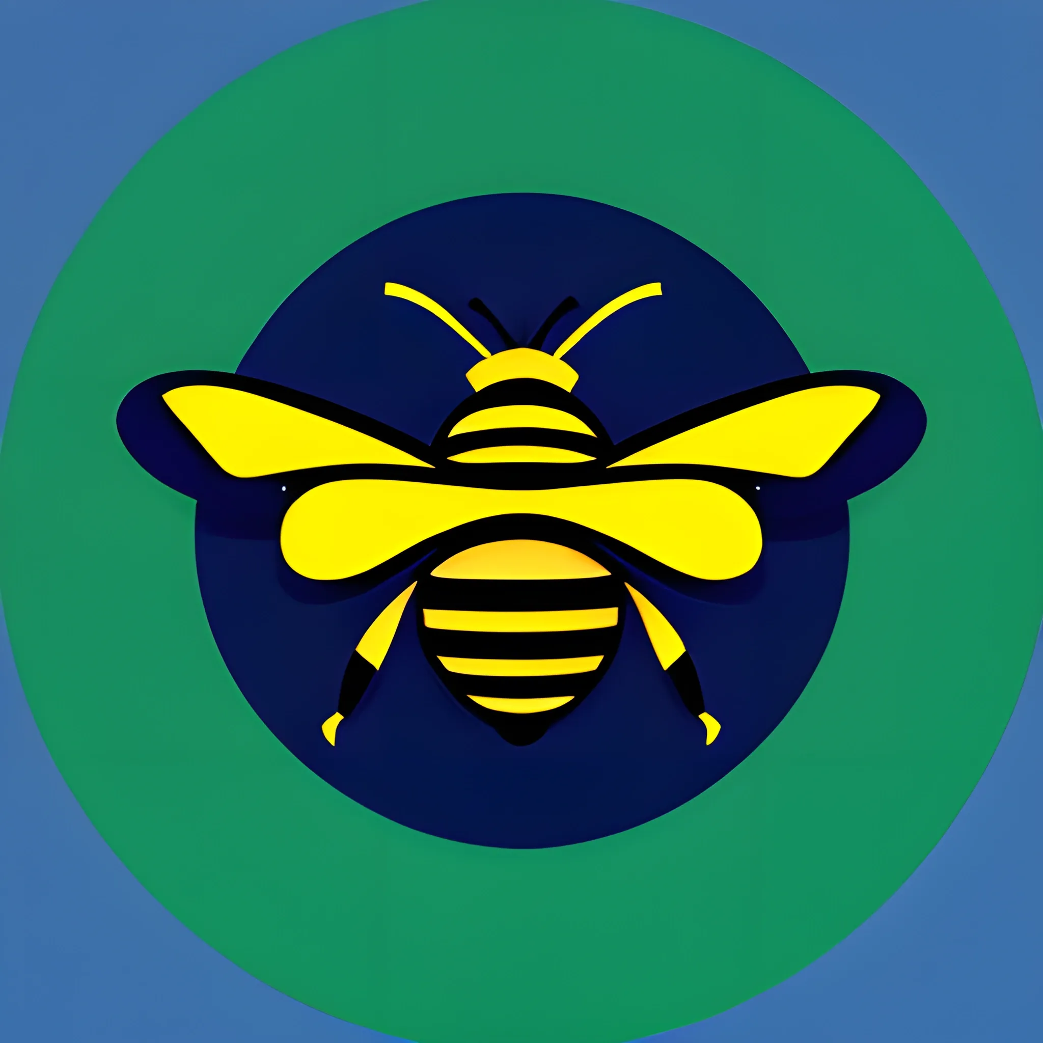
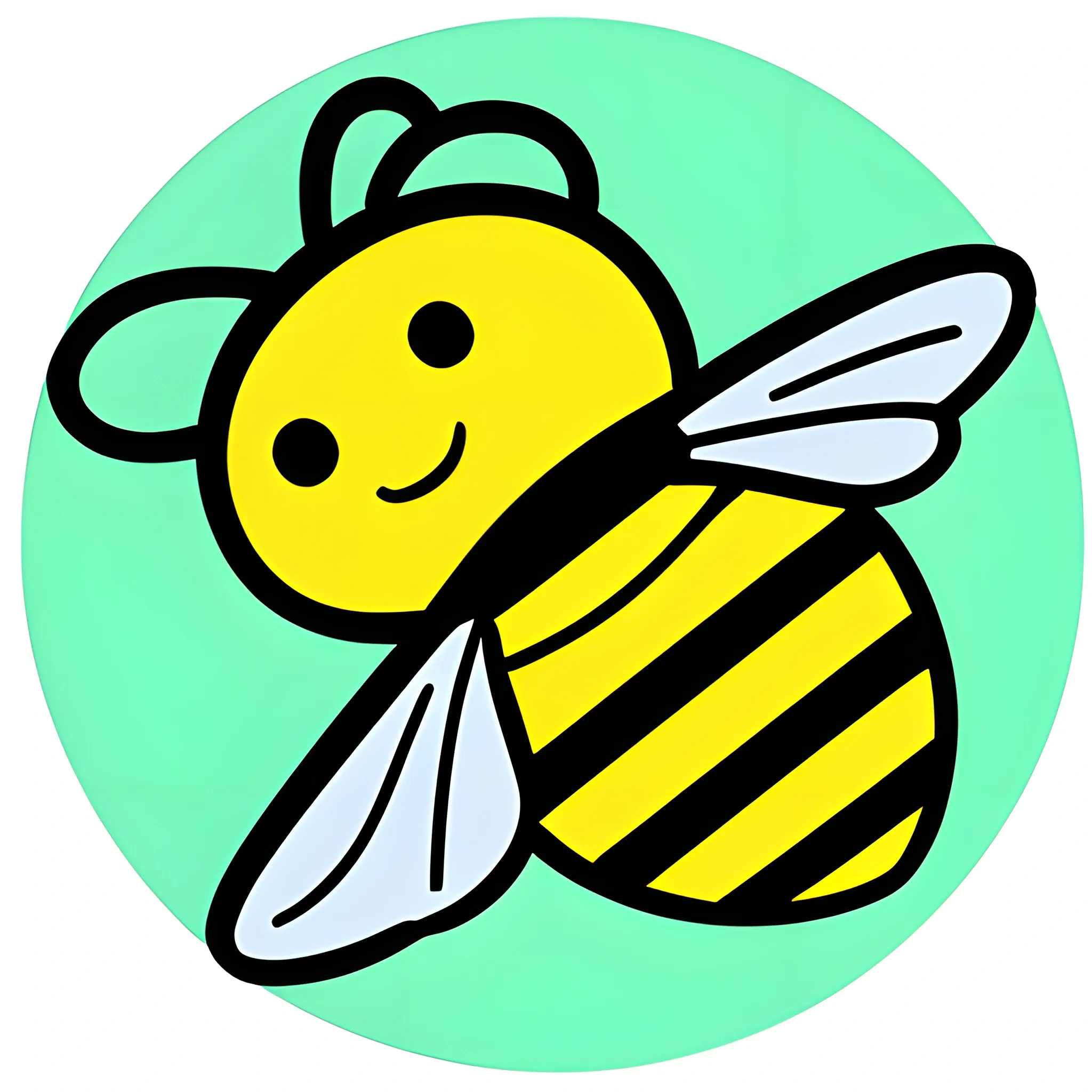
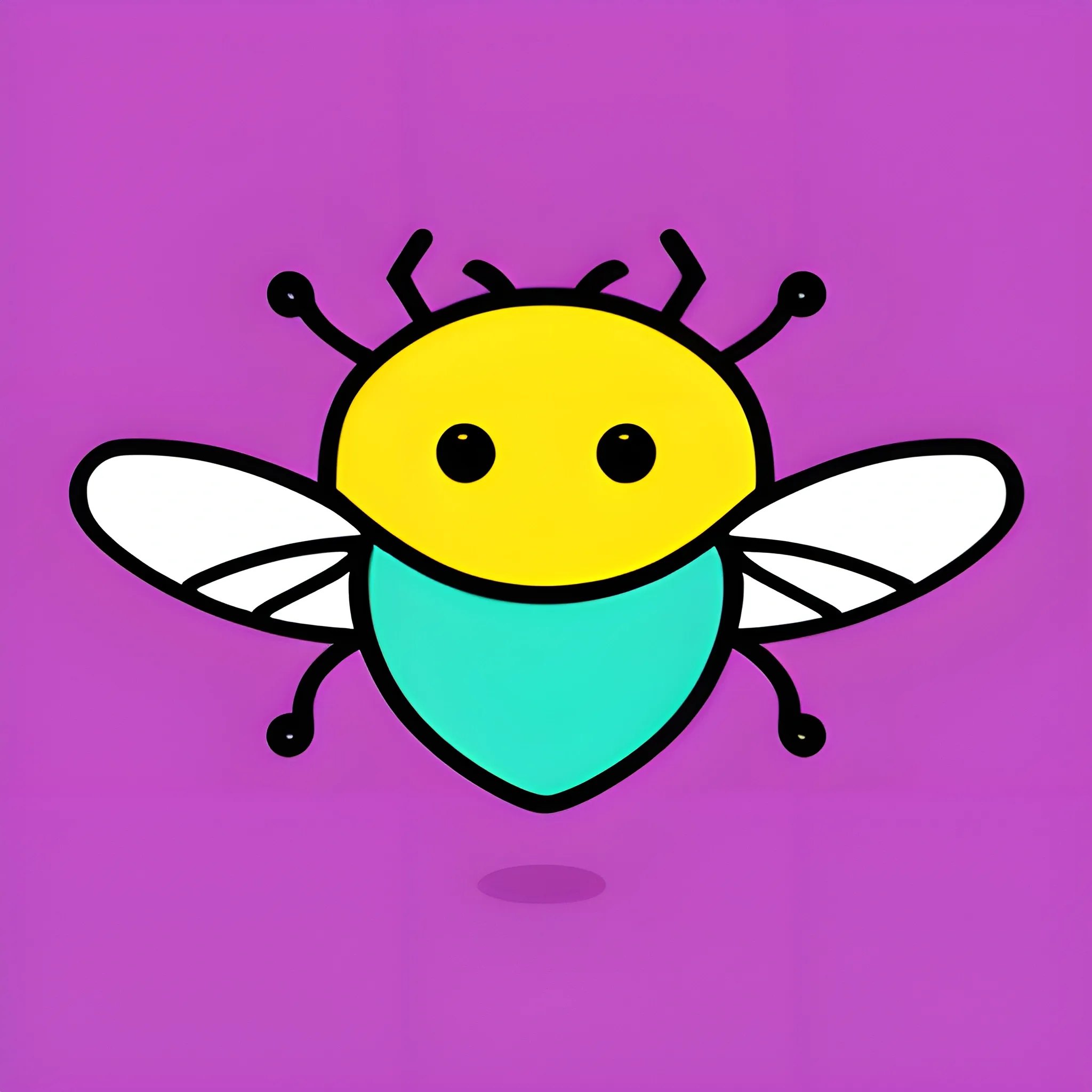
The app icon features a cute and friendly cartoon bee. The bee is depicted in a simplified and minimalist style , using clean lines and basic shapes. It has a round head with two large oval-shaped eyes , a small smile , and simple antennae on top. The bee's body is portrayed as an elongated oval shape , divided into three segments. Each segment is a slightly smaller oval than the previous one , creating a sense of movement and depth. The first segment represents the bee's head , the second its thorax , and the third its abdomen. The bee has two tiny wings on its back , rendered as small triangular shapes on each side of the body. These wings give a subtle impression of motion and activity. To emphasize the app's purpose , the bee is holding a tiny speech bubble with three dots inside , symbolizing messaging or communication. The entire icon is set on a circular background with a gradient of vibrant and friendly colors , such as a combination of bright yellow and light orange , radiating a warm and welcoming feeling. ,

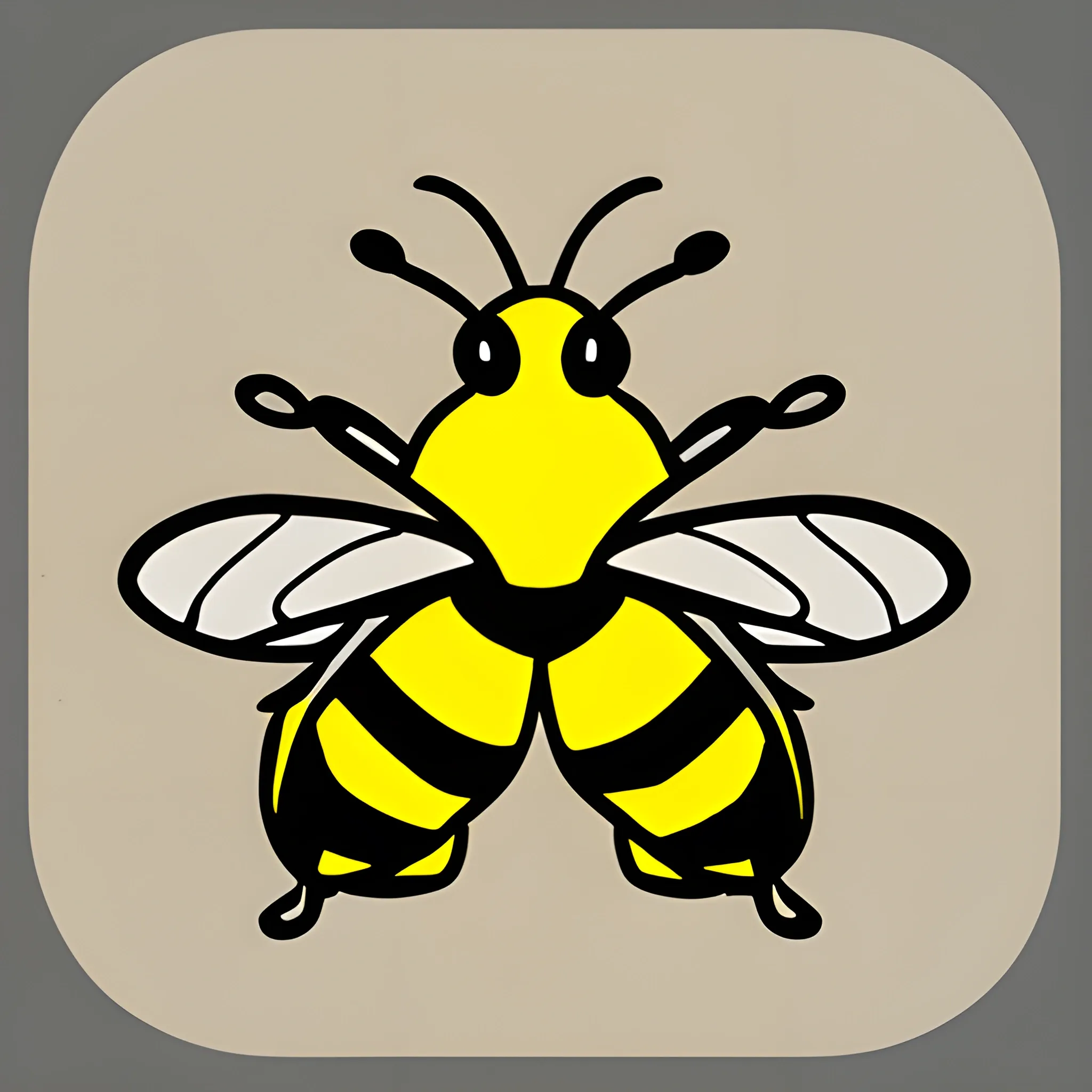
The app icon features a cute and friendly cartoon bee. The bee is depicted in a simplified and minimalist style , using clean lines and basic shapes. It has a round head with two large oval-shaped eyes , a small smile , and simple antennae on top. The bee's body is portrayed as an elongated oval shape , divided into three segments. Each segment is a slightly smaller oval than the previous one , creating a sense of movement and depth. The first segment represents the bee's head , the second its thorax , and the third its abdomen. The bee has two tiny wings on its back , rendered as small triangular shapes on each side of the body. These wings give a subtle impression of motion and activity. To emphasize the app's purpose , the bee is holding a tiny speech bubble with three dots inside , symbolizing messaging or communication. The entire icon is set on a circular background with a gradient of vibrant and friendly colors , such as a combination of bright yellow and light orange , radiating a warm and welcoming feeling. ,