Search Results for Design a clean
Explore AI generated designs, images, art and prompts by top community artists and designers.
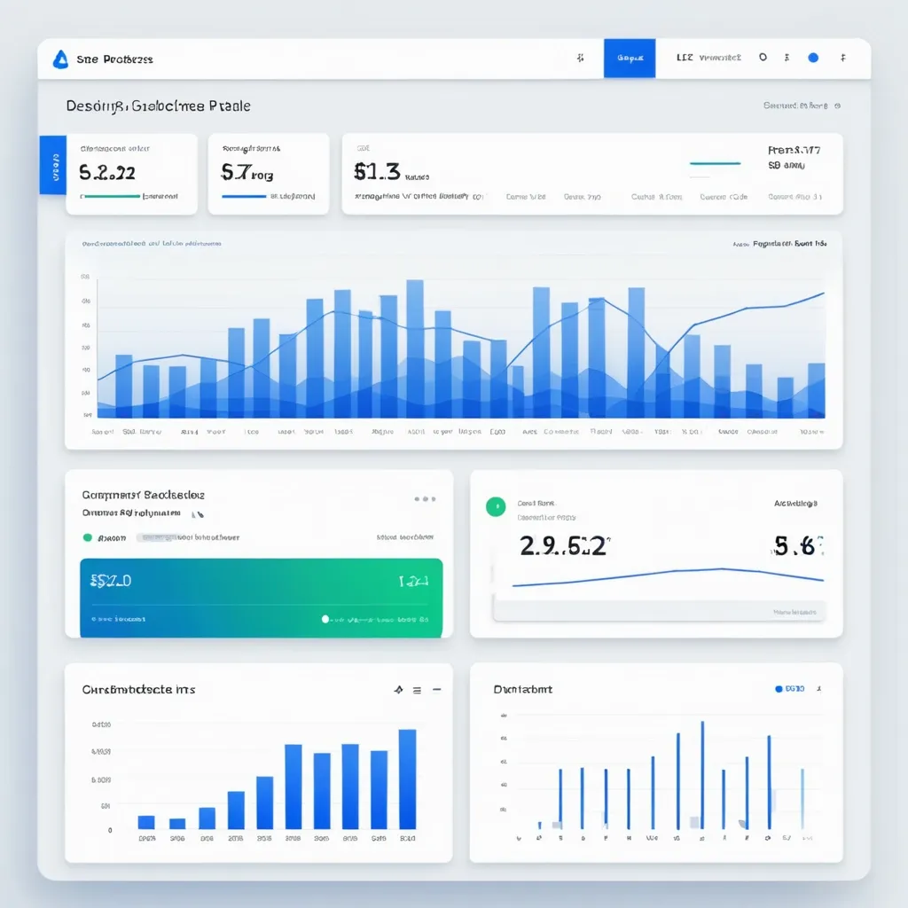

Design a clean , professional Analytics Page for the SynCloud Customer Portal. The page should focus on usage insights and billing alerts. Include the following features: Overview Cards (Top Section) Total API Requests (count) Total Compute Tokens used Current Billing Cycle Usage (percentage of quota consumed) Last Request Timestamp Budget Threshold Alerts Show colored alert bars at 50% , 80% , and 100% usage. Example: Green (50%) , Orange (80%) , Red (100%). Notifications panel showing recent alerts. Charts & Graphs Line chart: Daily API requests (last 7 days). Bar chart: Token consumption per week. Pie chart: Requests by service type (Playground , API , Agent). Detailed Usage History (Table) Columns: Date , Time , Request Type , Tokens Used , Status (Success/Failed). Search and filter by date range , request type. Option to export data as CSV/PDF. UX Considerations Sidebar navigation link highlighted: Analytics. Responsive layout (desktop + mobile). Minimal color palette with blue/white gradients and soft shadows. Tooltips on graphs for detailed insights. ,
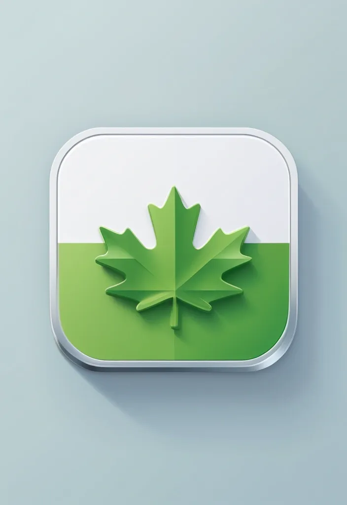
Design a clean , modern iOS-style mobile app icon for a Canadian corporate tax software called ‘SimpleTax’. Use a rounded square shape with flat colors and a minimalistic layout. Feature a maple leaf as the central element to reflect Canadian identity , and include green accents (such as a stripe , badge , or border) to suggest finance. Add a small version tag like ‘2024.1’ in a subtle but readable position. Avoid any glassy , glossy , or 3D effects — the style should be flat , balanced , professional , and App Store-ready. ,