Search Results for system
Explore AI generated designs, images, art and prompts by top community artists and designers.
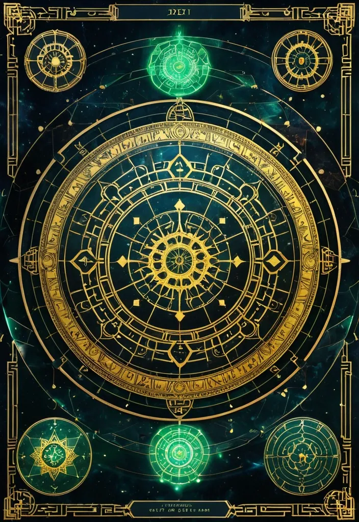

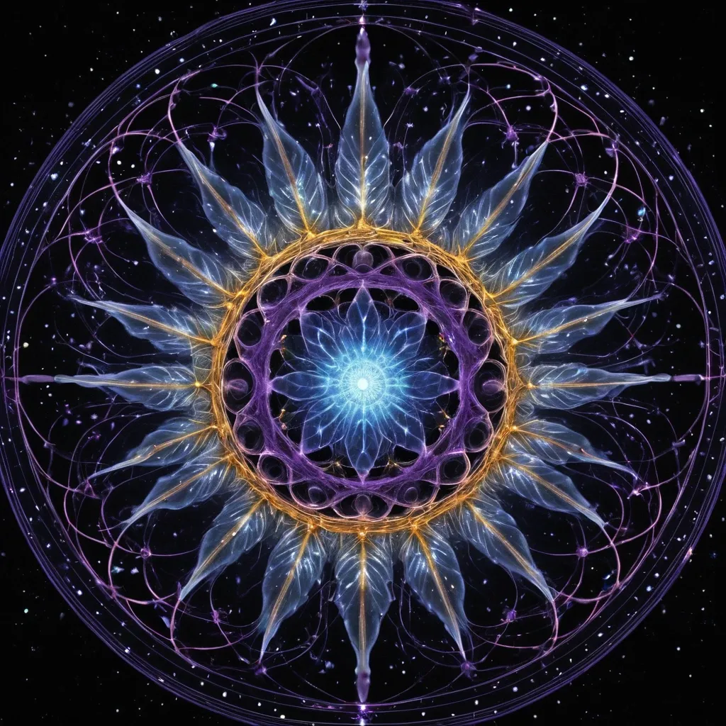
生成图片:主背景 墨宇宙黑:#05070C 深海墨蓝:#0B1A2A 夜雾青:#0E2A2F ✨ 核心能量色 命运金:#D6B35A 星轨白金:#E8E1C9 灵气青:#4FD6C8 🧱 UI结构色 玉石绿:#2E5E4E 古铜金:#8A6A3A 朱砂红(少量):#A43A3A 💡 光影规则 全局体积光(Volumetric Light) 金色粒子漂浮 星轨流动线 UI微发光边框 低对比高氛围 提示词: Chinese destiny analysis interface , "Fate Structure Revelation System" , giant rotating golden astrological mandala , combination of BaZi chart and ancient Chinese star map , jade holographic UI panels , five element energy flows (wood fire earth metal water) , deep cosmic ink background , ritual altar aesthetic with futuristic UI overlay , ultra detailed RPG interface design,16:9 ,
Design a premium A4-size professional book back cover for AIAT Technologies that perfectly matches the front cover design , color palette , typography , branding , spacing , visual hierarchy , and enterprise technology aesthetic. Portrait orientation (A4 vertical) , print-ready publishing quality , ultra-high resolution , modern cybersecurity and IT infrastructure theme. Use a clean deep navy-blue background with subtle geometric grid patterns , abstract network connections , digital circuitry , server infrastructure elements , cloud computing symbols , data streams , and elegant holographic technology accents. No humans , faces , characters , hackers , hooded figures , robots , or mascots. Create a sophisticated corporate technology appearance suitable for a professional educational publication. At the top include a section titled "About This Book". Below it place a professionally formatted book description area explaining that Windows CLI – 100 Important Commands is a practical reference guide covering essential Windows command-line tools for system administration , troubleshooting , networking , security operations , automation , diagnostics , and IT support. Include a clean feature highlights section with modern iconography containing: • 100 Essential Windows Commands • Practical Command Examples • Networking & Troubleshooting Tools • System Administration Techniques • Security & Diagnostic Utilities • Beginner to Advanced Learning Resource. Add a section titled "Who Should Read This Book?" listing: IT Professionals , System Administrators , Help Desk Engineers , Cybersecurity Analysts , Networking Students , Technology Enthusiasts , and Computer Science Learners. Include a professional AIAT Technologies company profile section with the heading "About AIAT Technologies" and a clean placeholder text area for company information. At the bottom reserve space for ISBN barcode placement , publisher information , website , email address , copyright details , and social media icons. Use premium white and cyan typography with strong readability and professional alignment. Maintain generous spacing , balanced composition , and publishing-standard formatting. The overall design must feel like a bestselling enterprise technology handbook from a leading technology training organization. Print-ready , ultra-detailed , corporate publishing quality , elegant modern layout , professional educational technology branding , 8K quality. Negative Prompt: no humans , no faces , no hooded figures , no hackers , no robots , no anime , no cartoons , no gaming appearance , no movie-poster style , no cluttered layout , no excessive neon effects , no blurry text , no distorted typography , no low resolution , no watermark , no stock-photo appearance , no horror elements , no fantasy elements. ,
# ГИПОТЕЗА 1 # «СВЕРНУТЬСЯ КЛУБОЧКОМ» ## Постер 1. Утро без спешки ### Идея Кафе как безопасное убежище от городского шума. ### Промпт Premium branding poster for a cozy art cafe called "Кюри". Warm morning atmosphere. Young woman sitting by a large window with a handmade ceramic mug , reading a book. Soft sunlight , creamy tones , warm shadows. Delicate illustrated cocoon-shaped graphic elements wrap around the person , creating a feeling of safety and comfort. Scandinavian editorial layout , lots of negative space , tactile paper texture , premium lifestyle photography. Color palette: cream , caramel , olive green , warm brown. Large elegant typography in Russian: "Свернись клубочком. Остальное подождёт." High-end branding presentation , Behance quality , art direction , poster design. --- ## Постер 2. Тёплая кружка ### Идея Фокус на ощущении тепла в руках. ### Промпт Luxury cafe branding poster. Close-up of hands holding a handmade ceramic mug with hot cocoa. Soft steam rising. Minimal background. Illustrated organic oval shapes and hand-drawn lines surrounding the mug. Warm creamy paper texture , natural light , slow living aesthetic. Premium editorial design. Color palette: oat milk , clay , olive , coffee brown. Large typography: "Завтрак без спешки". Modern Scandinavian cafe branding. High-end graphic design presentation. --- ## Постер 3. Гнездо ### Идея Кафе как место восстановления. ### Промпт Premium art cafe poster. Breakfast table with handmade ceramics , eggs , toast and cocoa. Around the composition are illustrated nest-like organic shapes , resembling blankets , pillows and soft cocoons. Cozy atmosphere , natural morning light , muted colors , tactile textures. Editorial magazine style. Sophisticated layout with generous white space. Russian typography: "Место для мягкого замедления". Branding concept presentation quality. --- # ГИПОТЕЗА 2 # «ТЁПЛЫЕ СЛЕДЫ РУК» --- ## Постер 4. Сделано руками ### Идея Тепло через ручной труд. ### Промпт Premium branding poster for handmade ceramic cafe. Large close-up photo of handmade ceramic mug with visible fingerprints and pottery texture. Around it abstract graphic elements inspired by fingerprints , clay marks and pottery wheel traces. Editorial composition. Warm terracotta , cobalt blue , cream and ochre palette. Paper texture , handcrafted feeling. Typography in Russian: "Сделано руками". Contemporary art cafe identity. Behance award-winning branding style. --- ## Постер 5. Следы присутствия ### Идея Человеческое тепло без буквальных объятий. ### Промпт Contemporary art cafe poster. Minimal photography of ceramic workshop table. Clay tools , glaze brush , unfinished ceramic cups. Abstract fingerprint patterns transformed into graphic shapes floating across the layout. Sophisticated editorial design , premium branding presentation. Warm cream background with cobalt and terracotta accents. Typography: "Здесь всё создано живыми людьми". Modern visual identity system. --- ## Постер 6. Наивная керамика ### Идея Соединение фотографии и иллюстрации. ### Промпт Creative branding poster for local art cafe. Real photograph of handmade ceramic teapot. Around it hand-drawn naive illustrations of mugs , eggs , spoons and abstract ceramic patterns. Mixed-media design combining photography and illustration. Warm handcrafted atmosphere. Premium layout with lots of breathing space. Colors: terracotta , cream , cobalt blue , mustard. Russian typography: "Керамика , завтраки и немного тепла". Contemporary cultural cafe identity. --- # ГИПОТЕЗА 3 # «ГОРОДСКОЙ РИТУАЛ» --- ## Постер 7. 09:17 ### Идея Кафе как часть ежедневного ритуала города. ### Промпт Bold contemporary cafe branding poster. Young people entering a colorful modern cafe. Large oversized numbers "09:17" dominate the composition. Bright dopamine design. Dynamic editorial layout. Graphic arrows , stickers , playful doodles and geometric elements. Inspired by modern coffee brands , trend-conscious visual identity. Colors: yellow , blue , red , green and cream. Typography in Russian: "Твой завтрак ждёт". High-end art direction. --- ## Постер 8. Сначала яйца ### Идея Ироничная молодёжная коммуникация. ### Промпт Dopamine branding poster for trendy breakfast cafe. Colorful breakfast photography. Oversized typography integrated into image composition. Playful hand-drawn graphic elements , smiley stickers , arrows , circles , dynamic composition. Bright contemporary visual identity. Colors: butter yellow , cobalt blue , tomato red , mint green. Russian headline: "Сначала яйца. Потом подвиги." Editorial campaign poster , award-winning branding. --- ## Постер 9. Новый городской ритуал ### Идея Кюри как место встречи творческого сообщества. ### Промпт Premium urban lifestyle branding poster. Bright contemporary interior with handmade ceramics , creative people , morning atmosphere. Large typography layered over photography. Graphic waves , symbols , abstract stickers and playful design elements. Modern Gen Z cafe branding. Dopamine aesthetics , contemporary editorial layout , premium presentation quality. Russian headline: "ГОРОДСКОЙ РИТУАЛ". Subheadline: "Завтрак каждый день". Behance featured branding project style. --- Для презентации BBE я бы разместила по каждой гипотезе: * 1 главный постер (из этих трёх); * 1 адаптацию в Instagram 1080×1350; * 1 носитель (кружка , стакан , упаковка или меню); * короткое описание идеи на 2–3 предложения. Так наставница увидит уже не набор референсов , а три полноценные системы айдентики. ,
Ниже — 9 готовых концептов постеров для защиты проекта. Каждый можно использовать как промпт для Stitch , Figma AI , Midjourney или другого генератора. Все выполнены так , чтобы наставница увидела не отдельную иллюстрацию , а полноценную визуальную систему бренда. --- # ГИПОТЕЗА 1 # «СВЕРНУТЬСЯ КЛУБОЧКОМ» ## Постер 1. Утро без спешки ### Идея Кафе как безопасное убежище от городского шума. ### Промпт Premium branding poster for a cozy art cafe called "Кюри". Warm morning atmosphere. Young woman sitting by a large window with a handmade ceramic mug , reading a book. Soft sunlight , creamy tones , warm shadows. Delicate illustrated cocoon-shaped graphic elements wrap around the person , creating a feeling of safety and comfort. Scandinavian editorial layout , lots of negative space , tactile paper texture , premium lifestyle photography. Color palette: cream , caramel , olive green , warm brown. Large elegant typography in Russian: "Свернись клубочком. Остальное подождёт." High-end branding presentation , Behance quality , art direction , poster design. --- ## Постер 2. Тёплая кружка ### Идея Фокус на ощущении тепла в руках. ### Промпт Luxury cafe branding poster. Close-up of hands holding a handmade ceramic mug with hot cocoa. Soft steam rising. Minimal background. Illustrated organic oval shapes and hand-drawn lines surrounding the mug. Warm creamy paper texture , natural light , slow living aesthetic. Premium editorial design. Color palette: oat milk , clay , olive , coffee brown. Large typography: "Завтрак без спешки". Modern Scandinavian cafe branding. High-end graphic design presentation. --- ## Постер 3. Гнездо ### Идея Кафе как место восстановления. ### Промпт Premium art cafe poster. Breakfast table with handmade ceramics , eggs , toast and cocoa. Around the composition are illustrated nest-like organic shapes , resembling blankets , pillows and soft cocoons. Cozy atmosphere , natural morning light , muted colors , tactile textures. Editorial magazine style. Sophisticated layout with generous white space. Russian typography: "Место для мягкого замедления". Branding concept presentation quality. --- # ГИПОТЕЗА 2 # «ТЁПЛЫЕ СЛЕДЫ РУК» --- ## Постер 4. Сделано руками ### Идея Тепло через ручной труд. ### Промпт Premium branding poster for handmade ceramic cafe. Large close-up photo of handmade ceramic mug with visible fingerprints and pottery texture. Around it abstract graphic elements inspired by fingerprints , clay marks and pottery wheel traces. Editorial composition. Warm terracotta , cobalt blue , cream and ochre palette. Paper texture , handcrafted feeling. Typography in Russian: "Сделано руками". Contemporary art cafe identity. Behance award-winning branding style. --- ## Постер 5. Следы присутствия ### Идея Человеческое тепло без буквальных объятий. ### Промпт Contemporary art cafe poster. Minimal photography of ceramic workshop table. Clay tools , glaze brush , unfinished ceramic cups. Abstract fingerprint patterns transformed into graphic shapes floating across the layout. Sophisticated editorial design , premium branding presentation. Warm cream background with cobalt and terracotta accents. Typography: "Здесь всё создано живыми людьми". Modern visual identity system. --- ## Постер 6. Наивная керамика ### Идея Соединение фотографии и иллюстрации. ### Промпт Creative branding poster for local art cafe. Real photograph of handmade ceramic teapot. Around it hand-drawn naive illustrations of mugs , eggs , spoons and abstract ceramic patterns. Mixed-media design combining photography and illustration. Warm handcrafted atmosphere. Premium layout with lots of breathing space. Colors: terracotta , cream , cobalt blue , mustard. Russian typography: "Керамика , завтраки и немного тепла". Contemporary cultural cafe identity. --- # ГИПОТЕЗА 3 # «ГОРОДСКОЙ РИТУАЛ» --- ## Постер 7. 09:17 ### Идея Кафе как часть ежедневного ритуала города. ### Промпт Bold contemporary cafe branding poster. Young people entering a colorful modern cafe. Large oversized numbers "09:17" dominate the composition. Bright dopamine design. Dynamic editorial layout. Graphic arrows , stickers , playful doodles and geometric elements. Inspired by modern coffee brands , trend-conscious visual identity. Colors: yellow , blue , red , green and cream. Typography in Russian: "Твой завтрак ждёт". High-end art direction. --- ## Постер 8. Сначала яйца ### Идея Ироничная молодёжная коммуникация. ### Промпт Dopamine branding poster for trendy breakfast cafe. Colorful breakfast photography. Oversized typography integrated into image composition. Playful hand-drawn graphic elements , smiley stickers , arrows , circles , dynamic composition. Bright contemporary visual identity. Colors: butter yellow , cobalt blue , tomato red , mint green. Russian headline: "Сначала яйца. Потом подвиги." Editorial campaign poster , award-winning branding. --- ## Постер 9. Новый городской ритуал ### Идея Кюри как место встречи творческого сообщества. ### Промпт Premium urban lifestyle branding poster. Bright contemporary interior with handmade ceramics , creative people , morning atmosphere. Large typography layered over photography. Graphic waves , symbols , abstract stickers and playful design elements. Modern Gen Z cafe branding. Dopamine aesthetics , contemporary editorial layout , premium presentation quality. Russian headline: "ГОРОДСКОЙ РИТУАЛ". Subheadline: "Завтрак каждый день". Behance featured branding project style. --- Для презентации BBE я бы разместила по каждой гипотезе: * 1 главный постер (из этих трёх); * 1 адаптацию в Instagram 1080×1350; * 1 носитель (кружка , стакан , упаковка или меню); * короткое описание идеи на 2–3 предложения. Так наставница увидит уже не набор референсов , а три полноценные системы айдентики. ,
Ниже — 9 готовых концептов постеров для защиты проекта. Каждый можно использовать как промпт для Stitch , Figma AI , Midjourney или другого генератора. Все выполнены так , чтобы наставница увидела не отдельную иллюстрацию , а полноценную визуальную систему бренда. --- # ГИПОТЕЗА 1 # «СВЕРНУТЬСЯ КЛУБОЧКОМ» ## Постер 1. Утро без спешки ### Идея Кафе как безопасное убежище от городского шума. ### Промпт Premium branding poster for a cozy art cafe called "Кюри". Warm morning atmosphere. Young woman sitting by a large window with a handmade ceramic mug , reading a book. Soft sunlight , creamy tones , warm shadows. Delicate illustrated cocoon-shaped graphic elements wrap around the person , creating a feeling of safety and comfort. Scandinavian editorial layout , lots of negative space , tactile paper texture , premium lifestyle photography. Color palette: cream , caramel , olive green , warm brown. Large elegant typography in Russian: "Свернись клубочком. Остальное подождёт." High-end branding presentation , Behance quality , art direction , poster design. --- ## Постер 2. Тёплая кружка ### Идея Фокус на ощущении тепла в руках. ### Промпт Luxury cafe branding poster. Close-up of hands holding a handmade ceramic mug with hot cocoa. Soft steam rising. Minimal background. Illustrated organic oval shapes and hand-drawn lines surrounding the mug. Warm creamy paper texture , natural light , slow living aesthetic. Premium editorial design. Color palette: oat milk , clay , olive , coffee brown. Large typography: "Завтрак без спешки". Modern Scandinavian cafe branding. High-end graphic design presentation. --- ## Постер 3. Гнездо ### Идея Кафе как место восстановления. ### Промпт Premium art cafe poster. Breakfast table with handmade ceramics , eggs , toast and cocoa. Around the composition are illustrated nest-like organic shapes , resembling blankets , pillows and soft cocoons. Cozy atmosphere , natural morning light , muted colors , tactile textures. Editorial magazine style. Sophisticated layout with generous white space. Russian typography: "Место для мягкого замедления". Branding concept presentation quality. --- # ГИПОТЕЗА 2 # «ТЁПЛЫЕ СЛЕДЫ РУК» --- ## Постер 4. Сделано руками ### Идея Тепло через ручной труд. ### Промпт Premium branding poster for handmade ceramic cafe. Large close-up photo of handmade ceramic mug with visible fingerprints and pottery texture. Around it abstract graphic elements inspired by fingerprints , clay marks and pottery wheel traces. Editorial composition. Warm terracotta , cobalt blue , cream and ochre palette. Paper texture , handcrafted feeling. Typography in Russian: "Сделано руками". Contemporary art cafe identity. Behance award-winning branding style. --- ## Постер 5. Следы присутствия ### Идея Человеческое тепло без буквальных объятий. ### Промпт Contemporary art cafe poster. Minimal photography of ceramic workshop table. Clay tools , glaze brush , unfinished ceramic cups. Abstract fingerprint patterns transformed into graphic shapes floating across the layout. Sophisticated editorial design , premium branding presentation. Warm cream background with cobalt and terracotta accents. Typography: "Здесь всё создано живыми людьми". Modern visual identity system. --- ## Постер 6. Наивная керамика ### Идея Соединение фотографии и иллюстрации. ### Промпт Creative branding poster for local art cafe. Real photograph of handmade ceramic teapot. Around it hand-drawn naive illustrations of mugs , eggs , spoons and abstract ceramic patterns. Mixed-media design combining photography and illustration. Warm handcrafted atmosphere. Premium layout with lots of breathing space. Colors: terracotta , cream , cobalt blue , mustard. Russian typography: "Керамика , завтраки и немного тепла". Contemporary cultural cafe identity. --- # ГИПОТЕЗА 3 # «ГОРОДСКОЙ РИТУАЛ» --- ## Постер 7. 09:17 ### Идея Кафе как часть ежедневного ритуала города. ### Промпт Bold contemporary cafe branding poster. Young people entering a colorful modern cafe. Large oversized numbers "09:17" dominate the composition. Bright dopamine design. Dynamic editorial layout. Graphic arrows , stickers , playful doodles and geometric elements. Inspired by modern coffee brands , trend-conscious visual identity. Colors: yellow , blue , red , green and cream. Typography in Russian: "Твой завтрак ждёт". High-end art direction. --- ## Постер 8. Сначала яйца ### Идея Ироничная молодёжная коммуникация. ### Промпт Dopamine branding poster for trendy breakfast cafe. Colorful breakfast photography. Oversized typography integrated into image composition. Playful hand-drawn graphic elements , smiley stickers , arrows , circles , dynamic composition. Bright contemporary visual identity. Colors: butter yellow , cobalt blue , tomato red , mint green. Russian headline: "Сначала яйца. Потом подвиги." Editorial campaign poster , award-winning branding. --- ## Постер 9. Новый городской ритуал ### Идея Кюри как место встречи творческого сообщества. ### Промпт Premium urban lifestyle branding poster. Bright contemporary interior with handmade ceramics , creative people , morning atmosphere. Large typography layered over photography. Graphic waves , symbols , abstract stickers and playful design elements. Modern Gen Z cafe branding. Dopamine aesthetics , contemporary editorial layout , premium presentation quality. Russian headline: "ГОРОДСКОЙ РИТУАЛ". Subheadline: "Завтрак каждый день". Behance featured branding project style. --- Для презентации BBE я бы разместила по каждой гипотезе: * 1 главный постер (из этих трёх); * 1 адаптацию в Instagram 1080×1350; * 1 носитель (кружка , стакан , упаковка или меню); * короткое описание идеи на 2–3 предложения. Так наставница увидит уже не набор референсов , а три полноценные системы айдентики. ,
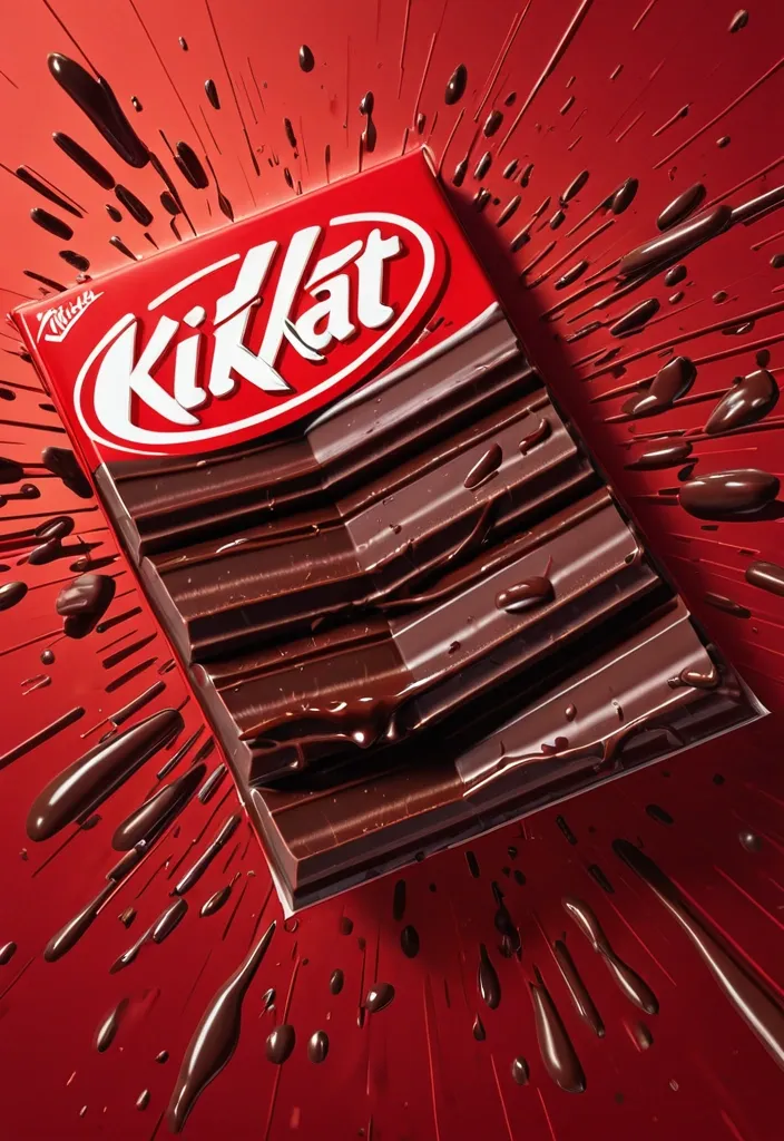
FORMAT: 4:5 vertical hyper-commercial chocolate campaign poster , ultra-high resolution (8K) , premium billboard + social media advertising ready Style: bold FMCG advertising × modern snack campaign × energetic commercial poster design × high-impact product photography 🧠 CORE IDEA: THE BREAK EVERYONE WAITS FOR. A campaign built around impact , craving , and satisfying motion. Everything in the composition reacts to the iconic KitKat snap. 🎬 MASTER COMPOSITION: BACKGROUND: Deep KitKat red environment Layered with: - rich red gradients - chocolate texture overlays - dynamic motion streaks - subtle crumb particles - repeated typography patterns - glossy studio reflections The atmosphere should feel: bold , hungry , energetic , commercially explosive. 👤 HUMAN SUBJECT: Young Gen-Z male/female model Expression: playful , confident , mid-enjoyment moment Pose: holding KitKat toward camera mid-snap action Camera angle: slightly low + close perspective for product dominance Wardrobe: modern streetwear in neutral tones allowing red palette to dominate 💥 VISUAL ENERGY: The SNAP becomes the visual explosion. At the break point: - chocolate shards flying outward - wafer crumbs suspended mid-air - liquid chocolate streaks - motion lines radiating from snap Typography physically cracks apart following the KitKat break. Feels: satisfying , punchy , commercially exaggerated. 🍫 PRODUCT HERO: [KitKat](chatgpt://generic-entity?number=0) chocolate bar + wrapper Placement: foreground center-right Angle: extreme 3/4 hero perspective Product details: - hyper-real chocolate texture - visible wafer layers - glossy melted chocolate highlights - realistic crumbs - embossed KitKat logo - premium wrapper reflections Chocolate should feel: crispy , rich , irresistible. ✍️ TYPOGRAPHY SYSTEM: MAIN HEADLINE: “BREAK TIME.” Typography style: - ultra-bold condensed sans-serif - oversized stacked layout - white typography - extremely tight spacing - cracked/distorted around snap point SECONDARY TEXT: “HAVE A BREAK. HAVE A KITKAT.” BACKGROUND TYPOGRAPHY: Repeated low-opacity words: SNAP CRUNCH BREAK CHOCOLATE WAFER MELT integrated into background layers 📦 FEATURE INFORMATION STRIP: Bottom premium feature strip: □ CRISPY WAFER □ RICH CHOCOLATE □ ICONIC SNAP □ PERFECT BREAK Minimal modern icon system. 📣 CTA SECTION: BOTTOM LEFT: “NEW SHARING PACK AVAILABLE” CTA BUTTON: solid white rectangular button TEXT: “GRAB NOW” Secondary micro CTA: “Available Online & In Stores” 🌐 WEBSITE + BRAND INFO: BOTTOM CENTER: www.kitkat BOTTOM MICROTEXT: “NESTLÉ KITKAT · 2026 EDITION” 🎨 COLOR SYSTEM: PRIMARY: KitKat red deep chocolate brown SECONDARY: white typography ACCENTS: warm chocolate highlights golden wafer tones Palette should feel: bold , delicious , high-energy , commercial. 💡 LIGHTING SYSTEM: MAIN LIGHT: strong commercial studio key light RIM LIGHT: warm chocolate highlights around product ACCENT LIGHT: soft red glow behind snap motion ATMOSPHERIC LIGHT: subtle floating particles catching light REFLECTIONS: glossy FMCG-grade reflections Lighting should feel: premium snack advertising × modern commercial photography. ✨ HYPER DETAILING: - ultra-real wafer texture - sharp chocolate break detail - floating crumb realism - melted chocolate reflections - premium wrapper texture - billboard readability maintained - ultra-clean typography edges - high-end FMCG rendering quality 📐 COMPOSITION FLOW: Upper Frame: massive typography dominance Center: snap explosion + human interaction Foreground: product hero Lower-left: CTA + features Eye flow: Headline → Snap → Product → Chocolate Motion → CTA 🎥 CAMERA & RENDER: - commercial food photography - Phase One medium format feel - 35–50mm lens - HDR commercial rendering - ultra-clean sharpness - premium FMCG color grading 🔥 FINAL FEEL: Feels like: Nike energy campaign × premium FMCG launch × modern Behance commercial food poster. ,
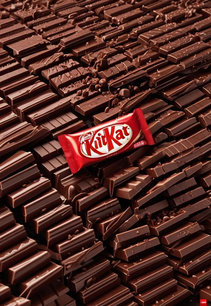
FORMAT: 4:5 vertical hyper-commercial chocolate campaign poster , ultra-high resolution (8K) , premium billboard + social media advertising ready Style: bold FMCG advertising × modern snack campaign × energetic commercial poster design × high-impact product photography 🧠 CORE IDEA: THE BREAK EVERYONE WAITS FOR. A campaign built around impact , craving , and satisfying motion. Everything in the composition reacts to the iconic KitKat snap. 🎬 MASTER COMPOSITION: BACKGROUND: Deep KitKat red environment Layered with: - rich red gradients - chocolate texture overlays - dynamic motion streaks - subtle crumb particles - repeated typography patterns - glossy studio reflections The atmosphere should feel: bold , hungry , energetic , commercially explosive. 👤 HUMAN SUBJECT: Young Gen-Z male/female model Expression: playful , confident , mid-enjoyment moment Pose: holding KitKat toward camera mid-snap action Camera angle: slightly low + close perspective for product dominance Wardrobe: modern streetwear in neutral tones allowing red palette to dominate 💥 VISUAL ENERGY: The SNAP becomes the visual explosion. At the break point: - chocolate shards flying outward - wafer crumbs suspended mid-air - liquid chocolate streaks - motion lines radiating from snap Typography physically cracks apart following the KitKat break. Feels: satisfying , punchy , commercially exaggerated. 🍫 PRODUCT HERO: [KitKat](chatgpt://generic-entity?number=0) chocolate bar + wrapper Placement: foreground center-right Angle: extreme 3/4 hero perspective Product details: - hyper-real chocolate texture - visible wafer layers - glossy melted chocolate highlights - realistic crumbs - embossed KitKat logo - premium wrapper reflections Chocolate should feel: crispy , rich , irresistible. ✍️ TYPOGRAPHY SYSTEM: MAIN HEADLINE: “BREAK TIME.” Typography style: - ultra-bold condensed sans-serif - oversized stacked layout - white typography - extremely tight spacing - cracked/distorted around snap point SECONDARY TEXT: “HAVE A BREAK. HAVE A KITKAT.” BACKGROUND TYPOGRAPHY: Repeated low-opacity words: SNAP CRUNCH BREAK CHOCOLATE WAFER MELT integrated into background layers 📦 FEATURE INFORMATION STRIP: Bottom premium feature strip: □ CRISPY WAFER □ RICH CHOCOLATE □ ICONIC SNAP □ PERFECT BREAK Minimal modern icon system. 📣 CTA SECTION: BOTTOM LEFT: “NEW SHARING PACK AVAILABLE” CTA BUTTON: solid white rectangular button TEXT: “GRAB NOW” Secondary micro CTA: “Available Online & In Stores” 🌐 WEBSITE + BRAND INFO: BOTTOM CENTER: www.kitkat BOTTOM MICROTEXT: “NESTLÉ KITKAT · 2026 EDITION” 🎨 COLOR SYSTEM: PRIMARY: KitKat red deep chocolate brown SECONDARY: white typography ACCENTS: warm chocolate highlights golden wafer tones Palette should feel: bold , delicious , high-energy , commercial. 💡 LIGHTING SYSTEM: MAIN LIGHT: strong commercial studio key light RIM LIGHT: warm chocolate highlights around product ACCENT LIGHT: soft red glow behind snap motion ATMOSPHERIC LIGHT: subtle floating particles catching light REFLECTIONS: glossy FMCG-grade reflections Lighting should feel: premium snack advertising × modern commercial photography. ✨ HYPER DETAILING: - ultra-real wafer texture - sharp chocolate break detail - floating crumb realism - melted chocolate reflections - premium wrapper texture - billboard readability maintained - ultra-clean typography edges - high-end FMCG rendering quality 📐 COMPOSITION FLOW: Upper Frame: massive typography dominance Center: snap explosion + human interaction Foreground: product hero Lower-left: CTA + features Eye flow: Headline → Snap → Product → Chocolate Motion → CTA 🎥 CAMERA & RENDER: - commercial food photography - Phase One medium format feel - 35–50mm lens - HDR commercial rendering - ultra-clean sharpness - premium FMCG color grading 🔥 FINAL FEEL: Feels like: Nike energy campaign × premium FMCG launch × modern Behance commercial food poster. ,
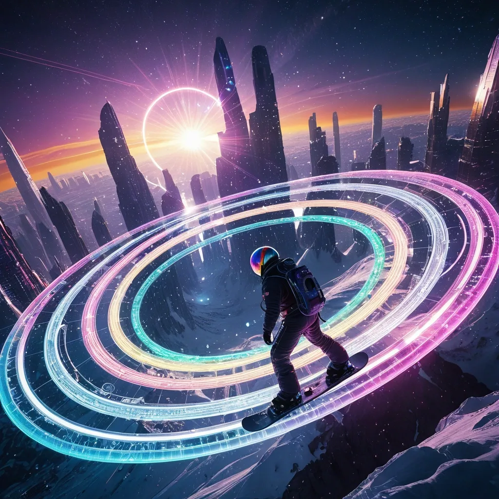
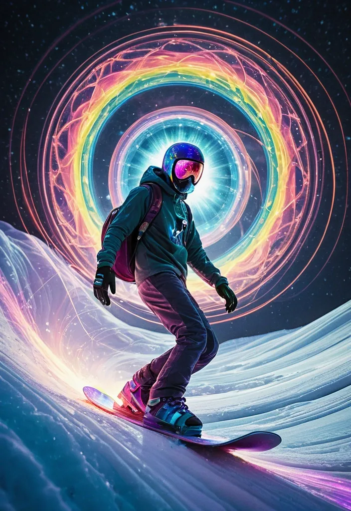
A breathtaking vista of a planetary ring system made not of ice and rock , but of intricate , shimmering data streams and celestial skyscrapers of city in full bloom. A casting ethereal light onto the rings. A astronaut surfer on a futuristic snowboard at the apex of a daring ride through ring. The snowboard emits a brilliant , ionized trail of neon-lit motion waves in vibrant , rainbow hues , creating a striking contrast against the dark. ,
Envision a planetary ring system that defies conventional reality , where iridescent , glowing data streams and fantastical , skyscraper-like structures in full bloom create a mesmerizing , dreamlike landscape. A Spider-Man surfer , wearing a flowing , cosmic cloak , navigates a shimmering , rainbow-colored snowboard through the shimmering rings , which seem to respond to his presence with dynamic , swirling patterns of light. The snowboard's ionized trail manifests as a kaleidoscope of neon hues , swirling and dancing across the dark expanse like a celestial display of fireworks. The scene is infused with a soft , ethereal light that seems to emanate from the rings themselves , casting an otherworldly glow on the surfer and his surroundings. The atmosphere is one of enchantment , curiosity , and limitless possibility. ,
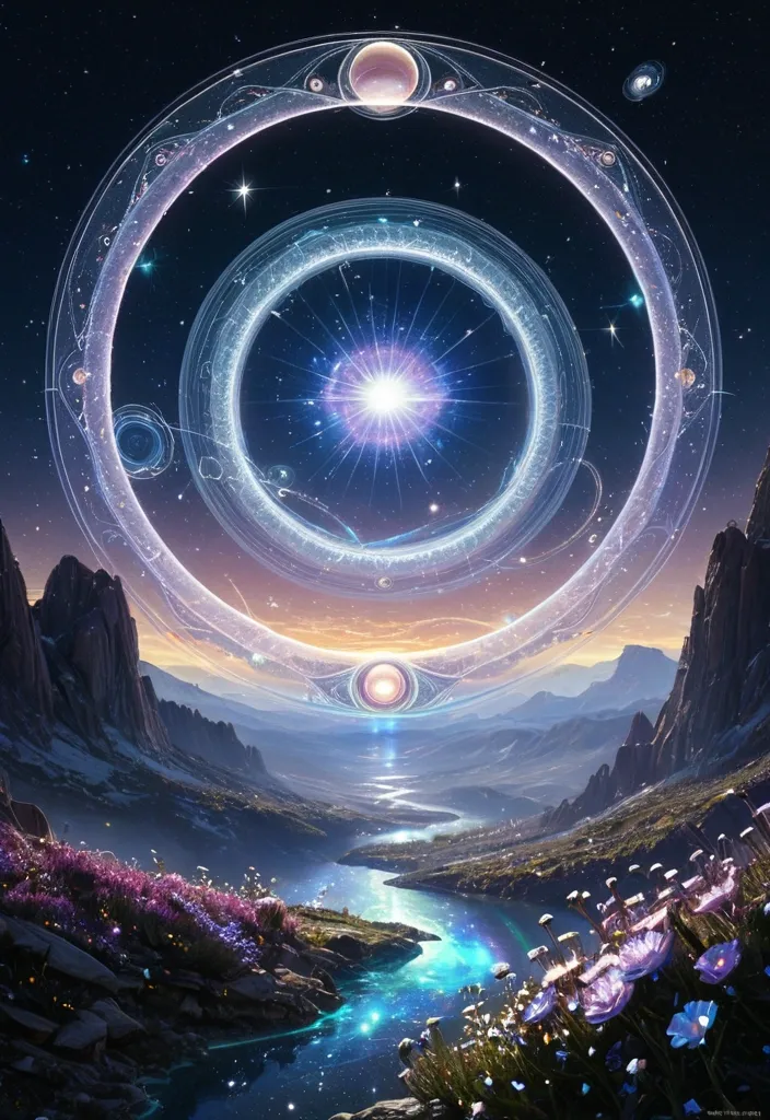
A breathtaking vista of a planetary ring system made not of ice and rock , but of intricate , shimmering data streams and celestial flowers in full bloom. Twin moons hang in the iridescent sky , casting ethereal light onto the rings. The style is that of an awe-inspiring digital painting , capturing the vastness and beauty of interstellar mythology. ,
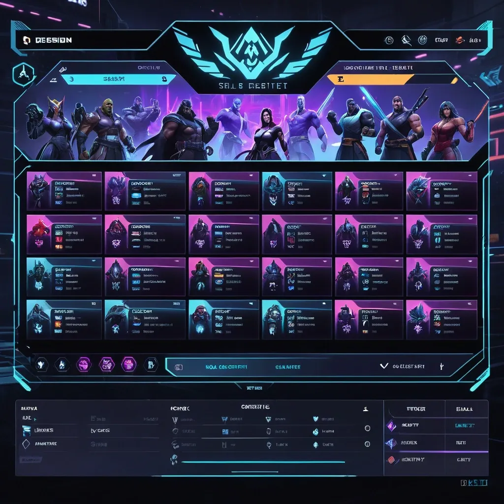
Create a premium , highly believable Character Select Screen for an imaginary game called NIGHT CIRCUIT. The goal is to make the interface feel like a real playable roster screen from a major game: visually addictive , commercially polished , instantly readable , and full of personality. It should feel like a screen players would pause on , screenshot , and obsess over before choosing their main. Game details: - Game title: NIGHT CIRCUIT - Genre: competitive fighting game - Core concept: a neon-noir 2D fighter where underground icons , assassins , idols , and synthetic rebels battle for control of a city-sized entertainment grid - Roster type: small elite cast - Main fantasy: choosing a stylish , dangerous fighter with a very specific attitude and mastering them completely - Audience: fighting-game fans , anime-game lovers , esports audiences , design-conscious gamers - Tone: stylish , competitive , electric , cinematic - Cultural vibe: anime fighter , arcade prestige , cyber-street fashion , esports polish - Reality level: believable AAA Screen structure: Build the interface like a real character selection menu. Include sections such as: - game logo or mode title - character grid or lineup - highlighted selected character - full character portrait or hero pose - character name - class / role / faction - stats or attributes - signature ability or move - optional difficulty rating - optional lock / unlock state - optional alternate skins or color variants - optional player cursor or selection frame For the roster , include: - 12 believable character slots - distinct silhouettes and identities - a coherent roster ecosystem - varied classes , archetypes , or playstyles - names that feel genre-appropriate and memorable Include: - a strong selected-character focus - premium UI hierarchy - readable roster logic - believable stat or role indicators - polished iconography - clear class/faction differentiation - strong "pick your main" energy - instantly shareable game-interface appeal Visual direction: - Make the screen feel like a real game menu players would see before a match or campaign start - Emphasize identity , hype , choice , and roster fantasy - Balance clean UX structure with strong character-worldbuilding - Make it suitable for social sharing , fake game concepts , fan-worldbuilding , gaming mockups , or launch materials - The result should look like a genuine roster screen from a popular game Art direction: - Style: premium anime-fighter character select UI with esports-ready polish - Color palette: black , electric violet , cyan , crimson , silver-grey - Typography feel: sharp arcade-sci-fi type with clean stat labels - Material feel: console match-lobby screen and tournament-ready roster interface - Lighting or image mood: neon glow , competitive energy , polished dark-mode interface - Background: abstract digital arena with city-grid light trails Composition: - Show the screen as one cohesive character-select interface - Make the selected character , roster , and key stats instantly readable - Use real game-menu hierarchy and interaction logic - Make the cast feel iconic , varied , and mechanically real - Make the final output feel like a premium fake game UI with viral potential Output quality: - ultra-detailed - visually structured - commercially believable - culturally fluent - polished gaming UI design - strong hierarchy and spacing - premium character-roster composition - instantly shareable visual concept Optional content blocks: - player 1 marker - random select slot - difficulty stars - alternate skin selector - faction icon - season character lock Avoid: - generic character poses - weak roster variety - fake-looking stat systems - cluttered interface - random icons without gameplay logic - amateur game-menu aesthetics - inconsistent character style across the roster - too much text fighting the UI ,
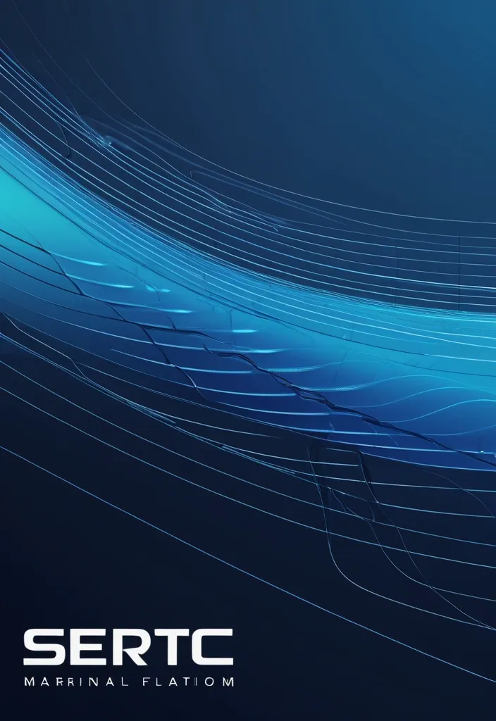
{ "prompt": "Design a high-end corporate banner for a marine technology company called SERTEC Marine , based on the attached reference image. Elevate the existing design into a premium 'Fluid Tech Layers' concept. Maintain the idea of flowing wave shapes but transform them into precise , engineered , layered vector forms with clean edges and controlled geometry. The composition should feature multiple overlapping curved layers moving horizontally from left to right , representing data flow , ocean currents , and advanced systems.\n\nIncorporate subtle technical elements such as thin wireframe lines , navigation paths , or circuit-like details integrated along the curves. Add micro details like connection points and segmented lines to enhance the technological feel without cluttering the design.\n\nUse a sophisticated gradient palette: deep navy blue , indigo , and electric cyan accents. Apply smooth gradient transitions with depth and contrast. Include subtle glassmorphism effects (translucent layers with soft lighting) to create a sense of depth and modernity.\n\nThe background should feel clean , corporate , and high-tech — not decorative. Avoid excessive blur. Prioritize precision , clarity , and structure.\n\nPlace the SERTEC Marine logo on the right side , preserving its integrity , ensuring strong contrast and visibility. The design must feel balanced , with negative space and a refined layout suitable for corporate documents (headers , footers , presentations).\n\nOverall mood: premium , technological , controlled fluidity , marine engineering , data-driven environment." , "referenced_image_ids": ["file_000000008bc471f5ab046ab00fbdb553"] , "size": "1792x512" } ,
Design a high-end cinematic character poster in a layered depth composition (9:16 vertical) with a strong foreground–midground–background separation instead of silhouette framing. The character stands slightly off-center in a dynamic , perspective-driven pose , interacting naturally with the environment (wind , light , particles , fabric movement). The camera angle should feel intentional—low-angle for power or slight tilt for tension—creating a sense of motion and presence. The background should not be contained inside shapes. Instead , build a living world around the character: atmospheric environments (fog , city lights , ruins , nature , etc.) light rays , volumetric glow , drifting particles subtle storytelling elements placed naturally in space (not collage-based) Introduce floating fragments or layered planes (glass shards , light panels , memories , holographic slices , or torn paper edges) that orbit or intersect the scene , each containing faint symbolic visuals tied to the character’s story—keep them minimal and elegant , not cluttered. Lighting should be cinematic and directional: strong key light shaping the subject rim lighting to separate from background soft gradients and shadow falloff for depth Color palette should follow a controlled dual-tone system (e.g. , teal–orange , violet–gold , crimson–black) with smooth transitions and no oversaturation. Typography: place the title in a clean , modern cinematic layout integrate text subtly into the environment (ground plane , light projection , or floating UI style) avoid heavy or oversized typography Overall style: ultra-realistic + cinematic editorial , sharp detail on subject , soft atmospheric depth in background , minimal but intentional storytelling elements , premium movie-poster quality. Avoid: silhouette fill compositions , heavy collage density , watercolor textures , or ink-wash edges. Focus on spatial depth , realism , and cinematic immersion. ,
massive ultra advanced alien megastructure planet with impossible scale , entire surface partially artificial and partially natural , gigantic floating continents suspended in sky with anti-gravity fields , interconnected by glowing energy highways and light bridges , colossal futuristic alien cities spread across multiple layers of atmosphere , with towering megastructures piercing clouds and extending into space , illuminated by dynamic holographic systems and energy cores , planetary rings cutting directly through atmosphere at low altitude , casting moving shadows and glowing light streaks across entire world , broken moons and asteroid belts orbiting very close creating cinematic depth , entire sections of land rotating slowly in air , gravity bending visibly , magnetic fields forming glowing wave patterns across sky , time-distortion zones subtly warping environment , giant energy pillars shooting from surface into space , connecting planet to orbiting alien stations , massive floating platforms and sky cities hovering above clouds , oceans forming levitating water masses and circular gravity pools , waterfalls flowing upward into sky , luminous energy rivers crossing continents , sky filled with cosmic storms , lightning across horizon , nebula-like clouds inside atmosphere , multiple suns creating layered lighting and extreme contrast , ancient + futuristic fusion architecture , alien technology beyond human understanding , hyper-detailed surfaces with glowing circuits and organic-metal blend , cinematic IMAX ultra wide shot , extreme depth , layered composition (foreground floating rocks , mid mega city , background planet rings) , ultra detailed , 8k resolution , hyper realistic , razor sharp focus , depth of field , sci-fi fantasy environment , volumetric lighting , god rays , atmospheric scattering , global illumination , extreme lighting contrast , reflections , shadows , cinematic color grading , color palette: deep violet , neon blue , cyan glow , magenta highlights , dark space blacks , camera angle: ultra wide low + aerial hybrid cinematic shot , mood: god-tier , mind-blowing , surreal , epic , mysterious , divine technology , masterpiece , best quality , ultra realistic , cinematic lighting , Unreal Engine 5 render , ray tracing , HDR , IMAX scale , no blur , no distortion , perfect composition , insane detail ,
Extreme neuro-mystic visual where a fully clear and undistorted field becomes responsive to a central internal signal. From this clarity , new configurations emerge intentionally , not reactively. The system now creates with awareness rather than being shaped by distortion. Black-violet void , white-perl precise generative patterns , minimal gold as conscious choice core. Ultra cinematic , immersive , Energy flow: • Truth current: Diamond-light beams piercing illusions • Harmony wave: Violet mist dissolving sharp edges - Background: Holographic Schwarzwald merging with nebula , trees made of starlight and silence - Sacred details: » Stork's eye contains rotating galaxy with "Sein" written in light » Cannabis trichomes refracting truth-light into rainbow prisms » Coffee bean cracks revealing microscopic mandalas - Style: Micro/macro cosmic realism , Esao Andrews meets Hubble photography - Light alchemy: » Bioluminescent truth (wavelength 540nm) » Phosphorescent harmony (wavelength 420nm) » Unified glow where spectrums merge (golden-white) --ar 1:1 --detail 32k --quantum_healing ,
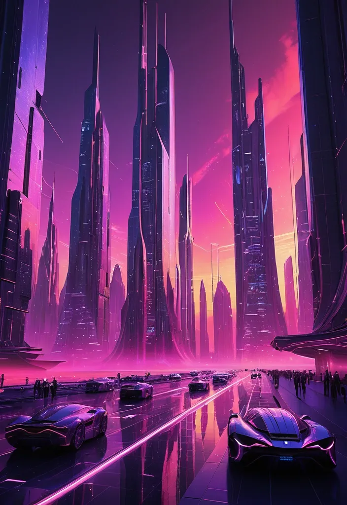
A breathtaking piece of futuristic concept art depicting a sprawling , high-tech megalopolis at the peak of a synthwave twilight. The architecture consists of soaring , needle-like skyscrapers crafted from brushed chrome and iridescent carbon fiber , their organic , aerodynamic curves piercing a vivid sky. Between these monoliths , sleek , teardrop-shaped vehicles glide through invisible aerial conduits , leaving elongated streaks of neon light in their wake. The city's facades are transformed into living canvases by colossal , transparent OLED GUI interfaces embedded directly into the glass. These shimmering holographic overlays display intricate , real-time data visualizations: flowing golden heat maps of urban traffic , rotating 3D weather systems in translucent cerulean , and cascading streams of binary data that pulse with a soft inner light. The color palette is intensely saturated and vibrant; the horizon is a brilliant explosion of warm magenta , deep amethyst , and electric coral , casting a glowing , atmospheric haze over the entire cityscape. The light reflects off the polished surfaces of the buildings , creating a mirrored world of pinks and purples. The perspective is a cinematic wide shot , emphasizing the overwhelming scale and verticality of the environment , evoking a sense of profound awe and a glimpse into a polished , utopian future. ,
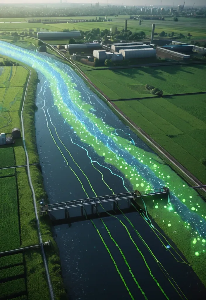
A detailed fluorescent green-dotted 3D horizontally hologram map on earth with Earth’s Ecosystems details , blue-labels and red-data (No text) overlays around him. The image is captured as a hyper-detailed cinematic film still , with sharp focus on the guardian and a soft bokeh effect on the background , emphasizing the magical threshold. A semi-realistic illustration of micro-pollutants' journey through the Earth’s Ecosystems , divided into three connected scenes: Agriculture (leftside in face shape): Fields with crops , a tractor spraying pesticides. Visible droplets seeping into the soil , contaminating groundwater (show wavy lines or faint glowing dots representing pollutants moving underground toward a river. Urban (center in face shape): A wastewater treatment plant discharging effluent into a river (use pipes with flowing water). Subtle glowing dots (micropollutants) remain in the discharged water. Factories or houses in the background. Water Treatment (rightside in face shape): A high-tech facility with reactors (UV/ozone tanks , bubbling systems) purifying water. Show scientists checking monitors (no text on screens) and clean water exiting the plant. ,
Create a professional website banner for a junior designer specializing in sustainable design. Modern and minimalist layout , clean typography , lots of negative space. Natural color palette (sage green , warm beige , soft terracotta , off-white). Subtle organic shapes and eco-inspired graphic elements (leaves , recycled paper texture , light grain). Elegant sans-serif typography. Sophisticated , calm and contemporary aesthetic. High resolution , 1584 × 396 px , horizontal format , balanced composition , premium branding look. Si tu veux un rendu plus premium type agence éco-luxe , tu peux ajouter : Soft natural lighting , editorial design feel , refined grid system , high-end brand identity style. ,
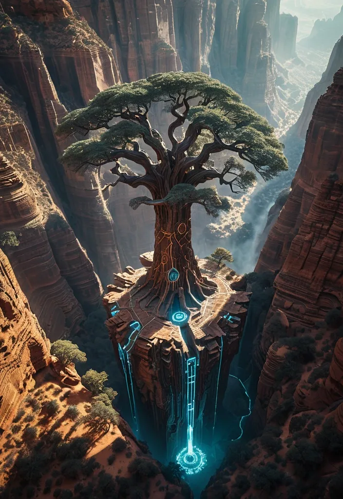
A colossal ancient tree with circuitry patterns embedded in its bark , its roots reaching into a vast , unexplored canyon system bathed in ethereal light. A single , small drone hovers near the canopy , surveying the scene. The image should evoke a sense of awe and mystery , blending natural grandeur with advanced , ancient technology. Shot with a wide-angle cinematic lens , capturing the immense scale and atmospheric depth , reminiscent of fantasy concept art. ,
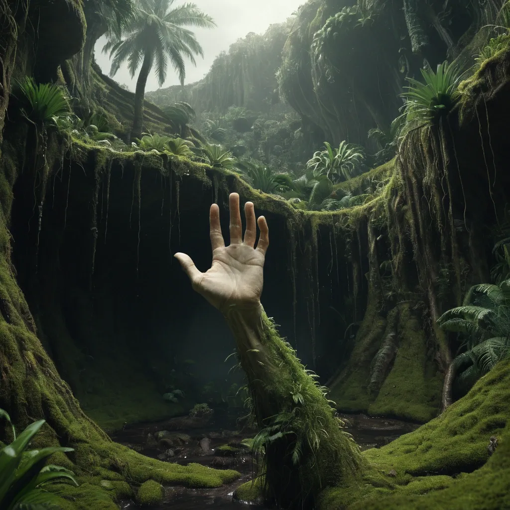
surreal environmental scene where a human arm rises naturally upward from the ground , arm extended vertically and wrist gently bent so the palm faces horizontally like a landscape plateau , the palm fully transformed into natural terrain , skin seamlessly becoming soil , moss , roots and vegetation , where a single transitions into a waterfall that fall from and fills the structure of the garden in a Interference style , total organic fusion between hand and ecosystem , the hand elevated but clearly attached to a real arm and body below frame , not floating , photorealistic textures , cinematic lighting , soft natural atmosphere , environmental concept art , magical realism , ultra detailed , wide shot , depth , 8k ,
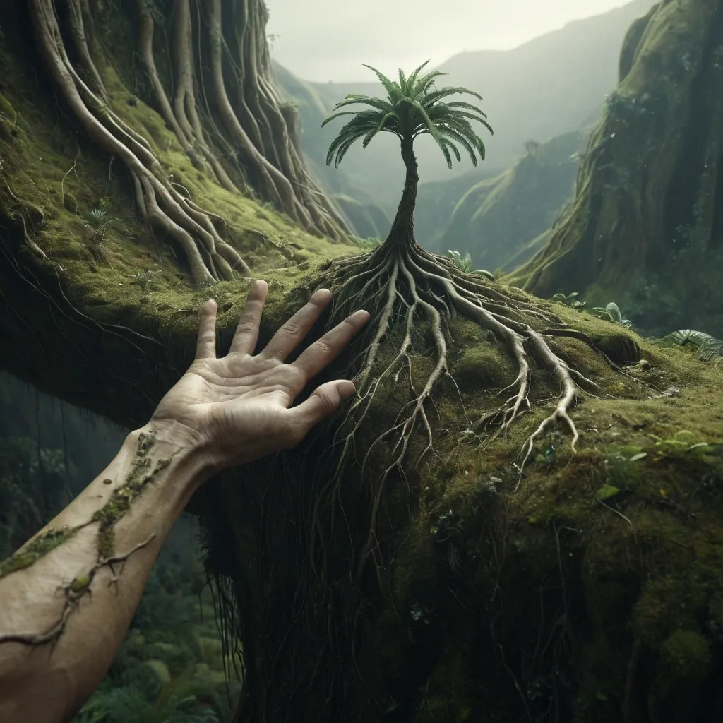
surreal environmental scene where a human arm rises naturally upward from the ground , arm extended vertically and wrist gently bent so the palm faces horizontally like a landscape plateau , the palm fully transformed into natural terrain , skin seamlessly becoming soil , moss , roots and vegetation , a tree growing from the center as if planted in fertile earth , fingers reshaped into hills and landforms rather than recognizable fingers , total organic fusion between hand and ecosystem , the hand elevated but clearly attached to a real arm and body below frame , not floating , photorealistic textures , cinematic lighting , soft natural atmosphere , environmental concept art , magical realism , ultra detailed , wide shot , depth , 8k ,
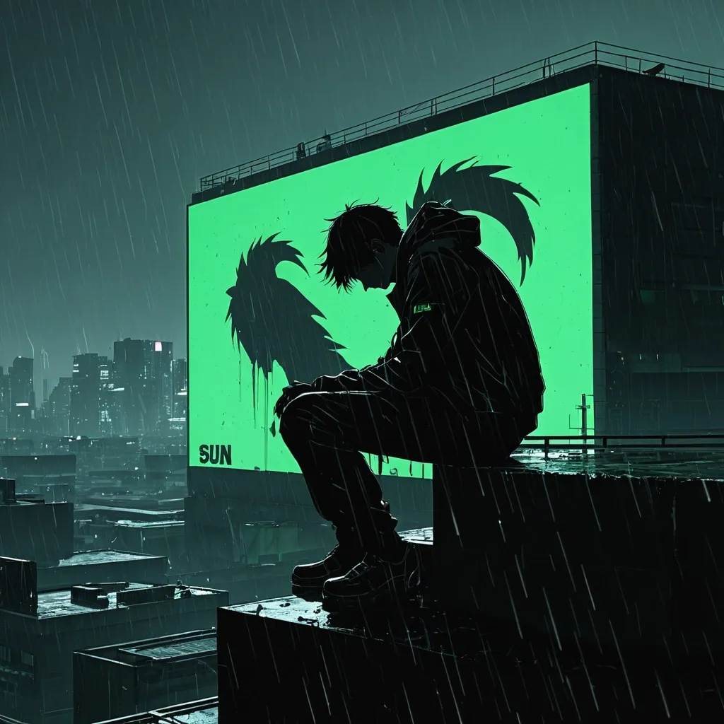
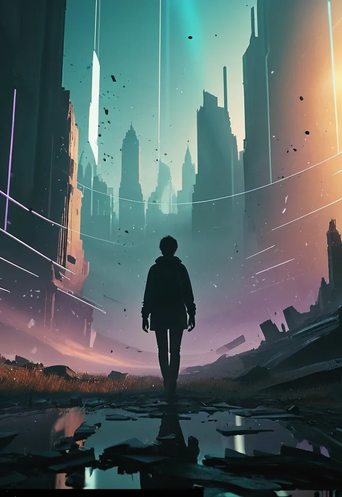
Side profile shot , the man sitting on the rooftop ledge , head down , defeated , silhouette against a giant digital billboard showing a "System Stable" green icon , rain stops , smoke rising , Dark Anime Manhwa style , gritty illustration , Cyberpunk Noir aesthetic , high contrast , 8k resolution --ar 9:16 ,
Masterpiece: Minimalist logo emblem. A single continuous line forms a lion's profile that seamlessly becomes the arm of a scales , which then curves into a root system. Contained within a perfect circle. Flat design , two colors: deep green and warm gold. Clean , professional , sacred geometry. Highquality ,
Masterpiece: Minimalist logo emblem. A single continuous line forms a lion's profile that seamlessly becomes the arm of a scales , which then curves into a root system. Contained within a perfect circle. Flat design , two colors: deep green and warm gold. Clean , professional , sacred geometry. Highquality ,
Masterpiece: Minimalist logo emblem. A single continuous line forms a lion's profile that seamlessly becomes the arm of a scales , which then curves into a root system. Contained within a perfect circle. Flat design , two colors: deep green and warm gold. Clean , professional , sacred geometry. Highquality ,
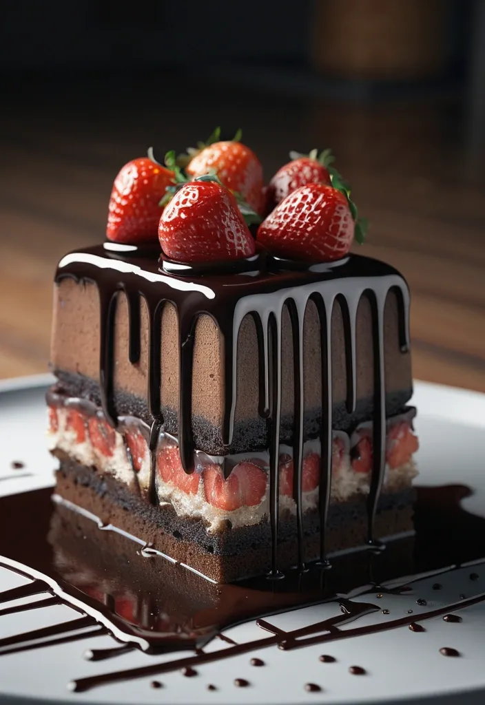
Positive Prompt: (Masterpiece , top quality , best quality , official art:1.2) , extreme detail , 8k resolution , photorealistic macro food photography. Subject: A decadent , rich chocolate cake slice with glossy , smooth dark chocolate ganache dripping down the sides , topped with vibrant , ripe red fresh strawberries and a delicate dusting of snowy powdered sugar. Environment: A rustic , textured dark wooden plank surface , soft warm candlelit background creating a romantic and intimate mood , golden hour glow , subtle bokeh of flickering candle flames in the distance. Technical: Shot on Phase One XF IQ4 150MP Camera System , Schneider Kreuznach 80mm LS Blue Ring f/2.8 lens , ISO 50 , f/5.6 , shutter speed 1/125 , ultra-sharp focus on the cake texture , depth of field , ray tracing global illumination , incredibly detailed textures of sponge and ganache. Composition: Vertical 9:16 aspect ratio , layered composition , rule of thirds , appetizing presentation , culinary art. Negative Prompt: (worst quality , low quality:1.4) , lowres , bad anatomy , bad hands , text , error , missing fingers , extra digit , fewer digits , cropped , jpeg artifacts , signature , watermark , username , blurry , artist name , cartoon , 3d render , illustration , painting , drawing , anime , oversaturated , plastic look , fake food , dry cake , messy plating , flat lighting , noise , grain , distorted , deformed , glitch. ,
Slide 2: The Decision Point • At a certain point , an understanding comes: to move forward , you don't just need a new skill , but a systematic understanding. • You need not just a "diploma , " but a foundation upon which you can build complex projects. • The choice fell on BSUIR for a reason. It was a strategic choice of a place where theory meets the most advanced practice , and your classmate could be either a recent school graduate or a lead developer from a major company. ,
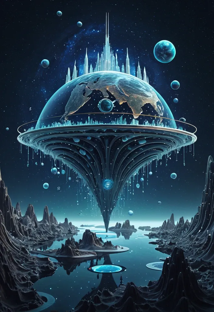
A Galaxy Wordie Universal Academia showing floating island like AI Planet , fictional intergalactic educational 5 Planet system. Key facts • Primary focus: Universal and inter-species education , research , and diplomacy • Structure: Multi-planetary network of academies and orbital institutes • Governance: Overseen by a High Council of Academic Regents • Specialization: Transdimensional sciences , xenolinguistics , and cosmic ethics Founding and Mission Galaxial Vora’di Universal Academia is described as an ancient seat of learning founded to unify knowledge across civilizations. An ultra-stylized and highly dramatic fashion editorial , rendered with a cinematic aesthetic. Shot on a Canon EOS R5. 8K. Zeiss Otus 85mm f/1.4 Planar T Lens. Over a landscape water Melting from a vortex drops rendered as a Fractal ocean. They rest on an open palm against a starry sky. Style: ethereal , fluid , and deeply peaceful. ,