Search Results for pog
Explore AI generated designs, images, art and prompts by top community artists and designers.
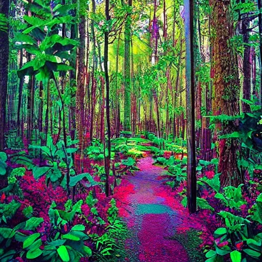

Immerse yourself in the mesmerizing beauty of the lush and vibrant forest depicted in this artwork. The centerpiece of this captivating scene is the magnificent typography formed by the towering trees , beautifully arranged to spell out the words "MONTE DEL RAIGOSU". The rich , green foliage creates a serene and enchanting ambiance that invites you to explore the depths of this magical forest. Whether you're an artist seeking inspiration or a nature enthusiast yearning for a visual retreat , this artwork on Arthub.ai will transport you to a world where nature and creativity intertwine. Discover the intricate details of each leaf , the interplay of light and shadow , and the harmony of the forest's natural elements. Let the letters "MONTE DEL RAIGOSU" guide your imagination as you delve into this immersive forest wonderland. With its vibrant colors , exquisite typography , and serene atmosphere , this artwork is a testament to the beauty and power of nature. It serves as a reminder of the endless possibilities that arise when creativity meets the natural world. Experience the magic for yourself on Arthub.ai and let "MONTE DEL RAIGOSU" be your gateway to a world of artistic inspiration and natural awe. , Trippy ,
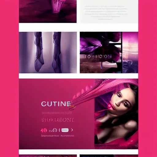
"Design a visually stunning and captivating horizontal banner for an online lingerie store that combines mysterious , sexy , and secret elements with an Oriental touch. The banner should evoke a strong sense of sensuality , desire , and an unstoppable allure. Incorporate rich colors , subtle patterns , and elegant typography to create a sophisticated and enticing visual experience. Ensure that the design is optimized for a horizontal layout and effectively communicates the brand's unique appeal. The banner should be ready to use , with no need for facial features or identifiable models. Focus on the elements that convey the emotions and themes desired , 3D ,
Clean and simple layout Easy navigation Limited color palette High contrast Large , easy-to-read typography Clear and concise information display Use of white space Minimalistic icons and graphics Responsive design for mobile devices User-centered design approach Efficient use of screen real estate Option to customize and personalize the dashboard. ,
Estoy buscando crear una etiqueta única y significativa en diseño para una etiqueta de Cerveza Artesanal "Tirano" que refleje un momento histórico significativo en Boyacá , Colombia. Elementos Clave del Diseño: 1. Tirano Español: En el centro del diseño , quiero que aparezca una representación visual de un español , un 'tirano' , como figura central. Este personaje debe destacar por su actitud desafiante y su expresión de poder. La figura del Tirano debería estar vestida con la vestimenta típica de la época de la conquista española , con detalles como una armadura. La elección de colores para esta figura puede incluir tonos oscuros y metálicos para resaltar su autoridad. 2. Templo del Sol en Llamas: En el fondo del diseño , detrás del Tirano , quiero que se represente el Templo del Sol en llamas. Este templo es un símbolo importante en la historia de Boyacá y la cultura muisca. 3. Detalles muiscas y artesanales sutiles: La idea es incorporar elementos culturales que honren la herencia muisca sin distraer del enfoque principal del Tirano y el Templo en llamas , manteniendo un equilibrio visual en el diseño. Además , considera incluir elementos de la cervecería artesanal. 4. Nombre de la Cerveza: El nombre "Tirano" debe estar arriba del diseño claramente visible , ya que va a ser parte de una etiqueta de la cerveza artesanal. 5. Tipografía Elegante y Legible: Elige una tipografía elegante y legible para el nombre de la cerveza "Tirano". ,
, Water Color , El logotipo de "Deep Sea Adventures Galápagos" es una representación llamativa y memorable de la marca. Se basa en un diseño tipográfico audaz y elegante con elementos marinos que resaltan el enfoque en el buceo y la vida submarina en las Islas Galápagos. El nombre "Deep Sea Adventures" se destaca en una fuente de letras prominente y estilizada , transmitiendo una sensación de aventura y emoción. La palabra "Deep" se encuentra en una tonalidad más oscura y profunda , mientras que "Sea Adventures" se muestra en un tono más ligero y fluido , evocando el entorno acuático. El logotipo incluye varios elementos marinos para complementar el texto. Puedes encontrar una concha marina estilizada , que simboliza la belleza natural del océano. Junto a ella , hay corales y algas que aportan un toque de color y textura , representando la vida submarina y la biodiversidad única de las Galápagos. El diseño del logotipo transmite una sensación de serenidad y exploración , mientras que la elección de colores puede variar según tus preferencias. Tonos azules y verdes suaves se utilizan comúnmente para evocar el océano y la naturaleza. También puedes considerar utilizar tonalidades vibrantes y contrastantes para resaltar la energía y la aventura. En resumen , el logotipo de "Deep Sea Adventures Galápagos" es un diseño tipográfico impactante con elementos marinos elegantes que reflejan la pasión por el buceo y la vida submarina en las Islas Galápagos. ,
Design a visually stunning and captivating banner for an online lingerie store that combines mysterious , sexy , and secret elements with an Oriental touch. The banner should evoke a strong sense of sensuality , desire , and an unstoppable allure. Incorporate rich colors , subtle patterns , and elegant typography to create a sophisticated and enticing visual experience , Trippy ,
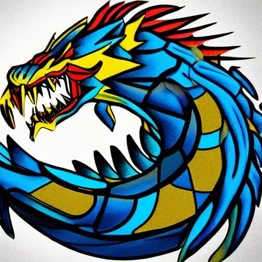
El logotipo consta de un dragón estilizado en forma de silueta , con una cabeza grande y ojos brillantes que transmiten energía y fuerza. El cuerpo del dragón está compuesto por líneas suaves y curvas que evocan movimiento y agilidad , y las alas extendidas sugieren libertad y expansión. El color principal del logotipo es un azul intenso y vibrante , que se funde con un degradado de negro en la parte inferior del diseño. El contraste entre los colores da una sensación de profundidad y misterio , y resalta la figura del dragón. En la parte inferior del logotipo , se puede incluir el texto "GAxDraga" en una tipografía moderna y estilizada , en un tono de gris claro que contraste con los colores del dragón ,
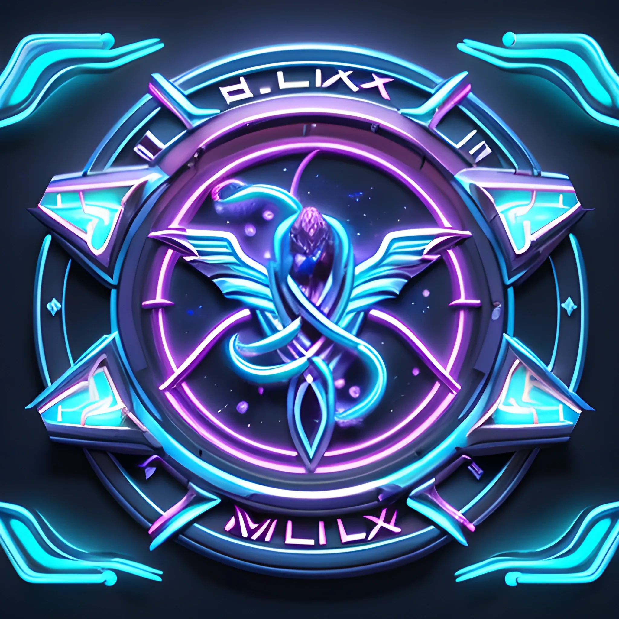
The "Velox" logo embodies Silkroad Online's essence , featuring a dynamic shield emblem illuminated with vibrant neon. Against midnight blue , a luminous azure shield , adorned with swift silver accents , evokes the game's excitement. Enigmatic markings , reminiscent of Medusa's intricate texture , glow in neon , enhanced by a perfected light effect. Swirling nova and sun effects add cosmic flair. Bold "Velox" typography below signifies strength amid this celestial display. This emblem promises immersive mystery , action , and adventure , all bathed in captivating neon brilliance and Medusa's allure. , 3D ,
A digital artwork featuring a 12cmx14cm advertisement for a product , with the Toonamidia logo prominently positioned. The ad has a minimalist design with no background color , presenting the product in a clean and sophisticated way. The product is digitally illustrated or rendered with precision and attention to detail. The Sherwin-Williams logo is prominently featured in the designated space , reinforcing the brand identity. The typography used for the product description and other details is minimalistic , adding to the overall simplicity of the design. The composition is balanced and visually pleasing , creating a strong visual impact within the limited space. Artwork conveys a sense of professionalism and elegance , drawing attention to both the product and the Sherwin-Williams brand. , Cartoon ,
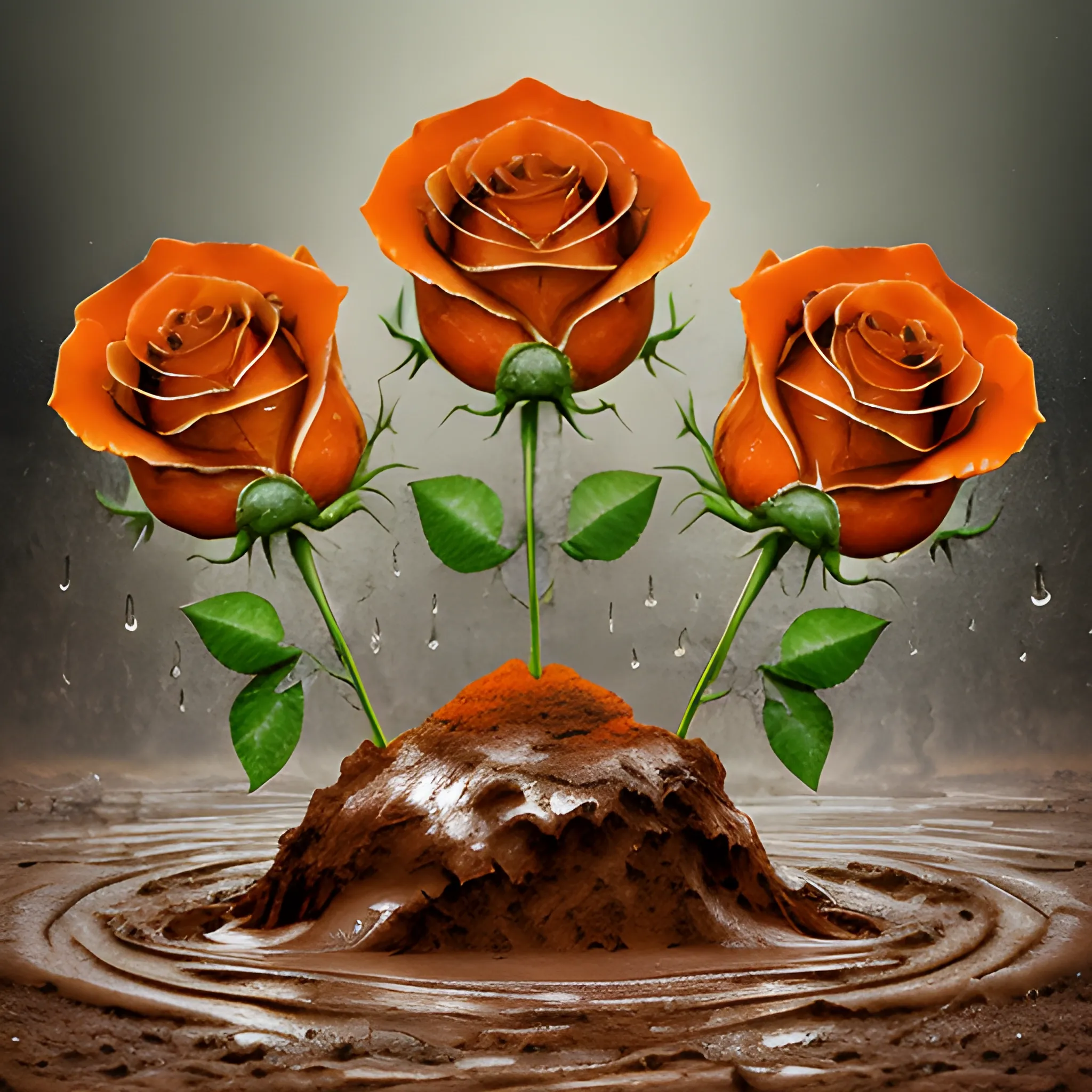
3 Orange Roses , growing through the mud , emerging from a rainy day , bold typography , earth-to-ethereal palette , texture overlays , spiritual iconography , gritty realism , ethereal abstraction , thought-provoking , high-impact , digital art , symbolic depth , subtle gradients , dynamic contrasts , LSD Trippy , Oil Painting ,
Corporate Identity (CI) Merkmale für zero4k IT Solutions: Farbschema: Primärfarbe: #0044FF (dunkles Blau) Sekundärfarbe: #00FF99 (helles Türkis/Grün) Akzentfarbe: #FF9900 (Orange) Logo: Das Logo kann aus dem Firmennamen "zero4k IT Solutions" bestehen oder ein stilisiertes Symbol enthalten , das die Geschäftstätigkeit von zero4k IT Solutions repräsentiert. Beispiel für mögliche Icons: Ein stilisiertes Computerchip-Symbol , um die IT-Kompetenz darzustellen. Ein abstraktes Symbol , das Innovation und Fortschritt symbolisiert. Ein stilisiertes Netzwerk-Symbol , um die Systemintegration zu repräsentieren. Ein Puzzleteil-Symbol , um die maßgeschneiderten Lösungen zu betonen. Die verwendeten Farben sollten sich am definierten Farbschema orientieren. Das Logo sollte sowohl in voller Farbe als auch in einer einfarbigen Version (z. B. Weiß oder Schwarz) verwendet werden können. Es sollte skalierbar sein , um in verschiedenen Größen verwendet werden zu können , sowohl auf der Webseite als auch in gedruckten Materialien. Typografie: Primäre Schriftart: Roboto (sans-serif) Sekundäre Schriftart (für Überschriften): Montserrat (sans-serif) Die Schriftarten sollten sowohl für die Webseite als auch für andere Marketingmaterialien wie Flyer oder Präsentationen verwendet werden. Bildstil: Bilder sollten einen professionellen und modernen Eindruck vermitteln. Verwenden Sie Bilder , die die Dienstleistungen von zero4k IT Solutions repräsentieren , z. B.: Ein Computerbildschirm oder eine Tastatur , um die Softwareentwicklung darzustellen. Ein Netzwerk oder Serverrack , um die Systemintegration zu symbolisieren. Ein Team von Fachleuten , um den IT-Beratungsdienst zu veranschaulichen. Ein Schloss oder ein Datenschutzsymbol , um die IT-Sicherheitslösungen zu betonen. Der Bildstil kann von klaren und lebendigen Farben bis hin zu gedämpften Tönen reichen , je nachdem , welche Atmosphäre und Botschaft vermittelt werden soll. Slogan: "Innovative IT-Lösungen für Ihr Unternehmen" ,
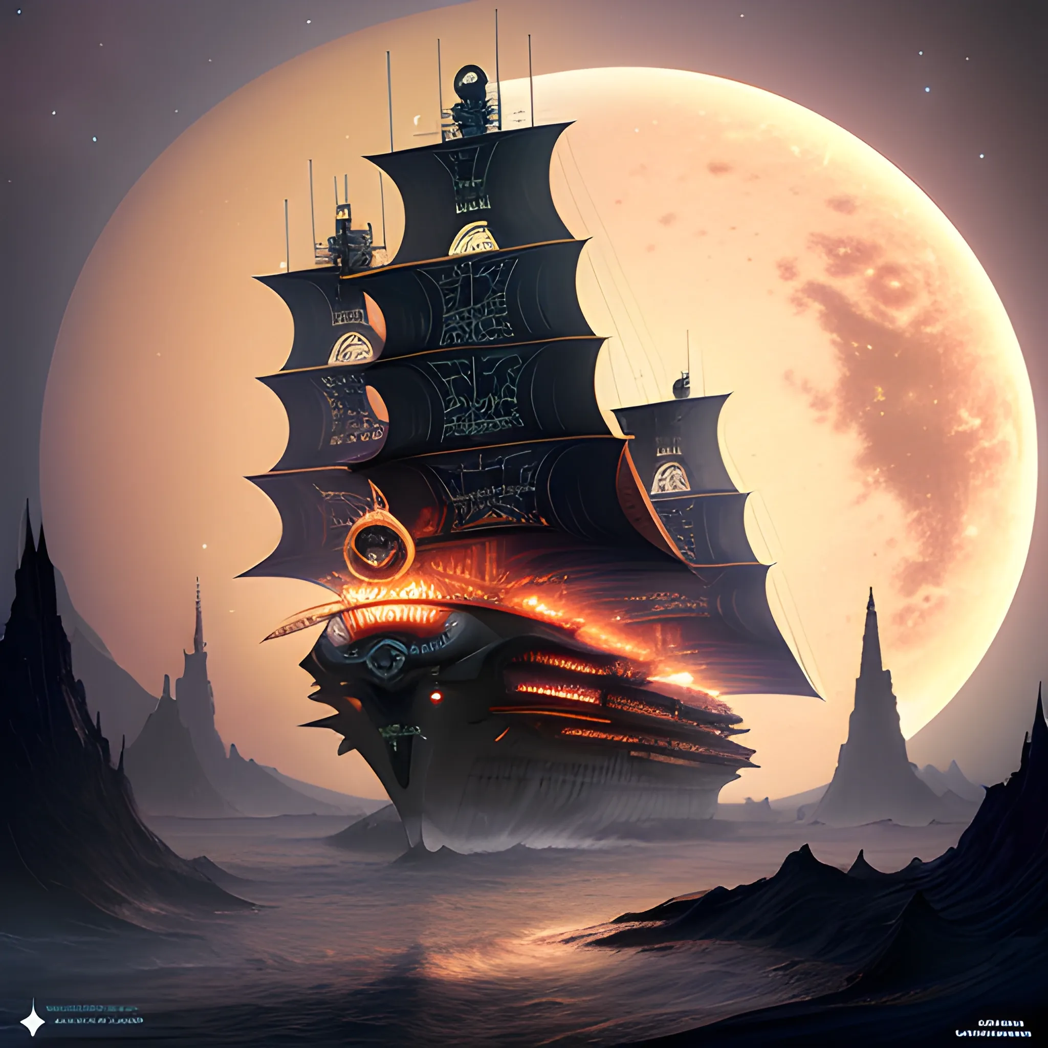
A breathtaking , awe-inspiring steampunk star batship designed by Spielberg , soaring through the vastness of space near Saturn. The ship is adorned with 750 , 000 intricate details and features , including a glowing motherboard that forms its backbone. Numerous smoke-belching diodes and riveting artillery are visible , while sparks crackle in the periphery. The crystal diamond bat-ear-shaped nacelles in the rear illuminate the scene , and the ship's design seamlessly blends elements of anime , fashion , architecture , and more. The overall atmosphere is a captivating dark fantasy world , combining typography , product , poster , 3D render , portrait photography , and cinematic elements into a visually stunning masterpiece. ,
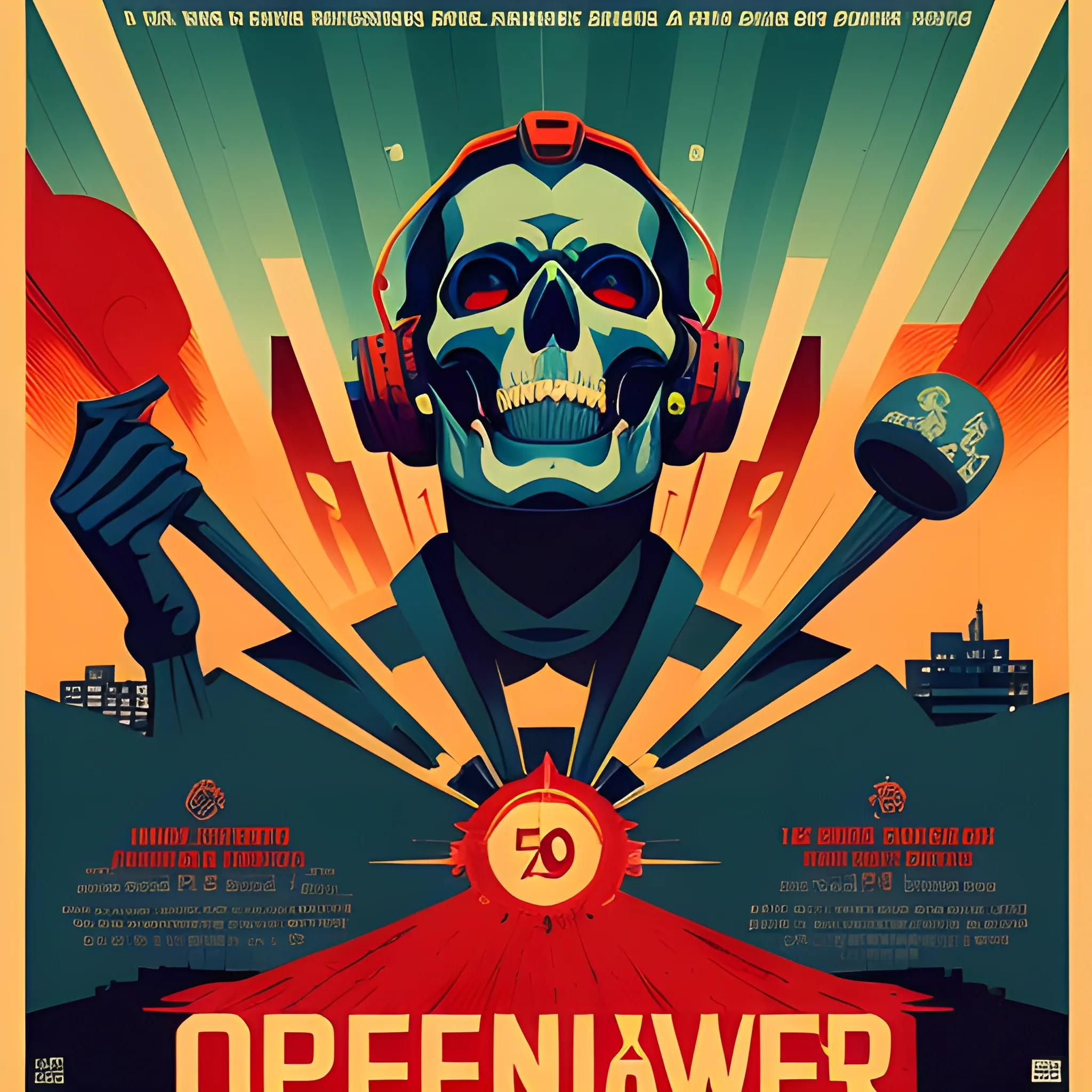
Openheimer Movie Poster , An intense movie poster for 'Openheimer' dominated by a nuclear explosion , accompanied by the phrase 'Ahora me he convertido en la Muerte , El destructor de mundos' , An urban environment , with the poster plastered on a city wall , catching the attention of passersby , The mood is somber and haunting , reflecting the destructive power of the nuclear explosion and the chilling phrase on the poster , Art Deco style with expressive , rich jewel tones and radiating geometric patterns that add to the intensity of the poster , Poster designed digitally , capturing the Art Deco aesthetics and typography while balancing the color contrast for the explosion and the text , --ar 51:91 --style raw --s 750 --v 5. 2 ,

Create an image showcasing a badass design featuring the Baltimore Ravens American football team. The design should convey strength , aggression , and a sense of dominance. The team's logo , a raven , should be the central focus. Depict the raven with sharp , menacing features and fiery eyes. It should exude an aura of power and intimidation. Surround the raven with elements that symbolize victory and fierceness , such as lightning bolts , shattered helmets , or a smoky battlefield. Incorporate bold and dynamic typography to display the team's name and motto , emphasizing their strong identity. The overall composition should radiate energy , inspiring a sense of fear in their opponents and admiration in their fans. , Trippy ,
Minimalist and elegant logo for personal brand and clothing "Dreams". Black is an elegant and sophisticated color that conveys authority and power for the typography of the brand name and also for some details of the logo , such as lines or shapes. White is a clean and fresh color that is often used to symbolize purity and simplicity. I could use white as the background of the logo so that the text and details in black and gold stand out on it. Gold is a luxurious and striking color that is often used to symbolize success and wealth. I could use gold for some details of the logo , such as edges or icons. As for the shape of the logo , I would look for something that is clean and simple , perhaps using basic geometric shapes. I would also look for a minimalist and elegant typography that is easy to read and that conveys the brand image. , Pencil Sketch , 3D ,
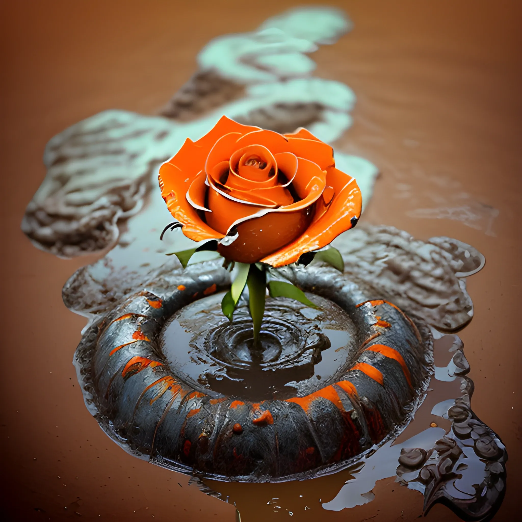
Orange Rose growing through the mud , emerging from a rainy day , bold typography , earth-to-ethereal palette , texture overlays , spiritual iconography , gritty realism , ethereal abstraction , thought-provoking , high-impact , digital art , symbolic depth , subtle gradients , dynamic contrasts , really Trippy ,
Corporate Identity (CI) Merkmale für zero4k IT Solutions: Farbschema: Primärfarbe: #0044FF (dunkles Blau) Sekundärfarbe: #00FF99 (helles Türkis/Grün) Akzentfarbe: #FF9900 (Orange) Logo: Das Logo kann aus dem Firmennamen "zero4k IT" oder "z4kIT" bestehen oder ein stilisiertes Symbol enthalten , das die Geschäftstätigkeit von zero4k IT Solutions repräsentiert. Beispiel für mögliche Grafiken , welche in einem modern flat icon design farblich gestaltet werden sollen : Ein stilisiertes Computerchip-Symbol , um die IT-Kompetenz darzustellen. Ein abstraktes Symbol , das Innovation und Fortschritt symbolisiert. Ein stilisiertes Netzwerk-Symbol , um die Systemintegration zu repräsentieren. Ein Puzzleteil-Symbol , um die maßgeschneiderten Lösungen zu betonen. Die verwendeten Farben sollten sich am definierten Farbschema orientieren. Das Logo sollte sowohl in voller Farbe als auch in einer einfarbigen Version (z. B. Weiß oder Schwarz) verwendet werden können. Es sollte skalierbar sein , um in verschiedenen Größen verwendet werden zu können , sowohl auf der Webseite als auch in gedruckten Materialien. Typografie: Primäre Schriftart: Roboto (sans-serif) Sekundäre Schriftart (für Überschriften): Montserrat (sans-serif) Die Schriftarten sollten sowohl für die Webseite als auch für andere Marketingmaterialien wie Flyer oder Präsentationen verwendet werden. Bildstil: Bilder sollten einen professionellen und modernen Eindruck vermitteln. Verwenden Sie Bilder , die die Dienstleistungen von zero4k IT Solutions repräsentieren , z. B.: Ein Computerbildschirm oder eine Tastatur , um die Softwareentwicklung darzustellen. Ein Netzwerk oder Serverrack , um die Systemintegration zu symbolisieren. Ein Team von Fachleuten , um den IT-Beratungsdienst zu veranschaulichen. Ein Schloss oder ein Datenschutzsymbol , um die IT-Sicherheitslösungen zu betonen. Der Bildstil kann von klaren und lebendigen Farben bis hin zu gedämpften Tönen reichen , je nachdem , welche Atmosphäre und Botschaft vermittelt werden soll. Slogan:"IT-Empowered" ,
Icono central: Utiliza un diseño central que represente una montaña con un cafetal en su base. Esto simboliza la ubicación en el páramo de Santander y la producción de café. Naturaleza: Rodea la montaña y el cafetal con elementos de la flora y fauna del páramo , como pájaros , flores silvestres y vegetación típica. Esto destaca la riqueza de la biodiversidad de la región. Colores: Utiliza una paleta de colores que represente la naturaleza y el clima de la región. Los tonos de verde para la vegetación y el azul para el cielo y los cuerpos de agua pueden ser adecuados. También puedes incorporar tonos de marrón y verde para representar los granos de café maduros. Tipografía: Elige una fuente de estilo rústico o artesanal para el nombre de tu café. Esto evoca la autenticidad y la artesanía de la producción de café en la región. Texto: Coloca el nombre de tu café y la ubicación "Páramo de Santander , Colombia" debajo o alrededor del icono central. Fondo de la Bolsa: Fondo natural: Utiliza una imagen o un patrón que represente la belleza del páramo de Santander , como un paisaje montañoso , una vista panorámica o incluso un dibujo de la vegetación del páramo. Esto añade autenticidad y atractivo visual a la bolsa. Colores: Mantén la paleta de colores del fondo en armonía con los colores del logotipo para crear una apariencia cohesiva. Información del producto: Incluye detalles sobre el tipo de café , el proceso de cultivo y cosecha , así como notas de sabor y aroma en la parte trasera de la bolsa. Recuerda que es esencial trabajar con un diseñador gráfico o una agencia de diseño para crear una bolsa de café atractiva y efectiva. Este diseño es solo una sugerencia inicial y puede personalizarse según tus preferencias y la identidad de tu café. Además , asegúrate de que la bolsa cumpla con todos los requisitos legales y de etiquetado aplicables a la venta de café en Colombia y otros mercados. ,
Logotipo: Tiburón Mordiendo un Balón de Soccer Elementos Principales: Un tiburón estilizado en posición de ataque , con las fauces abiertas y los dientes visibles. El tiburón está mordiendo un balón de fútbol (soccer) con fuerza. Puedes representar el movimiento del agua alrededor del tiburón para agregar dinamismo. Colores: Usa colores llamativos que representen la intensidad y la emoción del fútbol , como el azul profundo para el agua y un gris oscuro o negro para el tiburón. El balón de soccer puede tener los colores tradicionales: blanco y negro , con detalles en colores contrastantes si lo prefieres. Tipografía (si es necesario): variada Si decides agregar texto al logotipo , elige una tipografía audaz y moderna que diga: COMANDO TIBURÓN o Comando Tiburón. Asegúrate de que el texto sea legible y que complemente el diseño general del logotipo. Detalles Adicionales (opcional): Puedes agregar detalles como burbujas de agua alrededor del tiburón para enfatizar el entorno acuático. Asegúrate de que la composición sea equilibrada y que todos los elementos se destaquen claramente. ,